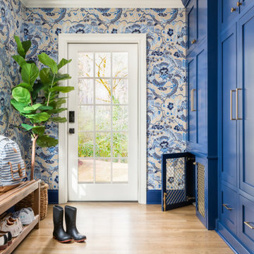
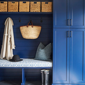
青い玄関 (茶色い床、オレンジの床) の写真
絞り込み:
資材コスト
並び替え:今日の人気順
写真 21〜40 枚目(全 321 枚)
1/4

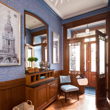
Lovely front entrance with delft blue paint and brass accents. Front doors should say welcome and thank you for visiting, I think this does just that!
Winner of the 2018 Tour of Homes Best Remodel, this whole house re-design of a 1963 Bennet & Johnson mid-century raised ranch home is a beautiful example of the magic we can weave through the application of more sustainable modern design principles to existing spaces.
We worked closely with our client on extensive updates to create a modernized MCM gem.
Here is an architecturally built house from the early 1970's which was brought into the new century during this complete home remodel by opening up the main living space with two small additions off the back of the house creating a seamless exterior wall, dropping the floor to one level throughout, exposing the post an beam supports, creating main level on-suite, den/office space, refurbishing the existing powder room, adding a butlers pantry, creating an over sized kitchen with 17' island, refurbishing the existing bedrooms and creating a new master bedroom floor plan with walk in closet, adding an upstairs bonus room off an existing porch, remodeling the existing guest bathroom, and creating an in-law suite out of the existing workshop and garden tool room.
Download our free ebook, Creating the Ideal Kitchen. DOWNLOAD NOW
Lakefront property in the northwest suburbs of Chicago is hard to come by, so when we were hired by this young family with exactly that, we were immediately inspired by not just the unusually large footprint of this 1950’s colonial revival but also the lovely views of the manmade lake it was sited on. The large 5-bedroom home was solidly stuck in the 1980’s, but we saw tons of potential. We started out by updating the existing staircase with a fresh coat of paint and adding new herringbone slate to the entry hall.
The powder room off the entryway also got a refresh - new flooring, new cabinets and fixtures. We ran the new slate right through into this space for some consistency. A fun wallpaper and shiplap trim add a welcoming feel and set the tone for the home.
Next, we tackled the kitchen. Located away from the rest of the first floor, the kitchen felt a little isolated, so we immediately began planning for how to better connect it to the rest of the first floor. We landed on removing the wall between the kitchen and dining room and designed a modified galley style space with separate cooking and clean up zones. The cooking zone consists of the refrigerator, prep sink and cooktop, along with a nice long run of prep space at the island. The cleanup side of the kitchen consists of the main sink and dishwasher. Both areas are situated so that the user can view the lake during prep work and cleanup!
One of the home’s main puzzles was how to incorporate the mudroom and area in front of the patio doors at the back of the house. We already had a breakfast table area, so the space by the patio doors was a bit of a no man’s land. We decided to separate the kitchen proper from what became the new mudroom with a large set of barn doors. That way you can quickly hide any mudroom messes but have easy access to the light coming in through the patio doors as well as the outdoor grilling station. We also love the impact the barn doors add to the overall space.
The homeowners’ first words to us were “it’s time to ditch the brown,” so we did! We chose a lovely blue pallet that reflects the home’s location on the lake which is also vibrant yet easy on the eye. Countertops are white quartz, and the natural oak floor works well with the other honey accents. The breakfast table was given a refresh with new chairs, chandelier and window treatments that frame the gorgeous views of the lake out the back.
We coordinated the slate mudroom flooring with that used in the home’s main entrance for a consistent feel. The storage area consists of open and closed storage to allow for some clutter control as needed.
Next on our “to do” list was revamping the dated brown bar area in the neighboring dining room. We eliminated the clutter by adding some closed cabinets and did some easy updates to help the space feel more current. One snag we ran into here was the discovery of a beam above the existing open shelving that had to be modified with a smaller structural beam to allow for our new design to work. This was an unexpected surprise, but in the end we think it was well worth it!
We kept the colors here a bit more muted to blend with the homeowner’s existing furnishings. Open shelving and polished nickel hardware add some simple detail to the new entertainment zone which also looks out onto the lake!
Next we tackled the upstairs starting with the homeowner’s son’s bath. The bath originally had both a tub shower and a separate shower, so we decided to swap out the shower for a new laundry area. This freed up some space downstairs in what used to be the mudroom/laundry room and is much more convenient for daily laundry needs.
We continued the blue palette here with navy cabinetry and the navy tile in the shower. Porcelain floor tile and chrome fixtures keep maintenance to a minimum while matte black mirrors and lighting add some depth the design. A low maintenance runner adds some warmth underfoot and ties the whole space together.
We added a pocket door to the bathroom to minimize interference with the door swings. The left door of the laundry closet is on a 180 degree hinge to allow for easy full access to the machines. Next we tackled the master bath which is an en suite arrangement. The original was typical of the 1980’s with the vanity outside of the bathroom, situated near the master closet. And the brown theme continued here with multiple shades of brown.
Our first move was to segment off the bath and the closet from the master bedroom. We created a short hall from the bedroom to the bathroom with his and hers walk-in closets on the left and right as well as a separate toilet closet outside of the main bathroom for privacy and flexibility.
The original bathroom had a giant soaking tub with steps (dangerous!) as well as a small shower that did not work well for our homeowner who is 6’3”. With other bathtubs in the home, they decided to eliminate the tub and create an oversized shower which takes up the space where the old tub was located. The double vanity is on the opposite wall and a bench is located under the window for morning conversations and a place to set a couple of towels.
The pallet in here is light and airy with a mix of blond wood, creamy porcelain and marble tile, and brass accents. A simple roman shade adds some texture and it’s top-down mechanism allows for light and privacy.
This large whole house remodel gave our homeowners not only the ability to maximize the potential of their home but also created a lovely new frame from which to view their fabulous lake views.
Designed by: Susan Klimala, CKD, CBD
Photography by: Michael Kaskel
For more information on kitchen and bath design ideas go to: www.kitchenstudio-ge.com
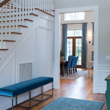
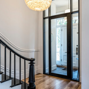
Image Courtesy © Richard Hilgendorff
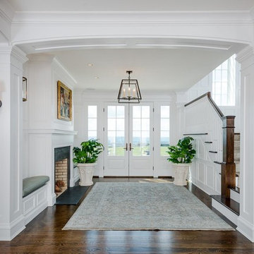
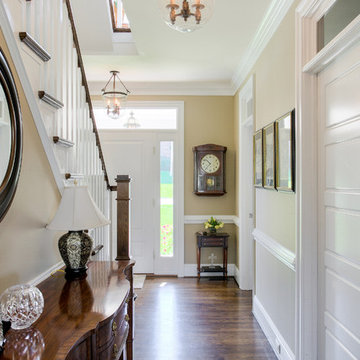
ボストンにあるトランジショナルスタイルのおしゃれな玄関ラウンジ (白い壁、無垢フローリング、ガラスドア、茶色い床) の写真
ボストンにあるトランジショナルスタイルのおしゃれな玄関ラウンジ (白い壁、無垢フローリング、ガラスドア、茶色い床) の写真
Mark Compton
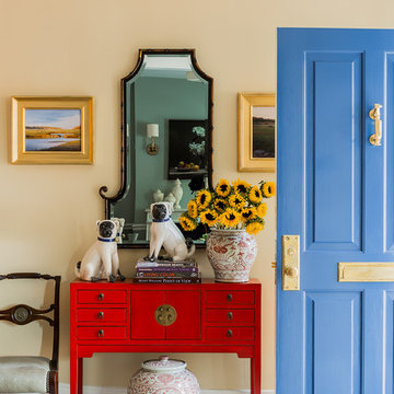
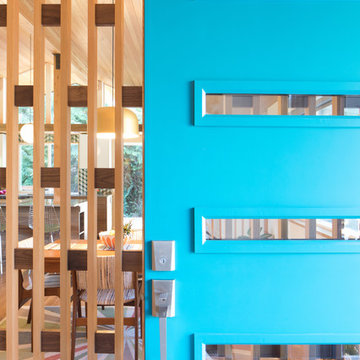
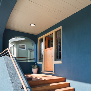
サンフランシスコにあるラグジュアリーな広いトランジショナルスタイルのおしゃれな玄関ドア (青い壁、無垢フローリング、淡色木目調のドア、茶色い床) の写真
サンフランシスコにあるラグジュアリーな広いトランジショナルスタイルのおしゃれな玄関ドア (青い壁、無垢フローリング、淡色木目調のドア、茶色い床) の写真
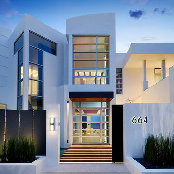
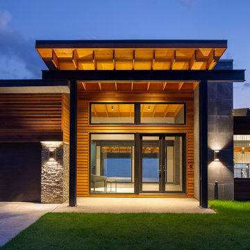
This home was designed with a clean, modern aesthetic that imposes a commanding view of its expansive riverside lot. The wide-span, open wing design provides a feeling of open movement and flow throughout the home. Interior design elements are tightly edited to their most elemental form. Simple yet daring lines simultaneously convey a sense of energy and tranquility. Super-matte, zero sheen finishes are punctuated by brightly polished stainless steel and are further contrasted by thoughtful use of natural textures and materials. The judges said “this home would be like living in a sculpture. It’s sleek and luxurious at the same time.”
The award for Best In Show goes to
RG Designs Inc. and K2 Design Group
Designers: Richard Guzman with Jenny Provost
From: Bonita Springs, Florida
Photography by Misty, Plano TX
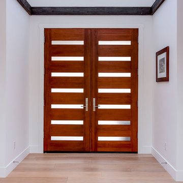
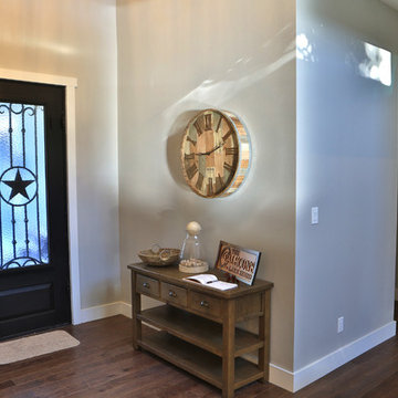
ダラスにあるお手頃価格の中くらいなカントリー風のおしゃれな玄関ドア (グレーの壁、濃色無垢フローリング、黒いドア、茶色い床) の写真
ダラスにあるお手頃価格の中くらいなカントリー風のおしゃれな玄関ドア (グレーの壁、濃色無垢フローリング、黒いドア、茶色い床) の写真
Five residential-style, three-level cottages are located behind the hotel facing 32nd Street. Spanning 1,500 square feet with a kitchen, rooftop deck featuring a fire place + barbeque, two bedrooms and a living room, showcasing masterfully designed interiors. Each cottage is named after the islands in Newport Beach and features a distinctive motif, tapping five elite Newport Beach-based firms: Grace Blu Design, Jennifer Mehditash Design, Brooke Wagner Design, Erica Bryen Design and Blackband Design.
青い玄関 (茶色い床、オレンジの床) の写真
2