コメント
Design Pros Share 10 Favorite Creamy White Paints
These off-white color choices include versatile tones, warming hues and pleasingly soft shades
Becky Harris
2024年3月23日
Choosing an off-white paint seems like it should be easy enough, but it can be tricky. Light sources, time of day and amount of natural light all affect the appearance of paint in different rooms. And undertones in the paint can skew toward other colors, such as yellow, pink or gray. With that in mind, we reached out to design professionals to compile a list of 10 favorite creamy white paints — from almost imperceptibly off-white to light sand — that they consider reliable go-tos.
As you’re considering each shade, note that paint colors look different in different parts of the country and at different times of day. They can even look noticeably different from one side of your house to the other. So be sure to test the paint in a large swath in the room where you want to use it and check on it throughout the day and night with different lighting schemes. And because other colors in the room also can affect how it looks, check it out next to the trim color or stain, as well as the furniture, flooring, tile, rugs and artwork you’d like to use in the room.
As you’re considering each shade, note that paint colors look different in different parts of the country and at different times of day. They can even look noticeably different from one side of your house to the other. So be sure to test the paint in a large swath in the room where you want to use it and check on it throughout the day and night with different lighting schemes. And because other colors in the room also can affect how it looks, check it out next to the trim color or stain, as well as the furniture, flooring, tile, rugs and artwork you’d like to use in the room.
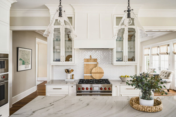
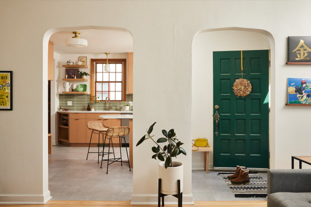
1. White Dove by Benjamin Moore
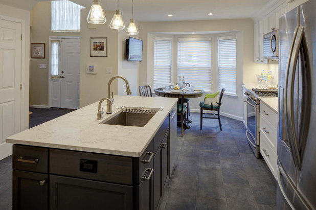
White Dove is a paint color that sits between white and off-white. As mentioned above, many hues can look different depending on other finishes, the amount of natural light in the room and the artificial lighting scheme. These first three photos illustrate these differences.
Interior designer Jena Bula of Delphinium Design used White Dove for the cabinetry and trim in this North Carolina kitchen. “We use white paint colors often in our designs but tend to avoid bright whites,” she says. “White Dove is a great soft white that helps to add dimension to a space. We are careful not to pair this color with bright whites as it can make it look a little yellow, but when paired with colors that are not whiter, it’s our go-to white cabinet color.”
Wall paint: Edgecomb Gray, Benjamin Moore
Find an interior designer on Houzz
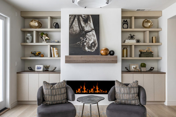
Interior designer Wendy Glaister is also a big fan of White Dove, and this pair of photographs of it used in a Northern California room shows how it looks in different light.
“I like Benjamin Moore White Dove. It’s nice and soft,” Glaister says. In this inviting living room, the wall paint works beautifully with the warm tones in the wood, shelving and cabinetry. At the same time, it’s a perfect backdrop for artwork that provides high contrast.
Browse paintings in the Houzz Shop
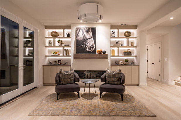
While the previous photo shows White Dove in bright natural daylight, this one shows how it looks in the same room artificially lit at night. The softness Glaister spoke of really comes through after dark, which is an important part of a color being comforting. And it’s a reminder to check your own paint swatches at different times of the day and in different lighting schemes.
2. Pure White by Sherwin-Williams
The name Pure White belies the very subtle taupe undertones in this paint color. “Pure White is my go-to for ceiling and walls as well as the main paint color,” interior designer Harmony Weihs says. “It’s a crisp white that has just enough warmth in it so it doesn’t feel stark or cold, while at the same time having very little undertones of yellow, pink or blue that other off-whites often have.
“On ceilings we suggest flat sheen and, depending on how many people and pets are in the home, I prefer a flat finish on the walls too, or eggshell if we are worried about high-traffic areas.”
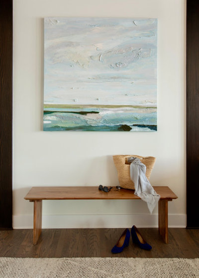
Shop for a bench
The name Pure White belies the very subtle taupe undertones in this paint color. “Pure White is my go-to for ceiling and walls as well as the main paint color,” interior designer Harmony Weihs says. “It’s a crisp white that has just enough warmth in it so it doesn’t feel stark or cold, while at the same time having very little undertones of yellow, pink or blue that other off-whites often have.
“On ceilings we suggest flat sheen and, depending on how many people and pets are in the home, I prefer a flat finish on the walls too, or eggshell if we are worried about high-traffic areas.”
Shop for a bench
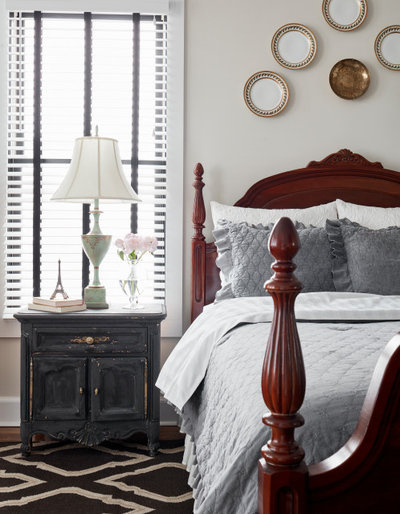
3. Natural Choice by Sherwin-Williams
“Natural Choice is a warm white with a hint of taupe to it,” says interior designer Joni Spear, who likes this color so much that she’s used it in her own homes. Here, it creates an inviting feel in her bedroom.
9 Ways to Layer Warm Neutral Colors for Comfortably Refined Rooms
“Natural Choice is a warm white with a hint of taupe to it,” says interior designer Joni Spear, who likes this color so much that she’s used it in her own homes. Here, it creates an inviting feel in her bedroom.
9 Ways to Layer Warm Neutral Colors for Comfortably Refined Rooms
4. Swiss Coffee by Benjamin Moore
Swiss Coffee has never let interior designer Emily Pueringer down. “This really is a perfect warm white,” she says. “It has such a subtle warm glow that is beautiful and soft in all lighting throughout the day. And there are no unsettling undertones to worry about — it’s quite versatile and forgiving.”
Swiss Coffee has never let interior designer Emily Pueringer down. “This really is a perfect warm white,” she says. “It has such a subtle warm glow that is beautiful and soft in all lighting throughout the day. And there are no unsettling undertones to worry about — it’s quite versatile and forgiving.”
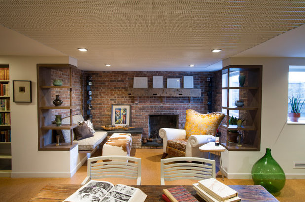
5. City Loft by Sherwin-Williams
Architect John Conroy thinks very carefully about how paint works with light, particularly in a space that doesn’t receive a lot of it naturally, such as a basement. One of his favorite choices is City Loft by Sherwin-Williams, seen here in a cozy basement library.
“We needed an off-white that could be used on the walls as well as the ceilings since the ceilings were low,” Conroy says. “City Loft was the right choice to complement the warm colors in the space and the 2700 Kelvin lighting temperature.”
Find a local paint professional
City Loft is also a favorite of designer Dana Bender of Pine Street Carpenters & The Kitchen Studio. She first sampled it in her own home eight years ago and realized it was “the one” without having to sample more colors, which was usually her standard practice. It’s been a go-to ever since.
“City Loft is a fantastic neutral and never pulls any surprise undertones — it reads consistently on any wall or room of the house,” Bender says. “It looks great in morning, evening and in natural or artificial light. And it pairs easily with nearly any cabinetry color, for kitchen or bathroom projects.” The designer also notes that its hints of both beige and gray give it a versatility that works with warm and cool color palettes. This versatility is especially useful when continuing a paint color from room to room within an open floor plan.
Designer Secrets: 10 Pros Share Their Favorite White Paints
6. Snow Day by Clare
“It’s a challenge capturing the right white that works in a Minnesota home when the trees are lush in the summer and bare in the winter, as each season impacts how paint colors read,” interior designer Colleen Slack says. “We selected the aptly named Snow Day by Clare as it works year-round in this 1938 home. It pairs beautifully with the warmth of both the original woodwork and new cabinetry, as well as the cooler tone of the tile floors.”
10 Off-White Paint Colors for Home Exteriors
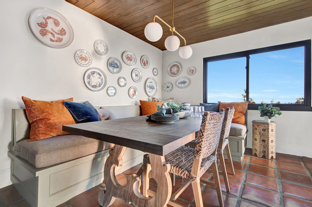
7. White Tie by Farrow & Ball
“I love Farrow & Ball’s White Tie because it has soft, light undertones, and when light changes in this beach house, nothing too crazy happens,” interior designer Shannon Ggem says. “At the same time, it manages to be dynamic and will take on a lovely golden warmth in a sunset or a clean, creamy look on a blue sky day.”
Here you can see how well the paint color works with the home’s architectural elements. These include the wood ceiling and original 40-year-old Saltillo tile floors.
New to home remodeling? Learn the basics
8. Wainscot White by ECOS Paints
Sometimes the exact paint a designer needs isn’t on the market. This was the case for interior designer Lisa Tharp, who prioritizes nontoxic finishes in all her designs. She collaborated with ECOS Paints to come up with her own line, including her ideal off-white with warm gray undertones.
“Wainscot White is a versatile chalky white that adds sophisticated life without gaining yellow,” Tharp says. “Not only does ECOS paint provide exceptional coverage, you can breathe easy knowing it is organic and nontoxic.”
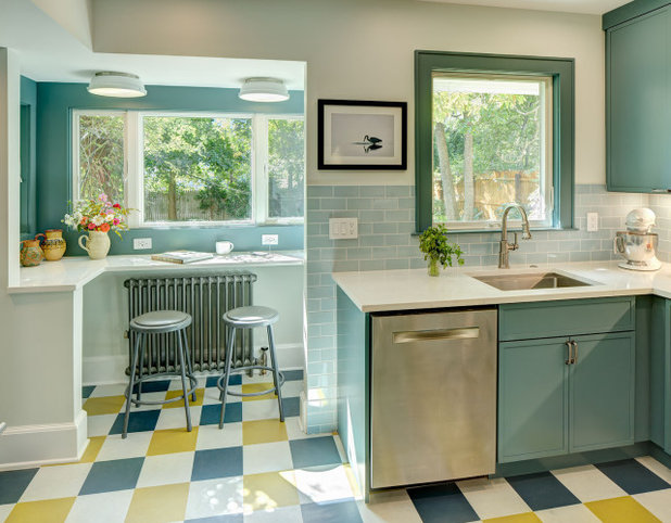
9. Opaline by Sherwin-Williams
While designers have their trusty go-tos, that doesn’t mean they won’t try out new paints. For this kitchen, interior designer Tracey Stephens needed a good off-white to complement the teal cabinets and light blue backsplash tiles.
“Opaline was new to me, but I like it!” she says. “It is a pale gray with an undertone of aqua or green depending on the light. It looked really good with the pale blue tile and the deeper teal-ish cabinets.”
10. Zurich White by Sherwin-Williams
Another favorite of Stephens’ is the paint she used to brighten and warm this New Jersey townhouse kitchen. “It’s a very reliable favorite warm white with a greige undertone,” she says.
Your Turn: Do you have a favorite creamy white paint color? Please share it in the Comments. We’d also love to see photos of it in your home.
More on Houzz
Read more decorating guides
Browse photos for inspiration
Find a design pro
Shop for your home

おすすめの記事
エコ・サステナブル
世界の専門家が注目する、サステナブルな住まいづくりのかたちとは?
今後期待されるサステナブル=持続可能なソリューションとは?Houzzで活躍する世界の専門家に伺いました。
続きを読む
家づくりのヒント
建築家と家づくりをするメリットとは?
文/志田茂
「値段が高そう」「敷居が高い」……。建築家との家づくりは大変そうだと思っている人もいると思います。でも、唯一無二の理想の住まいを実現したいなら、建築家との家づくりはおすすめです。
続きを読む
小さな住まい
コンパクトリビングの賢いスペース活用法
コンパクトな空間は、ひとつひとつの要素が持つ「意味」が大切。スペースを最大限に生かしながら、快適に過ごせるテクニックと実例をご紹介しましょう。
続きを読む
キッチンの記事
プロに聞く、オーダーキッチンを作りたいなら知っておきたいこと
デザインと使い勝手がカスタマイズされたオンリーワンのオーダーキッチン。取り入れたいなら知っておくべきことを専門家に聞きました。
続きを読む
ライフスタイル
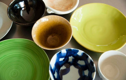
知っておきたい器づかいのコツ:料理をおいしく見せる器の色
文/進藤由美子
料理をおいしそうに見せる器って、どんな器でしょう? 家での食事をおいしく、楽しくする器の揃え方、使い方のコツを2回に分けてご紹介します。前編は、器の色について。
続きを読む
キッチンの記事
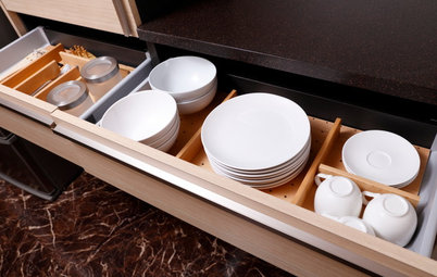
家事をストレスフリーに! キッチンカウンター下収納の使い方と収納アイデア
オープンタイプのキッチンが人気の今、キッチンカウンター下収納はその後の使いやすさを左右する重要な検討事項です。種類別カウンター下収納の特徴を参考に、家族が使いたくなるキッチンまわりをつくりましょう。
続きを読む
家づくりのヒント
心地よい住まいを実現するために、自分に問うべき質問とは?
インテリアのプロたちが依頼主に、最初に投げかける質問があります。それに対する自分の答えと向き合うことで、自分と住まいとの関係をよりよく変えていきましょう。
続きを読む
和室の記事
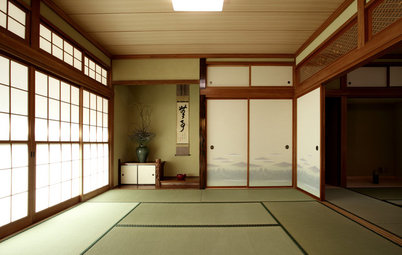
やさしい光を採り入れる「障子」の魅力
日本が誇る自然素材の美しきミニマルデザイン、障子は、私たちが考えている以上に幅広い応用力のある室内建具。この伝統の機能美を、改めて見直してみたいものです。
続きを読む
地域別特集
美しい伝統を守りながら、現代的技術で暮らしを快適に。京都に建つ14の住まい
文/藤間紗花
Houzzでみつけた、京都市内に建つ住まいの事例を、手がけた専門家の解説とともにご紹介します。
続きを読む