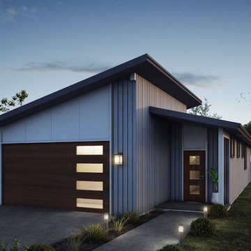
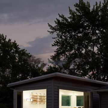
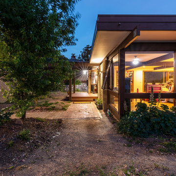
小さな黒いミッドセンチュリースタイルの家の外観の写真
絞り込み:
資材コスト
並び替え:今日の人気順
写真 1〜20 枚目(全 38 枚)
1/4
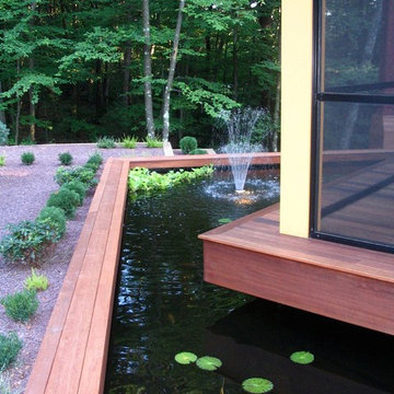
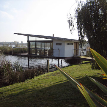
A dining pavilion that floats in the water on the city side of the house and floats in air on the rural side of the house. There is waterfall that runs under the house connecting the orthogonal pond on the city side with the free form pond on the rural side.
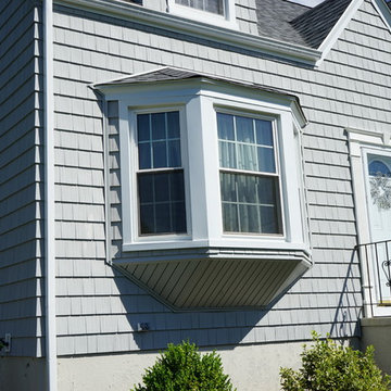
A Cape Cod style house with Alside Pelican Bay cedar shake siding, Color: Cape Cod Gray and Energy Star approved Sunrise Bay and double hung windows with white grids. Installed by Sidetex in North Haven CT 06473
The new front extension is housing utility room, home office and a boot room. New Velfac windows were installed throughout the house.
Photo: Frederik Rissom

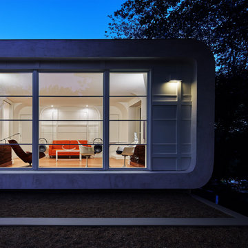
New entry hall. The exterior’s rich golds and greens harmonize with the surrounding woods and help ground the building.
Photo: Erick Mikiten, AIA
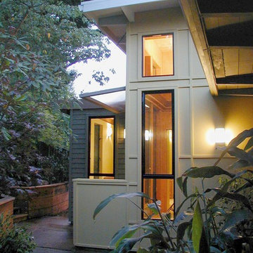
サンフランシスコにあるお手頃価格の小さなミッドセンチュリースタイルのおしゃれな家の外観 (緑の外壁) の写真
サンフランシスコにあるお手頃価格の小さなミッドセンチュリースタイルのおしゃれな家の外観 (緑の外壁) の写真
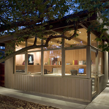
Home office studio in mid-Century Modern Renovation & Addition.
サンフランシスコにあるお手頃価格の小さなミッドセンチュリースタイルのおしゃれな家の外観の写真
サンフランシスコにあるお手頃価格の小さなミッドセンチュリースタイルのおしゃれな家の外観の写真
With a grand total of 1,247 square feet of living space, the Lincoln Deck House was designed to efficiently utilize every bit of its floor plan. This home features two bedrooms, two bathrooms, a two-car detached garage and boasts an impressive great room, whose soaring ceilings and walls of glass welcome the outside in to make the space feel one with nature.
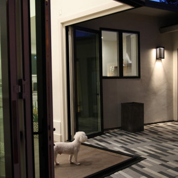
Check this out! No post in the middle means these accordion doors provide unobstructed access to the courtyard.
サンフランシスコにある小さなミッドセンチュリースタイルのおしゃれな家の外観 (漆喰サイディング) の写真
サンフランシスコにある小さなミッドセンチュリースタイルのおしゃれな家の外観 (漆喰サイディング) の写真
Photographers: Richard Seymour and Mike Ford
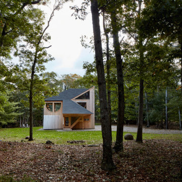
ハンプシャーにある小さなミッドセンチュリースタイルのおしゃれな家の外観の写真
ハンプシャーにある小さなミッドセンチュリースタイルのおしゃれな家の外観の写真
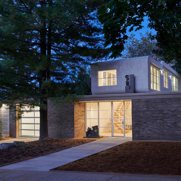
Designed in 1970 for an art collector, the existing referenced 70’s architectural principles. With its cadence of ‘70’s brick masses punctuated by a garage and a 4-foot-deep entrance recess. This recess, however, didn’t convey to the interior, which was occupied by disjointed service spaces. To solve, service spaces are moved and reorganized in open void in the garage. (See plan) This also organized the home: Service & utility on the left, reception central, and communal living spaces on the right.
To maintain clarity of the simple one-story 70’s composition, the second story add is recessive. A flex-studio/extra bedroom and office are designed ensuite creating a slender form and orienting them front to back and setting it back allows the add recede. Curves create a definite departure from the 70s home and by detailing it to "hover like a thought" above the first-floor roof and mentally removable sympathetic add.Existing unrelenting interior walls and a windowless entry, although ideal for fine art was unconducive for the young family of three. Added glass at the front recess welcomes light view and the removal of interior walls not only liberate rooms to communicate with each other but also reinform the cleared central entry space as a hub.
Even though the renovation reinforms its relationship with art, the joy and appreciation of art was not dismissed. A metal sculpture lost in the corner of the south side yard bumps the sculpture at the front entrance to the kitchen terrace over an added pedestal. (See plans) Since the roof couldn’t be railed without compromising the one-story '70s composition, the sculpture garden remains physically inaccessible however mirrors flanking the chimney allow the sculptures to be appreciated in three dimensions. The mirrors also afford privacy from the adjacent Tudor's large master bedroom addition 16-feet away.
View of the house at dusk from the Woodland Garden on the uphill side of the house. New addition and bridge connection are too the right. Roof of original house was reframed to create a line of clerestory windows.
Photographer:Paul Bussman
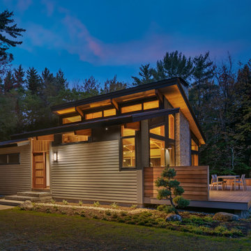
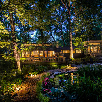
A small cabin in the woods with humble finishes makes for a cozy but modern design.
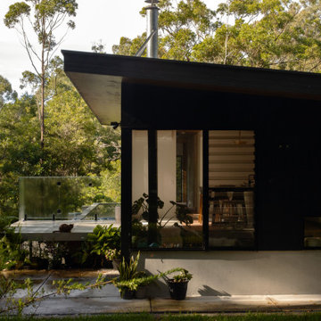
サンシャインコーストにある小さなミッドセンチュリースタイルのおしゃれな家の外観の写真
サンシャインコーストにある小さなミッドセンチュリースタイルのおしゃれな家の外観の写真
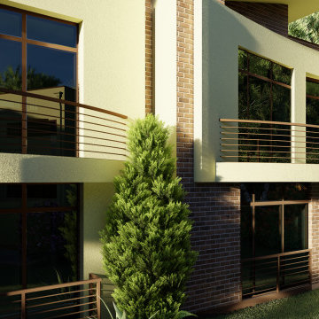
ELITE LIVING IN LILONGWE - MALAWI
Located in Area 47, this proposed 1-acre lot development containing a mix of 1 and 2 bedroom modern townhouses with a clean-line design and feel houses 41 Units. Each house also contains an indoor-outdoor living concept and an open plan living concept. Surrounded by a lush green-gated community, the project will offer young professionals a unique combination of comfort, convenience, natural beauty and tranquility.
Designed in 1970 for an art collector, the existing referenced 70’s architectural principles. With its cadence of ‘70’s brick masses punctuated by a garage and a 4-foot-deep entrance recess. This recess, however, didn’t convey to the interior, which was occupied by disjointed service spaces. To solve, service spaces are moved and reorganized in open void in the garage. (See plan) This also organized the home: Service & utility on the left, reception central, and communal living spaces on the right.
To maintain clarity of the simple one-story 70’s composition, the second story add is recessive. A flex-studio/extra bedroom and office are designed ensuite creating a slender form and orienting them front to back and setting it back allows the add recede. Curves create a definite departure from the 70s home and by detailing it to "hover like a thought" above the first-floor roof and mentally removable sympathetic add.Existing unrelenting interior walls and a windowless entry, although ideal for fine art was unconducive for the young family of three. Added glass at the front recess welcomes light view and the removal of interior walls not only liberate rooms to communicate with each other but also reinform the cleared central entry space as a hub.
Even though the renovation reinforms its relationship with art, the joy and appreciation of art was not dismissed. A metal sculpture lost in the corner of the south side yard bumps the sculpture at the front entrance to the kitchen terrace over an added pedestal. (See plans) Since the roof couldn’t be railed without compromising the one-story '70s composition, the sculpture garden remains physically inaccessible however mirrors flanking the chimney allow the sculptures to be appreciated in three dimensions. The mirrors also afford privacy from the adjacent Tudor's large master bedroom addition 16-feet away.
Front of house after
サンフランシスコにあるお手頃価格の小さなミッドセンチュリースタイルのおしゃれな家の外観 (漆喰サイディング) の写真
サンフランシスコにあるお手頃価格の小さなミッドセンチュリースタイルのおしゃれな家の外観 (漆喰サイディング) の写真
小さな黒いミッドセンチュリースタイルの家の外観の写真
1