小さな陸屋根の写真
絞り込み:
資材コスト
並び替え:今日の人気順
写真 361〜380 枚目(全 3,041 枚)
1/3
Carport and feature roof perimeter triangular flashing.
サンシャインコーストにある小さなコンテンポラリースタイルのおしゃれな家の外観の写真
サンシャインコーストにある小さなコンテンポラリースタイルのおしゃれな家の外観の写真
Project Overview:
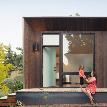
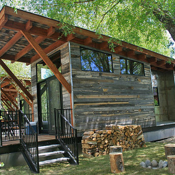
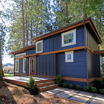
This modern ADU build was designed by Wittman Estes Architecture + Landscape and pre-fab tech builder NODE. Our Gendai siding with an Amber oil finish clads the exterior. Featured in Dwell, Designmilk and other online architectural publications, this tiny project packs a punch with affordable design and a focus on sustainability.
This modern ADU build was designed by Wittman Estes Architecture + Landscape and pre-fab tech builder NODE. Our shou sugi ban Gendai siding with a clear alkyd finish clads the exterior. Featured in Dwell, Designmilk and other online architectural publications, this tiny project packs a punch with affordable design and a focus on sustainability.
“A Seattle homeowner hired Wittman Estes to design an affordable, eco-friendly unit to live in her backyard as a way to generate rental income. The modern structure is outfitted with a solar roof that provides all of the energy needed to power the unit and the main house. To make it happen, the firm partnered with NODE, known for their design-focused, carbon negative, non-toxic homes, resulting in Seattle’s first DADU (Detached Accessory Dwelling Unit) with the International Living Future Institute’s (IFLI) zero energy certification.”
Product: Gendai 1×6 select grade shiplap
Prefinish: Amber
Application: Residential – Exterior
SF: 350SF
Designer: Wittman Estes, NODE
Builder: NODE, Don Bunnell
Date: November 2018
Location: Seattle, WA
Photos courtesy of: Andrew Pogue
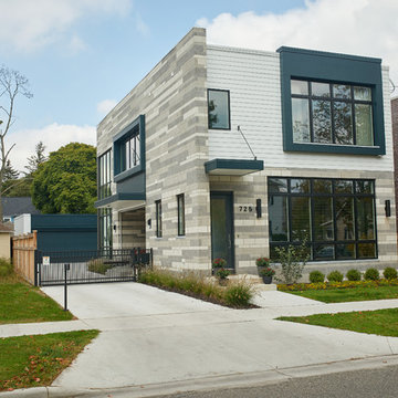
Interior Designer: Vision Interiors by Visbeen
Builder: Joel Peterson Homes
Photographer: Ashley Avila Photography
As a conceptual urban infill project, the Wexley, is designed for a narrow lot in the center of a city block. The 26’x48’ floor plan is divided into thirds from front to back and from left to right. In plan, the left third is reserved for circulation spaces and is reflected in elevation by a monolithic block wall in three shades of gray. Punching through this block wall, in three distinct parts, are the main levels windows for the stair tower, bathroom, and patio. The right two thirds of the main level are reserved for the living room, kitchen, and dining room. At 16’ long, front to back, these three rooms align perfectly with the three-part block wall façade. It’s this interplay between plan and elevation that creates cohesion between each façade, no matter where it’s viewed. Given that this project would have neighbors on either side, great care was taken in crafting desirable vistas for the living, dinning, and master bedroom. Upstairs, with a view to the street, the master bedroom has a pair of closets and a skillfully planned bathroom complete with soaker tub and separate tiled shower. Main level cabinetry and built-ins serve as dividing elements between rooms and framing elements for views outside.
Wheelhaus modular tiny home with reclaimed wood soffit from Centennial Woods.
Centennial Woods LLC was founded in 1999, we reclaim and repurpose weathered wood from the snow fences in the plains and mountains of Wyoming. We are now one of the largest providers of reclaimed wood in the world with an international clientele comprised of home owners, builders, designers, and architects. Our wood is FSC 100% Recycled certified and will contribute to LEED points.
A local Houston art collector hired us to create a low maintenance, sophisticated, contemporary landscape design. She wanted her property to compliment her eclectic taste in architecture, outdoor sculpture, and modern art. Her house was built with a minimalist approach to decoration, emphasizing right angles and windows instead of architectural keynotes. The west wing of the house was only one story, while the east wing was two-story. The windows in both wings were larger than usual, so that visitors could see her art collection from the home’s exterior. Near one of the large rear windows, there was an abstract metal sculpture designed in the form of a spiral.
When she initially contacted us, the surrounding property had only a few trees and indigenous grass as vegetation. This was actually a good beginning point with us, because it allowed us to develop a contemporary landscape design that featured a very linear, crisp look supportive of the home and its contents. We began by planting a garden around the large contemporary sculpture near the window. Landscape designers planted horsetail reed under windows, along the sides of the home, and around the corners. This vegetation is very resilient and hardy, and requires little trimming, weeding, or mulching. This helped unite the diverse elements of sculpture, contemporary architecture, and landscape design into a more fluid harmony that preserved the proportions of each unique element, but eliminated any tendency for the elements to clash with one another.
We then added two stonework designs to the landscape surrounding the contemporary art collection and home. The first was a linear walkway we build from concrete pads purchased through a retail vendor as a cost-saving benefit to our client. We created this walkway to follow the perimeter of the home so that visitors could walk around the entire property and admire the outdoor sculptures and the collections of modern art visible through the windows. This was especially enjoyable at night, when the entire home was brightly lit from within.
To add a touch of tranquility and quite repose to the stark right angles of the home and surrounding contemporary landscape, we designed a special seating area toward the northwest corner of the property. We wanted to create a sense of contemplation in this area, so we departed from the linear and angular designs of the surrounding landscape and established a theme of circular geometry. We laid down gravel as ground cover, then placed large, circular pads arranged like giant stepping stones that led up to a stone patio filled with chairs. The shape of the granite pads and the contours of the graveled area further complimented the spirals and turns in the outdoor metal sculpture, and balanced the entire contemporary landscape design with proportional geometric forms of lines, angles, and curves.
This particular contemporary landscape design also has a sense of movement attached to it. All stonework leads to a destination of some sort. The linear pathway provides a guided tour around the home, garden, and modern art collection. The granite pathway stones create movement toward separate space where the entire experience of art, vegetation, and architecture can be viewed and experienced as a unity.
Contemporary landscaping designs like create form out of feeling by using basic geometric forms and variations of forms. Sometimes very stark forms are used to create a sense of absolutism or contrast. At other times, forms are blended, or even distorted to suggest a sense of complex emotion, or a sense of multi-dimensional reality. The exact nature of the design is always highly subjective, and developed on a case-by-case basis with the client.
The cantilevered informal sitting area hangs out into the back yard. Floating aluminum steps create a path from the house to a raised ipe deck and down to the yard. The deep corrugations of the metal siding contrast with the vertical v-groove siding of the original ranch house. The floating steel and glass cube adds a dramatic interior volume and captures the view of the landscaped back yard.
Photo copyright Nathan Eikelberg
Set in the garden beside a traditional Dutch Colonial home in Wellesley, Flavin conceived this boldly modern retreat, built of steel, wood and concrete. The building is designed to engage the client’s passions for gardening, entertaining and restoring vintage Vespa scooters. The Vespa repair shop and garage are on the first floor. The second floor houses a home office and veranda. On top is a roof deck with space for lounging and outdoor dining, surrounded by a vegetable garden in raised planters. The structural steel frame of the building is left exposed; and the side facing the public side is draped with a mahogany screen that creates privacy in the building and diffuses the dappled light filtered through the trees. Photo by: Peter Vanderwarker Photography
Nagold 2012 für haefele
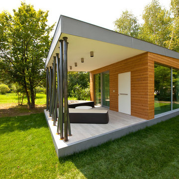
Die großen, bislang ungenutzten Flachdächer mitten in den Städten zu erschließen, ist der
Grundgedanke, auf dem die Idee des
Loftcube basiert. Der Berliner Designer Werner Aisslinger will mit leichten, mobilen
Wohneinheiten diesen neuen, sonnigen
Lebensraum im großen Stil eröffnen und
vermarkten. Nach zweijährigen Vorarbeiten
präsentierten die Planer im Jahr 2003 den
Prototypen ihrer modularen Wohneinheiten
auf dem Flachdach des Universal Music
Gebäudes in Berlin.
Der Loftcube besteht aus einem Tragwerk mit aufgesteckten Fassadenelementen und einem variablen inneren Ausbausystem. Schneller als ein ein Fertighaus ist er innerhalb von 2-3 Tagen inklusive Innenausbau komplett aufgestellt. Zudem lässt sich der Loftcube in der gleichen Zeit auch wieder abbauen und an einen anderen Ort transportieren. Der Loftcube bietet bei Innenabmessungen von 6,25 x 6,25 m etwa 39 m2 Wohnfläche. Die nächst größere Einheit bietet bei rechteckigem Grundriss eine Raumgröße von 55 m2. Ausgehend von diesen Grundmodulen können - durch Brücken miteinander verbundener Einzelelemente - ganze Wohnlandschaften errichtet werden. Je nach Anforderung kann so die Wohnfläche im Laufe der Zeit den Bedürfnissen der Nutzer immer wieder angepasst werden. Die gewünschte Mobilität gewährleistet die auf
Containermaße begrenzte Größe aller
Bauteile. design: studio aisslinger Foto: Aisslinger
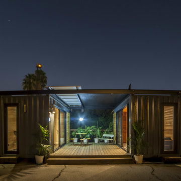
A look at the two 20' Off Grid Micro Dwellings we built for New Old Stock Inc here at our Toronto, Canada container modification facility. Included here are two 20' High Cube shipping containers, 12'x20' deck and solar/sun canopy. Notable features include Spanish Ceder throughout, custom mill work, Calcutta tiled shower and toilet area, complete off grid solar power and water for both units.
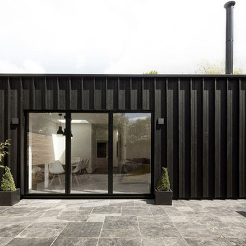
Photography by Richard Chivers https://www.rchivers.co.uk/
Marshall House is an extension to a Grade II listed dwelling in the village of Twyford, near Winchester, Hampshire. The original house dates from the 17th Century, although it had been remodelled and extended during the late 18th Century.
The clients contacted us to explore the potential to extend their home in order to suit their growing family and active lifestyle. Due to the constraints of living in a listed building, they were unsure as to what development possibilities were available. The brief was to replace an existing lean-to and 20th century conservatory with a new extension in a modern, contemporary approach. The design was developed in close consultation with the local authority as well as their historic environment department, in order to respect the existing property and work to achieve a positive planning outcome.
Like many older buildings, the dwelling had been adjusted here and there, and updated at numerous points over time. The interior of the existing property has a charm and a character - in part down to the age of the property, various bits of work over time and the wear and tear of the collective history of its past occupants. These spaces are dark, dimly lit and cosy. They have low ceilings, small windows, little cubby holes and odd corners. Walls are not parallel or perpendicular, there are steps up and down and places where you must watch not to bang your head.
The extension is accessed via a small link portion that provides a clear distinction between the old and new structures. The initial concept is centred on the idea of contrasts. The link aims to have the effect of walking through a portal into a seemingly different dwelling, that is modern, bright, light and airy with clean lines and white walls. However, complementary aspects are also incorporated, such as the strategic placement of windows and roof lights in order to cast light over walls and corners to create little nooks and private views. The overall form of the extension is informed by the awkward shape and uses of the site, resulting in the walls not being parallel in plan and splaying out at different irregular angles.
Externally, timber larch cladding is used as the primary material. This is painted black with a heavy duty barn paint, that is both long lasting and cost effective. The black finish of the extension contrasts with the white painted brickwork at the rear and side of the original house. The external colour palette of both structures is in opposition to the reality of the interior spaces. Although timber cladding is a fairly standard, commonplace material, visual depth and distinction has been created through the articulation of the boards. The inclusion of timber fins changes the way shadows are cast across the external surface during the day. Whilst at night, these are illuminated by external lighting.
A secondary entrance to the house is provided through a concealed door that is finished to match the profile of the cladding. This opens to a boot/utility room, from which a new shower room can be accessed, before proceeding to the new open plan living space and dining area.
小さな陸屋根の写真
19