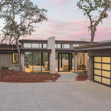
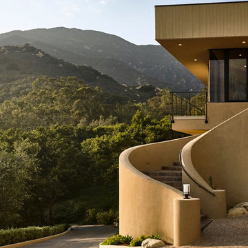
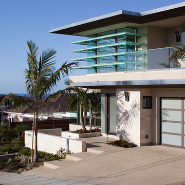
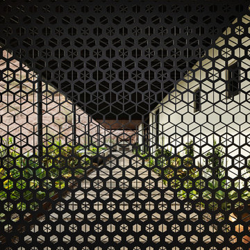
家の外観 - 陸屋根、ベージュの家の写真
絞り込み:
資材コスト
並び替え:今日の人気順
写真 781〜800 枚目(全 6,089 枚)
1/3
Photos: Frank Paul Perez, Red Lily Studios
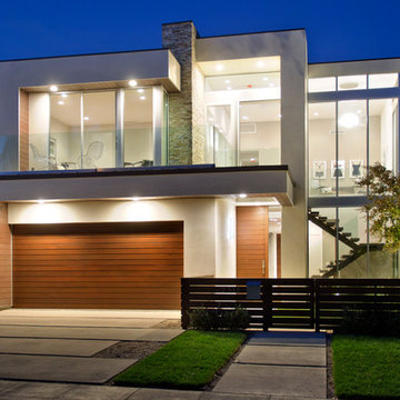
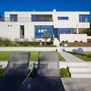
サンフランシスコにあるラグジュアリーな巨大なコンテンポラリースタイルのおしゃれな家の外観 (混合材サイディング) の写真
サンフランシスコにあるラグジュアリーな巨大なコンテンポラリースタイルのおしゃれな家の外観 (混合材サイディング) の写真
After four years of searching for the perfect spot, this avid golfer stumbled upon a unique solution - Azenco's R-Blade adjustable louvered roof pergola! This innovative structure was designed to provide both protection and accessibility for a high-tech golf simulator within an outdoor environment. It is also much more cost effective than renovating existing structures or building home additions costing upwards of $500K.
Susan Fisher Plotner/Susan Fisher Photography
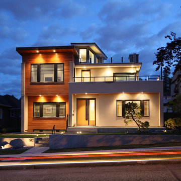
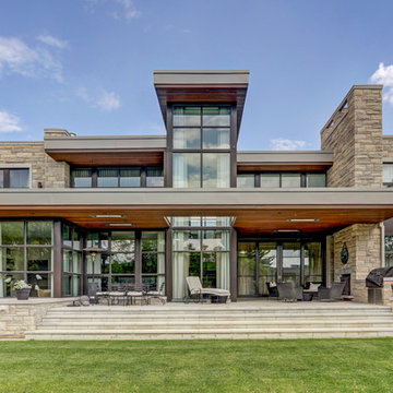
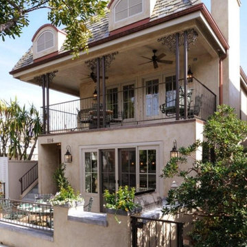
ニューヨークにある高級な地中海スタイルのおしゃれな家の外観 (石材サイディング) の写真
ニューヨークにある高級な地中海スタイルのおしゃれな家の外観 (石材サイディング) の写真
A visual artist and his fiancée’s house and studio were designed with various themes in mind, such as the physical context, client needs, security, and a limited budget.
Six options were analyzed during the schematic design stage to control the wind from the northeast, sunlight, light quality, cost, energy, and specific operating expenses. By using design performance tools and technologies such as Fluid Dynamics, Energy Consumption Analysis, Material Life Cycle Assessment, and Climate Analysis, sustainable strategies were identified. The building is self-sufficient and will provide the site with an aquifer recharge that does not currently exist.
The main masses are distributed around a courtyard, creating a moderately open construction towards the interior and closed to the outside. The courtyard contains a Huizache tree, surrounded by a water mirror that refreshes and forms a central part of the courtyard.
The house comprises three main volumes, each oriented at different angles to highlight different views for each area. The patio is the primary circulation stratagem, providing a refuge from the wind, a connection to the sky, and a night sky observatory. We aim to establish a deep relationship with the site by including the open space of the patio.
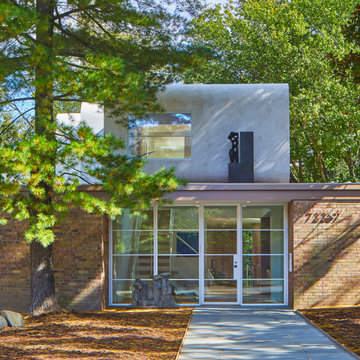
Designed in 1970 for an art collector, the existing referenced 70’s architectural principles. With its cadence of ‘70’s brick masses punctuated by a garage and a 4-foot-deep entrance recess. This recess, however, didn’t convey to the interior, which was occupied by disjointed service spaces. To solve, service spaces are moved and reorganized in open void in the garage. (See plan) This also organized the home: Service & utility on the left, reception central, and communal living spaces on the right.
To maintain clarity of the simple one-story 70’s composition, the second story add is recessive. A flex-studio/extra bedroom and office are designed ensuite creating a slender form and orienting them front to back and setting it back allows the add recede. Curves create a definite departure from the 70s home and by detailing it to "hover like a thought" above the first-floor roof and mentally removable sympathetic add.Existing unrelenting interior walls and a windowless entry, although ideal for fine art was unconducive for the young family of three. Added glass at the front recess welcomes light view and the removal of interior walls not only liberate rooms to communicate with each other but also reinform the cleared central entry space as a hub.
Even though the renovation reinforms its relationship with art, the joy and appreciation of art was not dismissed. A metal sculpture lost in the corner of the south side yard bumps the sculpture at the front entrance to the kitchen terrace over an added pedestal. (See plans) Since the roof couldn’t be railed without compromising the one-story '70s composition, the sculpture garden remains physically inaccessible however mirrors flanking the chimney allow the sculptures to be appreciated in three dimensions. The mirrors also afford privacy from the adjacent Tudor's large master bedroom addition 16-feet away.
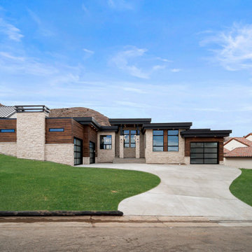
The objective was to create a warm neutral space to later customize to a specific colour palate/preference of the end user for this new construction home being built to sell. A high-end contemporary feel was requested to attract buyers in the area. An impressive kitchen that exuded high class and made an impact on guests as they entered the home, without being overbearing. The space offers an appealing open floorplan conducive to entertaining with indoor-outdoor flow.
Due to the spec nature of this house, the home had to remain appealing to the builder, while keeping a broad audience of potential buyers in mind. The challenge lay in creating a unique look, with visually interesting materials and finishes, while not being so unique that potential owners couldn’t envision making it their own. The focus on key elements elevates the look, while other features blend and offer support to these striking components. As the home was built for sale, profitability was important; materials were sourced at best value, while retaining high-end appeal. Adaptations to the home’s original design plan improve flow and usability within the kitchen-greatroom. The client desired a rich dark finish. The chosen colours tie the kitchen to the rest of the home (creating unity as combination, colours and materials, is repeated throughout).
Photos- Paul Grdina
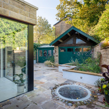
An elegant, highly glazed extension to a period property in the heart of Sheffield.
Black, slimline glazing punctuates the stone walls to create a modern aesthetic to a transitional form.

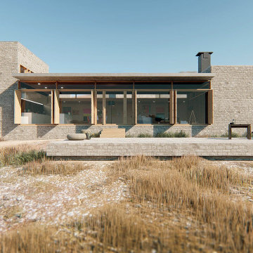
Cedar wood and stucco paired with natural stone details make up the striking exterior while massive windows flood the interior with natural light. Nestled in a lush wooded surround the landscape ensures every room has a serene view.
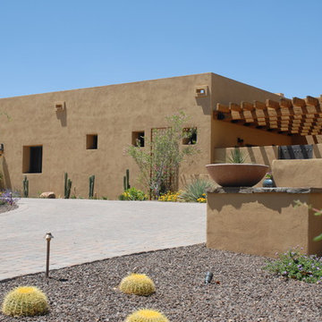
家の外観 - 陸屋根、ベージュの家の写真
40