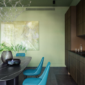
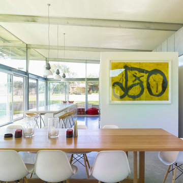
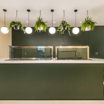
緑色のダイニングキッチン (コンクリートの床、濃色無垢フローリング) の写真
絞り込み:
資材コスト
並び替え:今日の人気順
写真 21〜40 枚目(全 162 枚)
1/5
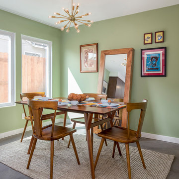
Our homeowners approached us for design help shortly after purchasing a fixer upper. They wanted to redesign the home into an open concept plan. Their goal was something that would serve multiple functions: allow them to entertain small groups while accommodating their two small children not only now but into the future as they grow up and have social lives of their own. They wanted the kitchen opened up to the living room to create a Great Room. The living room was also in need of an update including the bulky, existing brick fireplace. They were interested in an aesthetic that would have a mid-century flair with a modern layout. We added built-in cabinetry on either side of the fireplace mimicking the wood and stain color true to the era. The adjacent Family Room, needed minor updates to carry the mid-century flavor throughout.
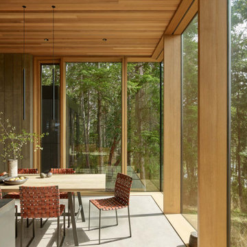
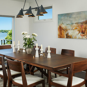
Dining room with floor to ceiling windows, cedar ceiling, concrete floor, light stained slab table.
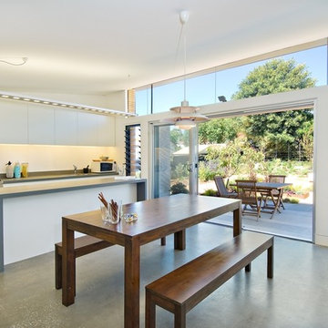
シアトルにあるモダンスタイルのおしゃれなダイニングキッチン (コンクリートの床、グレーの床、板張り天井) の写真
シアトルにあるモダンスタイルのおしゃれなダイニングキッチン (コンクリートの床、グレーの床、板張り天井) の写真
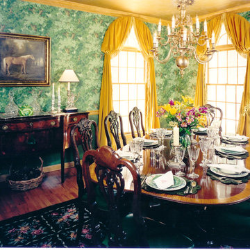
Beautiful "woods" wallpaper over glazed strie walls, all in green. with sumptuous velvet curtains and glass, china and candles create complementary textures and an inviting glow for evening occasions in this richly decorated dining room
© David Papazian
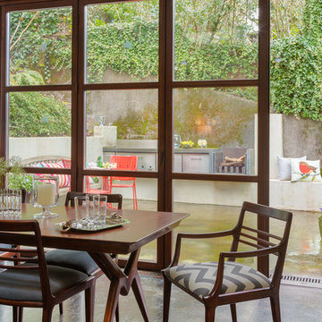
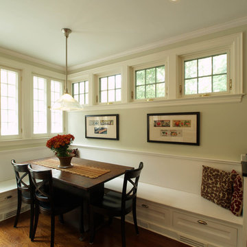
ポートランドにある中くらいなコンテンポラリースタイルのおしゃれなダイニングキッチン (コンクリートの床、ベージュの壁、暖炉なし) の写真
ポートランドにある中くらいなコンテンポラリースタイルのおしゃれなダイニングキッチン (コンクリートの床、ベージュの壁、暖炉なし) の写真
Dining banquette.
Lee Grider Photography - http://lgp.pixpawebsites.com/#/?i=413
Playful and relaxed, honoring classical Victorian elements with contemporary living for a modern young family.
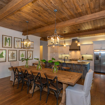
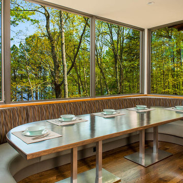
ニューヨークにあるトランジショナルスタイルのおしゃれなダイニングキッチン (濃色無垢フローリング、茶色い床、ベージュの壁、羽目板の壁) の写真
ニューヨークにあるトランジショナルスタイルのおしゃれなダイニングキッチン (濃色無垢フローリング、茶色い床、ベージュの壁、羽目板の壁) の写真
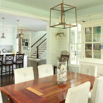
This custom kitchen seating area features built in drawers and french casement windows looking out on the rear yard and patio
ニューヨークにあるラグジュアリーな広いトラディショナルスタイルのおしゃれなダイニングキッチン (濃色無垢フローリング、ベージュの壁、暖炉なし、茶色い床) の写真
ニューヨークにあるラグジュアリーな広いトラディショナルスタイルのおしゃれなダイニングキッチン (濃色無垢フローリング、ベージュの壁、暖炉なし、茶色い床) の写真
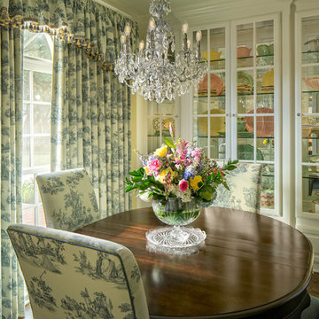
The breakfast nook is bright and cheery with soft yellow walls and toile fabric. The chandelier gives light through refracting sunshine throughout the nook.
Recently, this Victorian style home welcomed its new owners with open arms – the only glitch in the budding relationship, the kitchen. The U shaped kitchen huddled in just half of the nice large room available to it – a long peninsula bisecting the space creating an awkward divide between the work area and the cramped breakfast nook/serving area.
The new owners enjoy cooking and they needed space for both of them to work in the kitchen at the same time. The old U shape did not accommodate this. The sink was too close to the range, the peninsula hemmed them in without providing a focused workstation, and the refrigerator sat at the end competing with people entering the space. And finally, the kitchen just lacked style – it did not fit with the Victorian style architecture and décor of the home.
San Luis Kitchen to the rescue! After attending a few of our monthly design seminars, the homeowners decided to take the remodeling plunge. They brought us a sketch of the space, explained their need for a more functional 2-cook space, and expressed interest in replacing the peninsula with an island. After visiting the home, we identified some other areas of design opportunity/constraint – an exterior door that was seldom used, an existing wood floor that extended throughout the house, a beautiful view from the breakfast nook windows, and a large existing pantry.
Our first thought for the new kitchen was to provide a visual focal point. The homeowners were excited by the idea of a “mantle” type wood hood which we situated facing out toward the formal dining room as the opening statement for the kitchen. We also added an island set at 90 degrees to the prior location of the peninsula – decorative open shelves face out from the island creating more visual interest. The new island not only reinforces the focal point of the hood, but also, working with the new built-in hutch, embraces the breakfast nook and integrates it with the rest of the kitchen. (Changing the peninsula to an island did create a need to patch the hardwood floor – thankfully the homeowner was able to find a source for replacement flooring that was almost a seamless blend)
Working with both the homeowners and their interior designer, we decided to combine a creamy white finish for the main cabinets with a cordovan maple stain for the island and hutch. The goal of this color scheme was a bright happy kitchen (the white) with a formal furniture feel to the cabinetry (the dark red maple pieces). Often, in Victorian or other classic style spaces, we see different pieces brought together (over time or as a planned design) to form a cohesive but diverse whole.
As functional considerations for the design, the main sink was moved to the island and a prep sink was added in the corner between the new cook-top and a designated bake center/prep station located where the old range had been. This gives space for both homeowners to work in the kitchen simultaneously using multiple workstations. We added a built-in refrigerator with decorative door panels (to blend comfortably with the cabinets), a wall oven/microwave combo – both of which are now in the space that used to have the redundant exterior door – expanding the kitchen all the way to the far wall. And lastly, keeping the basic structure of the existing pantry, we refaced it with matching doors and added rollout shelves for convenience.
The new kitchen gracefully meets all of the homeowners needs both as a showpiece and as a backdrop to their daily lives. Now they are comfortably ensconced in their entire home, including the kitchen!
SilverLeaf Custom Homes' 2012 San Antonio Parade of Homes Entry. Interior Design by Interiors by KM. Photo Courtesy: Siggi Ragnar.
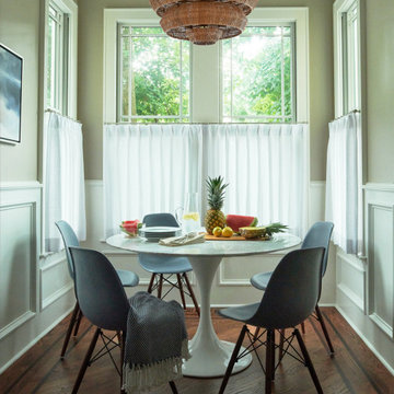
オースティンにある小さなコンテンポラリースタイルのおしゃれなダイニングキッチン (グレーの壁、濃色無垢フローリング) の写真
オースティンにある小さなコンテンポラリースタイルのおしゃれなダイニングキッチン (グレーの壁、濃色無垢フローリング) の写真
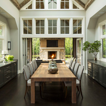
Bold, dramatic and singular home with a relaxed yet sophisticated interior. Minimal but not austere. Subtle but impactful. Mix of California and Colorado influences in a Minnesota foundation.
Builder - John Kraemer & Sons / Architect - Sharratt Design Company / Troy Thies - Project Photographer
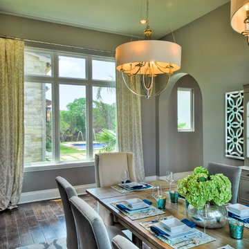
A mid-sized transitional open-concept house that impresses with its warm, neutral color palette combined with splashes of purple, green, and blue hues. A classic eating area with a round, wooden table paired with sage green wooden and upholstered dining chairs, and large, glass centerpieces, and a chandelier makes for an inviting eat-in kitchen arrangement.
Home designed by Aiken interior design firm, Nandina Home & Design. They serve Augusta, Georgia, as well as Columbia and Lexington, South Carolina.
For more about Nandina Home & Design, click here: https://nandinahome.com/
To learn more about this project, click here: http://nandinahome.com/portfolio/woodside-model-home/
緑色のダイニングキッチン (コンクリートの床、濃色無垢フローリング) の写真
2