コメント
Feel the Power of the Dark Side
These 10 examples show how designers use deep colors to highlight — or hide — elements in a room
Jess McBride
2016年12月31日
Designers have many tools and tricks for decorating homes. Some are matters of personal taste and signature style, while others are rooted in tradition and conventional wisdom. One move is using dark colors to make objects appear to either advance or recede in a room. Here are 10 ways designers wield the power of the dark side.
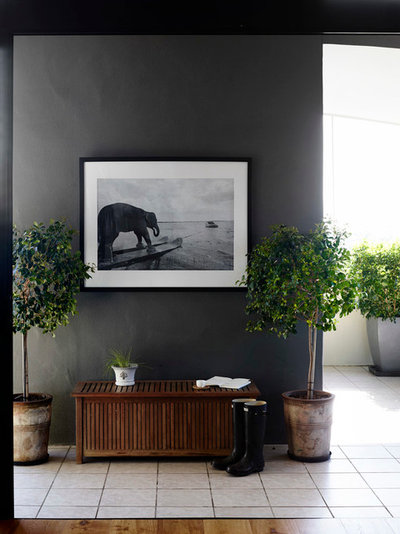
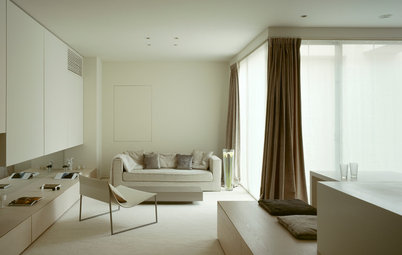
1. Show off a picture. If you’re a fan of black-and-white photography, you should become friends with dark wall colors. This Australian hallway designed by Claire Stevens features a wall covered in a matte charcoal-gray paint that seems to recede into the background, allowing the white-matted photo to advance and stand out as a focal point.
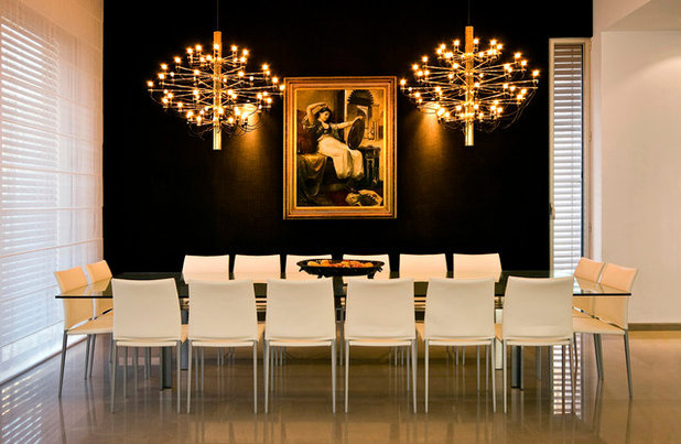
2. Create a light show. There’s a reason light pollution hinders stargazing. The darker the sky, the more the celestial bodies glow. Light, like black-and-white photography, is even more luminous against a dark background, whether the night sky or a painted wall. If you’ve invested in striking light fixtures, consider upping their drama by painting the walls a rich, dark hue.
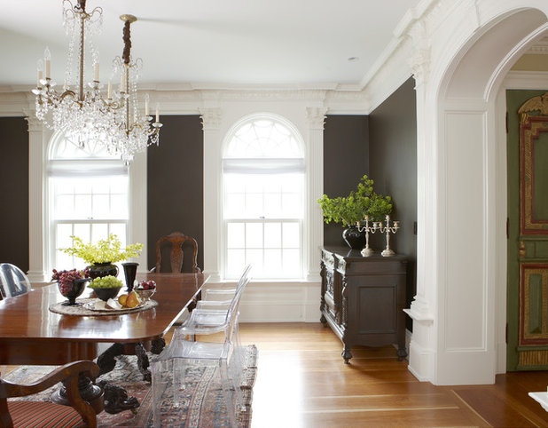
3. Maximize millwork. Cloaking walls in dark colors allows them to recede so that fine millwork can advance, especially when it’s painted white. Many people hesitate to darken their walls out of fear that the space will feel cramped or that such a strong color will dominate everything else in the room. This elegant dining space should allay those fears — the walls simply stand back as the detailed millwork shines.
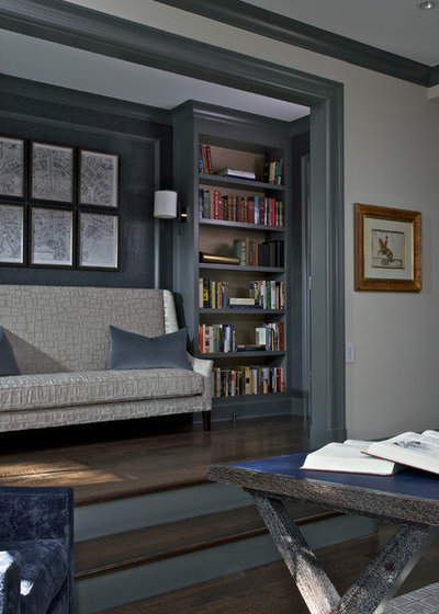
4. Be a friend to fabric. Upholstery fabric doesn’t need to be very light to stand out; it just needs to be set against an even darker background for contrast. The neutrality and scale of the delicate gray-on-gray pattern on this settee may have faded into the background of a beige or light gray wall. Do a piece like this honor by setting it against a dark backdrop where it can become the star of the room.
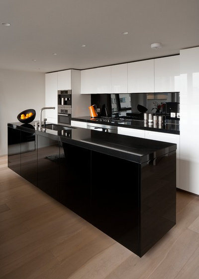
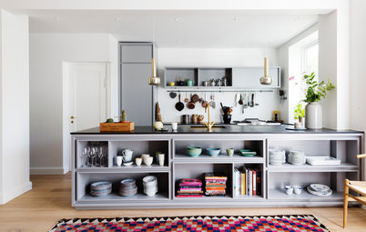
5. Reduce visual weight. Using a bold black for the largest single unit in a room will seem counterintuitive to some, but hopefully this kitchen clears up any misgivings. The enormous island is undeniably present, but its black lacquer seems to minimize its proportions and blur its edges, thereby reinforcing the openness of the kitchen.
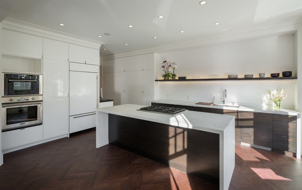
6. Change the perspective. Visually canceling out a large unit isn’t always necessary or desired. Instead, altering its proportions with darker tones can do the trick. Here, the island’s white quartz waterfall top and sides are left to be admired, while the base is de-emphasized with a deep rich wood stain to help it blend into the flooring.
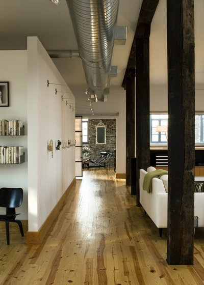
7. Minimize columns. If black and other moody shades make objects recede or disappear, it stands to reason that a dark hue would be the go-to choice for painting structural necessities you’d rather not call attention to, such as columns in an open floor plan. Notice here that white paint covers the surviving walls; again, color can be used thoughtfully to highlight what is desired and downplay what isn’t.
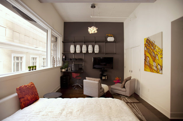
8. Conceal a TV. Another item that ranks high among those we wish to camouflage is the television, and the surest way to reduce its power over a room is to set it against a dark wall. A quick once-over of this San Francisco bedroom designed by Susan Diana Harris reveals a lovely little light fixture hanging from the ceiling and a series of decorative vases on floating shelves, but it takes a closer inspection to reveal the TV hiding in plain sight.
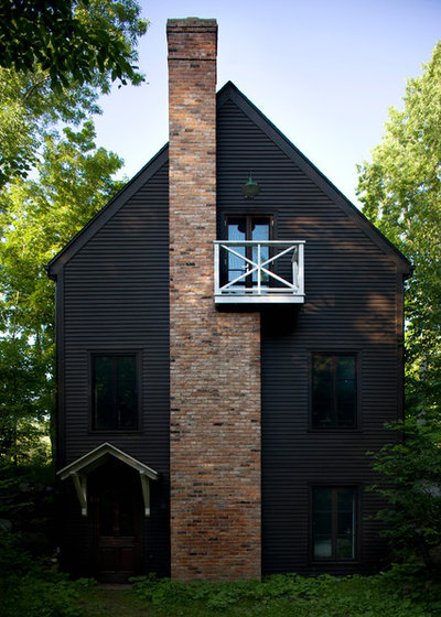
9. Play with exterior paint effects. Just like a dark interior wall, a darkly painted exterior brings out other elements. This farmhouse in Quebec, Canada, almost disappears into the vegetation. The chimney and balcony still stand out to give indications of human life, but the underlying structure seems designed to hide behind the real stars of the property, the trees.
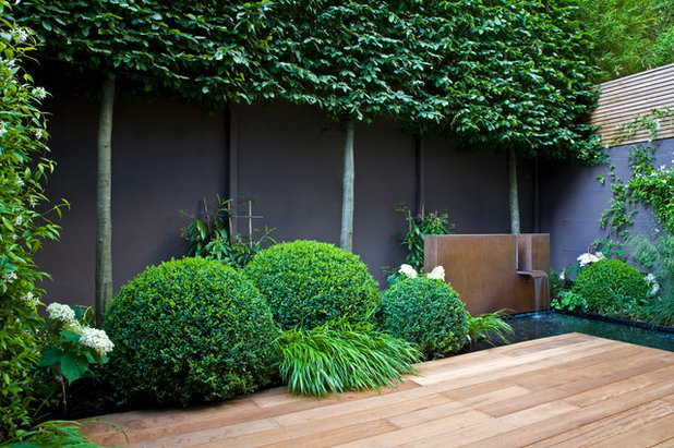
10. Open the backyard. Far from constricting the sense of space, the dark fence seems to eliminate this backyard’s boundary. The perimeter effectively goes away, making the yard feel more open and spacious. Additionally, dark paint can perk up a worn fence since it hides defects.
More
11 Reasons to Paint Your Interior Doors Black
8 Reasons to Paint Your Interior Trim Black
More
11 Reasons to Paint Your Interior Doors Black
8 Reasons to Paint Your Interior Trim Black

おすすめの記事
エコ・サステナブル
世界の専門家が注目する、サステナブルな住まいづくりのかたちとは?
今後期待されるサステナブル=持続可能なソリューションとは?Houzzで活躍する世界の専門家に伺いました。
続きを読む
家づくりのヒント
建築家と家づくりをするメリットとは?
文/志田茂
「値段が高そう」「敷居が高い」……。建築家との家づくりは大変そうだと思っている人もいると思います。でも、唯一無二の理想の住まいを実現したいなら、建築家との家づくりはおすすめです。
続きを読む
小さな住まい
コンパクトリビングの賢いスペース活用法
コンパクトな空間は、ひとつひとつの要素が持つ「意味」が大切。スペースを最大限に生かしながら、快適に過ごせるテクニックと実例をご紹介しましょう。
続きを読む
キッチンの記事
プロに聞く、オーダーキッチンを作りたいなら知っておきたいこと
デザインと使い勝手がカスタマイズされたオンリーワンのオーダーキッチン。取り入れたいなら知っておくべきことを専門家に聞きました。
続きを読む

ライフスタイル
知っておきたい器づかいのコツ:料理をおいしく見せる器の色
文/進藤由美子
料理をおいしそうに見せる器って、どんな器でしょう? 家での食事をおいしく、楽しくする器の揃え方、使い方のコツを2回に分けてご紹介します。前編は、器の色について。
続きを読む
キッチンの記事
家事をストレスフリーに! キッチンカウンター下収納の使い方と収納アイデア
オープンタイプのキッチンが人気の今、キッチンカウンター下収納はその後の使いやすさを左右する重要な検討事項です。種類別カウンター下収納の特徴を参考に、家族が使いたくなるキッチンまわりをつくりましょう。
続きを読む
家づくりのヒント
心地よい住まいを実現するために、自分に問うべき質問とは?
インテリアのプロたちが依頼主に、最初に投げかける質問があります。それに対する自分の答えと向き合うことで、自分と住まいとの関係をよりよく変えていきましょう。
続きを読む
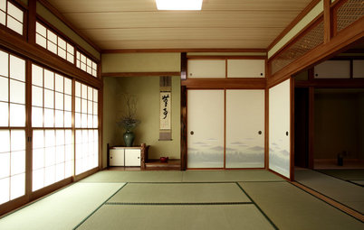
和室の記事
やさしい光を採り入れる「障子」の魅力
日本が誇る自然素材の美しきミニマルデザイン、障子は、私たちが考えている以上に幅広い応用力のある室内建具。この伝統の機能美を、改めて見直してみたいものです。
続きを読む
地域別特集
美しい伝統を守りながら、現代的技術で暮らしを快適に。京都に建つ14の住まい
文/藤間紗花
Houzzでみつけた、京都市内に建つ住まいの事例を、手がけた専門家の解説とともにご紹介します。
続きを読む