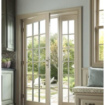
片開きドア、引き戸トランジショナルスタイルの玄関 (セラミックタイルの床、無垢フローリング) の写真
絞り込み:
資材コスト
並び替え:今日の人気順
写真 1〜20 枚目(全 3,165 枚)
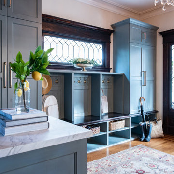
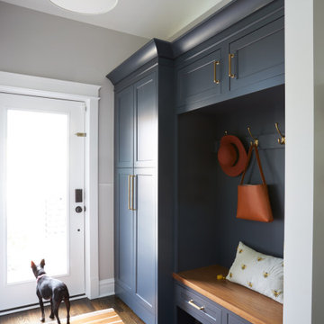
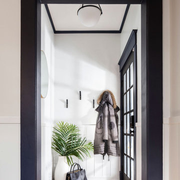
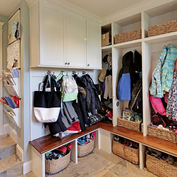
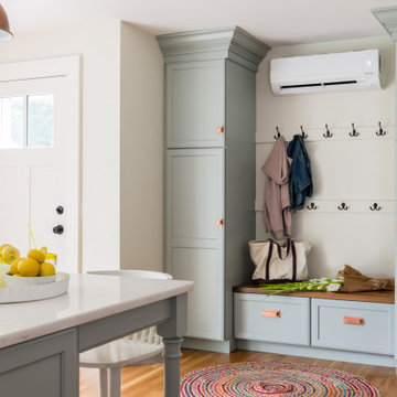
アトランタにある中くらいなトランジショナルスタイルのおしゃれなマッドルーム (ベージュの壁、無垢フローリング、白いドア、茶色い床) の写真
We laid mosaic floor tiles in the hallway of this Isle of Wight holiday home, redecorated, changed the ironmongery & added panelling and bench seats.
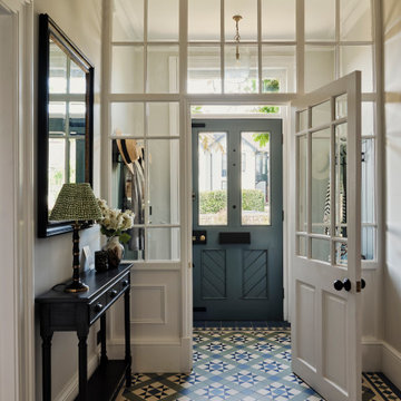
他の地域にある広いトランジショナルスタイルのおしゃれな玄関ラウンジ (グレーの壁、セラミックタイルの床、青いドア、マルチカラーの床、パネル壁) の写真
他の地域にある広いトランジショナルスタイルのおしゃれな玄関ラウンジ (グレーの壁、セラミックタイルの床、青いドア、マルチカラーの床、パネル壁) の写真
Download our free ebook, Creating the Ideal Kitchen. DOWNLOAD NOW
For many, extra time at home during COVID left them wanting more from their homes. Whether you realized the shortcomings of your space or simply wanted to combat boredom, a well-designed and functional home was no longer a want, it became a need. Tina found herself wanting more from her Old Irving Park home and reached out to The Kitchen Studio about adding function to her kitchen to make the most of the available real estate.
At the end of the day, there is nothing better than returning home to a bright and happy space you love. And this kitchen wasn’t that for Tina. Dark and dated, with a palette from the past and features that didn’t make the most of the available square footage, this remodel required vision and a fresh approach to the space. Lead designer, Stephanie Cole’s main design goal was better flow, while adding greater functionality with organized storage, accessible open shelving, and an overall sense of cohesion with the adjoining family room.
The original kitchen featured a large pizza oven, which was rarely used, yet its footprint limited storage space. The nearby pantry had become a catch-all, lacking the organization needed in the home. The initial plan was to keep the pizza oven, but eventually Tina realized she preferred the design possibilities that came from removing this cumbersome feature, with the goal of adding function throughout the upgraded and elevated space. Eliminating the pantry added square footage and length to the kitchen for greater function and more storage. This redesigned space reflects how she lives and uses her home, as well as her love for entertaining.
The kitchen features a classic, clean, and timeless palette. White cabinetry, with brass and bronze finishes, contrasts with rich wood flooring, and lets the large, deep blue island in Woodland’s custom color Harbor – a neutral, yet statement color – draw your eye.
The kitchen was the main priority. In addition to updating and elevating this space, Tina wanted to maximize what her home had to offer. From moving the location of the patio door and eliminating a window to removing an existing closet in the mudroom and the cluttered pantry, the kitchen footprint grew. Once the floorplan was set, it was time to bring cohesion to her home, creating connection between the kitchen and surrounding spaces.
The color palette carries into the mudroom, where we added beautiful new cabinetry, practical bench seating, and accessible hooks, perfect for guests and everyday living. The nearby bar continues the aesthetic, with stunning Carrara marble subway tile, hints of brass and bronze, and a design that further captures the vibe of the kitchen.
Every home has its unique design challenges. But with a fresh perspective and a bit of creativity, there is always a way to give the client exactly what they want [and need]. In this particular kitchen, the existing soffits and high slanted ceilings added a layer of complexity to the lighting layout and upper perimeter cabinets.
While a space needs to look good, it also needs to function well. This meant making the most of the height of the room and accounting for the varied ceiling features, while also giving Tina everything she wanted and more. Pendants and task lighting paired with an abundance of natural light amplify the bright aesthetic. The cabinetry layout and design compliments the soffits with subtle profile details that bring everything together. The tile selections add visual interest, drawing the eye to the focal area above the range. Glass-doored cabinets further customize the space and give the illusion of even more height within the room.
While her family may be grown and out of the house, Tina was focused on adding function without sacrificing a stunning aesthetic and dreamy finishes that make the kitchen the gathering place of any home. It was time to love her kitchen again, and if you’re wondering what she loves most, it’s the niche with glass door cabinetry and open shelving for display paired with the marble mosaic backsplash over the range and complimenting hood. Each of these features is a stunning point of interest within the kitchen – both brag-worthy additions to a perimeter layout that previously felt limited and lacking.
Whether your remodel is the result of special needs in your home or simply the excitement of focusing your energy on creating a fun new aesthetic, we are here for it. We love a good challenge because there is always a way to make a space better – adding function and beauty simultaneously.
This 1910 West Highlands home was so compartmentalized that you couldn't help to notice you were constantly entering a new room every 8-10 feet. There was also a 500 SF addition put on the back of the home to accommodate a living room, 3/4 bath, laundry room and back foyer - 350 SF of that was for the living room. Needless to say, the house needed to be gutted and replanned.
Kitchen+Dining+Laundry-Like most of these early 1900's homes, the kitchen was not the heartbeat of the home like they are today. This kitchen was tucked away in the back and smaller than any other social rooms in the house. We knocked out the walls of the dining room to expand and created an open floor plan suitable for any type of gathering. As a nod to the history of the home, we used butcherblock for all the countertops and shelving which was accented by tones of brass, dusty blues and light-warm greys. This room had no storage before so creating ample storage and a variety of storage types was a critical ask for the client. One of my favorite details is the blue crown that draws from one end of the space to the other, accenting a ceiling that was otherwise forgotten.
Primary Bath-This did not exist prior to the remodel and the client wanted a more neutral space with strong visual details. We split the walls in half with a datum line that transitions from penny gap molding to the tile in the shower. To provide some more visual drama, we did a chevron tile arrangement on the floor, gridded the shower enclosure for some deep contrast an array of brass and quartz to elevate the finishes.
Powder Bath-This is always a fun place to let your vision get out of the box a bit. All the elements were familiar to the space but modernized and more playful. The floor has a wood look tile in a herringbone arrangement, a navy vanity, gold fixtures that are all servants to the star of the room - the blue and white deco wall tile behind the vanity.
Full Bath-This was a quirky little bathroom that you'd always keep the door closed when guests are over. Now we have brought the blue tones into the space and accented it with bronze fixtures and a playful southwestern floor tile.
Living Room & Office-This room was too big for its own good and now serves multiple purposes. We condensed the space to provide a living area for the whole family plus other guests and left enough room to explain the space with floor cushions. The office was a bonus to the project as it provided privacy to a room that otherwise had none before.
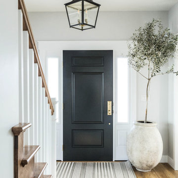
Photo: Caroline Sharpnack © 2017 Houzz
ナッシュビルにあるトランジショナルスタイルのおしゃれな玄関ロビー (白い壁、無垢フローリング、黄色いドア、茶色い床) の写真
ナッシュビルにあるトランジショナルスタイルのおしゃれな玄関ロビー (白い壁、無垢フローリング、黄色いドア、茶色い床) の写真
Mudroom. Ceramic tile engineered to look like slate but without the maintanence.
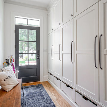
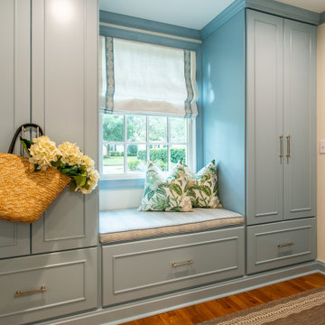
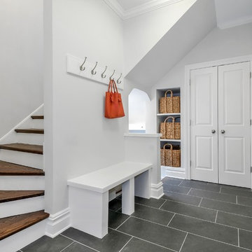
シカゴにある高級な中くらいなトランジショナルスタイルのおしゃれなマッドルーム (グレーの壁、セラミックタイルの床、白いドア) の写真
シカゴにある高級な中くらいなトランジショナルスタイルのおしゃれなマッドルーム (グレーの壁、セラミックタイルの床、白いドア) の写真
ロサンゼルスにある小さなトランジショナルスタイルのおしゃれな玄関ドア (青い壁、無垢フローリング、ガラスドア、茶色い床) の写真
This new house project was for a young couple with 2 kids. They wanted a traditional style with a sophisticated upscale interior. The project included a see through upper cabinet to the large covered out door room. The great room concept with painted wood ceilings added the character to this traditional style.
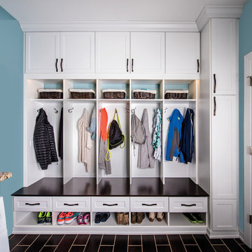
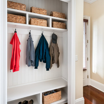
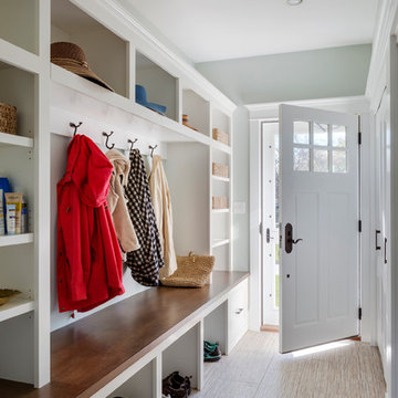
Keeping track of all the coats, shoes, backpacks and specialty gear for several small children can be an organizational challenge all by itself. Combine that with busy schedules and various activities like ballet lessons, little league, art classes, swim team, soccer and music, and the benefits of a great mud room organization system like this one becomes invaluable. Rather than an enclosed closet, separate cubbies for each family member ensures that everyone has a place to store their coats and backpacks. The look is neat and tidy, but easier than a traditional closet with doors, making it more likely to be used by everyone — including children. Hooks rather than hangers are easier for children and help prevent jackets from being to left on the floor. A shoe shelf beneath each cubby keeps all the footwear in order so that no one ever ends up searching for a missing shoe when they're in a hurry. a drawer above the shoe shelf keeps mittens, gloves and small items handy. A shelf with basket above each coat cubby is great for keys, wallets and small items that might otherwise become lost. The cabinets above hold gear that is out-of-season or infrequently used. An additional shoe cupboard that spans from floor to ceiling offers a place to keep boots and extra shoes.
White shaker style cabinet doors with oil rubbed bronze hardware presents a simple, clean appearance to organize the clutter, while bead board panels at the back of the coat cubbies adds a casual, country charm.
Designer - Gerry Ayala
Photo - Cathy Rabeler
Emily Followill
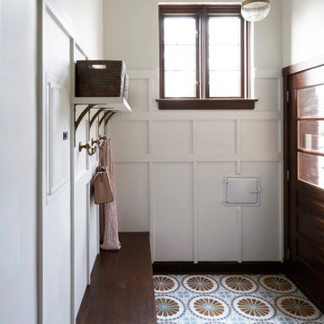
アトランタにあるお手頃価格の中くらいなトランジショナルスタイルのおしゃれな玄関 (ベージュの壁、無垢フローリング、ガラスドア、茶色い床) の写真
アトランタにあるお手頃価格の中くらいなトランジショナルスタイルのおしゃれな玄関 (ベージュの壁、無垢フローリング、ガラスドア、茶色い床) の写真
This Oceanside home, built to take advantage of majestic rocky views of the North Atlantic, incorporates outside living with inside glamor.
Sunlight streams through the large exterior windows that overlook the ocean. The light filters through to the back of the home with the clever use of over sized door frames with transoms, and a large pass through opening from the kitchen/living area to the dining area.
Retractable mosquito screens were installed on the deck to create an outdoor- dining area, comfortable even in the mid summer bug season. Photography: Greg Premru
Regan Wood photo credit
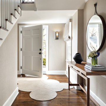
ニューヨークにあるトランジショナルスタイルのおしゃれな玄関ホール (グレーの壁、無垢フローリング、白いドア、茶色い床) の写真
ニューヨークにあるトランジショナルスタイルのおしゃれな玄関ホール (グレーの壁、無垢フローリング、白いドア、茶色い床) の写真
片開きドア、引き戸トランジショナルスタイルの玄関 (セラミックタイルの床、無垢フローリング) の写真
1