小さな黒い家の外観 (混合材屋根) の写真
絞り込み:
資材コスト
並び替え:今日の人気順
写真 1〜20 枚目(全 67 枚)
1/4
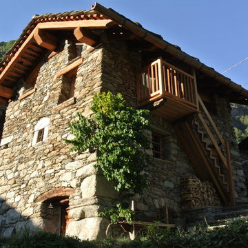
Recupero di edificio d'interesse storico
他の地域にある高級な小さなラスティックスタイルのおしゃれな家の外観 (石材サイディング、マルチカラーの外壁、混合材屋根) の写真
他の地域にある高級な小さなラスティックスタイルのおしゃれな家の外観 (石材サイディング、マルチカラーの外壁、混合材屋根) の写真
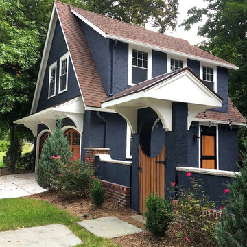
this 1920s carriage house was substantially rebuilt and linked to the main residence via new garden gate and private courtyard. Care was taken in matching brick and stucco detailing.
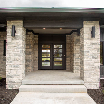
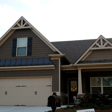
Form and function meld in this smaller footprint ranch home perfect for empty nesters or young families.
インディアナポリスにあるお手頃価格の小さなモダンスタイルのおしゃれな家の外観 (混合材サイディング、混合材屋根、縦張り) の写真
インディアナポリスにあるお手頃価格の小さなモダンスタイルのおしゃれな家の外観 (混合材サイディング、混合材屋根、縦張り) の写真
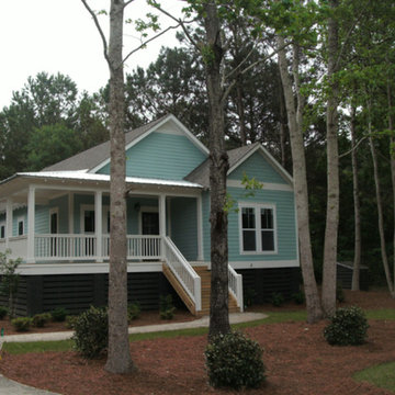
The Sapelo is a comfortable country style design that will always make you feel at home, with plenty of modern fixtures inside! It is a 1591 square foot 3 bedroom 2 bath home, with a gorgeous front porch for enjoying those beautiful summer evenings!
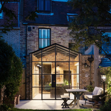
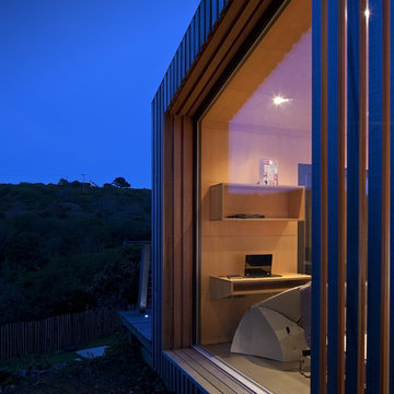
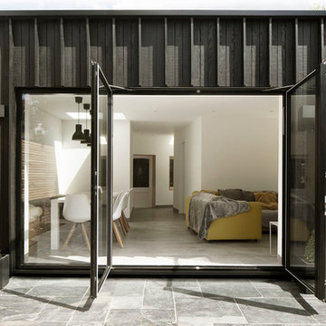
Photography by Richard Chivers https://www.rchivers.co.uk/
Marshall House is an extension to a Grade II listed dwelling in the village of Twyford, near Winchester, Hampshire. The original house dates from the 17th Century, although it had been remodelled and extended during the late 18th Century.
The clients contacted us to explore the potential to extend their home in order to suit their growing family and active lifestyle. Due to the constraints of living in a listed building, they were unsure as to what development possibilities were available. The brief was to replace an existing lean-to and 20th century conservatory with a new extension in a modern, contemporary approach. The design was developed in close consultation with the local authority as well as their historic environment department, in order to respect the existing property and work to achieve a positive planning outcome.
Like many older buildings, the dwelling had been adjusted here and there, and updated at numerous points over time. The interior of the existing property has a charm and a character - in part down to the age of the property, various bits of work over time and the wear and tear of the collective history of its past occupants. These spaces are dark, dimly lit and cosy. They have low ceilings, small windows, little cubby holes and odd corners. Walls are not parallel or perpendicular, there are steps up and down and places where you must watch not to bang your head.
The extension is accessed via a small link portion that provides a clear distinction between the old and new structures. The initial concept is centred on the idea of contrasts. The link aims to have the effect of walking through a portal into a seemingly different dwelling, that is modern, bright, light and airy with clean lines and white walls. However, complementary aspects are also incorporated, such as the strategic placement of windows and roof lights in order to cast light over walls and corners to create little nooks and private views. The overall form of the extension is informed by the awkward shape and uses of the site, resulting in the walls not being parallel in plan and splaying out at different irregular angles.
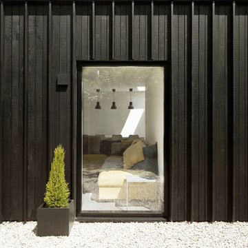
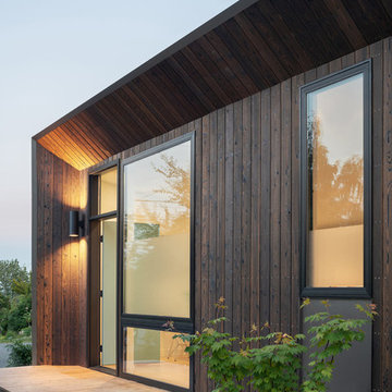
Externally, timber larch cladding is used as the primary material. This is painted black with a heavy duty barn paint, that is both long lasting and cost effective. The black finish of the extension contrasts with the white painted brickwork at the rear and side of the original house. The external colour palette of both structures is in opposition to the reality of the interior spaces. Although timber cladding is a fairly standard, commonplace material, visual depth and distinction has been created through the articulation of the boards. The inclusion of timber fins changes the way shadows are cast across the external surface during the day. Whilst at night, these are illuminated by external lighting.
A secondary entrance to the house is provided through a concealed door that is finished to match the profile of the cladding. This opens to a boot/utility room, from which a new shower room can be accessed, before proceeding to the new open plan living space and dining area.
Project Overview:
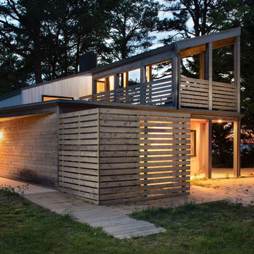
This modern ADU build was designed by Wittman Estes Architecture + Landscape and pre-fab tech builder NODE. Our Gendai siding with an Amber oil finish clads the exterior. Featured in Dwell, Designmilk and other online architectural publications, this tiny project packs a punch with affordable design and a focus on sustainability.
This modern ADU build was designed by Wittman Estes Architecture + Landscape and pre-fab tech builder NODE. Our shou sugi ban Gendai siding with a clear alkyd finish clads the exterior. Featured in Dwell, Designmilk and other online architectural publications, this tiny project packs a punch with affordable design and a focus on sustainability.
“A Seattle homeowner hired Wittman Estes to design an affordable, eco-friendly unit to live in her backyard as a way to generate rental income. The modern structure is outfitted with a solar roof that provides all of the energy needed to power the unit and the main house. To make it happen, the firm partnered with NODE, known for their design-focused, carbon negative, non-toxic homes, resulting in Seattle’s first DADU (Detached Accessory Dwelling Unit) with the International Living Future Institute’s (IFLI) zero energy certification.”
Product: Gendai 1×6 select grade shiplap
Prefinish: Amber
Application: Residential – Exterior
SF: 350SF
Designer: Wittman Estes, NODE
Builder: NODE, Don Bunnell
Date: November 2018
Location: Seattle, WA
Photos courtesy of: Andrew Pogue
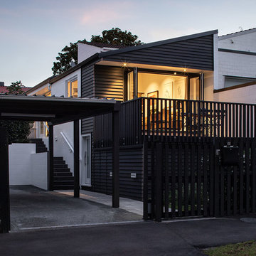
At night the house glows lantern-like in the street, with fun contrast between the black and white cladding.
オークランドにある高級な小さなコンテンポラリースタイルのおしゃれな家の外観 (タウンハウス、混合材屋根) の写真
オークランドにある高級な小さなコンテンポラリースタイルのおしゃれな家の外観 (タウンハウス、混合材屋根) の写真
Old brick ranch gets transformed into a new contemporary bungalow with clean lines, open floor plan, and warm style for young family.
お手頃価格の小さなコンテンポラリースタイルのおしゃれな家の外観 (コンクリート繊維板サイディング、混合材屋根) の写真
お手頃価格の小さなコンテンポラリースタイルのおしゃれな家の外観 (コンクリート繊維板サイディング、混合材屋根) の写真
a plywood panel marks the new side entry vestibule, accessed from the driveway and framed by bold wide horizontal black siding at the new addition
オレンジカウンティにある高級な小さなモダンスタイルのおしゃれな家の外観 (コンクリート繊維板サイディング、混合材屋根) の写真
オレンジカウンティにある高級な小さなモダンスタイルのおしゃれな家の外観 (コンクリート繊維板サイディング、混合材屋根) の写真
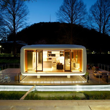
Nagold 2012 für haefele
Die großen, bislang ungenutzten Flachdächer mitten in den Städten zu erschließen, ist der
Grundgedanke, auf dem die Idee des
Loftcube basiert. Der Berliner Designer Werner Aisslinger will mit leichten, mobilen
Wohneinheiten diesen neuen, sonnigen
Lebensraum im großen Stil eröffnen und
vermarkten. Nach zweijährigen Vorarbeiten
präsentierten die Planer im Jahr 2003 den
Prototypen ihrer modularen Wohneinheiten
auf dem Flachdach des Universal Music
Gebäudes in Berlin.
Der Loftcube besteht aus einem Tragwerk mit aufgesteckten Fassadenelementen und einem variablen inneren Ausbausystem. Schneller als ein ein Fertighaus ist er innerhalb von 2-3 Tagen inklusive Innenausbau komplett aufgestellt. Zudem lässt sich der Loftcube in der gleichen Zeit auch wieder abbauen und an einen anderen Ort transportieren. Der Loftcube bietet bei Innenabmessungen von 6,25 x 6,25 m etwa 39 m2 Wohnfläche. Die nächst größere Einheit bietet bei rechteckigem Grundriss eine Raumgröße von 55 m2. Ausgehend von diesen Grundmodulen können - durch Brücken miteinander verbundener Einzelelemente - ganze Wohnlandschaften errichtet werden. Je nach Anforderung kann so die Wohnfläche im Laufe der Zeit den Bedürfnissen der Nutzer immer wieder angepasst werden. Die gewünschte Mobilität gewährleistet die auf
Containermaße begrenzte Größe aller
Bauteile. design: studio aisslinger Foto: Aisslinger
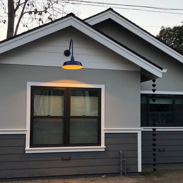
The ADU is finished in grey stucco and grey and white clapboard with black windows and rain chains. The window on the left is the bedroom, and the one on the right is the kitchen. The front door is to the left of the house.
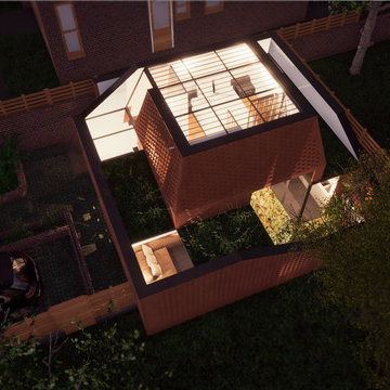
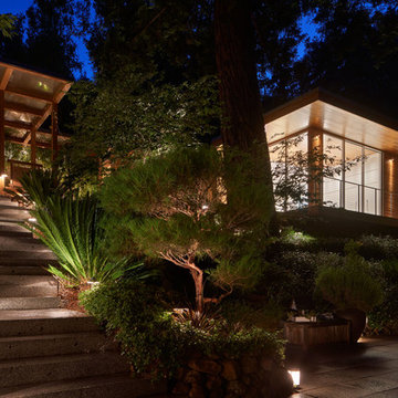
Modern Farmhouse
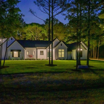
ヒューストンにあるお手頃価格の小さなカントリー風のおしゃれな家の外観 (混合材サイディング、混合材屋根) の写真
ヒューストンにあるお手頃価格の小さなカントリー風のおしゃれな家の外観 (混合材サイディング、混合材屋根) の写真
View of entry at sunset. Photo by Danny Bostwick.
他の地域にある小さなモダンスタイルのおしゃれな家の外観 (混合材サイディング、混合材屋根) の写真
他の地域にある小さなモダンスタイルのおしゃれな家の外観 (混合材サイディング、混合材屋根) の写真
Photography by Richard Chivers https://www.rchivers.co.uk/
Marshall House is an extension to a Grade II listed dwelling in the village of Twyford, near Winchester, Hampshire. The original house dates from the 17th Century, although it had been remodelled and extended during the late 18th Century.
The clients contacted us to explore the potential to extend their home in order to suit their growing family and active lifestyle. Due to the constraints of living in a listed building, they were unsure as to what development possibilities were available. The brief was to replace an existing lean-to and 20th century conservatory with a new extension in a modern, contemporary approach. The design was developed in close consultation with the local authority as well as their historic environment department, in order to respect the existing property and work to achieve a positive planning outcome.
Like many older buildings, the dwelling had been adjusted here and there, and updated at numerous points over time. The interior of the existing property has a charm and a character - in part down to the age of the property, various bits of work over time and the wear and tear of the collective history of its past occupants. These spaces are dark, dimly lit and cosy. They have low ceilings, small windows, little cubby holes and odd corners. Walls are not parallel or perpendicular, there are steps up and down and places where you must watch not to bang your head.
The extension is accessed via a small link portion that provides a clear distinction between the old and new structures. The initial concept is centred on the idea of contrasts. The link aims to have the effect of walking through a portal into a seemingly different dwelling, that is modern, bright, light and airy with clean lines and white walls. However, complementary aspects are also incorporated, such as the strategic placement of windows and roof lights in order to cast light over walls and corners to create little nooks and private views. The overall form of the extension is informed by the awkward shape and uses of the site, resulting in the walls not being parallel in plan and splaying out at different irregular angles.
Externally, timber larch cladding is used as the primary material. This is painted black with a heavy duty barn paint, that is both long lasting and cost effective. The black finish of the extension contrasts with the white painted brickwork at the rear and side of the original house. The external colour palette of both structures is in opposition to the reality of the interior spaces. Although timber cladding is a fairly standard, commonplace material, visual depth and distinction has been created through the articulation of the boards. The inclusion of timber fins changes the way shadows are cast across the external surface during the day. Whilst at night, these are illuminated by external lighting.
A secondary entrance to the house is provided through a concealed door that is finished to match the profile of the cladding. This opens to a boot/utility room, from which a new shower room can be accessed, before proceeding to the new open plan living space and dining area.
小さな黒い家の外観 (混合材屋根) の写真
1