白いダイニングキッチン (白い床、黄色い床、朝食スペース) の写真
絞り込み:
資材コスト
並び替え:今日の人気順
写真 1〜20 枚目(全 575 枚)
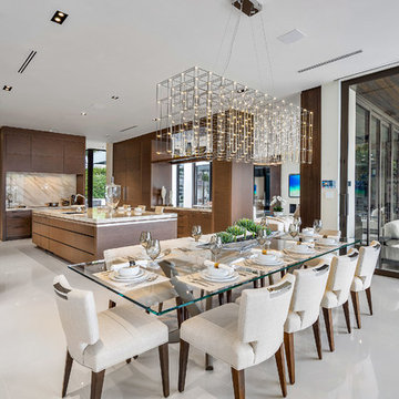
Fully integrated Signature Estate featuring Creston controls and Crestron panelized lighting, and Crestron motorized shades and draperies, whole-house audio and video, HVAC, voice and video communication atboth both the front door and gate. Modern, warm, and clean-line design, with total custom details and finishes. The front includes a serene and impressive atrium foyer with two-story floor to ceiling glass walls and multi-level fire/water fountains on either side of the grand bronze aluminum pivot entry door. Elegant extra-large 47'' imported white porcelain tile runs seamlessly to the rear exterior pool deck, and a dark stained oak wood is found on the stairway treads and second floor. The great room has an incredible Neolith onyx wall and see-through linear gas fireplace and is appointed perfectly for views of the zero edge pool and waterway. The center spine stainless steel staircase has a smoked glass railing and wood handrail.
Photo courtesy Royal Palm Properties
Dan Cutrona
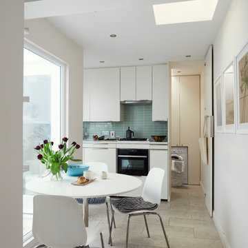
ボストンにある高級な広いビーチスタイルのおしゃれなダイニングキッチン (白い壁、淡色無垢フローリング、白い床、暖炉なし) の写真
ボストンにある高級な広いビーチスタイルのおしゃれなダイニングキッチン (白い壁、淡色無垢フローリング、白い床、暖炉なし) の写真
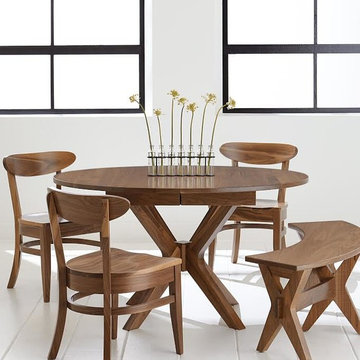
The Vadsco Pedestal table is a modern take on the dining table. The Vadsco table is available in a 42x54" oval shape with 1 - 12" leaf. Also available in 48x54 - with up to 1 - 12" leaf.
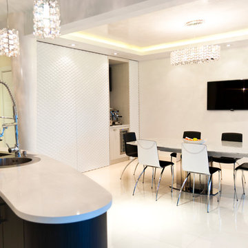
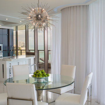
マイアミにある中くらいなコンテンポラリースタイルのおしゃれなダイニングキッチン (大理石の床、横長型暖炉、石材の暖炉まわり、白い床) の写真
Traditional breakfast room
トロントにある高級な広いトラディショナルスタイルのおしゃれなダイニングキッチン (黄色い壁、大理石の床、暖炉なし、白い床) の写真
トロントにある高級な広いトラディショナルスタイルのおしゃれなダイニングキッチン (黄色い壁、大理石の床、暖炉なし、白い床) の写真
Custom Dining Room Side Board
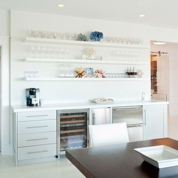
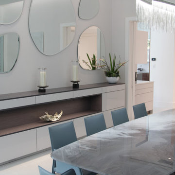
マイアミにある高級な中くらいなコンテンポラリースタイルのおしゃれなダイニング (朝食スペース、白い壁、セラミックタイルの床、白い床) の写真
マイアミにある高級な中くらいなコンテンポラリースタイルのおしゃれなダイニング (朝食スペース、白い壁、セラミックタイルの床、白い床) の写真
Nearly two decades ago now, Susan and her husband put a letter in the mailbox of this eastside home: "If you have any interest in selling, please reach out." But really, who would give up a Flansburgh House?
Fast forward to 2020, when the house went on the market! By then it was clear that three children and a busy home design studio couldn't be crammed into this efficient footprint. But what's second best to moving into your dream home? Being asked to redesign the functional core for the family that was.
In this classic Flansburgh layout, all the rooms align tidily in a square around a central hall and open air atrium. As such, all the spaces are both connected to one another and also private; and all allow for visual access to the outdoors in two directions—toward the atrium and toward the exterior. All except, in this case, the utilitarian galley kitchen. That space, oft-relegated to second class in midcentury architecture, got the shaft, with narrow doorways on two ends and no good visual access to the atrium or the outside. Who spends time in the kitchen anyway?
As is often the case with even the very best midcentury architecture, the kitchen at the Flansburgh House needed to be modernized; appliances and cabinetry have come a long way since 1970, but our culture has evolved too, becoming more casual and open in ways we at SYH believe are here to stay. People (gasp!) do spend time—lots of time!—in their kitchens! Nonetheless, our goal was to make this kitchen look as if it had been designed this way by Earl Flansburgh himself.
The house came to us full of bold, bright color. We edited out some of it (along with the walls it was on) but kept and built upon the stunning red, orange and yellow closet doors in the family room adjacent to the kitchen. That pop was balanced by a few colorful midcentury pieces that our clients already owned, and the stunning light and verdant green coming in from both the atrium and the perimeter of the house, not to mention the many skylights. Thus, the rest of the space just needed to quiet down and be a beautiful, if neutral, foil. White terrazzo tile grounds custom plywood and black cabinetry, offset by a half wall that offers both camouflage for the cooking mess and also storage below, hidden behind seamless oak tambour.
Contractor: Rusty Peterson
Cabinetry: Stoll's Woodworking
Photographer: Sarah Shields
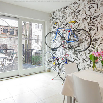
Stylish kitchen dinette with a new sliding glass doors we installed. With a gorgeous graphic accent wall and bright beautiful design, this dining area looks fantastic with a new white patio door we installed in this home in Brooklyn. Get started replacing your doors and windows now with Renewal by Andersen of Brooklyn, Queens and all of Long Island.
. . . . . . . . . .
Find the perfect doors for your home -- Contact Us Today: (844) 245-2799
Feature in: Luxe Magazine Miami & South Florida Luxury Magazine
If visitors to Robyn and Allan Webb’s one-bedroom Miami apartment expect the typical all-white Miami aesthetic, they’ll be pleasantly surprised upon stepping inside. There, bold theatrical colors, like a black textured wallcovering and bright teal sofa, mix with funky patterns,
such as a black-and-white striped chair, to create a space that exudes charm. In fact, it’s the wife’s style that initially inspired the design for the home on the 20th floor of a Brickell Key high-rise. “As soon as I saw her with a green leather jacket draped across her shoulders, I knew we would be doing something chic that was nothing like the typical all- white modern Miami aesthetic,” says designer Maite Granda of Robyn’s ensemble the first time they met. The Webbs, who often vacation in Paris, also had a clear vision for their new Miami digs: They wanted it to exude their own modern interpretation of French decor.
“We wanted a home that was luxurious and beautiful,”
says Robyn, noting they were downsizing from a four-story residence in Alexandria, Virginia. “But it also had to be functional.”
To read more visit: https:
https://maitegranda.com/wp-content/uploads/2018/01/LX_MIA18_HOM_MaiteGranda_10.pdf
Rolando Diaz
Nearly two decades ago now, Susan and her husband put a letter in the mailbox of this eastside home: "If you have any interest in selling, please reach out." But really, who would give up a Flansburgh House?
Fast forward to 2020, when the house went on the market! By then it was clear that three children and a busy home design studio couldn't be crammed into this efficient footprint. But what's second best to moving into your dream home? Being asked to redesign the functional core for the family that was.
In this classic Flansburgh layout, all the rooms align tidily in a square around a central hall and open air atrium. As such, all the spaces are both connected to one another and also private; and all allow for visual access to the outdoors in two directions—toward the atrium and toward the exterior. All except, in this case, the utilitarian galley kitchen. That space, oft-relegated to second class in midcentury architecture, got the shaft, with narrow doorways on two ends and no good visual access to the atrium or the outside. Who spends time in the kitchen anyway?
As is often the case with even the very best midcentury architecture, the kitchen at the Flansburgh House needed to be modernized; appliances and cabinetry have come a long way since 1970, but our culture has evolved too, becoming more casual and open in ways we at SYH believe are here to stay. People (gasp!) do spend time—lots of time!—in their kitchens! Nonetheless, our goal was to make this kitchen look as if it had been designed this way by Earl Flansburgh himself.
The house came to us full of bold, bright color. We edited out some of it (along with the walls it was on) but kept and built upon the stunning red, orange and yellow closet doors in the family room adjacent to the kitchen. That pop was balanced by a few colorful midcentury pieces that our clients already owned, and the stunning light and verdant green coming in from both the atrium and the perimeter of the house, not to mention the many skylights. Thus, the rest of the space just needed to quiet down and be a beautiful, if neutral, foil. White terrazzo tile grounds custom plywood and black cabinetry, offset by a half wall that offers both camouflage for the cooking mess and also storage below, hidden behind seamless oak tambour.
Contractor: Rusty Peterson
Cabinetry: Stoll's Woodworking
Photographer: Sarah Shields
白いダイニングキッチン (白い床、黄色い床、朝食スペース) の写真
1