お手頃価格の中くらいなダイニング (薪ストーブ、グレーの床) の写真
絞り込み:
資材コスト
並び替え:今日の人気順
写真 1〜20 枚目(全 59 枚)
1/5
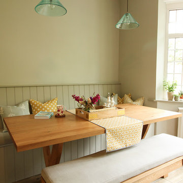
Custom built, hand painted bench seating with padded seat and scatter cushions. Walls and Bench painted in Little Green. Delicate glass pendants from Pooky lighting.
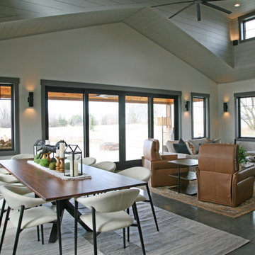
The open concept living room and dining room offer panoramic views of the property with lounging comfort from every seat inside.
ミルウォーキーにあるお手頃価格の中くらいなラスティックスタイルのおしゃれなLDK (グレーの壁、コンクリートの床、薪ストーブ、石材の暖炉まわり、グレーの床、三角天井、板張り壁) の写真
ミルウォーキーにあるお手頃価格の中くらいなラスティックスタイルのおしゃれなLDK (グレーの壁、コンクリートの床、薪ストーブ、石材の暖炉まわり、グレーの床、三角天井、板張り壁) の写真
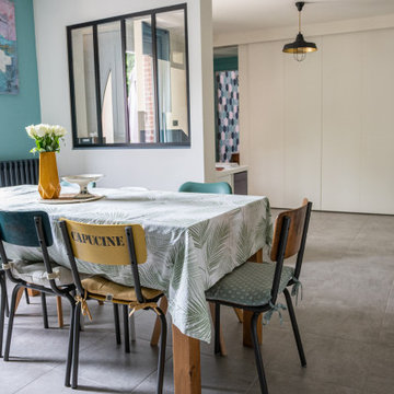
Séjour-salle à manger rénovée dans un style mêlant ambiances scandinave, industrielle et végétale
他の地域にあるお手頃価格の中くらいな北欧スタイルのおしゃれなダイニング (青い壁、セラミックタイルの床、薪ストーブ、グレーの床) の写真
他の地域にあるお手頃価格の中くらいな北欧スタイルのおしゃれなダイニング (青い壁、セラミックタイルの床、薪ストーブ、グレーの床) の写真
Photography by Richard Chivers https://www.rchivers.co.uk/
Marshall House is an extension to a Grade II listed dwelling in the village of Twyford, near Winchester, Hampshire. The original house dates from the 17th Century, although it had been remodelled and extended during the late 18th Century.
The clients contacted us to explore the potential to extend their home in order to suit their growing family and active lifestyle. Due to the constraints of living in a listed building, they were unsure as to what development possibilities were available. The brief was to replace an existing lean-to and 20th century conservatory with a new extension in a modern, contemporary approach. The design was developed in close consultation with the local authority as well as their historic environment department, in order to respect the existing property and work to achieve a positive planning outcome.
Like many older buildings, the dwelling had been adjusted here and there, and updated at numerous points over time. The interior of the existing property has a charm and a character - in part down to the age of the property, various bits of work over time and the wear and tear of the collective history of its past occupants. These spaces are dark, dimly lit and cosy. They have low ceilings, small windows, little cubby holes and odd corners. Walls are not parallel or perpendicular, there are steps up and down and places where you must watch not to bang your head.
The extension is accessed via a small link portion that provides a clear distinction between the old and new structures. The initial concept is centred on the idea of contrasts. The link aims to have the effect of walking through a portal into a seemingly different dwelling, that is modern, bright, light and airy with clean lines and white walls. However, complementary aspects are also incorporated, such as the strategic placement of windows and roof lights in order to cast light over walls and corners to create little nooks and private views. The overall form of the extension is informed by the awkward shape and uses of the site, resulting in the walls not being parallel in plan and splaying out at different irregular angles.
Externally, timber larch cladding is used as the primary material. This is painted black with a heavy duty barn paint, that is both long lasting and cost effective. The black finish of the extension contrasts with the white painted brickwork at the rear and side of the original house. The external colour palette of both structures is in opposition to the reality of the interior spaces. Although timber cladding is a fairly standard, commonplace material, visual depth and distinction has been created through the articulation of the boards. The inclusion of timber fins changes the way shadows are cast across the external surface during the day. Whilst at night, these are illuminated by external lighting.
A secondary entrance to the house is provided through a concealed door that is finished to match the profile of the cladding. This opens to a boot/utility room, from which a new shower room can be accessed, before proceeding to the new open plan living space and dining area.
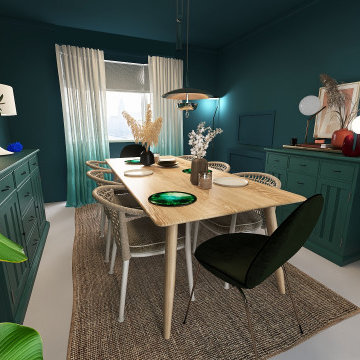
Colour and connection are the two elements that unify the interior of this Glasgow home. Prior to the renovation, these rooms were separate, so we chose a colour continuum that would draw the eye through the now seamless spaces.
.
We worked off of a cool turquoise colour palette to brighten up the living area, while we shrouded the dining room in a moody deep jewel. The cool leafy palette extends to the couch’s upholstery and to the monochrome credenza in the dining room. To make the blue-green scheme really pop, we selected warm-toned red accent lamps, dried pampas grass, and muted pink artwork.
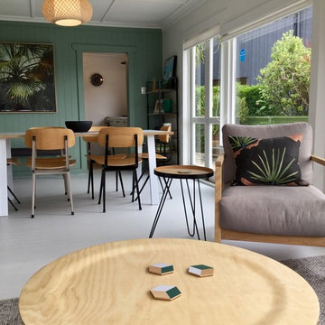
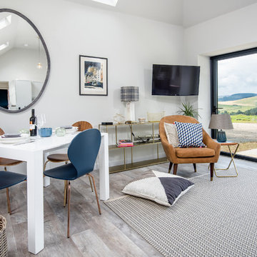
Aménagement et décoration pièce de vie dans un style scandinave chic
Partir d'une pièce vide et imaginer les espaces, meubler et décorer pour rendre cette maison accueillante et chaleureuse pour la vie de famille
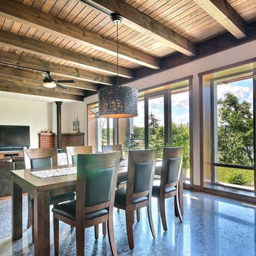
モントリオールにあるお手頃価格の中くらいなコンテンポラリースタイルのおしゃれなLDK (白い壁、コンクリートの床、グレーの床、薪ストーブ、レンガの暖炉まわり) の写真
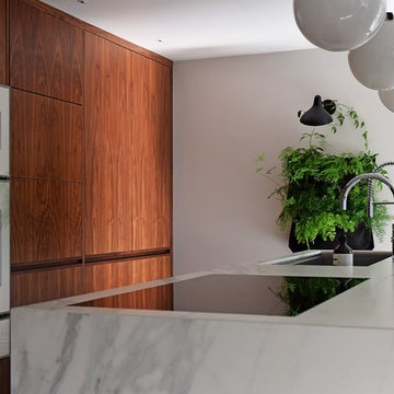
The aim for this West facing kitchen was to have a warm welcoming feel, combined with a fresh, easy to maintain and clean aesthetic.
This level is relatively dark in the mornings and the multitude of small rooms didn't work for it. Collaborating with the conservation officers, we created an open plan layout, which still hinted at the former separation of spaces through the use of ceiling level change and cornicing.
We used a mix of vintage and antique items and designed a kitchen with a mid-century feel but cutting-edge components to create a comfortable and practical space.
Extremely comfortable vintage dining chairs were sourced for a song and recovered in a sturdy peachy pink mohair velvet
The bar stools were sourced all the way from the USA via a European dealer, and also provide very comfortable seating for those perching at the imposing kitchen island.
Mirror splashbacks line the joinery back wall to reflect the light coming from the window and doors and bring more green inside the room.
Photo by Matthias Peters
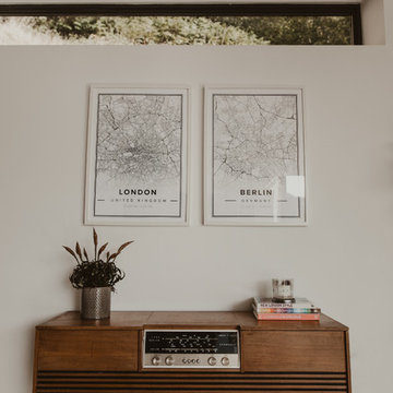
Open Plan living and dining area styled with a found Mid Century radiogram contrasted against the industrial polished concrete floor
他の地域にあるお手頃価格の中くらいなエクレクティックスタイルのおしゃれなLDK (白い壁、コンクリートの床、薪ストーブ、グレーの床) の写真
他の地域にあるお手頃価格の中くらいなエクレクティックスタイルのおしゃれなLDK (白い壁、コンクリートの床、薪ストーブ、グレーの床) の写真
Context
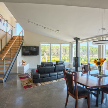
Norbert and Robin had dreamed of retiring in a Passive House-certified home overlooking the Lubberland Creek Preserve in Southeastern New Hampshire, and they’d done their homework. They were interested in using four integrated Zehnder America (www.zehnderamerica.com) technologies to make the 1,900 square foot home extremely energy efficient.
They didn’t miss any opportunity to innovate or raise the bar on sustainable design. Our goals were focused on guaranteeing their comfort in every season, saving them money on a fixed income, and reducing the home’s overall impact on the environment as much as possible.
Response
The home faces directly south and captures sunlight all winter under tall and vaulted ceilings and a continuous band of slim-lined, Italian triple-pane windows and doors that provide gorgeous views of the wild preserve. A second-story office nook and clerestory provide even deeper views, with a little more privacy.
Zehnder, which previously sold its innovative products only in Europe, took on the project as a test house. We designed around Zehnder’s vent-based systems, including a geothermal heat loop that heats and cools incoming air, a heat pump cooling system, electric towel-warmer radiators in the bathrooms, and a highly efficient energy recovery ventilator, which recycles heat and minimizes the need for air conditioning. The house effectively has no conventional heating system—and doesn’t need it. We also looked for efficiencies and smart solutions everywhere, from the lights to the windows to the insulation.
The kitchen exhaust hood eliminates, cleans, and recirculates cooking fumes in the home’s unique kitchen, custom-designed to match the ways Norbert likes to prepare meals. There are several countertop heights so they can prep and clean comfortably, and the eat-in kitchen also has two seating heights so people can sit and socialize while they’re working on dinner. An adjacent screened porch greets guests and opens to the view.
A roof-mounted solar system helps to ensure that the home generates more energy than it consumes—helped by features such as a heat pump water heater, superinsulation, LED lights and a polished concrete floor that helps regulate indoor temperatures.
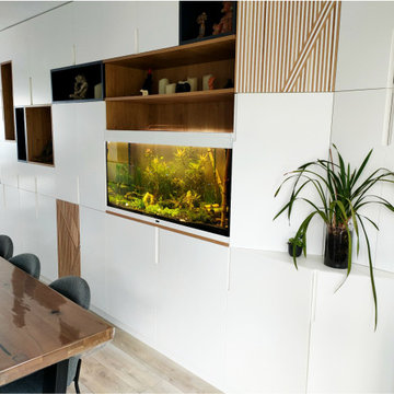
APRES - Le meuble est rythmé par des pleins et des vides. Il crée une continuité visuelle dans la salle à manger, sans la surcharger.
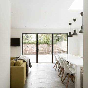
リールにあるお手頃価格の中くらいなコンテンポラリースタイルのおしゃれなLDK (白い壁、淡色無垢フローリング、薪ストーブ、グレーの床) の写真
リールにあるお手頃価格の中くらいなコンテンポラリースタイルのおしゃれなLDK (白い壁、淡色無垢フローリング、薪ストーブ、グレーの床) の写真
Photography by Richard Chivers https://www.rchivers.co.uk/
Marshall House is an extension to a Grade II listed dwelling in the village of Twyford, near Winchester, Hampshire. The original house dates from the 17th Century, although it had been remodelled and extended during the late 18th Century.
The clients contacted us to explore the potential to extend their home in order to suit their growing family and active lifestyle. Due to the constraints of living in a listed building, they were unsure as to what development possibilities were available. The brief was to replace an existing lean-to and 20th century conservatory with a new extension in a modern, contemporary approach. The design was developed in close consultation with the local authority as well as their historic environment department, in order to respect the existing property and work to achieve a positive planning outcome.
Like many older buildings, the dwelling had been adjusted here and there, and updated at numerous points over time. The interior of the existing property has a charm and a character - in part down to the age of the property, various bits of work over time and the wear and tear of the collective history of its past occupants. These spaces are dark, dimly lit and cosy. They have low ceilings, small windows, little cubby holes and odd corners. Walls are not parallel or perpendicular, there are steps up and down and places where you must watch not to bang your head.
The extension is accessed via a small link portion that provides a clear distinction between the old and new structures. The initial concept is centred on the idea of contrasts. The link aims to have the effect of walking through a portal into a seemingly different dwelling, that is modern, bright, light and airy with clean lines and white walls. However, complementary aspects are also incorporated, such as the strategic placement of windows and roof lights in order to cast light over walls and corners to create little nooks and private views. The overall form of the extension is informed by the awkward shape and uses of the site, resulting in the walls not being parallel in plan and splaying out at different irregular angles.
Externally, timber larch cladding is used as the primary material. This is painted black with a heavy duty barn paint, that is both long lasting and cost effective. The black finish of the extension contrasts with the white painted brickwork at the rear and side of the original house. The external colour palette of both structures is in opposition to the reality of the interior spaces. Although timber cladding is a fairly standard, commonplace material, visual depth and distinction has been created through the articulation of the boards. The inclusion of timber fins changes the way shadows are cast across the external surface during the day. Whilst at night, these are illuminated by external lighting.
A secondary entrance to the house is provided through a concealed door that is finished to match the profile of the cladding. This opens to a boot/utility room, from which a new shower room can be accessed, before proceeding to the new open plan living space and dining area.
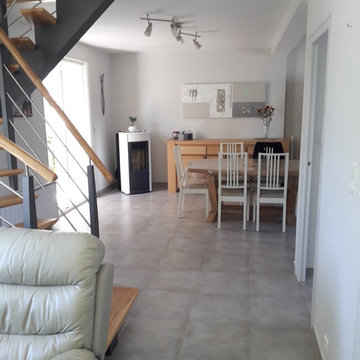
Le changement de l'escalier et la démolition du muret de la cuisine à permis d'obtenir un espace beaucoup plus grand et aéré. Un poêle est venu complété la décoration mais surtout apporter des économies d'énergie à mes clients.
Open Plan living and dining area, Tom Raffield light, Retro sideboard and glass top to the exposed well.
Polished concrete throughout the open plan area.
To see more visit: https://www.greta-mae.co.uk/interior-design-projects
The aim for this West facing kitchen was to have a warm welcoming feel, combined with a fresh, easy to maintain and clean aesthetic.
This level is relatively dark in the mornings and the multitude of small rooms didn't work for it. Collaborating with the conservation officers, we created an open plan layout, which still hinted at the former separation of spaces through the use of ceiling level change and cornicing.
We used a mix of vintage and antique items and designed a kitchen with a mid-century feel but cutting-edge components to create a comfortable and practical space.
Extremely comfortable vintage dining chairs were sourced for a song and recovered in a sturdy peachy pink mohair velvet
The bar stools were sourced all the way from the USA via a European dealer, and also provide very comfortable seating for those perching at the imposing kitchen island.
Mirror splashbacks line the joinery back wall to reflect the light coming from the window and doors and bring more green inside the room.
Photo by Matthias Peters
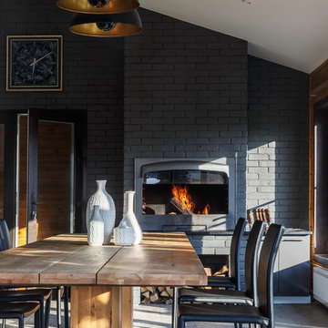
Дмитрий Чебаненко
モスクワにあるお手頃価格の中くらいなトランジショナルスタイルのおしゃれなダイニング (グレーの床、黒い壁、薪ストーブ) の写真
モスクワにあるお手頃価格の中くらいなトランジショナルスタイルのおしゃれなダイニング (グレーの床、黒い壁、薪ストーブ) の写真
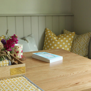
Custom built, hand painted bench seating with padded seat and scatter cushions. Walls and Bench painted in Little Green. Delicate glass pendants from Pooky lighting. Tub chairs from Next provide cosy seating by the fire.
Tracey Bloxham, Inside Story Photography
他の地域にあるお手頃価格の中くらいなコンテンポラリースタイルのおしゃれなダイニング (グレーの壁、ラミネートの床、薪ストーブ、グレーの床) の写真
他の地域にあるお手頃価格の中くらいなコンテンポラリースタイルのおしゃれなダイニング (グレーの壁、ラミネートの床、薪ストーブ、グレーの床) の写真
お手頃価格の中くらいなダイニング (薪ストーブ、グレーの床) の写真
1