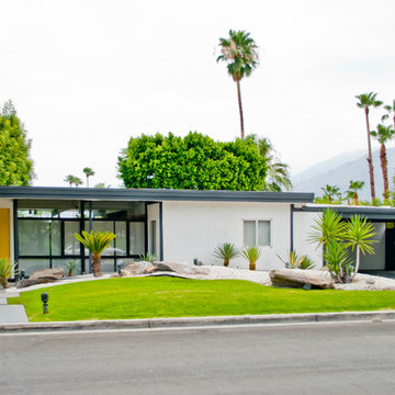
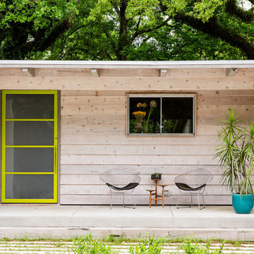
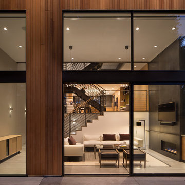
小さなミッドセンチュリースタイルの家の外観の写真
絞り込み:
資材コスト
並び替え:今日の人気順
写真 1〜20 枚目(全 105 枚)
1/5
The new front extension is housing utility room, home office and a boot room. New Velfac windows were installed throughout the house.
Photo: Frederik Rissom
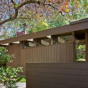
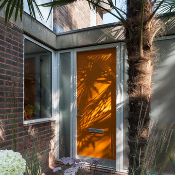
Mid-Century Modern Renovation & Addition. Exterior of mid-century home in Berkeley, California with redwood siding, orange front door, exposed wood beams and transom windows. - Photo by Bruce Damonte.
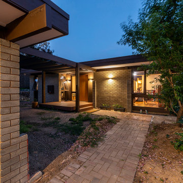

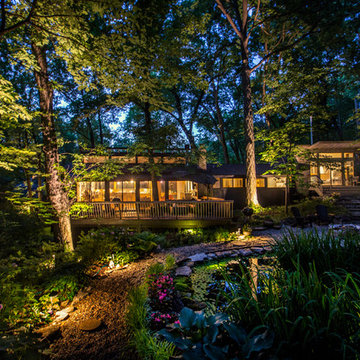
View of the house at dusk from the Woodland Garden on the uphill side of the house. New addition and bridge connection are too the right. Roof of original house was reframed to create a line of clerestory windows.
Photographer:Paul Bussman
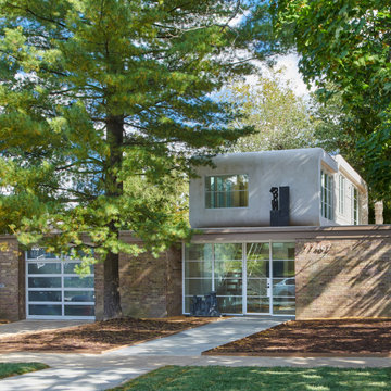
Designed in 1970 for an art collector, the existing referenced 70’s architectural principles. With its cadence of ‘70’s brick masses punctuated by a garage and a 4-foot-deep entrance recess. This recess, however, didn’t convey to the interior, which was occupied by disjointed service spaces. To solve, service spaces are moved and reorganized in open void in the garage. (See plan) This also organized the home: Service & utility on the left, reception central, and communal living spaces on the right.
To maintain clarity of the simple one-story 70’s composition, the second story add is recessive. A flex-studio/extra bedroom and office are designed ensuite creating a slender form and orienting them front to back and setting it back allows the add recede. Curves create a definite departure from the 70s home and by detailing it to "hover like a thought" above the first-floor roof and mentally removable sympathetic add.Existing unrelenting interior walls and a windowless entry, although ideal for fine art was unconducive for the young family of three. Added glass at the front recess welcomes light view and the removal of interior walls not only liberate rooms to communicate with each other but also reinform the cleared central entry space as a hub.
Even though the renovation reinforms its relationship with art, the joy and appreciation of art was not dismissed. A metal sculpture lost in the corner of the south side yard bumps the sculpture at the front entrance to the kitchen terrace over an added pedestal. (See plans) Since the roof couldn’t be railed without compromising the one-story '70s composition, the sculpture garden remains physically inaccessible however mirrors flanking the chimney allow the sculptures to be appreciated in three dimensions. The mirrors also afford privacy from the adjacent Tudor's large master bedroom addition 16-feet away.
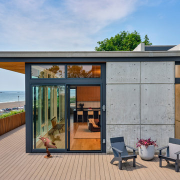
Devereux Beach House
Our client presented Flavin Architects with a unique challenge. On a site that previously hosted two houses, our client asked us to design a modestly sized house and separate art studio. Both structures reduce the height and bulk of the original buildings. The modern concrete house we designed is situated on the brow of a steep cliff overlooking Marblehead harbor. The concrete visually anchors the house to stone outcroppings on the property, and the low profile ensures the structure doesn’t conflict with the surround of traditional, gabled homes.
Three primary concrete walls run north to south in parallel, forming the structural walls of the home. The entry sequence is carefully considered. The front door is hidden from view from the street. An entry path leads to an intimate courtyard, from which the front door is first visible. Upon entering, the visitor gets the first glimpse of the sea, framed by a portal of cast-in-place concrete. The kitchen, living, and dining space have a soaring 10-foot ceiling creating an especially spacious sense of interiority. A cantilevered deck runs the length of the living room, with a solid railing providing privacy from beach below. Where the house grows from a single to a two-story structure, the concrete walls rise magisterially to the full height of the building. The exterior concrete walls are accented with zinc gutters and downspouts, and wooden Ipe slats which softly filter light through the windows.

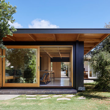
This 8.3 star energy rated home is a beacon when it comes to paired back, simple and functional elegance. With great attention to detail in the design phase as well as carefully considered selections in materials, openings and layout this home performs like a Ferrari. The in-slab hydronic system that is run off a sizeable PV system assists with minimising temperature fluctuations.
This home is entered into 2023 Design Matters Award as well as a winner of the 2023 HIA Greensmart Awards. Karli Rise is featured in Sanctuary Magazine in 2023.
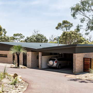
Located in Rye on the Mornington Peninsula this addition helps to create a family home from the original 1960’s weekender. Although in good condition the late modernist home lacked the living spaces and good connections to the garden that the family required.
The owners were very keen to honour and respect the original dwelling. Minimising change where possible especially to the finely crafted timber ceiling and dress timber windows typical of the period.
The addition is located on a corner of the original house, east facing windows to the existing living spaces become west facing glazing to the additions. A new entry is located at the junction of old and new creating direct access from front to back.
Designed in 1970 for an art collector, the existing referenced 70’s architectural principles. With its cadence of ‘70’s brick masses punctuated by a garage and a 4-foot-deep entrance recess. This recess, however, didn’t convey to the interior, which was occupied by disjointed service spaces. To solve, service spaces are moved and reorganized in open void in the garage. (See plan) This also organized the home: Service & utility on the left, reception central, and communal living spaces on the right.
To maintain clarity of the simple one-story 70’s composition, the second story add is recessive. A flex-studio/extra bedroom and office are designed ensuite creating a slender form and orienting them front to back and setting it back allows the add recede. Curves create a definite departure from the 70s home and by detailing it to "hover like a thought" above the first-floor roof and mentally removable sympathetic add.Existing unrelenting interior walls and a windowless entry, although ideal for fine art was unconducive for the young family of three. Added glass at the front recess welcomes light view and the removal of interior walls not only liberate rooms to communicate with each other but also reinform the cleared central entry space as a hub.
Even though the renovation reinforms its relationship with art, the joy and appreciation of art was not dismissed. A metal sculpture lost in the corner of the south side yard bumps the sculpture at the front entrance to the kitchen terrace over an added pedestal. (See plans) Since the roof couldn’t be railed without compromising the one-story '70s composition, the sculpture garden remains physically inaccessible however mirrors flanking the chimney allow the sculptures to be appreciated in three dimensions. The mirrors also afford privacy from the adjacent Tudor's large master bedroom addition 16-feet away.
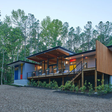
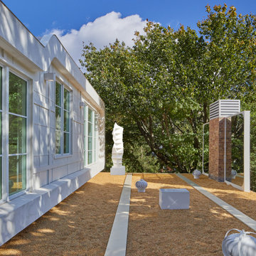
The south facing view of the Privacy House has a 13' high window wall. Primary colors inspired by flags were used to organize the exterior spaces. To the right of the deck is a floating cypress screen which affords privacy for the owners when viewed from the street. Photo by Keith Isaacs.
The new front extension is housing utility room, home office and a boot room. New Velfac windows were installed throughout the house.
Photo: Frederik Rissom
John Lum Architecture
Paul Dyer Photography
サンフランシスコにある小さなミッドセンチュリースタイルのおしゃれな家の外観の写真
サンフランシスコにある小さなミッドセンチュリースタイルのおしゃれな家の外観の写真
小さなミッドセンチュリースタイルの家の外観の写真
1