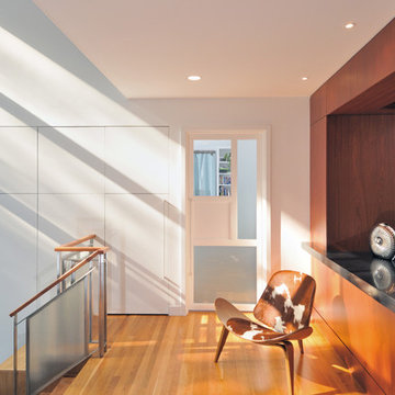
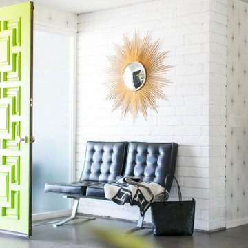
広いミッドセンチュリースタイルの玄関 (セラミックタイルの床、無垢フローリング) の写真
絞り込み:
資材コスト
並び替え:今日の人気順
写真 1〜20 枚目(全 82 枚)
1/5
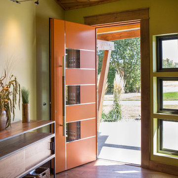
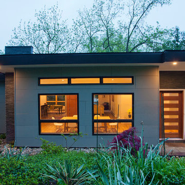
A mountain modern residence situated in the Gallatin Valley of Montana. Our modern aluminum door adds just the right amount of flair to this beautiful home designed by FORMation Architecture. The Circle F Residence has a beautiful mixture of natural stone, wood and metal, creating a home that blends flawlessly into it’s environment.
The modern door design was selected to complete the home with a warm front entrance. This signature piece is designed with horizontal cutters and a wenge wood handle accented with stainless steel caps. The obscure glass was chosen to add natural light and provide privacy to the front entry of the home. Performance was also factor in the selection of this piece; quad pane glass and a fully insulated aluminum door slab offer high performance and protection from the extreme weather. This distinctive modern aluminum door completes the home and provides a warm, beautiful entry way.
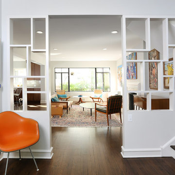
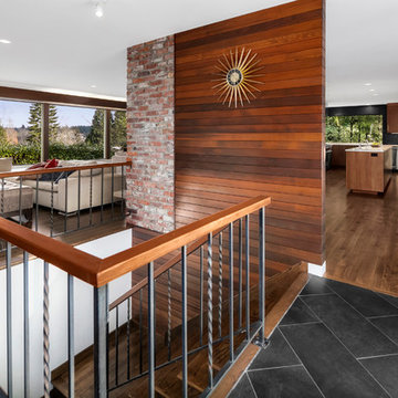
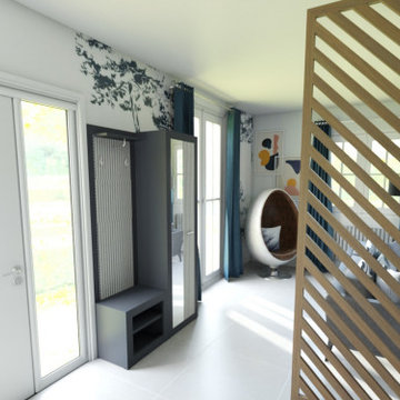
Some elements of the original home were preserved, including this room divider, which artistically separates the foyer from the living room.
シカゴにある高級な広いミッドセンチュリースタイルのおしゃれな玄関ロビー (白い壁、無垢フローリング) の写真
シカゴにある高級な広いミッドセンチュリースタイルのおしゃれな玄関ロビー (白い壁、無垢フローリング) の写真
Photo by Michael Todoran
ロサンゼルスにあるラグジュアリーな広いミッドセンチュリースタイルのおしゃれな玄関ドア (ベージュの壁、無垢フローリング、ガラスドア) の写真
ロサンゼルスにあるラグジュアリーな広いミッドセンチュリースタイルのおしゃれな玄関ドア (ベージュの壁、無垢フローリング、ガラスドア) の写真
シアトルにある高級な広いミッドセンチュリースタイルのおしゃれな玄関ロビー (白い壁、セラミックタイルの床、淡色木目調のドア) の写真
The entry has large windows to allow natural light seep through the space. The black metal door frame and stair rail give great contrast to the white walls.
Paula et Guillaume ont acquis une nouvelle maison. Et pour la 2è fois ils ont fait appel à WherDeco. Pour cette grande pièce de vie, ils avaient envie d'espace, de décloisonnement et d'un intérieur qui arrive à mixer bien sûr leur 2 styles : le contemporain pour Guillaume et l'industriel pour Paula. Nous leur avons proposé le forfait Déco qui comprenait un conseil couleurs, des planches d'ambiances, les plans 3D et la shopping list.
Download our free ebook, Creating the Ideal Kitchen. DOWNLOAD NOW
As with most projects, it all started with the kitchen layout. The home owners came to us wanting to upgrade their kitchen and overall aesthetic in their suburban home, with a combination of fresh paint, updated finishes, and improved flow for more ease when doing everyday activities.
A monochromatic, earth-toned palette left the kitchen feeling uninspired. It lacked the brightness they wanted from their space. An eat-in table underutilized the available square footage. The butler’s pantry was out of the way and hard to access, and the dining room felt detached from the kitchen.
Lead Designer, Stephanie Cole, saw an improved layout for the spaces that were no longer working for this family. By eliminating an existing wall between the kitchen and dining room, and relocating the bar area to the dining room, we opened up the kitchen, providing all the space we needed to create a dreamy and functional layout. A new perimeter configuration promoted circulation while also making space for a large and functional island loaded with seating – a must for any family. Because an island that isn’t big enough for everyone (and a few more) is a recipe for disaster. The light white cabinetry is fresh and contrasts with the deeper tones in the wood flooring, creating a modern aesthetic that is elevated, yet approachable for everyday living.
With better flow as the overarching goal, we made some structural changes too. To remove a bottleneck in the entryway, we angled one of the dining room walls to create more natural separation between rooms and facilitate ease of movement throughout the large space.
At The Kitchen Studio, we believe a well-designed kitchen uses every square inch to the fullest. By starting from scratch, it was possible to rethink the entire kitchen layout and design the space according to how it is used, because the kitchen shouldn’t make it harder to feed the family. A new location for the existing range, flanked by a new column refrigerator and freezer on each side, worked to anchor the space. The very large and very spacious island (a dream island if we do say so ourselves) now houses the primary sink and provides ample space for food prep and family gathering.
The new kitchen table and coordinating banquette seating provide a cozy nook for quick breakfasts before school or work, and evening homework sessions. Elegant gold details catch the natural light, elevating the aesthetic.
The dining room was transformed into one of this client’s favorite spaces and we couldn’t agree more. We saw an opportunity to give the dining room a more distinguished identity by closing off the entrance from the foyer. The relocated wet bar enhances the sophisticated vibe of this gathering space, complete with beautiful antique mirror tiles and open shelving encased by moody built-in cabinets.
Updated furnishings add warmth. A rich walnut table is paired with custom chairs in a muted coral fabric. The large, transitional chandelier grounds the room, pairing beautifully with the gold finishes prevalent in the faucet and cabinet hardware. Linen-inspired wallpaper and cream-toned window treatments add to the glamorous feel of this entertainment space.
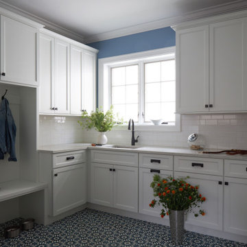
There is no way around it. The laundry room was cramped. The large washer and dryer blocked access to the sink and left little room for the space to serve its other essential function – as a mudroom. Because we reworked the kitchen layout to create more space overall, we could rethink the mudroom too – an essential for any busy family. The first step was moving the washer and dryer to an existing area on the second floor, where most of the family’s laundry lives (no one wants to carry laundry up and down the stairs if they don’t have to anyway). This is a more functional solution and opened up the space for all the mudroom necessities – including the existing kitchen refrigerator, loads of built-in cubbies, and a bench.
It’s hard to not fall in love with every detail of a new space, especially when it serves your day-to-day life. But that doesn’t mean the clients didn’t have their favorite features they use on the daily. This remodel was focused largely on function with a new kitchen layout. And it’s the functional features that have the biggest impact. The large island provides much needed workspace in the kitchen and is a spot where everyone gathers together – it grounds the space and the family. And the custom counter stools are the icing on the cake. The nearby mudroom has everything their previous space was lacking – ample storage, space for everyone’s essentials, and the beloved cement floor tiles that are both durable and artistic.
Historical Renovation
Objective: The homeowners asked us to join the project after partial demo and construction was in full
swing. Their desire was to significantly enlarge and update the charming mid-century modern home to
meet the needs of their joined families and frequent social gatherings. It was critical though that the
expansion be seamless between old and new, where one feels as if the home “has always been this
way”.
Solution: We created spaces within rooms that allowed family to gather and socialize freely or allow for
private conversations. As constant entertainers, the couple wanted easier access to their favorite wines
than having to go to the basement cellar. A custom glass and stainless steel wine cellar was created
where bottles seem to float in the space between the dining room and kitchen area.
A nineteen foot long island dominates the great room as well as any social gathering where it is
generally spread from end to end with food and surrounded by friends and family.
Aside of the master suite, three oversized bedrooms each with a large en suite bath provide plenty of
space for kids returning from college and frequent visits from friends and family.
A neutral color palette was chosen throughout to bring warmth into the space but not fight with the
clients’ collections of art, antique rugs and furnishings. Soaring ceiling, windows and huge sliding doors
bring the naturalness of the large wooded lot inside while lots of natural wood and stone was used to
further complement the outdoors and their love of nature.
Outside, a large ground level fire-pit surrounded by comfortable chairs is another favorite gathering
spot.
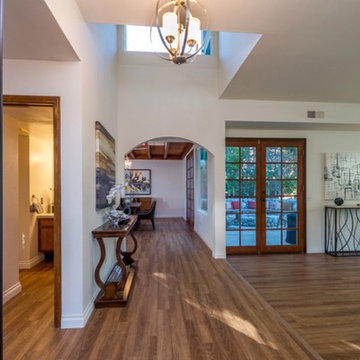
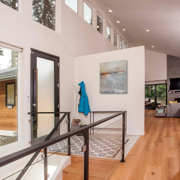
Open entry floor plan with wood floors, opening to the living area, dining room, exterior courtyard and stairs to second level.
Photos provided by Tyler Martin
Client's recently purchased their home and wanted to make some updates without having to do a full gut job. We used the original cabinets but opted for new glass doors, a little woodwork to modernize them and got rid of the old medium oak cabinets and did a light grey color. Topped with a white quartz counter, accompanied by a limestone backsplash. To finish it off we gave the cabinets new hardware and pendant lights. The pot rack also was a new addition and fits perfectly over the new large peninsula. Throughout the rest of the home we blended their existing furniture with a few new pieces and added some color to spruce up their new home.
Fran Brennan
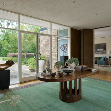
ヒューストンにある広いミッドセンチュリースタイルのおしゃれな玄関ロビー (茶色い壁、無垢フローリング、ガラスドア、茶色い床) の写真
ヒューストンにある広いミッドセンチュリースタイルのおしゃれな玄関ロビー (茶色い壁、無垢フローリング、ガラスドア、茶色い床) の写真
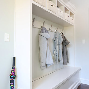
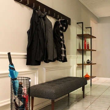
This white, custom-built mudroom was designed to keep coats, backpacks and seasonal items organized.
シカゴにある高級な広いミッドセンチュリースタイルのおしゃれな玄関ロビー (白い壁、無垢フローリング) の写真
シカゴにある高級な広いミッドセンチュリースタイルのおしゃれな玄関ロビー (白い壁、無垢フローリング) の写真
広いミッドセンチュリースタイルの玄関 (セラミックタイルの床、無垢フローリング) の写真
1