キッチン (青いキャビネット、表し梁) の写真
並び替え:今日の人気順
写真 1〜20 枚目(全 436 枚)
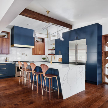
The kitchen in this Mid Century Modern home is a true showstopper. The designer expanded the original kitchen footprint and doubled the kitchen in size. The walnut dividing wall and walnut cabinets are hallmarks of the original mid century design, while a mix of deep blue cabinets provide a more modern punch. The triangle shape is repeated throughout the kitchen in the backs of the counter stools, the ends of the waterfall island, the light fixtures, the clerestory windows, and the walnut dividing wall.
Large airy open plan kitchen, flooded with natural light opening onto the garden. Hand made timber units, with feature copper lights, antique timber floor and window seat.
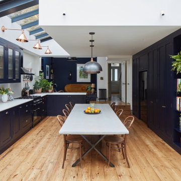
Amos Goldreich Architecture has completed an asymmetric brick extension that celebrates light and modern life for a young family in North London. The new layout gives the family distinct kitchen, dining and relaxation zones, and views to the large rear garden from numerous angles within the home.
The owners wanted to update the property in a way that would maximise the available space and reconnect different areas while leaving them clearly defined. Rather than building the common, open box extension, Amos Goldreich Architecture created distinctly separate yet connected spaces both externally and internally using an asymmetric form united by pale white bricks.
Previously the rear plan of the house was divided into a kitchen, dining room and conservatory. The kitchen and dining room were very dark; the kitchen was incredibly narrow and the late 90’s UPVC conservatory was thermally inefficient. Bringing in natural light and creating views into the garden where the clients’ children often spend time playing were both important elements of the brief. Amos Goldreich Architecture designed a large X by X metre box window in the centre of the sitting room that offers views from both the sitting area and dining table, meaning the clients can keep an eye on the children while working or relaxing.
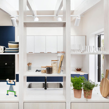
Amos Goldreich Architecture enlivened and lightened the home by working with materials that encourage the diffusion of light throughout the spaces. Exposed timber rafters create a clever shelving screen, functioning both as open storage and a permeable room divider to maintain the connection between the sitting area and kitchen. A deep blue kitchen with plywood handle detailing creates balance and contrast against the light tones of the pale timber and white walls.
The new extension is clad in white bricks which help to bounce light around the new interiors, emphasise the freshness and newness, and create a clear, distinct separation from the existing part of the late Victorian semi-detached London home. Brick continues to make an impact in the patio area where Amos Goldreich Architecture chose to use Stone Grey brick pavers for their muted tones and durability. A sedum roof spans the entire extension giving a beautiful view from the first floor bedrooms. The sedum roof also acts to encourage biodiversity and collect rainwater.
Continues
Amos Goldreich, Director of Amos Goldreich Architecture says:
“The Framework House was a fantastic project to work on with our clients. We thought carefully about the space planning to ensure we met the brief for distinct zones, while also keeping a connection to the outdoors and others in the space.
“The materials of the project also had to marry with the new plan. We chose to keep the interiors fresh, calm, and clean so our clients could adapt their future interior design choices easily without the need to renovate the space again.”
Clients, Tom and Jennifer Allen say:
“I couldn’t have envisioned having a space like this. It has completely changed the way we live as a family for the better. We are more connected, yet also have our own spaces to work, eat, play, learn and relax.”
“The extension has had an impact on the entire house. When our son looks out of his window on the first floor, he sees a beautiful planted roof that merges with the garden.”
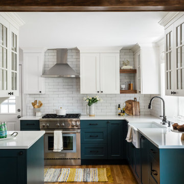
他の地域にあるお手頃価格の中くらいなサンタフェスタイルのおしゃれなキッチン (エプロンフロントシンク、シェーカースタイル扉のキャビネット、青いキャビネット、木材カウンター、マルチカラーのキッチンパネル、セラミックタイルのキッチンパネル、シルバーの調理設備、無垢フローリング、白いキッチンカウンター、表し梁) の写真
Builder: Michels homes
Design: Megan Dent, Studio M Kitchen & Bath
ミネアポリスにあるラグジュアリーな広いシャビーシック調のおしゃれなキッチン (エプロンフロントシンク、落し込みパネル扉のキャビネット、青いキャビネット、御影石カウンター、ベージュキッチンパネル、セラミックタイルのキッチンパネル、シルバーの調理設備、無垢フローリング、茶色い床、ベージュのキッチンカウンター、表し梁) の写真
ミネアポリスにあるラグジュアリーな広いシャビーシック調のおしゃれなキッチン (エプロンフロントシンク、落し込みパネル扉のキャビネット、青いキャビネット、御影石カウンター、ベージュキッチンパネル、セラミックタイルのキッチンパネル、シルバーの調理設備、無垢フローリング、茶色い床、ベージュのキッチンカウンター、表し梁) の写真
サンクトペテルブルクにある広い北欧スタイルのおしゃれなキッチン (アンダーカウンターシンク、シェーカースタイル扉のキャビネット、青いキャビネット、グレーのキッチンパネル、パネルと同色の調理設備、磁器タイルの床、アイランドなし、グレーの床、グレーのキッチンカウンター、表し梁) の写真
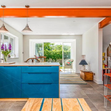
Sun, sand, surf, and some homosexuality. Welcome to Ptown! Our home is inspired by summer breezes, local flair, and a passion for togetherness. We created layers using natural fibers, textual grasscloths, “knotty” artwork, and one-of-a-kind vintage finds. Brass metals, exposed ceiling planks, and unkempt linens provide beachside casualness.
ダラスにあるラグジュアリーな巨大なトラディショナルスタイルのおしゃれなキッチン (アンダーカウンターシンク、落し込みパネル扉のキャビネット、青いキャビネット、クオーツストーンカウンター、木材のキッチンパネル、カラー調理設備、無垢フローリング、グレーのキッチンカウンター、表し梁) の写真
This 1940’s Colonial style home in Boston’s Jamaica Plain had strong bones and rich character but lacked the space, modern conveniences, and storage that our clients desired. While they wished to retain the look of the exterior, as well as some of the home’s unique original features,, the kitchen and dining room needed to be reimagined in design, layout, and functionality.
Key considerations were the compact size of the home and a smaller lot that didn’t give our client the flexibility of an addition. Without adding on to the existing floor plan, we needed to find a way to gain vital extra space in the kitchen, which, with walls enclosing it on all sides, was dark and disconnected from the rest of the house. Our design team coordinated with our client to reconfigure the space by opening up the wall between the dining room and the kitchen to add a few extra inches – just enough to create an open flow between the two rooms. With the removal of that wall, the formerly dark kitchen was flooded with the natural light coming from the existing dining room windows, making the entire space feel brighter and more cohesive.
The original kitchen dated back to the mid-20th century and lacked, among other conveniences, a dishwasher, enough storage, or even countertop space for food prep. In redesigning the kitchen, we visually expanded the space by incorporating white upper cabinetry, open shelving, and white subway tiles extending from the backsplash to the ceiling. A new, larger window featuring a deep stone sill brought in even more light, and the appliances and apron sink were selected to retain the traditional look of the home while delivering modern functionality.
Considering how our client would use this space, we focused on creating a purposeful workspace and storage, ensuring that there was ample countertop space and cabinetry between the sink and range. A multi-purpose cabinet and countertop which serves as a microwave station and food service area were added to the backside of the dining room wall, packing a lot of utility into a small space.
Prior to this renovation, our client had painted the dining room in Mount Saint Anne by Benjamin Moore, a tranquil blue-gray that suited the room well and allowed the original built-in corner cabinetry to stand out, highlighting the home’s charm. With the newly opened floor plan extending into the kitchen, we selected a deep custom color for the base cabinets, Yorktowne Green by Benjamin Moore, to complement the dining room and pull all of the elements together in a cohesive space.
This transformation was remarkable, both functionally and visually. The kitchen is now a bright and inviting space that flows seamlessly into the rest of the house. The homeowners are thrilled with the results, and the small changes we incorporated that made a big difference in the overall feel and functionality of the space.
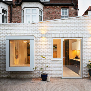
Amos Goldreich Architecture has completed an asymmetric brick extension that celebrates light and modern life for a young family in North London. The new layout gives the family distinct kitchen, dining and relaxation zones, and views to the large rear garden from numerous angles within the home.
The owners wanted to update the property in a way that would maximise the available space and reconnect different areas while leaving them clearly defined. Rather than building the common, open box extension, Amos Goldreich Architecture created distinctly separate yet connected spaces both externally and internally using an asymmetric form united by pale white bricks.
Previously the rear plan of the house was divided into a kitchen, dining room and conservatory. The kitchen and dining room were very dark; the kitchen was incredibly narrow and the late 90’s UPVC conservatory was thermally inefficient. Bringing in natural light and creating views into the garden where the clients’ children often spend time playing were both important elements of the brief. Amos Goldreich Architecture designed a large X by X metre box window in the centre of the sitting room that offers views from both the sitting area and dining table, meaning the clients can keep an eye on the children while working or relaxing.
Amos Goldreich Architecture enlivened and lightened the home by working with materials that encourage the diffusion of light throughout the spaces. Exposed timber rafters create a clever shelving screen, functioning both as open storage and a permeable room divider to maintain the connection between the sitting area and kitchen. A deep blue kitchen with plywood handle detailing creates balance and contrast against the light tones of the pale timber and white walls.
The new extension is clad in white bricks which help to bounce light around the new interiors, emphasise the freshness and newness, and create a clear, distinct separation from the existing part of the late Victorian semi-detached London home. Brick continues to make an impact in the patio area where Amos Goldreich Architecture chose to use Stone Grey brick pavers for their muted tones and durability. A sedum roof spans the entire extension giving a beautiful view from the first floor bedrooms. The sedum roof also acts to encourage biodiversity and collect rainwater.
Continues
Amos Goldreich, Director of Amos Goldreich Architecture says:
“The Framework House was a fantastic project to work on with our clients. We thought carefully about the space planning to ensure we met the brief for distinct zones, while also keeping a connection to the outdoors and others in the space.
“The materials of the project also had to marry with the new plan. We chose to keep the interiors fresh, calm, and clean so our clients could adapt their future interior design choices easily without the need to renovate the space again.”
Clients, Tom and Jennifer Allen say:
“I couldn’t have envisioned having a space like this. It has completely changed the way we live as a family for the better. We are more connected, yet also have our own spaces to work, eat, play, learn and relax.”
“The extension has had an impact on the entire house. When our son looks out of his window on the first floor, he sees a beautiful planted roof that merges with the garden.”
サンフランシスコにあるトランジショナルスタイルのおしゃれなキッチン (エプロンフロントシンク、シェーカースタイル扉のキャビネット、青いキャビネット、白いキッチンパネル、シルバーの調理設備、無垢フローリング、茶色い床、白いキッチンカウンター、表し梁、三角天井、板張り天井) の写真
Builder: Michels Homes
Design: Megan Dent, Studio M Kitchen & Bath
ミネアポリスにあるラグジュアリーな広いトラディショナルスタイルのおしゃれなキッチン (エプロンフロントシンク、落し込みパネル扉のキャビネット、青いキャビネット、御影石カウンター、ベージュキッチンパネル、セラミックタイルのキッチンパネル、シルバーの調理設備、無垢フローリング、茶色い床、ベージュのキッチンカウンター、表し梁) の写真
ミネアポリスにあるラグジュアリーな広いトラディショナルスタイルのおしゃれなキッチン (エプロンフロントシンク、落し込みパネル扉のキャビネット、青いキャビネット、御影石カウンター、ベージュキッチンパネル、セラミックタイルのキッチンパネル、シルバーの調理設備、無垢フローリング、茶色い床、ベージュのキッチンカウンター、表し梁) の写真
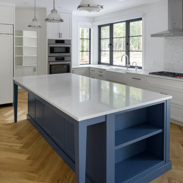
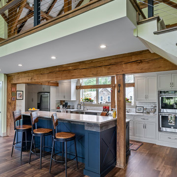
Fall in love with this Beautiful Modern Country Farmhouse nestled in Cobble Hill BC.
This Farmhouse has an ideal design for a family home, sprawled on 2 levels that are perfect for daily family living a well as entertaining guests and hosting special celebrations.
This gorgeous kitchen boasts beautiful fir beams with herringbone floors.
ハンプシャーにある広いモダンスタイルのおしゃれなキッチン (アンダーカウンターシンク、フラットパネル扉のキャビネット、青いキャビネット、白いキッチンパネル、シルバーの調理設備、セメントタイルの床、アイランドなし、グレーの床、グレーのキッチンカウンター、表し梁) の写真
THE PROBLEM
Our client adores their traditional layout and their traditional design style. But there were a few things that could be improved including flow and functionality in the kitchen - not to mention the cabinets, counters and appliances that had seen better days. The family room was used heavily for movie viewing, but it did not have a great set-up for the TV and was seriously lacking in the audio department. Their garage entry had become the primary way into the home for the homeowners, however it did not offer the welcoming feeling they wanted to have after a long day.
THE SOLUTION
To create better flow, we shifted the entry from the mud hall down a bit which gave us the space to add another run of cabinetry and relocate the fridge. We closed up the former dining room wall and converted it into a new office space as both homeowners work from home. Due to the shift in the entry from the mud hall, we also were able to then center the island to where it should be in the room creating some much needed balance.
Because we were not creating an open floor plan and removing walls and such, there was more budget for high ticket finishes. One of which was a 11’ custom walnut countertop for the island which became the anchoring design element for the kitchen along with custom cabinetry and high-end appliances.
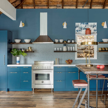
The renovation of a mid century cottage on the lake, now serves as a guest house. The renovation preserved the original architectural elements such as the ceiling and original stone fireplace to preserve the character, personality and history and provide the inspiration and canvas to which everything else would be added. To prevent the space from feeling dark & too rustic, the lines were kept clean, the furnishings modern and the use of saturated color was strategically placed throughout.
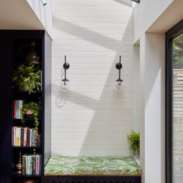
Large airy open plan kitchen, flooded with natural light opening onto the garden. Hand made timber units, with feature copper lights, antique timber floor and window seat.
Amos Goldreich Architecture has completed an asymmetric brick extension that celebrates light and modern life for a young family in North London. The new layout gives the family distinct kitchen, dining and relaxation zones, and views to the large rear garden from numerous angles within the home.
The owners wanted to update the property in a way that would maximise the available space and reconnect different areas while leaving them clearly defined. Rather than building the common, open box extension, Amos Goldreich Architecture created distinctly separate yet connected spaces both externally and internally using an asymmetric form united by pale white bricks.
Previously the rear plan of the house was divided into a kitchen, dining room and conservatory. The kitchen and dining room were very dark; the kitchen was incredibly narrow and the late 90’s UPVC conservatory was thermally inefficient. Bringing in natural light and creating views into the garden where the clients’ children often spend time playing were both important elements of the brief. Amos Goldreich Architecture designed a large X by X metre box window in the centre of the sitting room that offers views from both the sitting area and dining table, meaning the clients can keep an eye on the children while working or relaxing.
Amos Goldreich Architecture enlivened and lightened the home by working with materials that encourage the diffusion of light throughout the spaces. Exposed timber rafters create a clever shelving screen, functioning both as open storage and a permeable room divider to maintain the connection between the sitting area and kitchen. A deep blue kitchen with plywood handle detailing creates balance and contrast against the light tones of the pale timber and white walls.
The new extension is clad in white bricks which help to bounce light around the new interiors, emphasise the freshness and newness, and create a clear, distinct separation from the existing part of the late Victorian semi-detached London home. Brick continues to make an impact in the patio area where Amos Goldreich Architecture chose to use Stone Grey brick pavers for their muted tones and durability. A sedum roof spans the entire extension giving a beautiful view from the first floor bedrooms. The sedum roof also acts to encourage biodiversity and collect rainwater.
Continues
Amos Goldreich, Director of Amos Goldreich Architecture says:
“The Framework House was a fantastic project to work on with our clients. We thought carefully about the space planning to ensure we met the brief for distinct zones, while also keeping a connection to the outdoors and others in the space.
“The materials of the project also had to marry with the new plan. We chose to keep the interiors fresh, calm, and clean so our clients could adapt their future interior design choices easily without the need to renovate the space again.”
Clients, Tom and Jennifer Allen say:
“I couldn’t have envisioned having a space like this. It has completely changed the way we live as a family for the better. We are more connected, yet also have our own spaces to work, eat, play, learn and relax.”
“The extension has had an impact on the entire house. When our son looks out of his window on the first floor, he sees a beautiful planted roof that merges with the garden.”
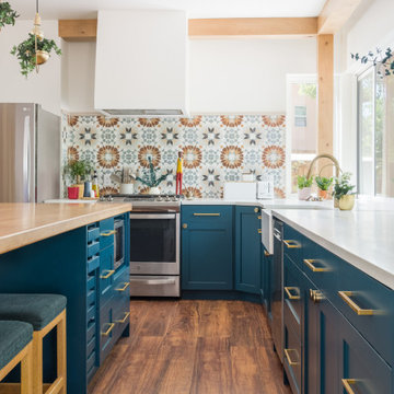
他の地域にあるお手頃価格の中くらいなエクレクティックスタイルのおしゃれなキッチン (エプロンフロントシンク、シェーカースタイル扉のキャビネット、青いキャビネット、木材カウンター、マルチカラーのキッチンパネル、セラミックタイルのキッチンパネル、シルバーの調理設備、無垢フローリング、白いキッチンカウンター、表し梁) の写真
Custom light grey inset cabinetry with a blue accent island to make the space come alive. Left the timber of the barn exposed to warm the space.
フィラデルフィアにある高級な中くらいなカントリー風のおしゃれなキッチン (エプロンフロントシンク、シェーカースタイル扉のキャビネット、青いキャビネット、クオーツストーンカウンター、白いキッチンパネル、磁器タイルのキッチンパネル、シルバーの調理設備、無垢フローリング、茶色い床、白いキッチンカウンター、表し梁) の写真
フィラデルフィアにある高級な中くらいなカントリー風のおしゃれなキッチン (エプロンフロントシンク、シェーカースタイル扉のキャビネット、青いキャビネット、クオーツストーンカウンター、白いキッチンパネル、磁器タイルのキッチンパネル、シルバーの調理設備、無垢フローリング、茶色い床、白いキッチンカウンター、表し梁) の写真
キッチン (青いキャビネット、表し梁) の写真
1