白い家の外観の写真
絞り込み:
資材コスト
並び替え:今日の人気順
写真 1〜20 枚目(全 180 枚)
1/4
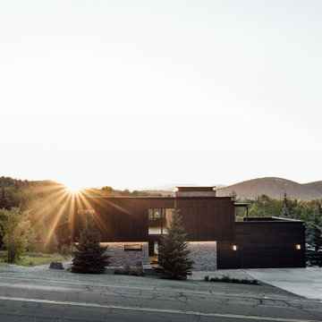
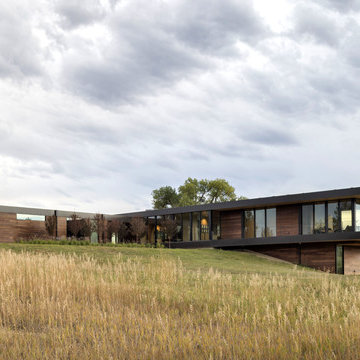
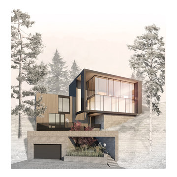
The exterior façade of the home is reminiscent of the 50’s with its mixed material aesthetic. The stacked stone veneer is complimented with the Shou Sugi Ban siding. The burned wood finish is an ancient Japanese technique that chars the wood, essentially wrapping it in carbon, adding protection and durability against mold, insects, and moisture related decay. This impressive burned wood finish is not only an indelible product but eye-catching as well. The horizontal and vertical orientation of the wood planks further emphasize the width and height of the structure. The subtle play of each material is simplistic and functional.
The home is able to take full advantage of views with the use of Glo’s A7 triple pane windows and doors. The energy-efficient series boasts triple pane glazing, a larger thermal break, high-performance spacers, and multiple air-seals. The large picture windows frame the landscape while maintaining comfortable interior temperatures year-round. The strategically placed operable windows throughout the residence offer cross-ventilation and a visual connection to the sweeping views of Utah. The modern hardware and color selection of the windows are not only aesthetically exceptional, but remain true to the mid-century modern design.
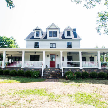
Complete home exterior redone from ranch style to modern farmhouse.
ロサンゼルスにあるラグジュアリーなカントリー風のおしゃれな家の外観 (下見板張り) の写真
ロサンゼルスにあるラグジュアリーなカントリー風のおしゃれな家の外観 (下見板張り) の写真
raked limestone and smooth stucco landscape walls guide visitors through the entry courtyard and toward the glass front door
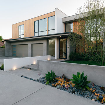
オレンジカウンティにある高級なモダンスタイルのおしゃれな家の外観の写真
オレンジカウンティにある高級なモダンスタイルのおしゃれな家の外観の写真
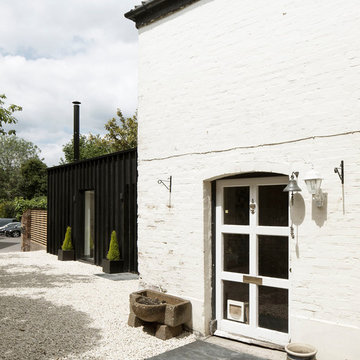
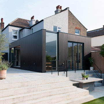
Photography by Richard Chivers https://www.rchivers.co.uk/
Marshall House is an extension to a Grade II listed dwelling in the village of Twyford, near Winchester, Hampshire. The original house dates from the 17th Century, although it had been remodelled and extended during the late 18th Century.
The clients contacted us to explore the potential to extend their home in order to suit their growing family and active lifestyle. Due to the constraints of living in a listed building, they were unsure as to what development possibilities were available. The brief was to replace an existing lean-to and 20th century conservatory with a new extension in a modern, contemporary approach. The design was developed in close consultation with the local authority as well as their historic environment department, in order to respect the existing property and work to achieve a positive planning outcome.
Like many older buildings, the dwelling had been adjusted here and there, and updated at numerous points over time. The interior of the existing property has a charm and a character - in part down to the age of the property, various bits of work over time and the wear and tear of the collective history of its past occupants. These spaces are dark, dimly lit and cosy. They have low ceilings, small windows, little cubby holes and odd corners. Walls are not parallel or perpendicular, there are steps up and down and places where you must watch not to bang your head.
The extension is accessed via a small link portion that provides a clear distinction between the old and new structures. The initial concept is centred on the idea of contrasts. The link aims to have the effect of walking through a portal into a seemingly different dwelling, that is modern, bright, light and airy with clean lines and white walls. However, complementary aspects are also incorporated, such as the strategic placement of windows and roof lights in order to cast light over walls and corners to create little nooks and private views. The overall form of the extension is informed by the awkward shape and uses of the site, resulting in the walls not being parallel in plan and splaying out at different irregular angles.
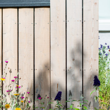
Externally, timber larch cladding is used as the primary material. This is painted black with a heavy duty barn paint, that is both long lasting and cost effective. The black finish of the extension contrasts with the white painted brickwork at the rear and side of the original house. The external colour palette of both structures is in opposition to the reality of the interior spaces. Although timber cladding is a fairly standard, commonplace material, visual depth and distinction has been created through the articulation of the boards. The inclusion of timber fins changes the way shadows are cast across the external surface during the day. Whilst at night, these are illuminated by external lighting.
A secondary entrance to the house is provided through a concealed door that is finished to match the profile of the cladding. This opens to a boot/utility room, from which a new shower room can be accessed, before proceeding to the new open plan living space and dining area.
外観写真・玄関正面・
非住宅地での住宅の佇まい方を考慮し、外観は箱型とし、プライバシーを確保するために道路に面した窓を少なくした。屋上すべてがルーフテラスであるがその存在も消すように計画した。
設計監理: アソトシヒロデザインオフィス
写真撮影:鳥村鋼一
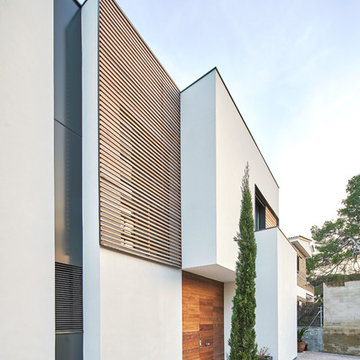
東京23区にあるコンテンポラリースタイルのおしゃれな家の外観の写真
東京23区にあるコンテンポラリースタイルのおしゃれな家の外観の写真
Rear and Side Facade with concrete built in seating and stairs
ロンドンにあるお手頃価格の中くらいなコンテンポラリースタイルのおしゃれな家の外観 (デュープレックス、混合材屋根) の写真
ロンドンにあるお手頃価格の中くらいなコンテンポラリースタイルのおしゃれな家の外観 (デュープレックス、混合材屋根) の写真
Front View.
Home designed by Hollman Cortes
ATLCAD Architectural Services.
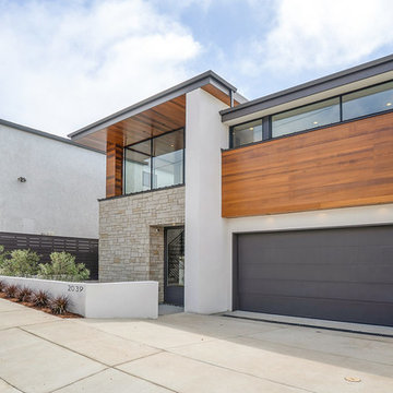
アトランタにあるお手頃価格の中くらいなモダンスタイルのおしゃれな家の外観 (混合材屋根) の写真
アトランタにあるお手頃価格の中くらいなモダンスタイルのおしゃれな家の外観 (混合材屋根) の写真
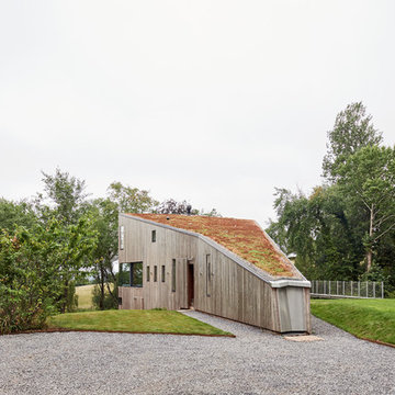
Timber clad extension to replace a conservatory
エディンバラにあるお手頃価格の中くらいなコンテンポラリースタイルのおしゃれな家の外観 (縦張り) の写真
エディンバラにあるお手頃価格の中くらいなコンテンポラリースタイルのおしゃれな家の外観 (縦張り) の写真
Helle und freundliche Wohnräume im Inneren des Anbaus.
Bildquelle: Wiese und Heckmann GmbH
他の地域にあるコンテンポラリースタイルのおしゃれな家の外観の写真
他の地域にあるコンテンポラリースタイルのおしゃれな家の外観の写真
sebastian kolm architekturfotografie
ニュルンベルクにあるモダンスタイルのおしゃれな家の外観の写真
ニュルンベルクにあるモダンスタイルのおしゃれな家の外観の写真
白い家の外観の写真
1