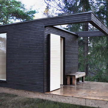
小さな黒い家の外観の写真
絞り込み:
資材コスト
並び替え:今日の人気順
写真 1〜20 枚目(全 162 枚)
1/5
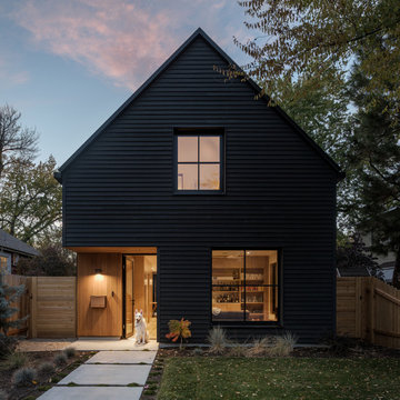
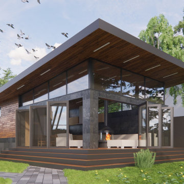
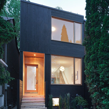
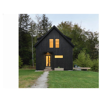
The artfully designed Boise Passive House is tucked in a mature neighborhood, surrounded by 1930’s bungalows. The architect made sure to insert the modern 2,000 sqft. home with intention and a nod to the charm of the adjacent homes. Its classic profile gleams from days of old while bringing simplicity and design clarity to the façade.
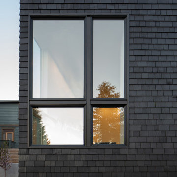
The 3 bed/2.5 bath home is situated on 3 levels, taking full advantage of the otherwise limited lot. Guests are welcomed into the home through a full-lite entry door, providing natural daylighting to the entry and front of the home. The modest living space persists in expanding its borders through large windows and sliding doors throughout the family home. Intelligent planning, thermally-broken aluminum windows, well-sized overhangs, and Selt external window shades work in tandem to keep the home’s interior temps and systems manageable and within the scope of the stringent PHIUS standards.
![[Out] Building](https://st.hzcdn.com/fimgs/pictures/exteriors/out-building-from-in-form-llc-img~369148ed0de93242_2178-1-082b54f-w360-h360-b0-p0.jpg)
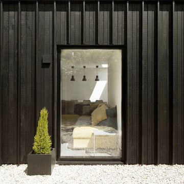
The identity of the exterior architecture is heavy, grounded, dark, and subtly reflective. The gabled geometries stack and shift to clearly identify he modest, covered entry portal.
Photography by Richard Chivers https://www.rchivers.co.uk/
Marshall House is an extension to a Grade II listed dwelling in the village of Twyford, near Winchester, Hampshire. The original house dates from the 17th Century, although it had been remodelled and extended during the late 18th Century.
The clients contacted us to explore the potential to extend their home in order to suit their growing family and active lifestyle. Due to the constraints of living in a listed building, they were unsure as to what development possibilities were available. The brief was to replace an existing lean-to and 20th century conservatory with a new extension in a modern, contemporary approach. The design was developed in close consultation with the local authority as well as their historic environment department, in order to respect the existing property and work to achieve a positive planning outcome.
Like many older buildings, the dwelling had been adjusted here and there, and updated at numerous points over time. The interior of the existing property has a charm and a character - in part down to the age of the property, various bits of work over time and the wear and tear of the collective history of its past occupants. These spaces are dark, dimly lit and cosy. They have low ceilings, small windows, little cubby holes and odd corners. Walls are not parallel or perpendicular, there are steps up and down and places where you must watch not to bang your head.
The extension is accessed via a small link portion that provides a clear distinction between the old and new structures. The initial concept is centred on the idea of contrasts. The link aims to have the effect of walking through a portal into a seemingly different dwelling, that is modern, bright, light and airy with clean lines and white walls. However, complementary aspects are also incorporated, such as the strategic placement of windows and roof lights in order to cast light over walls and corners to create little nooks and private views. The overall form of the extension is informed by the awkward shape and uses of the site, resulting in the walls not being parallel in plan and splaying out at different irregular angles.
Externally, timber larch cladding is used as the primary material. This is painted black with a heavy duty barn paint, that is both long lasting and cost effective. The black finish of the extension contrasts with the white painted brickwork at the rear and side of the original house. The external colour palette of both structures is in opposition to the reality of the interior spaces. Although timber cladding is a fairly standard, commonplace material, visual depth and distinction has been created through the articulation of the boards. The inclusion of timber fins changes the way shadows are cast across the external surface during the day. Whilst at night, these are illuminated by external lighting.
A secondary entrance to the house is provided through a concealed door that is finished to match the profile of the cladding. This opens to a boot/utility room, from which a new shower room can be accessed, before proceeding to the new open plan living space and dining area.
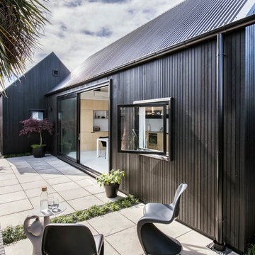
At night the house glows lantern-like in the street, with fun contrast between the black and white cladding.
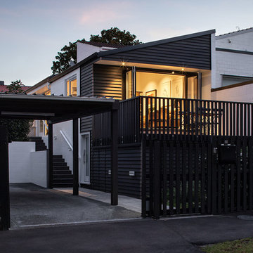
オークランドにある高級な小さなコンテンポラリースタイルのおしゃれな家の外観 (タウンハウス、混合材屋根) の写真
オークランドにある高級な小さなコンテンポラリースタイルのおしゃれな家の外観 (タウンハウス、混合材屋根) の写真
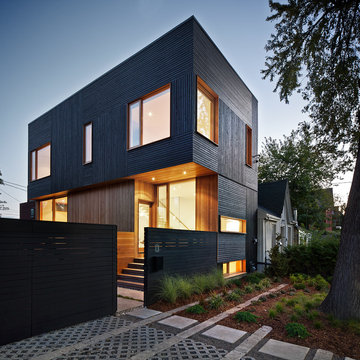
Martin Dufour architecte
Photographe: Ulysse Lemerise
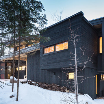
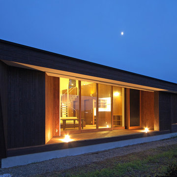
モントリオールにある小さなラスティックスタイルのおしゃれな家の外観の写真
モントリオールにある小さなラスティックスタイルのおしゃれな家の外観の写真
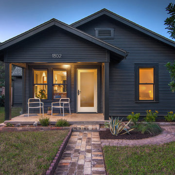
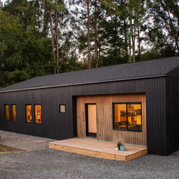
The project’s goal is to introduce more affordable contemporary homes for Triangle Area housing. This 1,800 SF modern ranch-style residence takes its shape from the archetypal gable form and helps to integrate itself into the neighborhood. Although the house presents a modern intervention, the project’s scale and proportional parameters integrate into its context.
Natural light and ventilation are passive goals for the project. A strong indoor-outdoor connection was sought by establishing views toward the wooded landscape and having a deck structure weave into the public area. North Carolina’s natural textures are represented in the simple black and tan palette of the facade.
小さな黒い家の外観の写真
1