高級な家の外観 (緑化屋根) の写真
絞り込み:
資材コスト
並び替え:今日の人気順
写真 1〜20 枚目(全 28 枚)
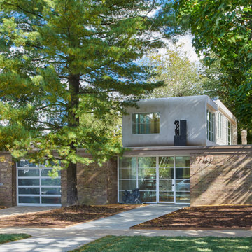
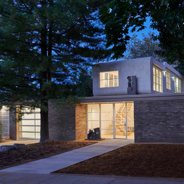
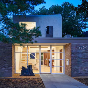
Designed in 1970 for an art collector, the existing referenced 70’s architectural principles. With its cadence of ‘70’s brick masses punctuated by a garage and a 4-foot-deep entrance recess. This recess, however, didn’t convey to the interior, which was occupied by disjointed service spaces. To solve, service spaces are moved and reorganized in open void in the garage. (See plan) This also organized the home: Service & utility on the left, reception central, and communal living spaces on the right.
To maintain clarity of the simple one-story 70’s composition, the second story add is recessive. A flex-studio/extra bedroom and office are designed ensuite creating a slender form and orienting them front to back and setting it back allows the add recede. Curves create a definite departure from the 70s home and by detailing it to "hover like a thought" above the first-floor roof and mentally removable sympathetic add.Existing unrelenting interior walls and a windowless entry, although ideal for fine art was unconducive for the young family of three. Added glass at the front recess welcomes light view and the removal of interior walls not only liberate rooms to communicate with each other but also reinform the cleared central entry space as a hub.
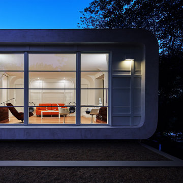
Even though the renovation reinforms its relationship with art, the joy and appreciation of art was not dismissed. A metal sculpture lost in the corner of the south side yard bumps the sculpture at the front entrance to the kitchen terrace over an added pedestal. (See plans) Since the roof couldn’t be railed without compromising the one-story '70s composition, the sculpture garden remains physically inaccessible however mirrors flanking the chimney allow the sculptures to be appreciated in three dimensions. The mirrors also afford privacy from the adjacent Tudor's large master bedroom addition 16-feet away.
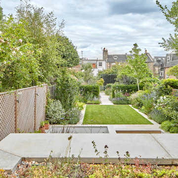
The new extension included a big rooflight almost taking the whole space of the roof. A Wildflower roof edge was included to soften the impact of the new extension and allow for views form the formal dining room at first floor.
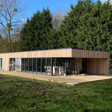
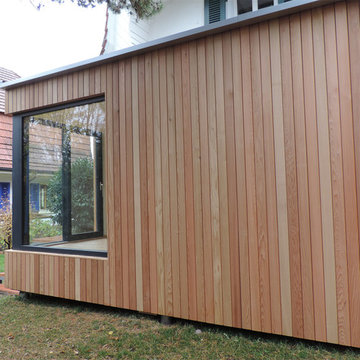
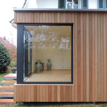
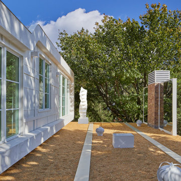
Garden pavilion for long term Client providing family space, home studio and office.
The project focused on the connection between the varied garden landscape and the existing property on site.
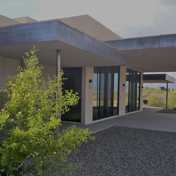
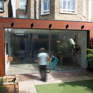
Cold rolled steel fascia accents the deep overhangs over the exposed aggregate porch in the contemporary home. Design and photo by Mary K Clark.
フェニックスにある高級なコンテンポラリースタイルのおしゃれな家の外観 (漆喰サイディング、緑化屋根) の写真
フェニックスにある高級なコンテンポラリースタイルのおしゃれな家の外観 (漆喰サイディング、緑化屋根) の写真
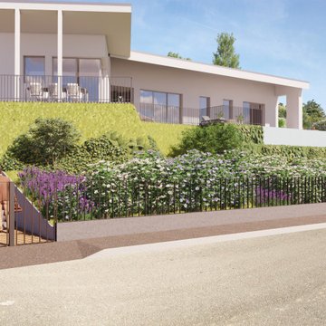
Il progetto architettonico si inserisce armoniosamente nel paesaggio delle colline moreniche a sud del lago di Garda verso Mantova, rispettando la natura circostante e l'antica storia del luogo. L'edificio, sviluppato su un unico piano e composto da due volumi, si integra perfettamente con i vigneti, gli uliveti e i boschi circostanti, minimizzando l'impatto paesaggistico.
Big sliding doors integrate the inside and outside of the house. The nice small framed aluminium doors are as high as the extension.
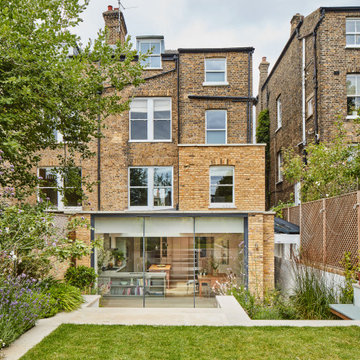
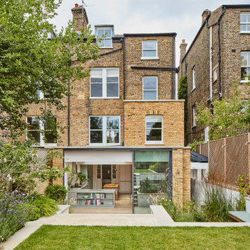
ロンドンにある高級なコンテンポラリースタイルのおしゃれな家の外観 (レンガサイディング、デュープレックス、緑化屋根) の写真
ロンドンにある高級なコンテンポラリースタイルのおしゃれな家の外観 (レンガサイディング、デュープレックス、緑化屋根) の写真
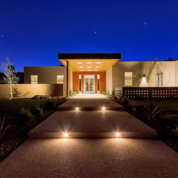
This is the walk-up entrance from the street. The nighttime lighting and details really show through in this picture. The shape, design and dimension here is incredible. Simple yet sophisticated. The low maintenance drought tolerant landscape can also be seen here.
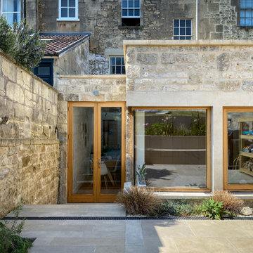
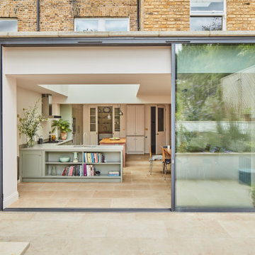
A single storey rear extension to a grade II listed Georgian townhouse in Bath. The design combines contemporary and traditional styles for a timeless effect. Oak windows and doors including a cantilevered glass corner are combined with Bath rubble stone and ashlar window surrounds.
Designed in 1970 for an art collector, the existing referenced 70’s architectural principles. With its cadence of ‘70’s brick masses punctuated by a garage and a 4-foot-deep entrance recess. This recess, however, didn’t convey to the interior, which was occupied by disjointed service spaces. To solve, service spaces are moved and reorganized in open void in the garage. (See plan) This also organized the home: Service & utility on the left, reception central, and communal living spaces on the right.
To maintain clarity of the simple one-story 70’s composition, the second story add is recessive. A flex-studio/extra bedroom and office are designed ensuite creating a slender form and orienting them front to back and setting it back allows the add recede. Curves create a definite departure from the 70s home and by detailing it to "hover like a thought" above the first-floor roof and mentally removable sympathetic add.Existing unrelenting interior walls and a windowless entry, although ideal for fine art was unconducive for the young family of three. Added glass at the front recess welcomes light view and the removal of interior walls not only liberate rooms to communicate with each other but also reinform the cleared central entry space as a hub.
Even though the renovation reinforms its relationship with art, the joy and appreciation of art was not dismissed. A metal sculpture lost in the corner of the south side yard bumps the sculpture at the front entrance to the kitchen terrace over an added pedestal. (See plans) Since the roof couldn’t be railed without compromising the one-story '70s composition, the sculpture garden remains physically inaccessible however mirrors flanking the chimney allow the sculptures to be appreciated in three dimensions. The mirrors also afford privacy from the adjacent Tudor's large master bedroom addition 16-feet away.
Big sliding doors integrate the inside and outside of the house. The nice small framed aluminium doors are as high as the extension.
ロンドンにある高級なコンテンポラリースタイルのおしゃれな家の外観 (レンガサイディング、デュープレックス、緑化屋根) の写真
ロンドンにある高級なコンテンポラリースタイルのおしゃれな家の外観 (レンガサイディング、デュープレックス、緑化屋根) の写真
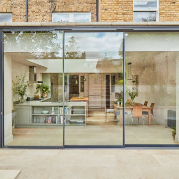
Big sliding doors integrate the inside and outside of the house. The nice small framed aluminium doors are as high as the extension.
ロンドンにある高級なコンテンポラリースタイルのおしゃれな家の外観 (レンガサイディング、デュープレックス、緑化屋根) の写真
ロンドンにある高級なコンテンポラリースタイルのおしゃれな家の外観 (レンガサイディング、デュープレックス、緑化屋根) の写真
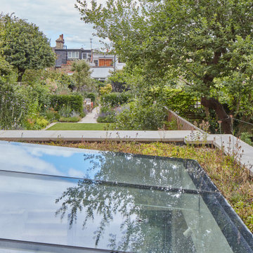
The new extension included a big rooflight almost taking the whole space of the roof. A Wildflower roof edge was included to soften the impact of the new extension and allow for views form the formal dining room at first floor.
Designed in 1970 for an art collector, the existing referenced 70’s architectural principles. With its cadence of ‘70’s brick masses punctuated by a garage and a 4-foot-deep entrance recess. This recess, however, didn’t convey to the interior, which was occupied by disjointed service spaces. To solve, service spaces are moved and reorganized in open void in the garage. (See plan) This also organized the home: Service & utility on the left, reception central, and communal living spaces on the right.
To maintain clarity of the simple one-story 70’s composition, the second story add is recessive. A flex-studio/extra bedroom and office are designed ensuite creating a slender form and orienting them front to back and setting it back allows the add recede. Curves create a definite departure from the 70s home and by detailing it to "hover like a thought" above the first-floor roof and mentally removable sympathetic add.Existing unrelenting interior walls and a windowless entry, although ideal for fine art was unconducive for the young family of three. Added glass at the front recess welcomes light view and the removal of interior walls not only liberate rooms to communicate with each other but also reinform the cleared central entry space as a hub.
Even though the renovation reinforms its relationship with art, the joy and appreciation of art was not dismissed. A metal sculpture lost in the corner of the south side yard bumps the sculpture at the front entrance to the kitchen terrace over an added pedestal. (See plans) Since the roof couldn’t be railed without compromising the one-story '70s composition, the sculpture garden remains physically inaccessible however mirrors flanking the chimney allow the sculptures to be appreciated in three dimensions. The mirrors also afford privacy from the adjacent Tudor's large master bedroom addition 16-feet away.
Big sliding doors integrate the inside and outside of the house. The nice small framed aluminium doors are as high as the extension.
ロンドンにある高級なコンテンポラリースタイルのおしゃれな家の外観 (レンガサイディング、デュープレックス、緑化屋根) の写真
ロンドンにある高級なコンテンポラリースタイルのおしゃれな家の外観 (レンガサイディング、デュープレックス、緑化屋根) の写真
Designed in 1970 for an art collector, the existing referenced 70’s architectural principles. With its cadence of ‘70’s brick masses punctuated by a garage and a 4-foot-deep entrance recess. This recess, however, didn’t convey to the interior, which was occupied by disjointed service spaces. To solve, service spaces are moved and reorganized in open void in the garage. (See plan) This also organized the home: Service & utility on the left, reception central, and communal living spaces on the right.
To maintain clarity of the simple one-story 70’s composition, the second story add is recessive. A flex-studio/extra bedroom and office are designed ensuite creating a slender form and orienting them front to back and setting it back allows the add recede. Curves create a definite departure from the 70s home and by detailing it to "hover like a thought" above the first-floor roof and mentally removable sympathetic add.Existing unrelenting interior walls and a windowless entry, although ideal for fine art was unconducive for the young family of three. Added glass at the front recess welcomes light view and the removal of interior walls not only liberate rooms to communicate with each other but also reinform the cleared central entry space as a hub.
Even though the renovation reinforms its relationship with art, the joy and appreciation of art was not dismissed. A metal sculpture lost in the corner of the south side yard bumps the sculpture at the front entrance to the kitchen terrace over an added pedestal. (See plans) Since the roof couldn’t be railed without compromising the one-story '70s composition, the sculpture garden remains physically inaccessible however mirrors flanking the chimney allow the sculptures to be appreciated in three dimensions. The mirrors also afford privacy from the adjacent Tudor's large master bedroom addition 16-feet away.
高級な家の外観 (緑化屋根) の写真
1