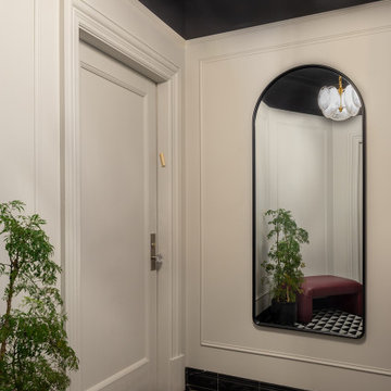
玄関 (磁器タイルの床、黒い床) の写真
絞り込み:
資材コスト
並び替え:今日の人気順
写真 1〜20 枚目(全 111 枚)
1/5
front entry w/ seating
トロントにあるお手頃価格の中くらいなコンテンポラリースタイルのおしゃれな玄関ロビー (白い壁、磁器タイルの床、黒い床、パネル壁) の写真
トロントにあるお手頃価格の中くらいなコンテンポラリースタイルのおしゃれな玄関ロビー (白い壁、磁器タイルの床、黒い床、パネル壁) の写真
Builder: John Kraemer & Sons | Photographer: Landmark Photography
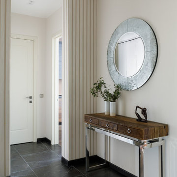
ミネアポリスにある中くらいなコンテンポラリースタイルのおしゃれな玄関ロビー (白い壁、磁器タイルの床、黒いドア、黒い床) の写真
ミネアポリスにある中くらいなコンテンポラリースタイルのおしゃれな玄関ロビー (白い壁、磁器タイルの床、黒いドア、黒い床) の写真
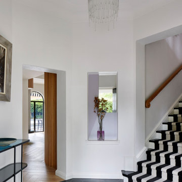
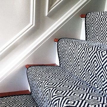
Large black and white art deco entryway with geometric concrete matt tiling from Perini matched with black and white stairway carpet runner. The project is a 1930s art deco Spanish mission-style house in Melbourne. See more from our Arch Deco Project.
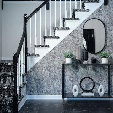
two story entry, two story entry light, black and white staircase, black and white carpet, modern entry light, wallpaper, tile floor
フィラデルフィアにある高級な中くらいなモダンスタイルのおしゃれな玄関ロビー (ベージュの壁、磁器タイルの床、黒いドア、黒い床、壁紙) の写真
フィラデルフィアにある高級な中くらいなモダンスタイルのおしゃれな玄関ロビー (ベージュの壁、磁器タイルの床、黒いドア、黒い床、壁紙) の写真
Welcome to the front vestibule of our Classic Six NYC apartment.
Classic Six is a six-room apartment floor plan found in buildings built in New York City prior to 1940. It consists of a formal dining room, a living room, a kitchen, two bedrooms, a smaller bedroom sometimes referred to as a maid's room, and one or two bathrooms.
Black, white and grey foyer with grasscloth wallpaper
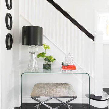
ニューヨークにある高級な小さなエクレクティックスタイルのおしゃれな玄関ロビー (グレーの壁、磁器タイルの床、黒いドア、黒い床) の写真
ニューヨークにある高級な小さなエクレクティックスタイルのおしゃれな玄関ロビー (グレーの壁、磁器タイルの床、黒いドア、黒い床) の写真
Download our free ebook, Creating the Ideal Kitchen. DOWNLOAD NOW
Lakefront property in the northwest suburbs of Chicago is hard to come by, so when we were hired by this young family with exactly that, we were immediately inspired by not just the unusually large footprint of this 1950’s colonial revival but also the lovely views of the manmade lake it was sited on. The large 5-bedroom home was solidly stuck in the 1980’s, but we saw tons of potential. We started out by updating the existing staircase with a fresh coat of paint and adding new herringbone slate to the entry hall.
The powder room off the entryway also got a refresh - new flooring, new cabinets and fixtures. We ran the new slate right through into this space for some consistency. A fun wallpaper and shiplap trim add a welcoming feel and set the tone for the home.
Next, we tackled the kitchen. Located away from the rest of the first floor, the kitchen felt a little isolated, so we immediately began planning for how to better connect it to the rest of the first floor. We landed on removing the wall between the kitchen and dining room and designed a modified galley style space with separate cooking and clean up zones. The cooking zone consists of the refrigerator, prep sink and cooktop, along with a nice long run of prep space at the island. The cleanup side of the kitchen consists of the main sink and dishwasher. Both areas are situated so that the user can view the lake during prep work and cleanup!
One of the home’s main puzzles was how to incorporate the mudroom and area in front of the patio doors at the back of the house. We already had a breakfast table area, so the space by the patio doors was a bit of a no man’s land. We decided to separate the kitchen proper from what became the new mudroom with a large set of barn doors. That way you can quickly hide any mudroom messes but have easy access to the light coming in through the patio doors as well as the outdoor grilling station. We also love the impact the barn doors add to the overall space.
The homeowners’ first words to us were “it’s time to ditch the brown,” so we did! We chose a lovely blue pallet that reflects the home’s location on the lake which is also vibrant yet easy on the eye. Countertops are white quartz, and the natural oak floor works well with the other honey accents. The breakfast table was given a refresh with new chairs, chandelier and window treatments that frame the gorgeous views of the lake out the back.
We coordinated the slate mudroom flooring with that used in the home’s main entrance for a consistent feel. The storage area consists of open and closed storage to allow for some clutter control as needed.
Next on our “to do” list was revamping the dated brown bar area in the neighboring dining room. We eliminated the clutter by adding some closed cabinets and did some easy updates to help the space feel more current. One snag we ran into here was the discovery of a beam above the existing open shelving that had to be modified with a smaller structural beam to allow for our new design to work. This was an unexpected surprise, but in the end we think it was well worth it!
We kept the colors here a bit more muted to blend with the homeowner’s existing furnishings. Open shelving and polished nickel hardware add some simple detail to the new entertainment zone which also looks out onto the lake!
Next we tackled the upstairs starting with the homeowner’s son’s bath. The bath originally had both a tub shower and a separate shower, so we decided to swap out the shower for a new laundry area. This freed up some space downstairs in what used to be the mudroom/laundry room and is much more convenient for daily laundry needs.
We continued the blue palette here with navy cabinetry and the navy tile in the shower. Porcelain floor tile and chrome fixtures keep maintenance to a minimum while matte black mirrors and lighting add some depth the design. A low maintenance runner adds some warmth underfoot and ties the whole space together.
We added a pocket door to the bathroom to minimize interference with the door swings. The left door of the laundry closet is on a 180 degree hinge to allow for easy full access to the machines. Next we tackled the master bath which is an en suite arrangement. The original was typical of the 1980’s with the vanity outside of the bathroom, situated near the master closet. And the brown theme continued here with multiple shades of brown.
Our first move was to segment off the bath and the closet from the master bedroom. We created a short hall from the bedroom to the bathroom with his and hers walk-in closets on the left and right as well as a separate toilet closet outside of the main bathroom for privacy and flexibility.
The original bathroom had a giant soaking tub with steps (dangerous!) as well as a small shower that did not work well for our homeowner who is 6’3”. With other bathtubs in the home, they decided to eliminate the tub and create an oversized shower which takes up the space where the old tub was located. The double vanity is on the opposite wall and a bench is located under the window for morning conversations and a place to set a couple of towels.
The pallet in here is light and airy with a mix of blond wood, creamy porcelain and marble tile, and brass accents. A simple roman shade adds some texture and it’s top-down mechanism allows for light and privacy.
This large whole house remodel gave our homeowners not only the ability to maximize the potential of their home but also created a lovely new frame from which to view their fabulous lake views.
Designed by: Susan Klimala, CKD, CBD
Photography by: Michael Kaskel
For more information on kitchen and bath design ideas go to: www.kitchenstudio-ge.com
Photography: Stephani Buchman
Floral: Bluebird Event Design
トロントにあるお手頃価格の中くらいなトランジショナルスタイルのおしゃれな玄関ロビー (白い壁、磁器タイルの床、黒い床) の写真
トロントにあるお手頃価格の中くらいなトランジショナルスタイルのおしゃれな玄関ロビー (白い壁、磁器タイルの床、黒い床) の写真
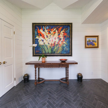
ニューヨークにあるお手頃価格の中くらいなカントリー風のおしゃれな玄関ロビー (磁器タイルの床、黒い床、塗装板張りの天井、塗装板張りの壁) の写真
Архитектор-дизайнер: Ирина Килина
Дизайнер: Екатерина Дудкина
サンクトペテルブルクにある中くらいなコンテンポラリースタイルのおしゃれな玄関ラウンジ (ベージュの壁、磁器タイルの床、黒い床、折り上げ天井、パネル壁) の写真
サンクトペテルブルクにある中くらいなコンテンポラリースタイルのおしゃれな玄関ラウンジ (ベージュの壁、磁器タイルの床、黒い床、折り上げ天井、パネル壁) の写真
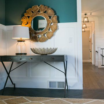
A welcoming foyer with board and batten painted woodwork on the walls. A mix of modern and rustic elements. The painted woodwork offsets this bold paint color. The color is repeated in the art over the stairs.
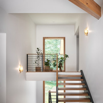
Midcentury Modern Foyer
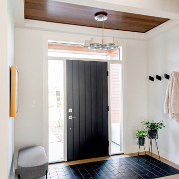
アトランタにある高級な中くらいなミッドセンチュリースタイルのおしゃれな玄関ロビー (白い壁、磁器タイルの床、黒いドア、黒い床、表し梁) の写真
アトランタにある高級な中くらいなミッドセンチュリースタイルのおしゃれな玄関ロビー (白い壁、磁器タイルの床、黒いドア、黒い床、表し梁) の写真
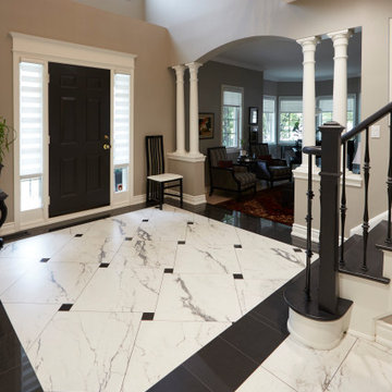
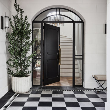
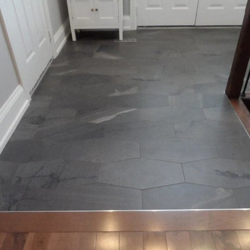
The entrance to the home. Since the kitchen tiles continued into the foyer, we decided to make the space feel grander and more special by defining the area with a different tile layout. Fortunately, the tiles we selected came in a few different sizes, which allowed us to be more creative. In the kitchen and hallway leading to the kitchen we used a standard stacked layout for the 12 x 24 tiles. In the foyer, we switched to 24 x 24 tiles and mixed them with small gloss black tiles for an interesting twist on the classic diagonal layout . We further delineated the 2-story space with a wide border of glossy black, adding formality to the columned entrance to the living room.
The clients opted to go the extra mile with their budget, so we took the bold entrance to the next level by refinishing the staircase in the same black and white scheme. Black paint on the front door was the final touch to make it all come together.
玄関 (磁器タイルの床、黒い床) の写真
1