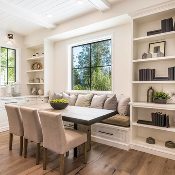
ダイニング (茶色い床) の写真
絞り込み:
資材コスト
並び替え:今日の人気順
写真 1〜20 枚目(全 66,980 枚)
1/2
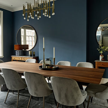
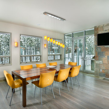
For this 1961 Mid-Century home we did a complete remodel while maintaining many existing features and our client’s bold furniture. We took our cues for style from our stylish clients; incorporating unique touches to create a home that feels very them. The result is a space that feels casual and modern but with wonderful character and texture as a backdrop.
The restrained yet bold color palette consists of dark neutrals, jewel tones, woven textures, handmade tiles, and antique rugs.
Winner of the 2018 Tour of Homes Best Remodel, this whole house re-design of a 1963 Bennet & Johnson mid-century raised ranch home is a beautiful example of the magic we can weave through the application of more sustainable modern design principles to existing spaces.
We worked closely with our client on extensive updates to create a modernized MCM gem.
Extensive alterations include:
- a completely redesigned floor plan to promote a more intuitive flow throughout
- vaulted the ceilings over the great room to create an amazing entrance and feeling of inspired openness
- redesigned entry and driveway to be more inviting and welcoming as well as to experientially set the mid-century modern stage
- the removal of a visually disruptive load bearing central wall and chimney system that formerly partitioned the homes’ entry, dining, kitchen and living rooms from each other
- added clerestory windows above the new kitchen to accentuate the new vaulted ceiling line and create a greater visual continuation of indoor to outdoor space
- drastically increased the access to natural light by increasing window sizes and opening up the floor plan
- placed natural wood elements throughout to provide a calming palette and cohesive Pacific Northwest feel
- incorporated Universal Design principles to make the home Aging In Place ready with wide hallways and accessible spaces, including single-floor living if needed
- moved and completely redesigned the stairway to work for the home’s occupants and be a part of the cohesive design aesthetic
- mixed custom tile layouts with more traditional tiling to create fun and playful visual experiences
- custom designed and sourced MCM specific elements such as the entry screen, cabinetry and lighting
- development of the downstairs for potential future use by an assisted living caretaker
- energy efficiency upgrades seamlessly woven in with much improved insulation, ductless mini splits and solar gain
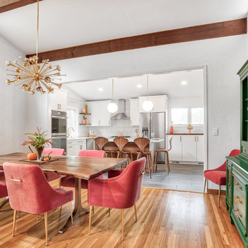
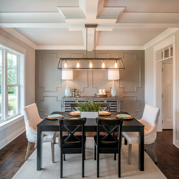
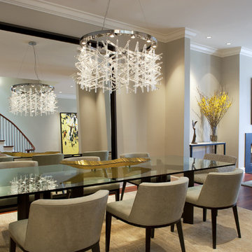
We took the wall down that originally divided these two rooms, combining them to make one beautiful dining/kitchen area.
Photos by Chris Veith.
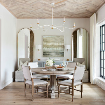
ニューヨークにある中くらいなミッドセンチュリースタイルのおしゃれなダイニングキッチン (白い壁、茶色い床、無垢フローリング) の写真
ニューヨークにある中くらいなミッドセンチュリースタイルのおしゃれなダイニングキッチン (白い壁、茶色い床、無垢フローリング) の写真
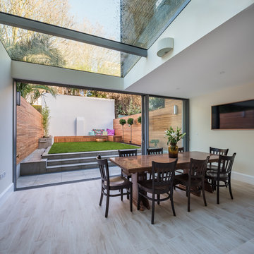
A contemporary refurbishment and extension of a Locally Listed mid-terraced Victorian house located within the East Canonbury Conservation Area.
This proposal secured planning permission to remodel and extend the lower ground floor of this mid-terrace property. Through a joint application with the adjoining neighbour to ensure that the symmetry and balance of the terrace is maintained, the house was also extended at 1st floor level. The lower ground floor now opens up to the rear garden while the glass roof ensures that daylight enters the heart of the house.
Jason Sandy www.AngleEyePhotography.com
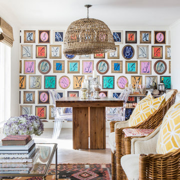
フィラデルフィアにあるカントリー風のおしゃれなダイニング (白い壁、濃色無垢フローリング、茶色い床) の写真
フィラデルフィアにあるカントリー風のおしゃれなダイニング (白い壁、濃色無垢フローリング、茶色い床) の写真
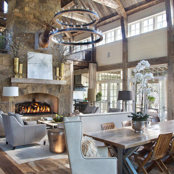
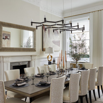
Level Three: A custom-designed chandelier with ocher-colored onyx pendants suits the dining room furnishings and space layout. Matching onyx sconces grace the window-wall behind the table.
Access to the outdoor deck and BBQ area (to the left of the fireplace column) is conveniently located near the dining and kitchen areas.
Photograph © Darren Edwards, San Diego
Cet ancien cabinet d’avocat dans le quartier du carré d’or, laissé à l’abandon, avait besoin d’attention. Notre intervention a consisté en une réorganisation complète afin de créer un appartement familial avec un décor épuré et contemplatif qui fasse appel à tous nos sens. Nous avons souhaité mettre en valeur les éléments de l’architecture classique de l’immeuble, en y ajoutant une atmosphère minimaliste et apaisante. En très mauvais état, une rénovation lourde et structurelle a été nécessaire, comprenant la totalité du plancher, des reprises en sous-œuvre, la création de points d’eau et d’évacuations.
Les espaces de vie, relèvent d’un savant jeu d’organisation permettant d’obtenir des perspectives multiples. Le grand hall d’entrée a été réduit, au profit d’un toilette singulier, hors du temps, tapissé de fleurs et d’un nez de cloison faisant office de frontière avec la grande pièce de vie. Le grand placard d’entrée comprenant la buanderie a été réalisé en bois de noyer par nos artisans menuisiers. Celle-ci a été délimitée au sol par du terrazzo blanc Carrara et de fines baguettes en laiton.
La grande pièce de vie est désormais le cœur de l’appartement. Pour y arriver, nous avons dû réunir quatre pièces et un couloir pour créer un triple séjour, comprenant cuisine, salle à manger et salon. La cuisine a été organisée autour d’un grand îlot mêlant du quartzite Taj Mahal et du bois de noyer. Dans la majestueuse salle à manger, la cheminée en marbre a été effacée au profit d’un mur en arrondi et d’une fenêtre qui illumine l’espace. Côté salon a été créé une alcôve derrière le canapé pour y intégrer une bibliothèque. L’ensemble est posé sur un parquet en chêne pointe de Hongris 38° spécialement fabriqué pour cet appartement. Nos artisans staffeurs ont réalisés avec détails l’ensemble des corniches et cimaises de l’appartement, remettant en valeur l’aspect bourgeois.
Un peu à l’écart, la chambre des enfants intègre un lit superposé dans l’alcôve tapissée d’une nature joueuse où les écureuils se donnent à cœur joie dans une partie de cache-cache sauvage. Pour pénétrer dans la suite parentale, il faut tout d’abord longer la douche qui se veut audacieuse avec un carrelage zellige vert bouteille et un receveur noir. De plus, le dressing en chêne cloisonne la chambre de la douche. De son côté, le bureau a pris la place de l’ancien archivage, et le vert Thé de Chine recouvrant murs et plafond, contraste avec la tapisserie feuillage pour se plonger dans cette parenthèse de douceur.
ダイニング (茶色い床) の写真
1