赤いコンテンポラリースタイルのLDK (茶色いキッチンカウンター) の写真
絞り込み:
資材コスト
並び替え:今日の人気順
写真 1〜4 枚目(全 4 枚)
1/5
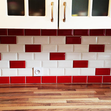
Il a été choisi de conserver les meubles mais de refaire la crédence en carreaux métro qui se prolongent sous la percée.
パリにある高級な中くらいなコンテンポラリースタイルのおしゃれなキッチン (ガラス扉のキャビネット、ベージュのキャビネット、木材カウンター、赤いキッチンパネル、サブウェイタイルのキッチンパネル、セラミックタイルの床、茶色い床、茶色いキッチンカウンター) の写真
パリにある高級な中くらいなコンテンポラリースタイルのおしゃれなキッチン (ガラス扉のキャビネット、ベージュのキャビネット、木材カウンター、赤いキッチンパネル、サブウェイタイルのキッチンパネル、セラミックタイルの床、茶色い床、茶色いキッチンカウンター) の写真
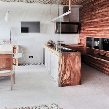
モスクワにある中くらいなコンテンポラリースタイルのおしゃれなキッチン (フラットパネル扉のキャビネット、中間色木目調キャビネット、白いキッチンパネル、シルバーの調理設備、白い床、アンダーカウンターシンク、木材カウンター、磁器タイルの床、セラミックタイルのキッチンパネル、茶色いキッチンカウンター) の写真
Aujourd'hui, nous vous présentons la cuisine de Manuel, dans le quartier des Chartrons. Un très beau projet qui nous a passionné du début à la fin! Une cuisine atypique avec une crédence inspirée du métro parisien, et beaucoup de rangements!
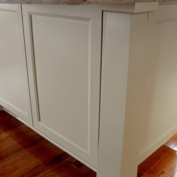
Designer Jodi Tramontin, CMKBD decided to create a "Contemporary Craftsman" inspired kitchen which would flow with the rest of the home's architecture, design and materials.
In order to create the perfect Contemporary Craftsman-inspired kitchen, she selected Dura Supreme's popular Lynden door style. The clean, simple lines on the doors rails and stiles along with the beautiful bevel detailing are the perfect complement to the Contemporary Craftsman-inspired kitchen that she wanted to create.
After the door style was decided on, it was time to create the color palette. When creating a color palette for a particular space, start by determining what items that will be staying in the room that you’ll need to coordinate with. For example, for Jodi’s new kitchen she needed to work with the existing paint, millwork (casings, trim, interior doors), and hardwood floor colors.
“One of the most common questions I get as a designer is "Do my cabinets have to match the rest of the woodwork within the home?" My answer to that question is "No - absolutely not". I love mixing different wood tones within any given space to create a unique and comfortable look.” – Jodi Tramontin, CMKBD
After looking at many different options for the cabinet finishes, Jodi decided on Dura Supreme's “Hazelnut stain” on Cherry for the perimeter cabinetry and Dura Supreme’s “Latte” paint on Maple/Paintable for the island. Both of these finishes coordinate beautifully with the existing paint, millwork, and hardwood.
Jodi also opted to go with a Low Sheen level on the stained finishes. Dura Supreme's standard sheen level on our stains is a semi-gloss finish while the low sheen is considered a satin finish. The low sheen option is just as strong and durable as our standard sheen. Please note that some finishes are only available in a lower sheen level. Your authorized Dura Supreme dealer can assist you with these selections.
The countertops and backsplash were selected to complement the Dura Supreme “Hazelnut” stain and “Latte” paint colors on the cabinetry.
Request a FREE Dura Supreme Brochure Packet:
http://www.durasupreme.com/request-brochure
Find a Dura Supreme Showroom near you today:
http://www.durasupreme.com/dealer-locator
赤いコンテンポラリースタイルのLDK (茶色いキッチンカウンター) の写真
1