ミッドセンチュリースタイルの家の外観の写真
絞り込み:
資材コスト
並び替え:今日の人気順
写真 1〜20 枚目(全 65 枚)
1/3
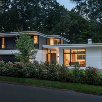
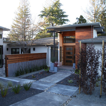
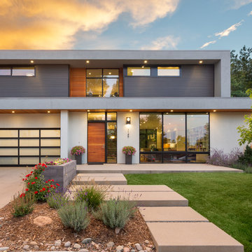
Our clients wanted to replace an existing suburban home with a modern house at the same Lexington address where they had lived for years. The structure the clients envisioned would complement their lives and integrate the interior of the home with the natural environment of their generous property. The sleek, angular home is still a respectful neighbor, especially in the evening, when warm light emanates from the expansive transparencies used to open the house to its surroundings. The home re-envisions the suburban neighborhood in which it stands, balancing relationship to the neighborhood with an updated aesthetic.
The floor plan is arranged in a “T” shape which includes a two-story wing consisting of individual studies and bedrooms and a single-story common area. The two-story section is arranged with great fluidity between interior and exterior spaces and features generous exterior balconies. A staircase beautifully encased in glass stands as the linchpin between the two areas. The spacious, single-story common area extends from the stairwell and includes a living room and kitchen. A recessed wooden ceiling defines the living room area within the open plan space.
Separating common from private spaces has served our clients well. As luck would have it, construction on the house was just finishing up as we entered the Covid lockdown of 2020. Since the studies in the two-story wing were physically and acoustically separate, zoom calls for work could carry on uninterrupted while life happened in the kitchen and living room spaces. The expansive panes of glass, outdoor balconies, and a broad deck along the living room provided our clients with a structured sense of continuity in their lives without compromising their commitment to aesthetically smart and beautiful design.
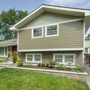
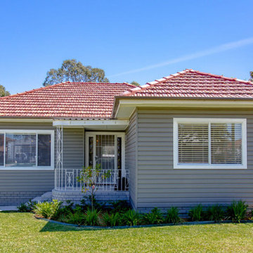
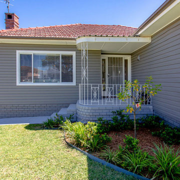
This 1960s split-level home desperately needed a change - not bigger space, just better. We removed the walls between the kitchen, living, and dining rooms to create a large open concept space that still allows a clear definition of space, while offering sight lines between spaces and functions. Homeowners preferred an open U-shape kitchen rather than an island to keep kids out of the cooking area during meal-prep, while offering easy access to the refrigerator and pantry. Green glass tile, granite countertops, shaker cabinets, and rustic reclaimed wood accents highlight the unique character of the home and family. The mix of farmhouse, contemporary and industrial styles make this house their ideal home.
Outside, new lap siding with white trim, and an accent of shake shingles under the gable. The new red door provides a much needed pop of color. Landscaping was updated with a new brick paver and stone front stoop, walk, and landscaping wall.
Here is an architecturally built house from the early 1970's which was brought into the new century during this complete home remodel by adding a garage space, new windows triple pane tilt and turn windows, cedar double front doors, clear cedar siding with clear cedar natural siding accents, clear cedar garage doors, galvanized over sized gutters with chain style downspouts, standing seam metal roof, re-purposed arbor/pergola, professionally landscaped yard, and stained concrete driveway, walkways, and steps.
Using a variety of hardscaping materials (wood, tile, rock, gravel and concrete) creates movement and interest in the landscape. The accordion doors on the left side of the tiled patio open completely--and in two different directions--thus opening the secondary dwelling unit entirely to the outdoors.
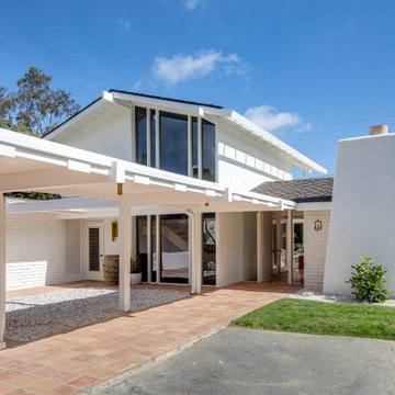
This mid-century modern house was built in the 1950's. The curved front porch and soffit together with the wrought iron balustrade and column are typical of this era.
The fresh, mid-grey paint colour palette have given the exterior a new lease of life, cleverly playing up its best features.
Designed in 1970 for an art collector, the existing referenced 70’s architectural principles. With its cadence of ‘70’s brick masses punctuated by a garage and a 4-foot-deep entrance recess. This recess, however, didn’t convey to the interior, which was occupied by disjointed service spaces. To solve, service spaces are moved and reorganized in open void in the garage. (See plan) This also organized the home: Service & utility on the left, reception central, and communal living spaces on the right.
To maintain clarity of the simple one-story 70’s composition, the second story add is recessive. A flex-studio/extra bedroom and office are designed ensuite creating a slender form and orienting them front to back and setting it back allows the add recede. Curves create a definite departure from the 70s home and by detailing it to "hover like a thought" above the first-floor roof and mentally removable sympathetic add.Existing unrelenting interior walls and a windowless entry, although ideal for fine art was unconducive for the young family of three. Added glass at the front recess welcomes light view and the removal of interior walls not only liberate rooms to communicate with each other but also reinform the cleared central entry space as a hub.
Even though the renovation reinforms its relationship with art, the joy and appreciation of art was not dismissed. A metal sculpture lost in the corner of the south side yard bumps the sculpture at the front entrance to the kitchen terrace over an added pedestal. (See plans) Since the roof couldn’t be railed without compromising the one-story '70s composition, the sculpture garden remains physically inaccessible however mirrors flanking the chimney allow the sculptures to be appreciated in three dimensions. The mirrors also afford privacy from the adjacent Tudor's large master bedroom addition 16-feet away.
This whole house remodel was perfectly designed and curated by the ever so talented Shannon Mclaren owner of PRAIRIE Interiors. Photo Credit: Chad Mellon of Mellon.Studio
Newport Beach Home Tour 2022
Our clients wanted to replace an existing suburban home with a modern house at the same Lexington address where they had lived for years. The structure the clients envisioned would complement their lives and integrate the interior of the home with the natural environment of their generous property. The sleek, angular home is still a respectful neighbor, especially in the evening, when warm light emanates from the expansive transparencies used to open the house to its surroundings. The home re-envisions the suburban neighborhood in which it stands, balancing relationship to the neighborhood with an updated aesthetic.
The floor plan is arranged in a “T” shape which includes a two-story wing consisting of individual studies and bedrooms and a single-story common area. The two-story section is arranged with great fluidity between interior and exterior spaces and features generous exterior balconies. A staircase beautifully encased in glass stands as the linchpin between the two areas. The spacious, single-story common area extends from the stairwell and includes a living room and kitchen. A recessed wooden ceiling defines the living room area within the open plan space.
Separating common from private spaces has served our clients well. As luck would have it, construction on the house was just finishing up as we entered the Covid lockdown of 2020. Since the studies in the two-story wing were physically and acoustically separate, zoom calls for work could carry on uninterrupted while life happened in the kitchen and living room spaces. The expansive panes of glass, outdoor balconies, and a broad deck along the living room provided our clients with a structured sense of continuity in their lives without compromising their commitment to aesthetically smart and beautiful design.
Warm wood siding contrasts beautifully against grey stucco, while black doors, windows and sconces connect the overall facade.
サンフランシスコにある中くらいなミッドセンチュリースタイルのおしゃれな家の外観 (漆喰サイディング、下見板張り) の写真
サンフランシスコにある中くらいなミッドセンチュリースタイルのおしゃれな家の外観 (漆喰サイディング、下見板張り) の写真
Here is an architecturally built house from the early 1970's which was brought into the new century during this complete home remodel by adding a garage space, new windows triple pane tilt and turn windows, cedar double front doors, clear cedar siding with clear cedar natural siding accents, clear cedar garage doors, galvanized over sized gutters with chain style downspouts, standing seam metal roof, re-purposed arbor/pergola, professionally landscaped yard, and stained concrete driveway, walkways, and steps.

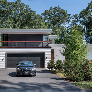
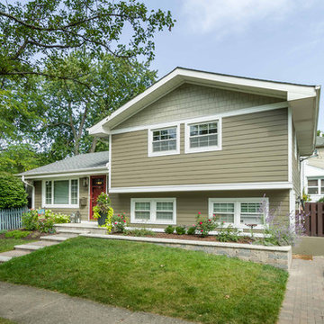
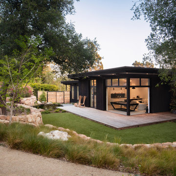
The modern prairie design of this custom home features hipped roofs, mixed materials, large statement windows, and lots of visual interest.
セントルイスにある高級なミッドセンチュリースタイルのおしゃれな家の外観 (石材サイディング、下見板張り) の写真
セントルイスにある高級なミッドセンチュリースタイルのおしゃれな家の外観 (石材サイディング、下見板張り) の写真
A closer view of this mid-century modern house built in the 1950's.
The gorgeous, curved porch definitely gives the house the wow factor and is highlighted further by the white painted balustrade and column against the mid grey painted walls.
This 1960s split-level home desperately needed a change - not bigger space, just better. We removed the walls between the kitchen, living, and dining rooms to create a large open concept space that still allows a clear definition of space, while offering sight lines between spaces and functions. Homeowners preferred an open U-shape kitchen rather than an island to keep kids out of the cooking area during meal-prep, while offering easy access to the refrigerator and pantry. Green glass tile, granite countertops, shaker cabinets, and rustic reclaimed wood accents highlight the unique character of the home and family. The mix of farmhouse, contemporary and industrial styles make this house their ideal home.
Outside, new lap siding with white trim, and an accent of shake shingles under the gable. The new red door provides a much needed pop of color. Landscaping was updated with a new brick paver and stone front stoop, walk, and landscaping wall.
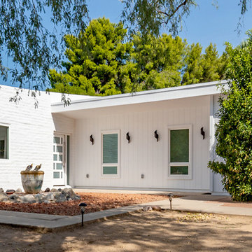
The design of the roofline of the original house, built in 1968, mimics the silhouettes of the nearby mountains with its sloping parallel walls of painted slump block. The top of the walls angle back and forth like the mountain ranges that surround Tucson, AZ.
The new fiber-cement siding, replaced old bland stucco. The vertical lines of the siding offer a contrast to the horizontal lines of the slump block walls.
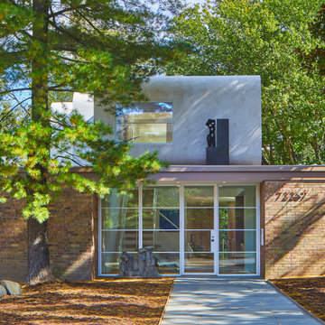
Designed in 1970 for an art collector, the existing referenced 70’s architectural principles. With its cadence of ‘70’s brick masses punctuated by a garage and a 4-foot-deep entrance recess. This recess, however, didn’t convey to the interior, which was occupied by disjointed service spaces. To solve, service spaces are moved and reorganized in open void in the garage. (See plan) This also organized the home: Service & utility on the left, reception central, and communal living spaces on the right.
To maintain clarity of the simple one-story 70’s composition, the second story add is recessive. A flex-studio/extra bedroom and office are designed ensuite creating a slender form and orienting them front to back and setting it back allows the add recede. Curves create a definite departure from the 70s home and by detailing it to "hover like a thought" above the first-floor roof and mentally removable sympathetic add.Existing unrelenting interior walls and a windowless entry, although ideal for fine art was unconducive for the young family of three. Added glass at the front recess welcomes light view and the removal of interior walls not only liberate rooms to communicate with each other but also reinform the cleared central entry space as a hub.
Even though the renovation reinforms its relationship with art, the joy and appreciation of art was not dismissed. A metal sculpture lost in the corner of the south side yard bumps the sculpture at the front entrance to the kitchen terrace over an added pedestal. (See plans) Since the roof couldn’t be railed without compromising the one-story '70s composition, the sculpture garden remains physically inaccessible however mirrors flanking the chimney allow the sculptures to be appreciated in three dimensions. The mirrors also afford privacy from the adjacent Tudor's large master bedroom addition 16-feet away.
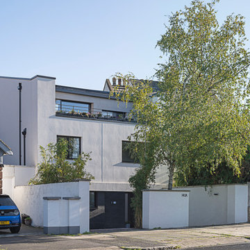
A 1960's three-storey property originally designed in the ‘upside-down’ style with an open-plan living space retrofitted to EnerPHit Plus certified standard. The project team aimed to retain as much of the existing structure and materials as possible, including the reuse of decommissioned pre-existing underfloor heating pipes.
To achieve EnerPHit Plus requirements involved careful consideration of how to introduce the airtightness to the existing building fabric without affecting the overall appearance of the existing house. There were also challenges about how to resolve thermal bridging between the new triple glazed windows and the existing walls.
The house needed extensive repair works addressing air leakages and damp, but the the client was keen to retain many of the original features of the modernist 1960s aesthetic. The building's reinforced-concrete structure presented difficulties since it was hard to know the condition of the structure, and where the pre-stressed areas would be, until the building work was underway.
Different wall build-ups (using internal or external wall insulation, such as EcoCork lime plaster, ThermaLine render or wood-based Steico insulation) were needed depending on the orientation of the building. The outside of the building was fully re-rendered, alongside making good windowsills with leaking flashings. The project team aimed to retain as much of the existing structure and materials as possible, including the reuse of decommissioned pre-existing underfloor heating pipes.
ミッドセンチュリースタイルの家の外観の写真
1