黒いミッドセンチュリースタイルの家の外観の写真
絞り込み:
資材コスト
並び替え:今日の人気順
写真 1〜16 枚目(全 16 枚)
1/5
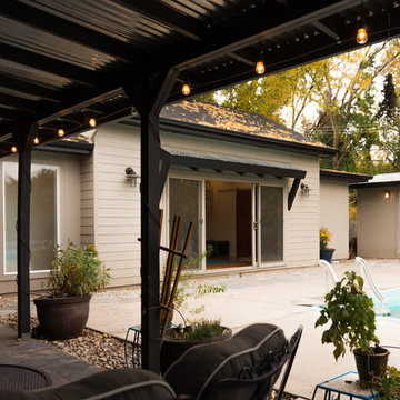
Using a variety of hardscaping materials (wood, tile, rock, gravel and concrete) creates movement and interest in the landscape. The accordion doors on the left side of the tiled patio open completely--and in two different directions--thus opening the secondary dwelling unit entirely to the outdoors.
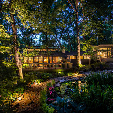
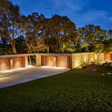
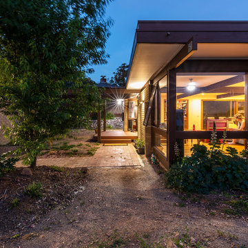
View of the house at dusk from the Woodland Garden on the uphill side of the house. New addition and bridge connection are too the right. Roof of original house was reframed to create a line of clerestory windows.
Photographer:Paul Bussman
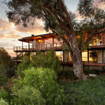
1950’s mid century modern hillside home.
full restoration | addition | modernization.
board formed concrete | clear wood finishes | mid-mod style.
サンタバーバラにあるラグジュアリーなミッドセンチュリースタイルのおしゃれな家の外観の写真
サンタバーバラにあるラグジュアリーなミッドセンチュリースタイルのおしゃれな家の外観の写真
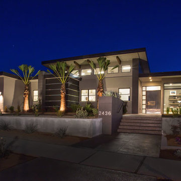
The Hive
Custom Home Built by Markay Johnson Construction Designer: Ashley Johnson & Gregory Abbott
Photographer: Scot Zimmerman
Southern Utah Parade of Homes
Designed in 1970 for an art collector, the existing referenced 70’s architectural principles. With its cadence of ‘70’s brick masses punctuated by a garage and a 4-foot-deep entrance recess. This recess, however, didn’t convey to the interior, which was occupied by disjointed service spaces. To solve, service spaces are moved and reorganized in open void in the garage. (See plan) This also organized the home: Service & utility on the left, reception central, and communal living spaces on the right.
To maintain clarity of the simple one-story 70’s composition, the second story add is recessive. A flex-studio/extra bedroom and office are designed ensuite creating a slender form and orienting them front to back and setting it back allows the add recede. Curves create a definite departure from the 70s home and by detailing it to "hover like a thought" above the first-floor roof and mentally removable sympathetic add.Existing unrelenting interior walls and a windowless entry, although ideal for fine art was unconducive for the young family of three. Added glass at the front recess welcomes light view and the removal of interior walls not only liberate rooms to communicate with each other but also reinform the cleared central entry space as a hub.
Even though the renovation reinforms its relationship with art, the joy and appreciation of art was not dismissed. A metal sculpture lost in the corner of the south side yard bumps the sculpture at the front entrance to the kitchen terrace over an added pedestal. (See plans) Since the roof couldn’t be railed without compromising the one-story '70s composition, the sculpture garden remains physically inaccessible however mirrors flanking the chimney allow the sculptures to be appreciated in three dimensions. The mirrors also afford privacy from the adjacent Tudor's large master bedroom addition 16-feet away.
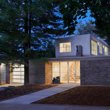
Large addition to a mid century modern home in Boise, Idaho. Designed by Studio Boise. Built by Icon Construction
Photography by Cesar Martinez
ボイシにある中くらいなミッドセンチュリースタイルのおしゃれな家の外観 (混合材サイディング) の写真
ボイシにある中くらいなミッドセンチュリースタイルのおしゃれな家の外観 (混合材サイディング) の写真
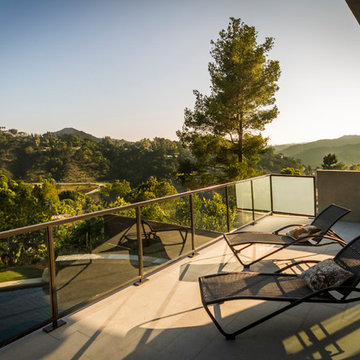
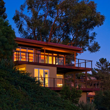
View from bedroom balcony.
Photo by Michael Todoran
ロサンゼルスにあるラグジュアリーなミッドセンチュリースタイルのおしゃれな家の外観 (漆喰サイディング) の写真
ロサンゼルスにあるラグジュアリーなミッドセンチュリースタイルのおしゃれな家の外観 (漆喰サイディング) の写真
1950’s mid century modern hillside home.
full restoration | addition | modernization.
board formed concrete | clear wood finishes | mid-mod style.
サンタバーバラにあるラグジュアリーなミッドセンチュリースタイルのおしゃれな家の外観の写真
サンタバーバラにあるラグジュアリーなミッドセンチュリースタイルのおしゃれな家の外観の写真
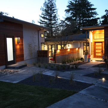
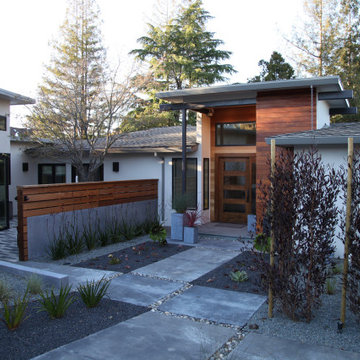
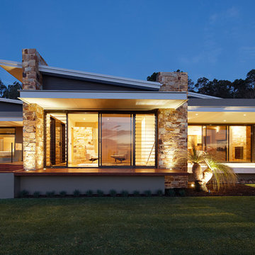
While much of the home is visible from the street, walls and plantings have been strategically placed to provide some privacy. Large windows and accordion doors integrate the home with the landscape. Black wall sconces mimic the vertical linear elements found in surrounding trees.
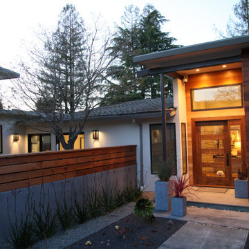
Natural wood siding creates a warm glow at twilight, as the family dog awaits visitors. Kangaroo Paws create a beautiful sculptural effect against the concrete and wood wall, as concrete planters mimic the arrangement of the walkways.
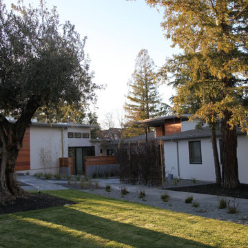
The home's multiple planes break up the structure and help integrate it into the landscape. A mature Olive tree and Redwood tree grace the front yard.
Designed in 1970 for an art collector, the existing referenced 70’s architectural principles. With its cadence of ‘70’s brick masses punctuated by a garage and a 4-foot-deep entrance recess. This recess, however, didn’t convey to the interior, which was occupied by disjointed service spaces. To solve, service spaces are moved and reorganized in open void in the garage. (See plan) This also organized the home: Service & utility on the left, reception central, and communal living spaces on the right.
To maintain clarity of the simple one-story 70’s composition, the second story add is recessive. A flex-studio/extra bedroom and office are designed ensuite creating a slender form and orienting them front to back and setting it back allows the add recede. Curves create a definite departure from the 70s home and by detailing it to "hover like a thought" above the first-floor roof and mentally removable sympathetic add.Existing unrelenting interior walls and a windowless entry, although ideal for fine art was unconducive for the young family of three. Added glass at the front recess welcomes light view and the removal of interior walls not only liberate rooms to communicate with each other but also reinform the cleared central entry space as a hub.
Even though the renovation reinforms its relationship with art, the joy and appreciation of art was not dismissed. A metal sculpture lost in the corner of the south side yard bumps the sculpture at the front entrance to the kitchen terrace over an added pedestal. (See plans) Since the roof couldn’t be railed without compromising the one-story '70s composition, the sculpture garden remains physically inaccessible however mirrors flanking the chimney allow the sculptures to be appreciated in three dimensions. The mirrors also afford privacy from the adjacent Tudor's large master bedroom addition 16-feet away.
黒いミッドセンチュリースタイルの家の外観の写真
1