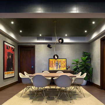
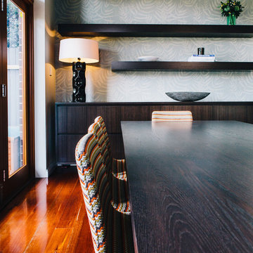
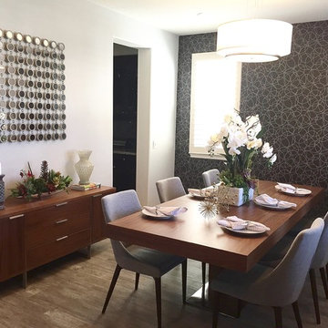
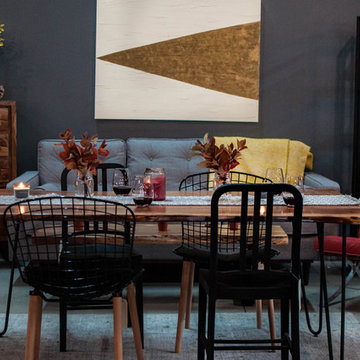
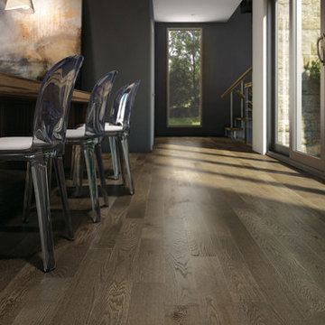
黒いミッドセンチュリースタイルのダイニング (コンクリートの床、ラミネートの床、無垢フローリング) の写真
絞り込み:
資材コスト
並び替え:今日の人気順
写真 1〜20 枚目(全 35 枚)
Photography by Alex Crook
www.alexcrook.com
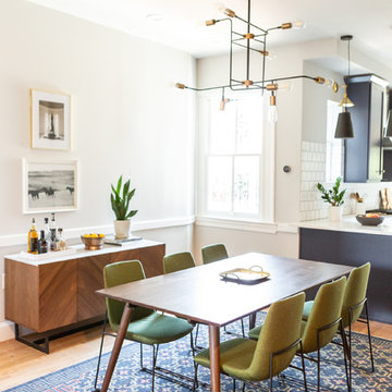
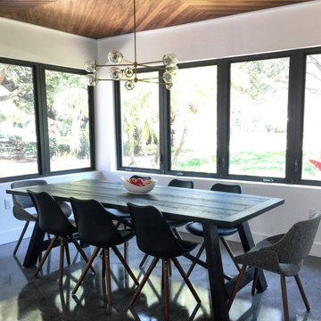
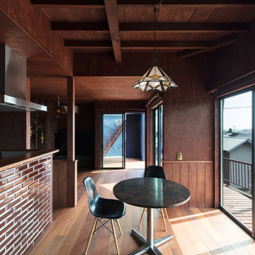
シアトルにある小さなミッドセンチュリースタイルのおしゃれなダイニングキッチン (黒い壁、無垢フローリング、両方向型暖炉、レンガの暖炉まわり、黄色い床) の写真
シアトルにある小さなミッドセンチュリースタイルのおしゃれなダイニングキッチン (黒い壁、無垢フローリング、両方向型暖炉、レンガの暖炉まわり、黄色い床) の写真
Harold Lambertus
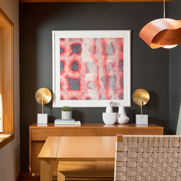
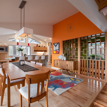
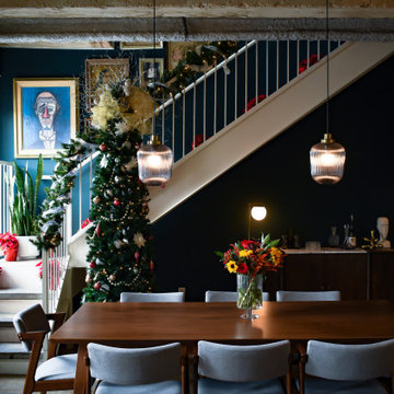
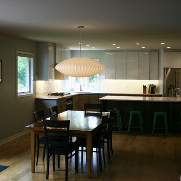
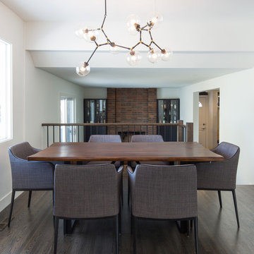
他の地域にある中くらいなミッドセンチュリースタイルのおしゃれな独立型ダイニング (グレーの壁、ラミネートの床、茶色い床) の写真
他の地域にある中くらいなミッドセンチュリースタイルのおしゃれな独立型ダイニング (グレーの壁、ラミネートの床、茶色い床) の写真
Styling the dining room mid-century in furniture and chandelier really added the "different" elements the homeowners were looking for. The new pattern in the run tied in to the kitchen without being too matchy matchy.
Download our free ebook, Creating the Ideal Kitchen. DOWNLOAD NOW
As with most projects, it all started with the kitchen layout. The home owners came to us wanting to upgrade their kitchen and overall aesthetic in their suburban home, with a combination of fresh paint, updated finishes, and improved flow for more ease when doing everyday activities.
A monochromatic, earth-toned palette left the kitchen feeling uninspired. It lacked the brightness they wanted from their space. An eat-in table underutilized the available square footage. The butler’s pantry was out of the way and hard to access, and the dining room felt detached from the kitchen.
Lead Designer, Stephanie Cole, saw an improved layout for the spaces that were no longer working for this family. By eliminating an existing wall between the kitchen and dining room, and relocating the bar area to the dining room, we opened up the kitchen, providing all the space we needed to create a dreamy and functional layout. A new perimeter configuration promoted circulation while also making space for a large and functional island loaded with seating – a must for any family. Because an island that isn’t big enough for everyone (and a few more) is a recipe for disaster. The light white cabinetry is fresh and contrasts with the deeper tones in the wood flooring, creating a modern aesthetic that is elevated, yet approachable for everyday living.
With better flow as the overarching goal, we made some structural changes too. To remove a bottleneck in the entryway, we angled one of the dining room walls to create more natural separation between rooms and facilitate ease of movement throughout the large space.
At The Kitchen Studio, we believe a well-designed kitchen uses every square inch to the fullest. By starting from scratch, it was possible to rethink the entire kitchen layout and design the space according to how it is used, because the kitchen shouldn’t make it harder to feed the family. A new location for the existing range, flanked by a new column refrigerator and freezer on each side, worked to anchor the space. The very large and very spacious island (a dream island if we do say so ourselves) now houses the primary sink and provides ample space for food prep and family gathering.
The new kitchen table and coordinating banquette seating provide a cozy nook for quick breakfasts before school or work, and evening homework sessions. Elegant gold details catch the natural light, elevating the aesthetic.
The dining room was transformed into one of this client’s favorite spaces and we couldn’t agree more. We saw an opportunity to give the dining room a more distinguished identity by closing off the entrance from the foyer. The relocated wet bar enhances the sophisticated vibe of this gathering space, complete with beautiful antique mirror tiles and open shelving encased by moody built-in cabinets.
Updated furnishings add warmth. A rich walnut table is paired with custom chairs in a muted coral fabric. The large, transitional chandelier grounds the room, pairing beautifully with the gold finishes prevalent in the faucet and cabinet hardware. Linen-inspired wallpaper and cream-toned window treatments add to the glamorous feel of this entertainment space.
There is no way around it. The laundry room was cramped. The large washer and dryer blocked access to the sink and left little room for the space to serve its other essential function – as a mudroom. Because we reworked the kitchen layout to create more space overall, we could rethink the mudroom too – an essential for any busy family. The first step was moving the washer and dryer to an existing area on the second floor, where most of the family’s laundry lives (no one wants to carry laundry up and down the stairs if they don’t have to anyway). This is a more functional solution and opened up the space for all the mudroom necessities – including the existing kitchen refrigerator, loads of built-in cubbies, and a bench.
It’s hard to not fall in love with every detail of a new space, especially when it serves your day-to-day life. But that doesn’t mean the clients didn’t have their favorite features they use on the daily. This remodel was focused largely on function with a new kitchen layout. And it’s the functional features that have the biggest impact. The large island provides much needed workspace in the kitchen and is a spot where everyone gathers together – it grounds the space and the family. And the custom counter stools are the icing on the cake. The nearby mudroom has everything their previous space was lacking – ample storage, space for everyone’s essentials, and the beloved cement floor tiles that are both durable and artistic.
Located in the heart of Downtown Dallas this once Interurban Transit station for the DFW area no serves as an urban dwelling. The historic building is filled with character and individuality which was a need for the interior design with decoration and furniture. Inspired by the 1930’s this loft is a center of social gatherings.
Location: Downtown, Dallas, Texas | Designer: Haus of Sabo | Completions: 2021
For this stunning Dining Room which overlooks the Huron River the selection of the modern interpretation of a refectory table seemed to be the perfect choice. The brushed steel stretcher adds to the modern appeal. The uniquely designed dining chair was the perfect companion. Without host chairs you are able to appreciate the beautiful detail of the chair and table base along with a sophisticated color palette. The Chandelier is sleek and un assuming but still has a powerful impact.
View from the family room into the dining area and kitchen.
An existing mid-century ranch was given a new lease on life with a whole house remodel and addition. An existing sunken living room had the floor raised and the front entry was relocated to make room for a complete master suite. The roof/ceiling over the entry and stair was raised with multiple clerestory lights introducing light into the center of the home. Finally, a compartmentalized existing layout was converted to an open plan with the kitchen/dining/living areas sharing a common area at the back of the home.
Dining Room
カルガリーにあるお手頃価格の中くらいなミッドセンチュリースタイルのおしゃれなダイニングキッチン (白い壁、無垢フローリング、茶色い床) の写真
カルガリーにあるお手頃価格の中くらいなミッドセンチュリースタイルのおしゃれなダイニングキッチン (白い壁、無垢フローリング、茶色い床) の写真
All rights reserved - Privatiselectionem
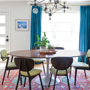
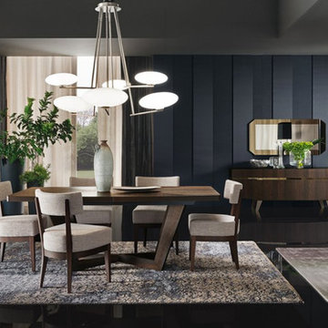
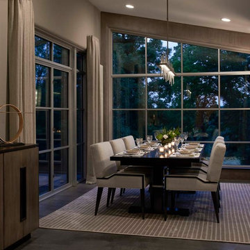
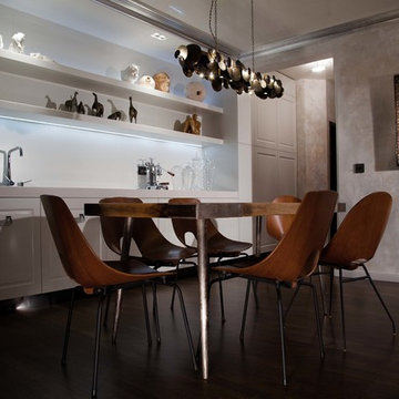
パリにあるラグジュアリーなミッドセンチュリースタイルのおしゃれなダイニングキッチン (無垢フローリング) の写真
パリにあるラグジュアリーなミッドセンチュリースタイルのおしゃれなダイニングキッチン (無垢フローリング) の写真
黒いミッドセンチュリースタイルのダイニング (コンクリートの床、ラミネートの床、無垢フローリング) の写真
1