小さな独立型リビング (グレーの床、白い床、ライブラリー) の写真
絞り込み:
資材コスト
並び替え:今日の人気順
写真 1〜20 枚目(全 35 枚)
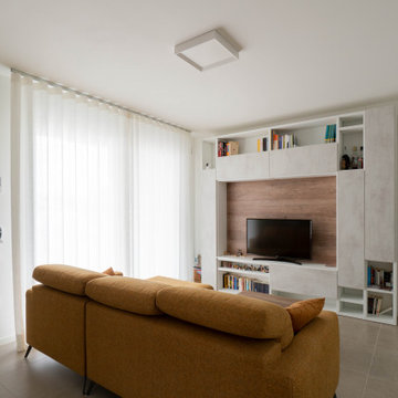
他の地域にある高級な小さなコンテンポラリースタイルのおしゃれな独立型リビング (ライブラリー、白い壁、磁器タイルの床、埋込式メディアウォール、グレーの床) の写真
Architecture & Interior Design By Arch Studio, Inc.
Photography by Eric Rorer
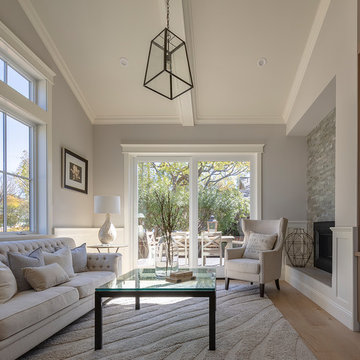
サンフランシスコにあるラグジュアリーな小さなカントリー風のおしゃれな独立型リビング (ライブラリー、グレーの壁、淡色無垢フローリング、両方向型暖炉、石材の暖炉まわり、壁掛け型テレビ、グレーの床) の写真
サンフランシスコにあるラグジュアリーな小さなカントリー風のおしゃれな独立型リビング (ライブラリー、グレーの壁、淡色無垢フローリング、両方向型暖炉、石材の暖炉まわり、壁掛け型テレビ、グレーの床) の写真
Light drenched TV lounge at the front of the building filled with antique artwork.
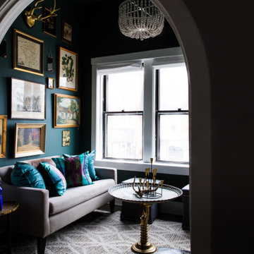
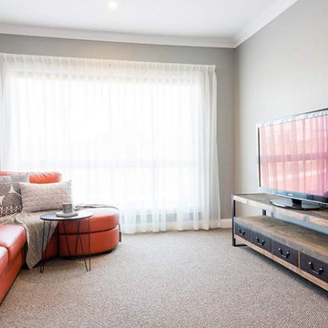
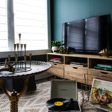
シカゴにあるお手頃価格の小さなエクレクティックスタイルのおしゃれな独立型リビング (ライブラリー、緑の壁、カーペット敷き、暖炉なし、据え置き型テレビ、グレーの床) の写真
シカゴにあるお手頃価格の小さなエクレクティックスタイルのおしゃれな独立型リビング (ライブラリー、緑の壁、カーペット敷き、暖炉なし、据え置き型テレビ、グレーの床) の写真
Старые деревянные полы выкрасили в белый. Белыми оставили стены и потолки. Позже дом украсили прикроватные тумбы, сервант, комод и шифоньер белого цвета
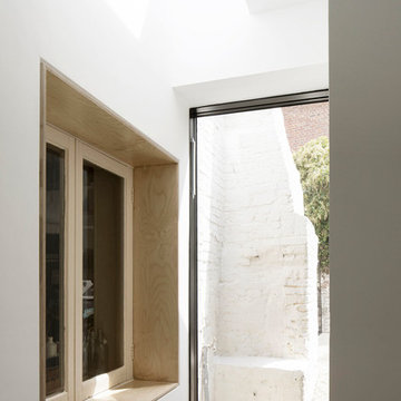
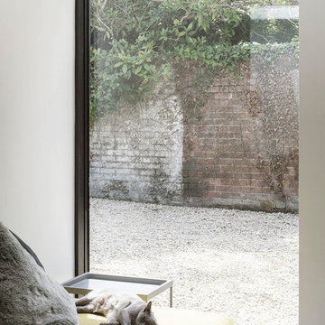
Photography by Richard Chivers https://www.rchivers.co.uk/
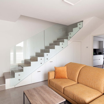
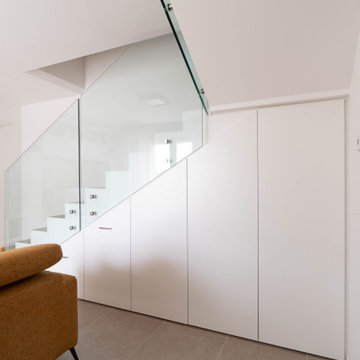
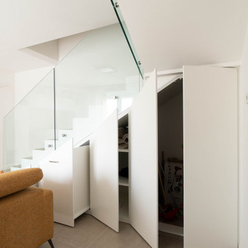
Marshall House is an extension to a Grade II listed dwelling in the village of Twyford, near Winchester, Hampshire. The original house dates from the 17th Century, although it had been remodelled and extended during the late 18th Century.
The clients contacted us to explore the potential to extend their home in order to suit their growing family and active lifestyle. Due to the constraints of living in a listed building, they were unsure as to what development possibilities were available. The brief was to replace an existing lean-to and 20th century conservatory with a new extension in a modern, contemporary approach. The design was developed in close consultation with the local authority as well as their historic environment department, in order to respect the existing property and work to achieve a positive planning outcome.
Like many older buildings, the dwelling had been adjusted here and there, and updated at numerous points over time. The interior of the existing property has a charm and a character - in part down to the age of the property, various bits of work over time and the wear and tear of the collective history of its past occupants. These spaces are dark, dimly lit and cosy. They have low ceilings, small windows, little cubby holes and odd corners. Walls are not parallel or perpendicular, there are steps up and down and places where you must watch not to bang your head.
The extension is accessed via a small link portion that provides a clear distinction between the old and new structures. The initial concept is centred on the idea of contrasts. The link aims to have the effect of walking through a portal into a seemingly different dwelling, that is modern, bright, light and airy with clean lines and white walls. However, complementary aspects are also incorporated, such as the strategic placement of windows and roof lights in order to cast light over walls and corners to create little nooks and private views. The overall form of the extension is informed by the awkward shape and uses of the site, resulting in the walls not being parallel in plan and splaying out at different irregular angles.
Externally, timber larch cladding is used as the primary material. This is painted black with a heavy duty barn paint, that is both long lasting and cost effective. The black finish of the extension contrasts with the white painted brickwork at the rear and side of the original house. The external colour palette of both structures is in opposition to the reality of the interior spaces. Although timber cladding is a fairly standard, commonplace material, visual depth and distinction has been created through the articulation of the boards. The inclusion of timber fins changes the way shadows are cast across the external surface during the day. Whilst at night, these are illuminated by external lighting.
A secondary entrance to the house is provided through a concealed door that is finished to match the profile of the cladding. This opens to a boot/utility room, from which a new shower room can be accessed, before proceeding to the new open plan living space and dining area.
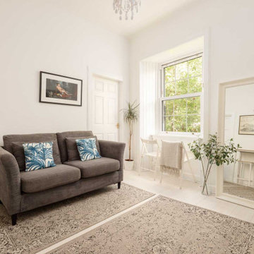
White coloured living room in small tenement apartment. Bright and neutral colour scheme contrasts nicely with green trees outside
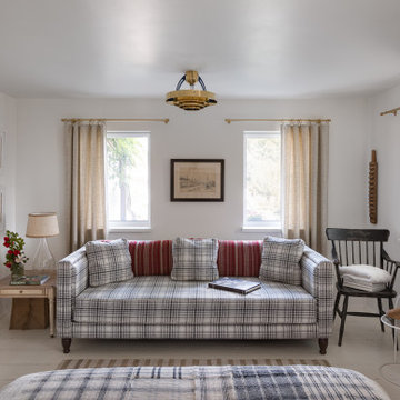
エディンバラにある低価格の小さなトランジショナルスタイルのおしゃれな独立型リビング (ライブラリー、白い壁、ラミネートの床、標準型暖炉、石材の暖炉まわり、据え置き型テレビ、グレーの床) の写真
エディンバラにある低価格の小さなトランジショナルスタイルのおしゃれな独立型リビング (ライブラリー、白い壁、ラミネートの床、標準型暖炉、石材の暖炉まわり、据え置き型テレビ、グレーの床) の写真
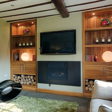
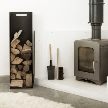
This bespoke shelving was designed and made to fit two alcoves each side of the chimneybreast in a room used by the family as a snug, TV and games room. The use of Zebrano veneer gives a light modern and stylish touch to the room. The veneer is used to create LED lit display shelving; a two door cupboard to conceal the games consoles sits above a log store in each alcove. The veneer is also used on the skirting linking the two halves of the design.
Boydyard Studios,
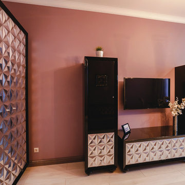
他の地域にある低価格の小さなトラディショナルスタイルのおしゃれな独立型リビング (ライブラリー、グレーの壁、カーペット敷き、据え置き型テレビ、グレーの床) の写真
他の地域にある低価格の小さなトラディショナルスタイルのおしゃれな独立型リビング (ライブラリー、グレーの壁、カーペット敷き、据え置き型テレビ、グレーの床) の写真
• Собственное производство
• Широкий модульный ряд и проекты по индивидуальным размерам
• Комплексная застройка дома
• Лучшие европейские материалы и комплектующие
• Цветовая палитра более 1000 наименований.
• Кратчайшие сроки изготовления
• Рассрочка платежа
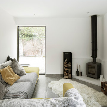
ハンプシャーにある高級な小さなコンテンポラリースタイルのおしゃれな独立型リビング (ライブラリー、グレーの壁、カーペット敷き、壁掛け型テレビ、グレーの床) の写真
他の地域にある高級な小さなコンテンポラリースタイルのおしゃれな独立型リビング (ライブラリー、白い壁、磁器タイルの床、埋込式メディアウォール、グレーの床) の写真
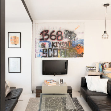
Graffiti adorns the modern space. The juxtaposition of vibrant art brings life to the clean minimalist decor.
オタワにある低価格の小さなモダンスタイルのおしゃれな独立型リビング (ライブラリー、白い壁、塗装フローリング、壁掛け型テレビ、白い床) の写真
オタワにある低価格の小さなモダンスタイルのおしゃれな独立型リビング (ライブラリー、白い壁、塗装フローリング、壁掛け型テレビ、白い床) の写真
他の地域にある高級な小さなコンテンポラリースタイルのおしゃれな独立型リビング (ライブラリー、白い壁、磁器タイルの床、埋込式メディアウォール、グレーの床) の写真
他の地域にある高級な小さなコンテンポラリースタイルのおしゃれな独立型リビング (ライブラリー、白い壁、磁器タイルの床、埋込式メディアウォール、グレーの床) の写真
Старые деревянные полы выкрасили в белый. Белыми оставили стены и потолки. Позже дом украсили прикроватные тумбы, сервант, комод и шифоньер белого цвета
Photography by Richard Chivers https://www.rchivers.co.uk/
Marshall House is an extension to a Grade II listed dwelling in the village of Twyford, near Winchester, Hampshire. The original house dates from the 17th Century, although it had been remodelled and extended during the late 18th Century.
The clients contacted us to explore the potential to extend their home in order to suit their growing family and active lifestyle. Due to the constraints of living in a listed building, they were unsure as to what development possibilities were available. The brief was to replace an existing lean-to and 20th century conservatory with a new extension in a modern, contemporary approach. The design was developed in close consultation with the local authority as well as their historic environment department, in order to respect the existing property and work to achieve a positive planning outcome.
Like many older buildings, the dwelling had been adjusted here and there, and updated at numerous points over time. The interior of the existing property has a charm and a character - in part down to the age of the property, various bits of work over time and the wear and tear of the collective history of its past occupants. These spaces are dark, dimly lit and cosy. They have low ceilings, small windows, little cubby holes and odd corners. Walls are not parallel or perpendicular, there are steps up and down and places where you must watch not to bang your head.
The extension is accessed via a small link portion that provides a clear distinction between the old and new structures. The initial concept is centred on the idea of contrasts. The link aims to have the effect of walking through a portal into a seemingly different dwelling, that is modern, bright, light and airy with clean lines and white walls. However, complementary aspects are also incorporated, such as the strategic placement of windows and roof lights in order to cast light over walls and corners to create little nooks and private views. The overall form of the extension is informed by the awkward shape and uses of the site, resulting in the walls not being parallel in plan and splaying out at different irregular angles.
Externally, timber larch cladding is used as the primary material. This is painted black with a heavy duty barn paint, that is both long lasting and cost effective. The black finish of the extension contrasts with the white painted brickwork at the rear and side of the original house. The external colour palette of both structures is in opposition to the reality of the interior spaces. Although timber cladding is a fairly standard, commonplace material, visual depth and distinction has been created through the articulation of the boards. The inclusion of timber fins changes the way shadows are cast across the external surface during the day. Whilst at night, these are illuminated by external lighting.
A secondary entrance to the house is provided through a concealed door that is finished to match the profile of the cladding. This opens to a boot/utility room, from which a new shower room can be accessed, before proceeding to the new open plan living space and dining area.
Light drenched TV lounge at the front of the building filled with antique artwork.
シカゴにある低価格の小さなエクレクティックスタイルのおしゃれな独立型リビング (ライブラリー、緑の壁、カーペット敷き、暖炉なし、据え置き型テレビ、グレーの床) の写真
シカゴにある低価格の小さなエクレクティックスタイルのおしゃれな独立型リビング (ライブラリー、緑の壁、カーペット敷き、暖炉なし、据え置き型テレビ、グレーの床) の写真
Photography by Richard Chivers https://www.rchivers.co.uk/
Marshall House is an extension to a Grade II listed dwelling in the village of Twyford, near Winchester, Hampshire. The original house dates from the 17th Century, although it had been remodelled and extended during the late 18th Century.
The clients contacted us to explore the potential to extend their home in order to suit their growing family and active lifestyle. Due to the constraints of living in a listed building, they were unsure as to what development possibilities were available. The brief was to replace an existing lean-to and 20th century conservatory with a new extension in a modern, contemporary approach. The design was developed in close consultation with the local authority as well as their historic environment department, in order to respect the existing property and work to achieve a positive planning outcome.
Like many older buildings, the dwelling had been adjusted here and there, and updated at numerous points over time. The interior of the existing property has a charm and a character - in part down to the age of the property, various bits of work over time and the wear and tear of the collective history of its past occupants. These spaces are dark, dimly lit and cosy. They have low ceilings, small windows, little cubby holes and odd corners. Walls are not parallel or perpendicular, there are steps up and down and places where you must watch not to bang your head.
The extension is accessed via a small link portion that provides a clear distinction between the old and new structures. The initial concept is centred on the idea of contrasts. The link aims to have the effect of walking through a portal into a seemingly different dwelling, that is modern, bright, light and airy with clean lines and white walls. However, complementary aspects are also incorporated, such as the strategic placement of windows and roof lights in order to cast light over walls and corners to create little nooks and private views. The overall form of the extension is informed by the awkward shape and uses of the site, resulting in the walls not being parallel in plan and splaying out at different irregular angles.
Externally, timber larch cladding is used as the primary material. This is painted black with a heavy duty barn paint, that is both long lasting and cost effective. The black finish of the extension contrasts with the white painted brickwork at the rear and side of the original house. The external colour palette of both structures is in opposition to the reality of the interior spaces. Although timber cladding is a fairly standard, commonplace material, visual depth and distinction has been created through the articulation of the boards. The inclusion of timber fins changes the way shadows are cast across the external surface during the day. Whilst at night, these are illuminated by external lighting.
A secondary entrance to the house is provided through a concealed door that is finished to match the profile of the cladding. This opens to a boot/utility room, from which a new shower room can be accessed, before proceeding to the new open plan living space and dining area.
小さな独立型リビング (グレーの床、白い床、ライブラリー) の写真
1