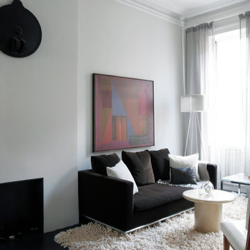
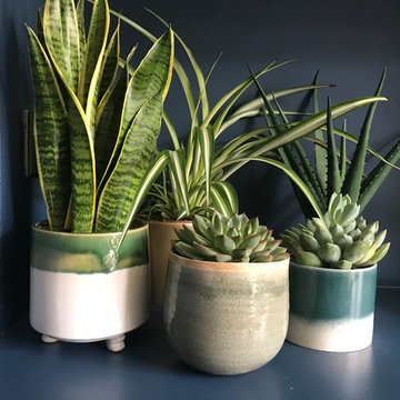
小さなリビング (木材の暖炉まわり、レンガの床、大理石の床、塗装フローリング) の写真
絞り込み:
資材コスト
並び替え:今日の人気順
写真 1〜20 枚目(全 34 枚)
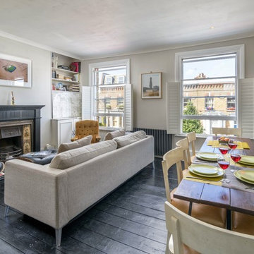
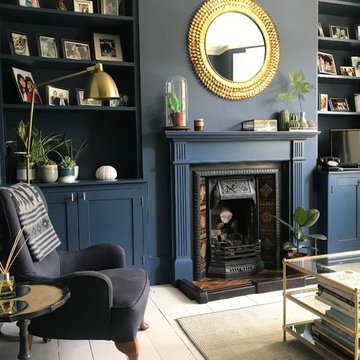
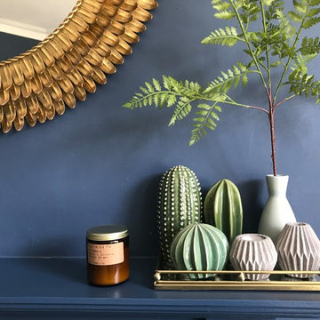
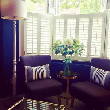
We chose a beautiful inky blue for this London Living room to feel fresh in the daytime when the sun streams in and cozy in the evening when it would otherwise feel quite cold. The colour also complements the original fireplace tiles.
We took the colour across the walls and woodwork, including the alcoves, and skirting boards, to create a perfect seamless finish. Balanced by the white floor, shutters and lampshade there is just enough light to keep it uplifting and atmospheric.
The final additions were a complementary green velvet sofa, luxurious touches of gold and brass and a glass table and mirror to make the room sparkle by bouncing the light from the metallic finishes across the glass and onto the mirror
The decorative fireplace and a tiki pendant.
ロサンゼルスにある高級な小さなエクレクティックスタイルのおしゃれなリビング (白い壁、塗装フローリング、標準型暖炉、木材の暖炉まわり、テレビなし) の写真
ロサンゼルスにある高級な小さなエクレクティックスタイルのおしゃれなリビング (白い壁、塗装フローリング、標準型暖炉、木材の暖炉まわり、テレビなし) の写真
ロンドンにあるお手頃価格の小さなトランジショナルスタイルのおしゃれなリビング (グレーの壁、塗装フローリング、標準型暖炉、木材の暖炉まわり、内蔵型テレビ) の写真
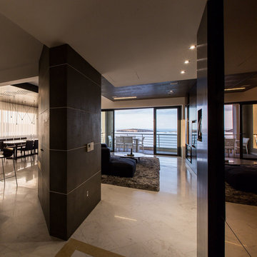
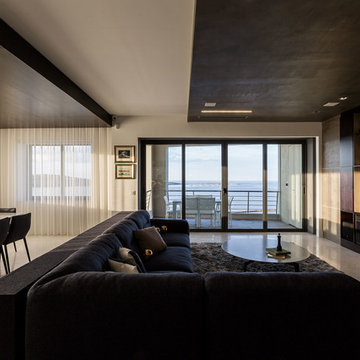
We were approached with a request to design the furnishings for an existing ‘finished’ apartment. The intention was to move in relatively fast, and the property already had an existing marble floor, kitchen and bathrooms which had to be kept. The property also boasted a fantastic 270 degree view, seen from most of the apartment. The clients had a very important role in the completion of the project. They were very involved during the design process and through various decoration choices. The final design was kept as a rigid guideline when faced with picking out all the different elements.
Once clear of all previous furniture, the space felt cold and bare; so we immediately felt the need for warmth, and raw, natural elements and textures to complement the cold marble floor while visually tying in the design of the whole apartment together.
Since the existing kitchen had a touch of dark walnut stain, we felt this material was one we should add to the palette of materials to contest the stark materials. A raw cement finish was another material we felt would add an interesting contrast and could be used in a variety of ways, from cabinets to walls and ceilings, to tie up the design of various areas of the apartment.
To warm up the living/dining area, keeping the existing marble floor but visually creating zones within the large living/dining area without hindering the flow, a dark timber custom-made soffit, continuous with a floor-to-ceiling drinks cabinet zones the dining area, giving it a degree of much-needed warmth.
The various windows with a stupendous 270 degree view needed to be visually tied together. This was done by introducing a continuous sheer [drape] which also doubled up as a sound-absorbing material along 2 of the 4 walls of the space.
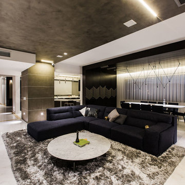
A very large sofa was required to fill up the space correctly, also required for the size of the young family.
Services were integrated within the units and soffits, while a customized design in the corner between the kitchen and the living room took into consideration the viewpoints from the main areas to create a pantry without hindering the flow or views. A strategically placed floor-to-ceiling mirror doubles up the space and extends the view to the inner parts of the apartment.
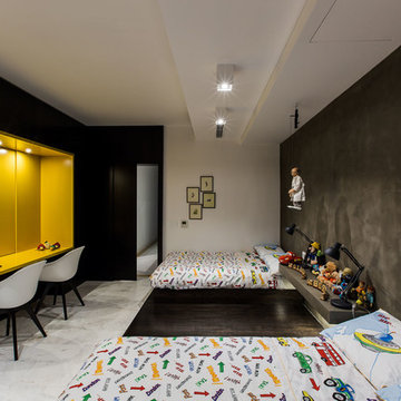
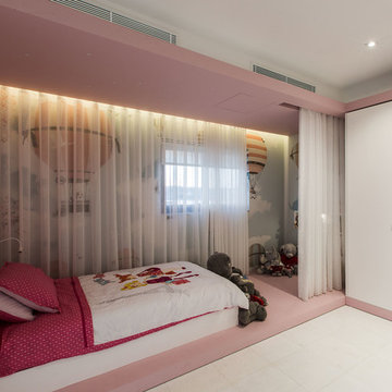
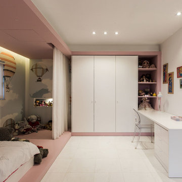
The daughter’s bedroom was a small challenge in itself, and a fun task, where we wanted to achieve the perception of a cozy niche with its own enclosed reading nook [for reading fairy tales], behind see-through curtains and a custom-ordered wall print sporting the girl’s favorite colors.
The sons’ bedroom had double the requirements in terms of space needed: more wardrobe, more homework desk space, a tv/play station area… “We combined a raised platform area between the boys’ beds to become an area with cushions where the kids can lay down and play, and face a hidden screen behind the homework desk’s sliding back panel for their play station”. The color of the homework desk was chosen in relation to the boys’ ages. A more masculine material palette was chosen for this room, in contrast to the light pastel palette of the girl’s bedroom. Again, this colour can easily be changed over time for a more mature look.
PROJECT DATA:
St. Paul’s Bay, Malta
DESIGN TEAM:
Perit Rebecca Zammit, Perit Daniel Scerri, Elyse Tonna
OTHER CREDITS:
Photography: Tonio Lombardi
Styling : TKS
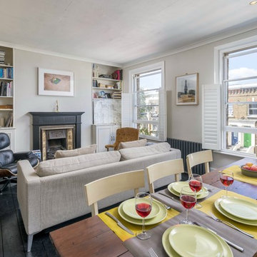
It's really about an eclectic mix: this sunlight is filtered through soft linen curtains that add texture and tone to the front parlor space. Complimented by a cream color shag rug and brown velvet sofa, the space takes on a soft and ethereal feeling by day and also by night. The chrome and glass coffee table placed between the front windows adds an eye-catching sparkle and shine allowing the accessories to float in the space.
Photo: Ward Roberts
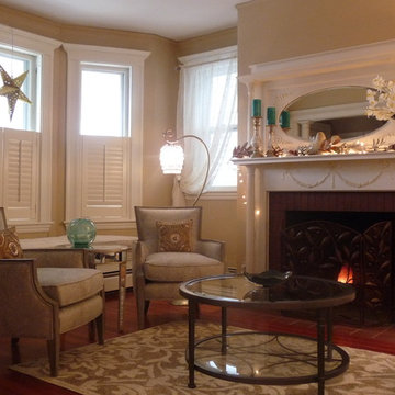
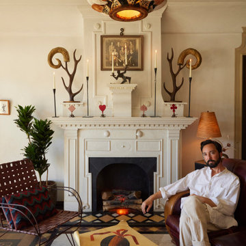
The design of this refined sitting room uses traditional Victorian elements such as the ornate white fireplace mantel/surround with accents of silver and gold to create a formal space in which to entertain. Polished cherry wood flooring and Doric columns lend an air of sophistication against soft beige walls. The inviting club chairs and glass coffee table with it's accents of wrought iron are echoed in the fireplace screen and complete this sophisticated, upscale space.
We were approached with a request to design the furnishings for an existing ‘finished’ apartment. The intention was to move in relatively fast, and the property already had an existing marble floor, kitchen and bathrooms which had to be kept. The property also boasted a fantastic 270 degree view, seen from most of the apartment. The clients had a very important role in the completion of the project. They were very involved during the design process and through various decoration choices. The final design was kept as a rigid guideline when faced with picking out all the different elements.
Once clear of all previous furniture, the space felt cold and bare; so we immediately felt the need for warmth, and raw, natural elements and textures to complement the cold marble floor while visually tying in the design of the whole apartment together.
Since the existing kitchen had a touch of dark walnut stain, we felt this material was one we should add to the palette of materials to contest the stark materials. A raw cement finish was another material we felt would add an interesting contrast and could be used in a variety of ways, from cabinets to walls and ceilings, to tie up the design of various areas of the apartment.
To warm up the living/dining area, keeping the existing marble floor but visually creating zones within the large living/dining area without hindering the flow, a dark timber custom-made soffit, continuous with a floor-to-ceiling drinks cabinet zones the dining area, giving it a degree of much-needed warmth.
The various windows with a stupendous 270 degree view needed to be visually tied together. This was done by introducing a continuous sheer [drape] which also doubled up as a sound-absorbing material along 2 of the 4 walls of the space.
A very large sofa was required to fill up the space correctly, also required for the size of the young family.
Services were integrated within the units and soffits, while a customized design in the corner between the kitchen and the living room took into consideration the viewpoints from the main areas to create a pantry without hindering the flow or views. A strategically placed floor-to-ceiling mirror doubles up the space and extends the view to the inner parts of the apartment.
The daughter’s bedroom was a small challenge in itself, and a fun task, where we wanted to achieve the perception of a cozy niche with its own enclosed reading nook [for reading fairy tales], behind see-through curtains and a custom-ordered wall print sporting the girl’s favorite colors.
The sons’ bedroom had double the requirements in terms of space needed: more wardrobe, more homework desk space, a tv/play station area… “We combined a raised platform area between the boys’ beds to become an area with cushions where the kids can lay down and play, and face a hidden screen behind the homework desk’s sliding back panel for their play station”. The color of the homework desk was chosen in relation to the boys’ ages. A more masculine material palette was chosen for this room, in contrast to the light pastel palette of the girl’s bedroom. Again, this colour can easily be changed over time for a more mature look.
PROJECT DATA:
St. Paul’s Bay, Malta
DESIGN TEAM:
Perit Rebecca Zammit, Perit Daniel Scerri, Elyse Tonna
OTHER CREDITS:
Photography: Tonio Lombardi
Styling : TKS
ロンドンにあるお手頃価格の小さなトランジショナルスタイルのおしゃれなリビング (グレーの壁、塗装フローリング、標準型暖炉、木材の暖炉まわり、内蔵型テレビ) の写真
Photographer: Dave Butterworth | Eye Was Here Photography
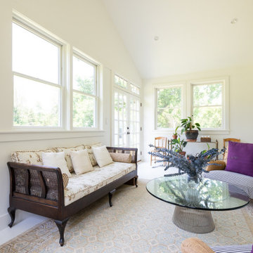
ニューヨークにある小さなカントリー風のおしゃれな独立型リビング (白い壁、塗装フローリング、標準型暖炉、木材の暖炉まわり、テレビなし、白い床) の写真
ニューヨークにある小さなカントリー風のおしゃれな独立型リビング (白い壁、塗装フローリング、標準型暖炉、木材の暖炉まわり、テレビなし、白い床) の写真
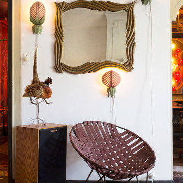
A large vintage speaker, leather strapped seat and antique mirror in the living room
ロサンゼルスにある高級な小さなエクレクティックスタイルのおしゃれなリビング (マルチカラーの壁、塗装フローリング、標準型暖炉、木材の暖炉まわり、テレビなし、マルチカラーの床) の写真
ロサンゼルスにある高級な小さなエクレクティックスタイルのおしゃれなリビング (マルチカラーの壁、塗装フローリング、標準型暖炉、木材の暖炉まわり、テレビなし、マルチカラーの床) の写真
We chose a beautiful inky blue for this London Living room to feel fresh in the daytime when the sun streams in and cozy in the evening when it would otherwise feel quite cold. The colour also complements the original fireplace tiles.
We took the colour across the walls and woodwork, including the alcoves, and skirting boards, to create a perfect seamless finish. Balanced by the white floor, shutters and lampshade there is just enough light to keep it uplifting and atmospheric.
The final additions were a complementary green velvet sofa, luxurious touches of gold and brass and a glass table and mirror to make the room sparkle by bouncing the light from the metallic finishes across the glass and onto the mirror
We were approached with a request to design the furnishings for an existing ‘finished’ apartment. The intention was to move in relatively fast, and the property already had an existing marble floor, kitchen and bathrooms which had to be kept. The property also boasted a fantastic 270 degree view, seen from most of the apartment. The clients had a very important role in the completion of the project. They were very involved during the design process and through various decoration choices. The final design was kept as a rigid guideline when faced with picking out all the different elements.
Once clear of all previous furniture, the space felt cold and bare; so we immediately felt the need for warmth, and raw, natural elements and textures to complement the cold marble floor while visually tying in the design of the whole apartment together.
Since the existing kitchen had a touch of dark walnut stain, we felt this material was one we should add to the palette of materials to contest the stark materials. A raw cement finish was another material we felt would add an interesting contrast and could be used in a variety of ways, from cabinets to walls and ceilings, to tie up the design of various areas of the apartment.
To warm up the living/dining area, keeping the existing marble floor but visually creating zones within the large living/dining area without hindering the flow, a dark timber custom-made soffit, continuous with a floor-to-ceiling drinks cabinet zones the dining area, giving it a degree of much-needed warmth.
The various windows with a stupendous 270 degree view needed to be visually tied together. This was done by introducing a continuous sheer [drape] which also doubled up as a sound-absorbing material along 2 of the 4 walls of the space.
A very large sofa was required to fill up the space correctly, also required for the size of the young family.
Services were integrated within the units and soffits, while a customized design in the corner between the kitchen and the living room took into consideration the viewpoints from the main areas to create a pantry without hindering the flow or views. A strategically placed floor-to-ceiling mirror doubles up the space and extends the view to the inner parts of the apartment.
The daughter’s bedroom was a small challenge in itself, and a fun task, where we wanted to achieve the perception of a cozy niche with its own enclosed reading nook [for reading fairy tales], behind see-through curtains and a custom-ordered wall print sporting the girl’s favorite colors.
The sons’ bedroom had double the requirements in terms of space needed: more wardrobe, more homework desk space, a tv/play station area… “We combined a raised platform area between the boys’ beds to become an area with cushions where the kids can lay down and play, and face a hidden screen behind the homework desk’s sliding back panel for their play station”. The color of the homework desk was chosen in relation to the boys’ ages. A more masculine material palette was chosen for this room, in contrast to the light pastel palette of the girl’s bedroom. Again, this colour can easily be changed over time for a more mature look.
PROJECT DATA:
St. Paul’s Bay, Malta
DESIGN TEAM:
Perit Rebecca Zammit, Perit Daniel Scerri, Elyse Tonna
OTHER CREDITS:
Photography: Tonio Lombardi
Styling : TKS
We chose a beautiful inky blue for this London Living room to feel fresh in the daytime when the sun streams in and cozy in the evening when it would otherwise feel quite cold. The colour also complements the original fireplace tiles.
We took the colour across the walls and woodwork, including the alcoves, and skirting boards, to create a perfect seamless finish. Balanced by the white floor, shutters and lampshade there is just enough light to keep it uplifting and atmospheric.
The final additions were a complementary green velvet sofa, luxurious touches of gold and brass and a glass table and mirror to make the room sparkle by bouncing the light from the metallic finishes across the glass and onto the mirror
We were approached with a request to design the furnishings for an existing ‘finished’ apartment. The intention was to move in relatively fast, and the property already had an existing marble floor, kitchen and bathrooms which had to be kept. The property also boasted a fantastic 270 degree view, seen from most of the apartment. The clients had a very important role in the completion of the project. They were very involved during the design process and through various decoration choices. The final design was kept as a rigid guideline when faced with picking out all the different elements.
Once clear of all previous furniture, the space felt cold and bare; so we immediately felt the need for warmth, and raw, natural elements and textures to complement the cold marble floor while visually tying in the design of the whole apartment together.
Since the existing kitchen had a touch of dark walnut stain, we felt this material was one we should add to the palette of materials to contest the stark materials. A raw cement finish was another material we felt would add an interesting contrast and could be used in a variety of ways, from cabinets to walls and ceilings, to tie up the design of various areas of the apartment.
To warm up the living/dining area, keeping the existing marble floor but visually creating zones within the large living/dining area without hindering the flow, a dark timber custom-made soffit, continuous with a floor-to-ceiling drinks cabinet zones the dining area, giving it a degree of much-needed warmth.
The various windows with a stupendous 270 degree view needed to be visually tied together. This was done by introducing a continuous sheer [drape] which also doubled up as a sound-absorbing material along 2 of the 4 walls of the space.
A very large sofa was required to fill up the space correctly, also required for the size of the young family.
Services were integrated within the units and soffits, while a customized design in the corner between the kitchen and the living room took into consideration the viewpoints from the main areas to create a pantry without hindering the flow or views. A strategically placed floor-to-ceiling mirror doubles up the space and extends the view to the inner parts of the apartment.
The daughter’s bedroom was a small challenge in itself, and a fun task, where we wanted to achieve the perception of a cozy niche with its own enclosed reading nook [for reading fairy tales], behind see-through curtains and a custom-ordered wall print sporting the girl’s favorite colors.
The sons’ bedroom had double the requirements in terms of space needed: more wardrobe, more homework desk space, a tv/play station area… “We combined a raised platform area between the boys’ beds to become an area with cushions where the kids can lay down and play, and face a hidden screen behind the homework desk’s sliding back panel for their play station”. The color of the homework desk was chosen in relation to the boys’ ages. A more masculine material palette was chosen for this room, in contrast to the light pastel palette of the girl’s bedroom. Again, this colour can easily be changed over time for a more mature look.
PROJECT DATA:
St. Paul’s Bay, Malta
DESIGN TEAM:
Perit Rebecca Zammit, Perit Daniel Scerri, Elyse Tonna
OTHER CREDITS:
Photography: Tonio Lombardi
Styling : TKS
小さなリビング (木材の暖炉まわり、レンガの床、大理石の床、塗装フローリング) の写真
1