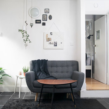
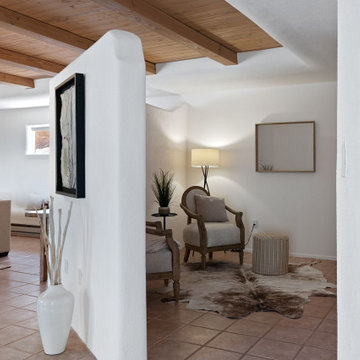
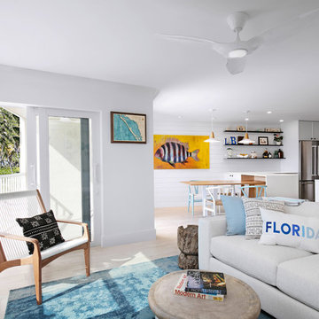
小さな白いリビング (セラミックタイルの床、白い壁) の写真
絞り込み:
資材コスト
並び替え:今日の人気順
写真 1〜20 枚目(全 196 枚)
1/5
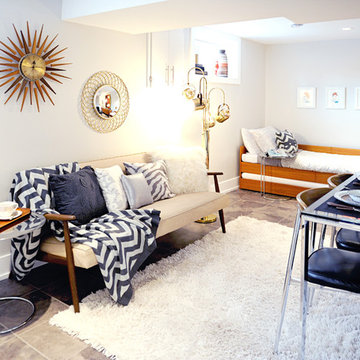
Photography: Paulina Ochoa Photography
Furniture & Lamps: Where on Earth Did You Get That? Antique Mall
Acessories & Artwork: Mid-Century Dweller, Ursela Ciechanska
Design & Decoration: Collage Interiors
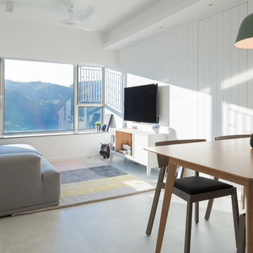
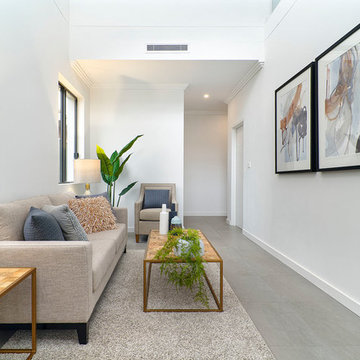
アリカンテにある低価格の小さなモダンスタイルのおしゃれなLDK (白い壁、セラミックタイルの床、暖炉なし、テレビなし、ベージュの床) の写真
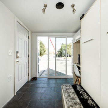
Photos by Jack Allan
Changed out light fixtures, repurposed shelving, and added vintage frames, horseshoe, and brass rack. Painted doors, skirting, and inside of closet. Most furniture and decor secondhand aside from sofa.
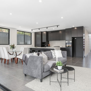
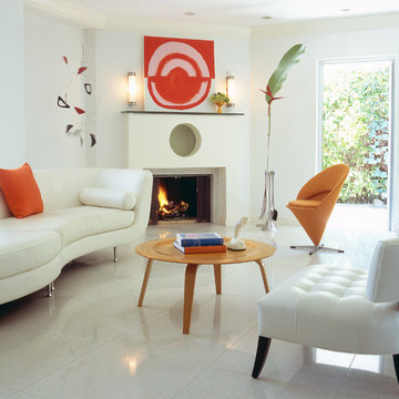
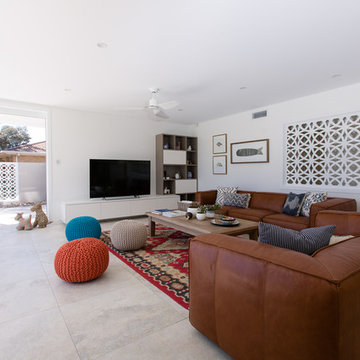
シドニーにある高級な小さなモダンスタイルのおしゃれなリビング (白い壁、セラミックタイルの床、暖炉なし、埋込式メディアウォール、グレーの床、レンガ壁、塗装板張りの天井) の写真
Explore the concept of modern luxury, translating it into a more tangible approach through marble pattern, textured glass, playing with silver and gold accent on basic french grey furniture. Gradient of blue and turquoise balanced the whole arrangement, creating a sense of serenity in this welcoming foyer and living area
Photography by Richard Chivers https://www.rchivers.co.uk/
Marshall House is an extension to a Grade II listed dwelling in the village of Twyford, near Winchester, Hampshire. The original house dates from the 17th Century, although it had been remodelled and extended during the late 18th Century.
The clients contacted us to explore the potential to extend their home in order to suit their growing family and active lifestyle. Due to the constraints of living in a listed building, they were unsure as to what development possibilities were available. The brief was to replace an existing lean-to and 20th century conservatory with a new extension in a modern, contemporary approach. The design was developed in close consultation with the local authority as well as their historic environment department, in order to respect the existing property and work to achieve a positive planning outcome.
Like many older buildings, the dwelling had been adjusted here and there, and updated at numerous points over time. The interior of the existing property has a charm and a character - in part down to the age of the property, various bits of work over time and the wear and tear of the collective history of its past occupants. These spaces are dark, dimly lit and cosy. They have low ceilings, small windows, little cubby holes and odd corners. Walls are not parallel or perpendicular, there are steps up and down and places where you must watch not to bang your head.
The extension is accessed via a small link portion that provides a clear distinction between the old and new structures. The initial concept is centred on the idea of contrasts. The link aims to have the effect of walking through a portal into a seemingly different dwelling, that is modern, bright, light and airy with clean lines and white walls. However, complementary aspects are also incorporated, such as the strategic placement of windows and roof lights in order to cast light over walls and corners to create little nooks and private views. The overall form of the extension is informed by the awkward shape and uses of the site, resulting in the walls not being parallel in plan and splaying out at different irregular angles.
Externally, timber larch cladding is used as the primary material. This is painted black with a heavy duty barn paint, that is both long lasting and cost effective. The black finish of the extension contrasts with the white painted brickwork at the rear and side of the original house. The external colour palette of both structures is in opposition to the reality of the interior spaces. Although timber cladding is a fairly standard, commonplace material, visual depth and distinction has been created through the articulation of the boards. The inclusion of timber fins changes the way shadows are cast across the external surface during the day. Whilst at night, these are illuminated by external lighting.
A secondary entrance to the house is provided through a concealed door that is finished to match the profile of the cladding. This opens to a boot/utility room, from which a new shower room can be accessed, before proceeding to the new open plan living space and dining area.
Correy DeWindt, LilGreen Photography
Designer:
Ellee Nolan Asaro
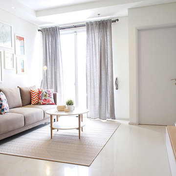
ニューヨークにある小さなコンテンポラリースタイルのおしゃれなリビング (白い壁、セラミックタイルの床、暖炉なし、テレビなし、ベージュの床) の写真
ニューヨークにある小さなコンテンポラリースタイルのおしゃれなリビング (白い壁、セラミックタイルの床、暖炉なし、テレビなし、ベージュの床) の写真
Les deux fenêtres sont maintenant ouvertes dans la pièce de vie, ce qui permet d'y amener un maximum de luminosité ! Un rez-de-chaussée certes, pour cette ancienne loge de gardien, mais pas sombre !
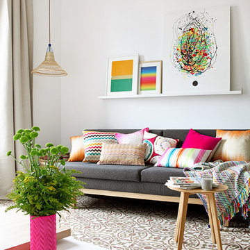
お手頃価格の小さなコンテンポラリースタイルのおしゃれなリビング (白い壁、セラミックタイルの床、暖炉なし、テレビなし、グレーの床) の写真
Living room design, shot for Nest Magazine Winter 2016.
A contemporary space with a retro twist.
Photo by Miles Wilson and Naomi Giatas
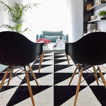
アデレードにあるお手頃価格の小さなコンテンポラリースタイルのおしゃれなリビング (白い壁、セラミックタイルの床) の写真
アデレードにあるお手頃価格の小さなコンテンポラリースタイルのおしゃれなリビング (白い壁、セラミックタイルの床) の写真
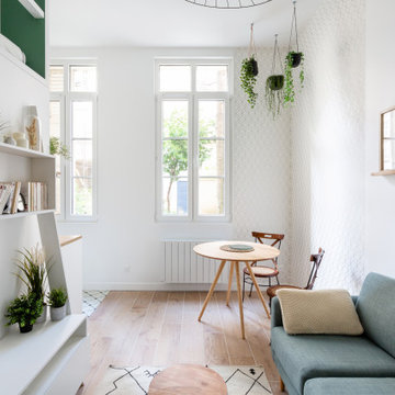
小さな白いリビング (セラミックタイルの床、白い壁) の写真
1