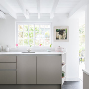
ターコイズブルーの、白いキッチン (表し梁、オニキスカウンター、珪岩カウンター、人工大理石カウンター、グレーの床、ピンクの床、赤い床) の写真
絞り込み:
資材コスト
並び替え:今日の人気順
写真 1〜20 枚目(全 119 枚)
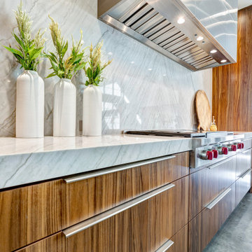
The natural walnut wood creates a gorgeous focal wall, while the high gloss acrylic finish on the island complements the veining in the thick natural stone countertops.
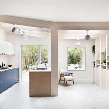
Amos Goldreich Architecture has completed an asymmetric brick extension that celebrates light and modern life for a young family in North London. The new layout gives the family distinct kitchen, dining and relaxation zones, and views to the large rear garden from numerous angles within the home.
The owners wanted to update the property in a way that would maximise the available space and reconnect different areas while leaving them clearly defined. Rather than building the common, open box extension, Amos Goldreich Architecture created distinctly separate yet connected spaces both externally and internally using an asymmetric form united by pale white bricks.
Previously the rear plan of the house was divided into a kitchen, dining room and conservatory. The kitchen and dining room were very dark; the kitchen was incredibly narrow and the late 90’s UPVC conservatory was thermally inefficient. Bringing in natural light and creating views into the garden where the clients’ children often spend time playing were both important elements of the brief. Amos Goldreich Architecture designed a large X by X metre box window in the centre of the sitting room that offers views from both the sitting area and dining table, meaning the clients can keep an eye on the children while working or relaxing.
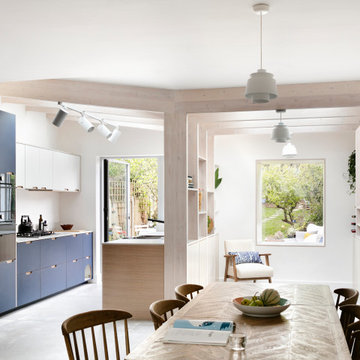
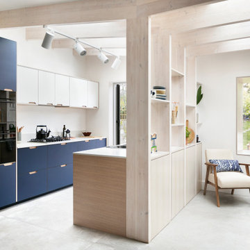
Amos Goldreich Architecture enlivened and lightened the home by working with materials that encourage the diffusion of light throughout the spaces. Exposed timber rafters create a clever shelving screen, functioning both as open storage and a permeable room divider to maintain the connection between the sitting area and kitchen. A deep blue kitchen with plywood handle detailing creates balance and contrast against the light tones of the pale timber and white walls.
The new extension is clad in white bricks which help to bounce light around the new interiors, emphasise the freshness and newness, and create a clear, distinct separation from the existing part of the late Victorian semi-detached London home. Brick continues to make an impact in the patio area where Amos Goldreich Architecture chose to use Stone Grey brick pavers for their muted tones and durability. A sedum roof spans the entire extension giving a beautiful view from the first floor bedrooms. The sedum roof also acts to encourage biodiversity and collect rainwater.
Continues
Amos Goldreich, Director of Amos Goldreich Architecture says:
“The Framework House was a fantastic project to work on with our clients. We thought carefully about the space planning to ensure we met the brief for distinct zones, while also keeping a connection to the outdoors and others in the space.
“The materials of the project also had to marry with the new plan. We chose to keep the interiors fresh, calm, and clean so our clients could adapt their future interior design choices easily without the need to renovate the space again.”
Clients, Tom and Jennifer Allen say:
“I couldn’t have envisioned having a space like this. It has completely changed the way we live as a family for the better. We are more connected, yet also have our own spaces to work, eat, play, learn and relax.”
“The extension has had an impact on the entire house. When our son looks out of his window on the first floor, he sees a beautiful planted roof that merges with the garden.”
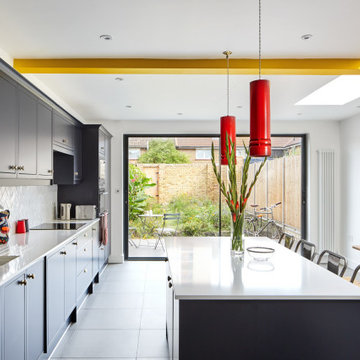
A new side extension allows for a generous new kitchen with direct link to the garden. Big generous sliding doors allow for fluid movement between the interior and the exterior. A big roof light was designed to flood the space with natural light. An exposed beam crossed the roof light and ceiling and gave us the opportunity to express it with a nice vivid colour which gives personality to the space.
フェニックスにあるお手頃価格のモダンスタイルのおしゃれなキッチン (フラットパネル扉のキャビネット、淡色木目調キャビネット、珪岩カウンター、アイランドなし、白いキッチンパネル、セラミックタイルのキッチンパネル、白い調理設備、コンクリートの床、グレーの床、表し梁) の写真
Rénovation, agencement et décoration d’une ancienne usine transformée en un loft de 250 m2 réparti sur 3 niveaux.
Les points forts :
Association de design industriel avec du mobilier vintage
La boîte buanderie
Les courbes et lignes géométriques valorisant les espaces
Crédit photo © Bertrand Fompeyrine
A modern contemporary kitchen remodel with mid-century modern influences. The eye catching exposed beams are complemented by a large island with panels capping the quartz counter top, which is a common mid-century design feature. The custom glass tile backsplash makes a statement, as do the pops of cobalt blue and the contemporary glass pendant lights.
コーンウォールにあるお手頃価格の小さなモダンスタイルのおしゃれなキッチン (ドロップインシンク、フラットパネル扉のキャビネット、ベージュのキャビネット、珪岩カウンター、白いキッチンパネル、クオーツストーンのキッチンパネル、黒い調理設備、スレートの床、アイランドなし、グレーの床、白いキッチンカウンター、表し梁、グレーとクリーム色) の写真
Cocina, dividida en dos por un muro de carga resultado de una ampliación.
他の地域にある低価格の小さな北欧スタイルのおしゃれなキッチン (中間色木目調キャビネット、珪岩カウンター、白いキッチンカウンター、白いキッチンパネル、グレーの床、表し梁) の写真
他の地域にある低価格の小さな北欧スタイルのおしゃれなキッチン (中間色木目調キャビネット、珪岩カウンター、白いキッチンカウンター、白いキッチンパネル、グレーの床、表し梁) の写真
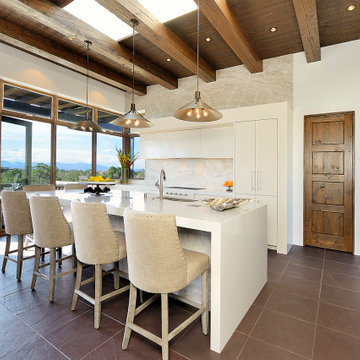
アルバカーキにある中くらいなサンタフェスタイルのおしゃれなキッチン (シングルシンク、フラットパネル扉のキャビネット、ベージュのキャビネット、ベージュキッチンパネル、石スラブのキッチンパネル、パネルと同色の調理設備、グレーの床、人工大理石カウンター、表し梁) の写真
A stunning Blue/Grey Handmade kitchen with White quartz, stunning island and white ceramic Undermounted sink
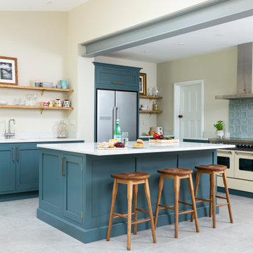
ロンドンにあるお手頃価格の中くらいなトランジショナルスタイルのおしゃれなキッチン (シェーカースタイル扉のキャビネット、青いキャビネット、珪岩カウンター、白いキッチンカウンター、青いキッチンパネル、シルバーの調理設備、グレーの床、表し梁) の写真
ロンドンにあるお手頃価格の中くらいなトランジショナルスタイルのおしゃれなキッチン (シェーカースタイル扉のキャビネット、青いキャビネット、珪岩カウンター、白いキッチンカウンター、青いキッチンパネル、シルバーの調理設備、グレーの床、表し梁) の写真
他の地域にある広い北欧スタイルのおしゃれなアイランドキッチン (フラットパネル扉のキャビネット、グレーのキャビネット、珪岩カウンター、シルバーの調理設備、ライムストーンの床、グレーの床、表し梁) の写真
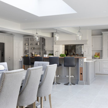
サリーにある高級な広いトラディショナルスタイルのおしゃれなキッチン (ドロップインシンク、シェーカースタイル扉のキャビネット、グレーのキャビネット、珪岩カウンター、メタリックのキッチンパネル、ミラータイルのキッチンパネル、シルバーの調理設備、ライムストーンの床、グレーの床、白いキッチンカウンター、表し梁) の写真
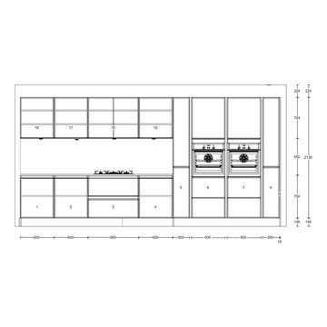
Die Kunst bei der Gestaltung dieser Küche war die Trapezform bei der Gestaltung der neuen Küche mit großem Sitzplatz Sinnvoll zu nutzen. Alle Unterschränke wurden in weißem Mattlack ausgeführt und die lange Zeile beginnt links mit einer Tiefe von 70cm und endet rechts mit 40cm. Die Kochinsel hat ebenfalls eine Trapezform. Oberschränke und Hochschränke wurden in Altholz ausgeführt.
Amos Goldreich Architecture has completed an asymmetric brick extension that celebrates light and modern life for a young family in North London. The new layout gives the family distinct kitchen, dining and relaxation zones, and views to the large rear garden from numerous angles within the home.
The owners wanted to update the property in a way that would maximise the available space and reconnect different areas while leaving them clearly defined. Rather than building the common, open box extension, Amos Goldreich Architecture created distinctly separate yet connected spaces both externally and internally using an asymmetric form united by pale white bricks.
Previously the rear plan of the house was divided into a kitchen, dining room and conservatory. The kitchen and dining room were very dark; the kitchen was incredibly narrow and the late 90’s UPVC conservatory was thermally inefficient. Bringing in natural light and creating views into the garden where the clients’ children often spend time playing were both important elements of the brief. Amos Goldreich Architecture designed a large X by X metre box window in the centre of the sitting room that offers views from both the sitting area and dining table, meaning the clients can keep an eye on the children while working or relaxing.
Amos Goldreich Architecture enlivened and lightened the home by working with materials that encourage the diffusion of light throughout the spaces. Exposed timber rafters create a clever shelving screen, functioning both as open storage and a permeable room divider to maintain the connection between the sitting area and kitchen. A deep blue kitchen with plywood handle detailing creates balance and contrast against the light tones of the pale timber and white walls.
The new extension is clad in white bricks which help to bounce light around the new interiors, emphasise the freshness and newness, and create a clear, distinct separation from the existing part of the late Victorian semi-detached London home. Brick continues to make an impact in the patio area where Amos Goldreich Architecture chose to use Stone Grey brick pavers for their muted tones and durability. A sedum roof spans the entire extension giving a beautiful view from the first floor bedrooms. The sedum roof also acts to encourage biodiversity and collect rainwater.
Continues
Amos Goldreich, Director of Amos Goldreich Architecture says:
“The Framework House was a fantastic project to work on with our clients. We thought carefully about the space planning to ensure we met the brief for distinct zones, while also keeping a connection to the outdoors and others in the space.
“The materials of the project also had to marry with the new plan. We chose to keep the interiors fresh, calm, and clean so our clients could adapt their future interior design choices easily without the need to renovate the space again.”
Clients, Tom and Jennifer Allen say:
“I couldn’t have envisioned having a space like this. It has completely changed the way we live as a family for the better. We are more connected, yet also have our own spaces to work, eat, play, learn and relax.”
“The extension has had an impact on the entire house. When our son looks out of his window on the first floor, he sees a beautiful planted roof that merges with the garden.”
The juxtaposition of soft texture and feminine details against hard metal and concrete finishes. Elements of floral wallpaper, paper lanterns, and abstract art blend together to create a sense of warmth. Soaring ceilings are anchored by thoughtfully curated and well placed furniture pieces. The perfect home for two.
The Sonoma Farmhaus project was designed for a cycling enthusiast with a globally demanding professional career, who wanted to create a place that could serve as both a retreat of solitude and a hub for gathering with friends and family. Located within the town of Graton, California, the site was chosen not only to be close to a small town and its community, but also to be within cycling distance to the picturesque, coastal Sonoma County landscape.
Taking the traditional forms of farmhouse, and their notions of sustenance and community, as inspiration, the project comprises an assemblage of two forms - a Main House and a Guest House with Bike Barn - joined in the middle by a central outdoor gathering space anchored by a fireplace. The vision was to create something consciously restrained and one with the ground on which it stands. Simplicity, clear detailing, and an innate understanding of how things go together were all central themes behind the design. Solid walls of rammed earth blocks, fabricated from soils excavated from the site, bookend each of the structures.
According to the owner, the use of simple, yet rich materials and textures...“provides a humanness I’ve not known or felt in any living venue I’ve stayed, Farmhaus is an icon of sustenance for me".
This Cornish county home required a bespoke designed kitchen to maximise storage yet create a warm, fresh and open feel to the room.
コーンウォールにあるお手頃価格の小さなコンテンポラリースタイルのおしゃれなキッチン (ドロップインシンク、フラットパネル扉のキャビネット、ベージュのキャビネット、珪岩カウンター、白いキッチンパネル、クオーツストーンのキッチンパネル、黒い調理設備、スレートの床、アイランドなし、グレーの床、白いキッチンカウンター、表し梁、グレーとクリーム色) の写真
コーンウォールにあるお手頃価格の小さなコンテンポラリースタイルのおしゃれなキッチン (ドロップインシンク、フラットパネル扉のキャビネット、ベージュのキャビネット、珪岩カウンター、白いキッチンパネル、クオーツストーンのキッチンパネル、黒い調理設備、スレートの床、アイランドなし、グレーの床、白いキッチンカウンター、表し梁、グレーとクリーム色) の写真
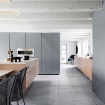
他の地域にある広い北欧スタイルのおしゃれなアイランドキッチン (フラットパネル扉のキャビネット、グレーのキャビネット、珪岩カウンター、シルバーの調理設備、ライムストーンの床、グレーの床、表し梁) の写真
Amos Goldreich Architecture has completed an asymmetric brick extension that celebrates light and modern life for a young family in North London. The new layout gives the family distinct kitchen, dining and relaxation zones, and views to the large rear garden from numerous angles within the home.
The owners wanted to update the property in a way that would maximise the available space and reconnect different areas while leaving them clearly defined. Rather than building the common, open box extension, Amos Goldreich Architecture created distinctly separate yet connected spaces both externally and internally using an asymmetric form united by pale white bricks.
Previously the rear plan of the house was divided into a kitchen, dining room and conservatory. The kitchen and dining room were very dark; the kitchen was incredibly narrow and the late 90’s UPVC conservatory was thermally inefficient. Bringing in natural light and creating views into the garden where the clients’ children often spend time playing were both important elements of the brief. Amos Goldreich Architecture designed a large X by X metre box window in the centre of the sitting room that offers views from both the sitting area and dining table, meaning the clients can keep an eye on the children while working or relaxing.
Amos Goldreich Architecture enlivened and lightened the home by working with materials that encourage the diffusion of light throughout the spaces. Exposed timber rafters create a clever shelving screen, functioning both as open storage and a permeable room divider to maintain the connection between the sitting area and kitchen. A deep blue kitchen with plywood handle detailing creates balance and contrast against the light tones of the pale timber and white walls.
The new extension is clad in white bricks which help to bounce light around the new interiors, emphasise the freshness and newness, and create a clear, distinct separation from the existing part of the late Victorian semi-detached London home. Brick continues to make an impact in the patio area where Amos Goldreich Architecture chose to use Stone Grey brick pavers for their muted tones and durability. A sedum roof spans the entire extension giving a beautiful view from the first floor bedrooms. The sedum roof also acts to encourage biodiversity and collect rainwater.
Continues
Amos Goldreich, Director of Amos Goldreich Architecture says:
“The Framework House was a fantastic project to work on with our clients. We thought carefully about the space planning to ensure we met the brief for distinct zones, while also keeping a connection to the outdoors and others in the space.
“The materials of the project also had to marry with the new plan. We chose to keep the interiors fresh, calm, and clean so our clients could adapt their future interior design choices easily without the need to renovate the space again.”
Clients, Tom and Jennifer Allen say:
“I couldn’t have envisioned having a space like this. It has completely changed the way we live as a family for the better. We are more connected, yet also have our own spaces to work, eat, play, learn and relax.”
“The extension has had an impact on the entire house. When our son looks out of his window on the first floor, he sees a beautiful planted roof that merges with the garden.”
Simon and Angharad were keen to utilise their Victorian terrace side return to create a charcterful space that combined the beauty and proportions of their Victorian terrace with a modern twist. Importantly making the kitchen feel more connected to the rest of the house.
ターコイズブルーの、白いキッチン (表し梁、オニキスカウンター、珪岩カウンター、人工大理石カウンター、グレーの床、ピンクの床、赤い床) の写真
1