赤いキッチン (ガラスタイルのキッチンパネル、ベージュのキャビネット、緑のキャビネット) の写真
絞り込み:
資材コスト
並び替え:今日の人気順
写真 1〜3 枚目(全 3 枚)
1/5
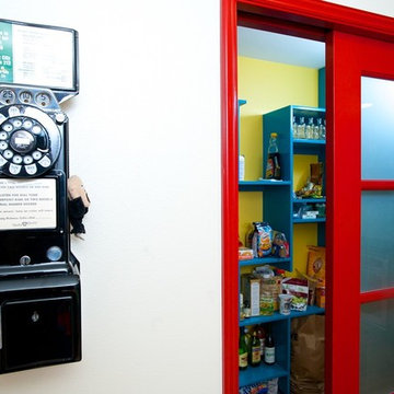
Walk-in pantry pocket door concept was based on Bristish phone booth. Storage shelving was designed to acommodate al the storables.
シアトルにある高級な中くらいなエクレクティックスタイルのおしゃれなキッチン (アンダーカウンターシンク、落し込みパネル扉のキャビネット、緑のキャビネット、クオーツストーンカウンター、マルチカラーのキッチンパネル、ガラスタイルのキッチンパネル、シルバーの調理設備、無垢フローリング) の写真
シアトルにある高級な中くらいなエクレクティックスタイルのおしゃれなキッチン (アンダーカウンターシンク、落し込みパネル扉のキャビネット、緑のキャビネット、クオーツストーンカウンター、マルチカラーのキッチンパネル、ガラスタイルのキッチンパネル、シルバーの調理設備、無垢フローリング) の写真
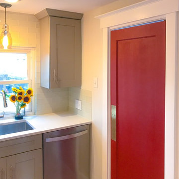
A splash of red adds just enough of an impact on this swinging door into the laundry room.
デンバーにあるお手頃価格の小さなトランジショナルスタイルのおしゃれなキッチン (ドロップインシンク、シェーカースタイル扉のキャビネット、緑のキャビネット、白いキッチンパネル、ガラスタイルのキッチンパネル、シルバーの調理設備、磁器タイルの床、赤い床、クオーツストーンカウンター) の写真
デンバーにあるお手頃価格の小さなトランジショナルスタイルのおしゃれなキッチン (ドロップインシンク、シェーカースタイル扉のキャビネット、緑のキャビネット、白いキッチンパネル、ガラスタイルのキッチンパネル、シルバーの調理設備、磁器タイルの床、赤い床、クオーツストーンカウンター) の写真
Designer Jodi Tramontin, CMKBD decided to create a "Contemporary Craftsman" inspired kitchen which would flow with the rest of the home's architecture, design and materials.
In order to create the perfect Contemporary Craftsman-inspired kitchen, she selected Dura Supreme's popular Lynden door style. The clean, simple lines on the doors rails and stiles along with the beautiful bevel detailing are the perfect complement to the Contemporary Craftsman-inspired kitchen that she wanted to create.
After the door style was decided on, it was time to create the color palette. When creating a color palette for a particular space, start by determining what items that will be staying in the room that you’ll need to coordinate with. For example, for Jodi’s new kitchen she needed to work with the existing paint, millwork (casings, trim, interior doors), and hardwood floor colors.
“One of the most common questions I get as a designer is "Do my cabinets have to match the rest of the woodwork within the home?" My answer to that question is "No - absolutely not". I love mixing different wood tones within any given space to create a unique and comfortable look.” – Jodi Tramontin, CMKBD
After looking at many different options for the cabinet finishes, Jodi decided on Dura Supreme's “Hazelnut stain” on Cherry for the perimeter cabinetry and Dura Supreme’s “Latte” paint on Maple/Paintable for the island. Both of these finishes coordinate beautifully with the existing paint, millwork, and hardwood.
Jodi also opted to go with a Low Sheen level on the stained finishes. Dura Supreme's standard sheen level on our stains is a semi-gloss finish while the low sheen is considered a satin finish. The low sheen option is just as strong and durable as our standard sheen. Please note that some finishes are only available in a lower sheen level. Your authorized Dura Supreme dealer can assist you with these selections.
The countertops and backsplash were selected to complement the Dura Supreme “Hazelnut” stain and “Latte” paint colors on the cabinetry.
Request a FREE Dura Supreme Brochure Packet:
http://www.durasupreme.com/request-brochure
Find a Dura Supreme Showroom near you today:
http://www.durasupreme.com/dealer-locator
赤いキッチン (ガラスタイルのキッチンパネル、ベージュのキャビネット、緑のキャビネット) の写真
1