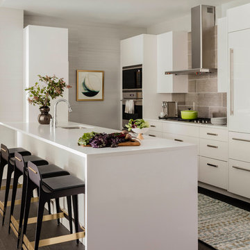
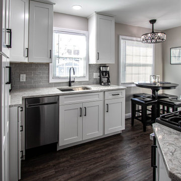
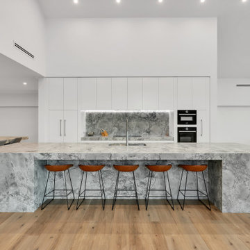
キッチン (グレーのキッチンパネル、フラットパネル扉のキャビネット、濃色無垢フローリング、ラミネートの床、クッションフロア) の写真
絞り込み:
資材コスト
並び替え:今日の人気順
写真 1〜20 枚目(全 7,140 枚)
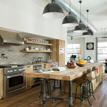
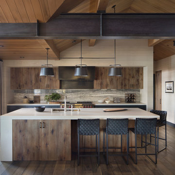
Kitchen remodel with reclaimed wood cabinetry and industrial details. Photography by Manolo Langis.
Located steps away from the beach, the client engaged us to transform a blank industrial loft space to a warm inviting space that pays respect to its industrial heritage. We use anchored large open space with a sixteen foot conversation island that was constructed out of reclaimed logs and plumbing pipes. The island itself is divided up into areas for eating, drinking, and reading. Bringing this theme into the bedroom, the bed was constructed out of 12x12 reclaimed logs anchored by two bent steel plates for side tables.
Doug Thompson
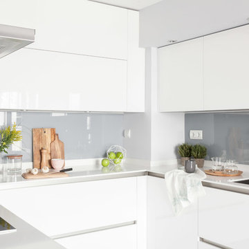
オーランドにあるコンテンポラリースタイルのおしゃれなII型キッチン (ダブルシンク、フラットパネル扉のキャビネット、グレーのキャビネット、グレーのキッチンパネル、シルバーの調理設備、濃色無垢フローリング、アイランドなし) の写真
オーランドにあるコンテンポラリースタイルのおしゃれなII型キッチン (ダブルシンク、フラットパネル扉のキャビネット、グレーのキャビネット、グレーのキッチンパネル、シルバーの調理設備、濃色無垢フローリング、アイランドなし) の写真
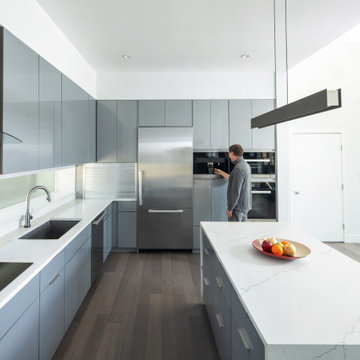
The kitchen is designed to be sleek and visible from the main living spaces. A waterfall edge to the island adds a detail. The appliances include a built in coffee maker, wall oven and wall microwave, built in stainless refrigerator, undercount sink and induction cooktop with range.
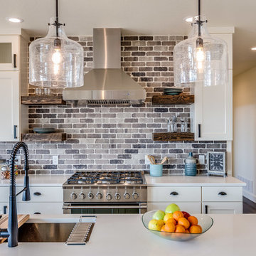
他の地域にあるカントリー風のおしゃれなキッチン (アンダーカウンターシンク、フラットパネル扉のキャビネット、白いキャビネット、クオーツストーンカウンター、グレーのキッチンパネル、レンガのキッチンパネル、シルバーの調理設備、濃色無垢フローリング、茶色い床、白いキッチンカウンター) の写真
Photography by Michael J. Lee
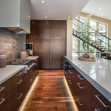
ボストンにあるラグジュアリーな中くらいなコンテンポラリースタイルのおしゃれなキッチン (アンダーカウンターシンク、フラットパネル扉のキャビネット、白いキャビネット、クオーツストーンカウンター、シルバーの調理設備、濃色無垢フローリング、茶色い床、白いキッチンカウンター、グレーのキッチンパネル) の写真
ボストンにあるラグジュアリーな中くらいなコンテンポラリースタイルのおしゃれなキッチン (アンダーカウンターシンク、フラットパネル扉のキャビネット、白いキャビネット、クオーツストーンカウンター、シルバーの調理設備、濃色無垢フローリング、茶色い床、白いキッチンカウンター、グレーのキッチンパネル) の写真
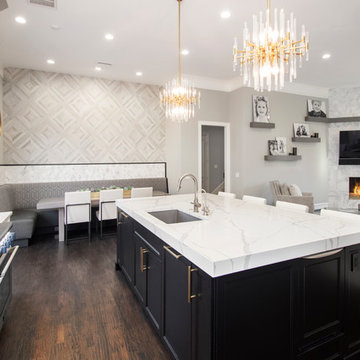
Our clients came to us wanting to update and open up their kitchen, breakfast nook, wet bar, and den. They wanted a cleaner look without clutter but didn’t want to go with an all-white kitchen, fearing it’s too trendy. Their kitchen was not utilized well and was not aesthetically appealing; it was very ornate and dark. The cooktop was too far back in the kitchen towards the butler’s pantry, making it awkward when cooking, so they knew they wanted that moved. The rest was left up to our designer to overcome these obstacles and give them their dream kitchen.
We gutted the kitchen cabinets, including the built-in china cabinet and all finishes. The pony wall that once separated the kitchen from the den (and also housed the sink, dishwasher, and ice maker) was removed, and those appliances were relocated to the new large island, which had a ton of storage and a 15” overhang for bar seating. Beautiful aged brass Quebec 6-light pendants were hung above the island.
All cabinets were replaced and drawers were designed to maximize storage. The Eclipse “Greensboro” cabinetry was painted gray with satin brass Emtek Mod Hex “Urban Modern” pulls. A large banquet seating area was added where the stand-alone kitchen table once sat. The main wall was covered with 20x20 white Golwoo tile. The backsplash in the kitchen and the banquette accent tile was a contemporary coordinating Tempesta Neve polished Wheaton mosaic marble.
In the wet bar, they wanted to completely gut and replace everything! The overhang was useless and it was closed off with a large bar that they wanted to be opened up, so we leveled out the ceilings and filled in the original doorway into the bar in order for the flow into the kitchen and living room more natural. We gutted all cabinets, plumbing, appliances, light fixtures, and the pass-through pony wall. A beautiful backsplash was installed using Nova Hex Graphite ceramic mosaic 5x5 tile. A 15” overhang was added at the counter for bar seating.
In the den, they hated the brick fireplace and wanted a less rustic look. The original mantel was very bulky and dark, whereas they preferred a more rectangular firebox opening, if possible. We removed the fireplace and surrounding hearth, brick, and trim, as well as the built-in cabinets. The new fireplace was flush with the wall and surrounded with Tempesta Neve Polished Marble 8x20 installed in a Herringbone pattern. The TV was hung above the fireplace and floating shelves were added to the surrounding walls for photographs and artwork.
They wanted to completely gut and replace everything in the powder bath, so we started by adding blocking in the wall for the new floating cabinet and a white vessel sink. Black Boardwalk Charcoal Hex Porcelain mosaic 2x2 tile was used on the bathroom floor; coordinating with a contemporary “Cleopatra Silver Amalfi” black glass 2x4 mosaic wall tile. Two Schoolhouse Electric “Isaac” short arm brass sconces were added above the aged brass metal framed hexagon mirror. The countertops used in here, as well as the kitchen and bar, were Elements quartz “White Lightning.” We refinished all existing wood floors downstairs with hand scraped with the grain. Our clients absolutely love their new space with its ease of organization and functionality.
Paul Dyer Photo
サンフランシスコにあるラスティックスタイルのおしゃれなキッチン (アンダーカウンターシンク、フラットパネル扉のキャビネット、中間色木目調キャビネット、グレーのキッチンパネル、石スラブのキッチンパネル、シルバーの調理設備、濃色無垢フローリング、茶色い床、ベージュのキッチンカウンター) の写真
サンフランシスコにあるラスティックスタイルのおしゃれなキッチン (アンダーカウンターシンク、フラットパネル扉のキャビネット、中間色木目調キャビネット、グレーのキッチンパネル、石スラブのキッチンパネル、シルバーの調理設備、濃色無垢フローリング、茶色い床、ベージュのキッチンカウンター) の写真
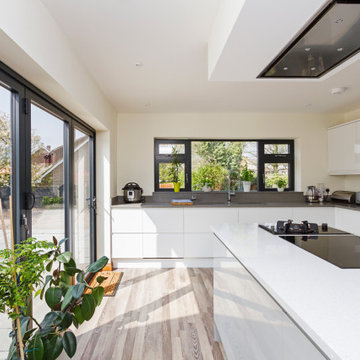
バッキンガムシャーにあるお手頃価格の小さなモダンスタイルのおしゃれなキッチン (アンダーカウンターシンク、フラットパネル扉のキャビネット、白いキャビネット、珪岩カウンター、グレーのキッチンパネル、ガラス板のキッチンパネル、パネルと同色の調理設備、クッションフロア、アイランドなし、グレーの床、白いキッチンカウンター) の写真
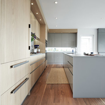
サンフランシスコにある高級な広いコンテンポラリースタイルのおしゃれなキッチン (シングルシンク、フラットパネル扉のキャビネット、シルバーの調理設備、淡色木目調キャビネット、人工大理石カウンター、グレーのキッチンパネル、モザイクタイルのキッチンパネル、ラミネートの床、茶色い床) の写真
Chris Rollet
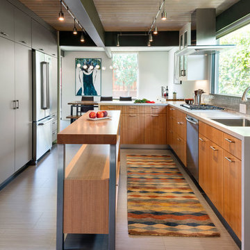
バンクーバーにあるラグジュアリーな中くらいなコンテンポラリースタイルのおしゃれなキッチン (アンダーカウンターシンク、フラットパネル扉のキャビネット、淡色木目調キャビネット、濃色無垢フローリング、ガラスカウンター、グレーのキッチンパネル、シルバーの調理設備) の写真
バンクーバーにあるラグジュアリーな中くらいなコンテンポラリースタイルのおしゃれなキッチン (アンダーカウンターシンク、フラットパネル扉のキャビネット、淡色木目調キャビネット、濃色無垢フローリング、ガラスカウンター、グレーのキッチンパネル、シルバーの調理設備) の写真
Scott Zimmerman, Modern kitchen with walnut cabinets and quartz counter top.
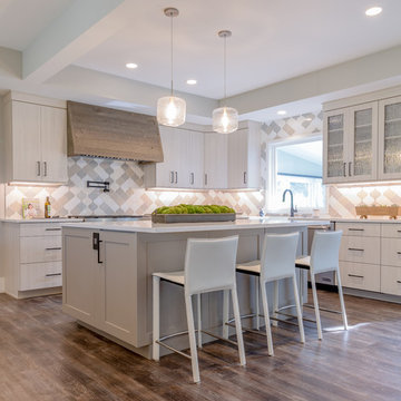
ソルトレイクシティにある高級な広いコンテンポラリースタイルのおしゃれなアイランドキッチン (フラットパネル扉のキャビネット、濃色木目調キャビネット、珪岩カウンター、グレーのキッチンパネル、石タイルのキッチンパネル、パネルと同色の調理設備、濃色無垢フローリング) の写真
ソルトレイクシティにある高級な広いコンテンポラリースタイルのおしゃれなアイランドキッチン (フラットパネル扉のキャビネット、濃色木目調キャビネット、珪岩カウンター、グレーのキッチンパネル、石タイルのキッチンパネル、パネルと同色の調理設備、濃色無垢フローリング) の写真
In this kitchen, Waypoint 650F door style in Painted Linen Finish with Eternia 3cm Ancaster quartz countertops accented with Top Knobs Lydia pull in Flat Black finish. The tile on the backsplash is 3x6 Anatolia Marlow with Tide Glossy finish. Also installed is an Elkay Crosstown Stainless Steel single bowl sink with colander, cutting board, drying rack and drain and a Moen Align pullout faucet in Matte Black finish. The flooring is Adura Rigid Sausalito LVT 6x48 plant in Bay Breeze for the kitchen and entry step.
シドニーにあるラグジュアリーな巨大なモダンスタイルのおしゃれなキッチン (アンダーカウンターシンク、フラットパネル扉のキャビネット、白いキャビネット、黒い調理設備、ベージュの床、グレーのキッチンカウンター、三角天井、御影石カウンター、グレーのキッチンパネル、御影石のキッチンパネル、クッションフロア) の写真
A combination of bricks, cement sheet, copper and Colorbond combine harmoniously to produce a striking street appeal. Internally the layout follows the client's brief to maintain a level of privacy for multiple family members while also taking advantage of the view and north facing orientation. The level of detail and finish is exceptional throughout the home with the added complexity of incorporating building materials sourced from overseas.
We used an open floor plan for the kitchen and dining, with both being part of the great room together with the living room. For this contemporary gray kitchen and dining, we used flush cabinet surfaces to achieve a minimalist and modern look. The backsplash is made with beautiful 3” x 16” light gray tiles that perfectly unite the white wall cabinets and the darker gray base cabinets. This monochromatic color scheme is also evident on the white dining table and countertops, and the gray and white chairs. We opted for an extra large kitchen island that provides an additional surface for food preparation and having quick meals. The modern island pendant lights serve as the functional centerpiece of the kitchen and dining area.
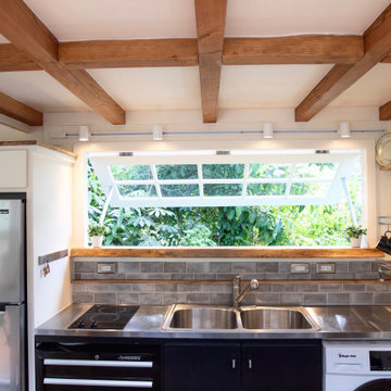
This coastal, contemporary Tiny Home features a warm yet industrial style kitchen with stainless steel counters and husky tool drawers and black cabinets. The silver metal counters are complimented by grey subway tiling as a backsplash against the warmth of the locally sourced curly mango wood windowsill ledge. The mango wood windowsill also acts as a pass-through window to an outdoor bar and seating area on the deck. Entertaining guests right from the kitchen essentially makes this a wet-bar. LED track lighting adds the right amount of accent lighting and brightness to the area. The window is actually a french door that is mirrored on the opposite side of the kitchen. This kitchen has 7-foot long stainless steel counters on either end. There are stainless steel outlet covers to match the industrial look. There are stained exposed beams adding a cozy and stylish feeling to the room. To the back end of the kitchen is a frosted glass pocket door leading to the bathroom. All shelving is made of Hawaiian locally sourced curly mango wood. A stainless steel fridge matches the rest of the style and is built-in to the staircase of this tiny home. Dish drying racks are hung on the wall to conserve space and reduce clutter.
In brief
Location, location, location
When looking for your perfect home where you can put down your grass roots and start a family there are many ‘must haves’ that we all have on our wish lists. The obvious contenders are price and location with many other niceties, like the number of bedrooms, layout and decor taking a back seat. As we all know, location can sell a home to those who strive to be in the right area, for transport links, local amenities and the all-important school catchment areas.
Like many other families throughout the UK our clients chose their house for its excellent location. Just ten minutes from the centre of Stafford by car, our client’s house is in a popular and sought-after suburb of the town for couples and families alike. They have always loved the location of their house for its easy access to work, schools, leisure facilities and social connections, but they were becoming increasingly frustrated with the layout of the ground floor of their home.
It’s inevitable that families will evolve and our needs from our properties will change too. Since the young family of four moved to their large four-bedroom detached house a few years ago, their property has been unable to meet their lifestyle needs and living patterns.
Although their property has adequate bedroom space for them and their two children, the layout of the downstairs living area was not functional and it obstructed their everyday life, making entertaining and family gatherings difficult.
Our First Meeting
Upon our initial consultation with our clients it was clear from the outset why they sought to make changes to the layout of their house. The property had been extended to create extra space by the previous owners, but unfortunately the design and build hadn’t been executed well at all. The rooms and layout were awkward in size and shape and it didn’t allow the family to come together and enjoy their home. They had the floor space, but it was sectioned off into separate rooms, some without a purpose.
The garden surrounds the house on all three sides and is of a good size in its entirety with different areas on each aspect. We could clearly see that the house itself didn’t address any particular aspect of the garden in any way.
Moving to a new house wasn’t an option, the family were happy with the location and size of the property. What they wanted was a modern, functional, stylish space for everyday family life, with the flexibility to accommodate their large extended family when needed and to ultimately add value to their property.
We were appointed by our clients to create a design solution to redesign the ground floor living area with a modern, light filled, open plan space that connects with the garden. It was clear from outset that our design intention was to break down the room barriers and to respond to the needs of the family, supporting their lifestyle now and for the future, bringing them together and creating a house they could call a home.
Delivering a project on time and within our client’s budget are always a top priority for our team. The family decided to stay in their house during construction, therefore it was even more essential to minimise the level of disruption to their daily lifestyle with a young family living on site.
The family needed help from our team at Croft Architecture to swiftly and successfully acquire Building Control Approval for their project to progress rapidly, ensuring project completion on time and to their determined budget.
Our Approach
Surveying the site
The client’s home is located on the entrance to a quiet cul-de-sac on a mature, leafy, suburban housing estate. Their home nestles into its well-established site, with ample space between the neighbouring properties and has considerable garden space to the rear and both sides.
During our initial visit we spent a long time with the family observing the existing layout, talking about how they currently live in the property, their annoyances with the house in its current form, how they would like to be able to live in their family home and how they aspired it to feel, look and live.
We walked through the house and it was clear that the existing layout didn’t work downstairs. The house had been extended onto before they had bought the property and the space hadn’t been well thought through in terms of how it would be used effectively.
The rooms directly to the left off the hallway, didn’t really have a proper function. The previously extended space had resulted in the house with too many rooms and subsequently this had led to a series of impractical spaces.
The long and narrow extension was home to a small U-shaped kitchen at the front of the house, which led onto the dining area and then onto a small room at the back of the extension. For the size of the house the kitchen and dining room in a much smaller and narrower area, leaving larger living areas to the rear of property with copious amounts of dead space. The small kitchen was tucked away at the front of the property which made life difficult for our clients to observe their children playing safely in the garden whilst preparing food and carrying out work in the kitchen. On the opposite side of the property there was another old extension which had a step down into it. This living area had a tiled floor and large glazed windows on all sides which made it feel almost like a conservatory.This area was rarely used by the family as it had no real function, plus it was hot in the summer and cold in the winter. It had become an under utilised space.
We walked around the property and it was clear that the house itself didn’t address their private garden space to any particular aspect in any way, meaning that the garden space was under used because of the poor connections.
The family wanted a combined kitchen, dining, lounge space for daily life and also for entertaining their family.
Design Approach
The size of the property presented the opportunity to substantially reconfigure the family home to create a series of dynamic living spaces oriented towards the large, south-facing garden.
Our team suggested removing the little kitchen from the front of the property and re positioning it within the unused glazed space at the back of the house.
The glazed room had internal French doors with a step down into the space separating it from the lounge. We proposed to remove the French doors, level the floor and make it into one room with the existing lounge.
To connect the new open plan kitchen and living space to the rear and side garden sliding and folding doors were the solution, extending the family’s usable living space by creating a seamless indoor-outdoor flow. There was already a patio area there and it made sense for the kitchen to move to the rear of the house to be close to the patio for easy outside dining.
It was therefore logical to retain the existing living space in it's current location next to the new kitchen, maintaining the natural flow of the house for the family after eating and entertaining in the kitchen.
When making decisions regarding the kitchen design, we worked closely with the family. They thoroughly enjoy spending time cooking and entertaining with their large extended family. To assist with their culinary preparations our clients had aspired to have an induction hob within their new kitchen. As they were working through the design with us, they weren’t sure about an induction hob because of different cooking methods required for certain meals that they like to produce. They particularly like making chapatis which require a round pan and a gas hob. We didn’t see this as a problem and suggested having a single gas burner for purely this purpose whilst still installing an induction hob. They decided to go ahead with our idea, choosing a single gas burner and an induction hob, and it looks great!
The existing lounge space had a corner aspect at the rear property that protruded into the garden. Positioned next to the kitchen and dining space it seemed logical to us for the living area to also open out onto the patio, thus connecting the garden to the house on a wider aspect. To enhance the connection between the garden and the living room we thought that a corner door would work extremely well to really open up this space. The clients really liked the design concept to create a feature of the corner with glazed sliding doors that would completely open the house up to the garden. They were excited about the prospect of the allowing huge amounts of natural light into their home and the flexible access it would provide to the garden.
Once the new kitchen, dining and living space had been concluded, we then had to consider what the previous kitchen and dining area was going to be used for within the small, long side extension. We talked with our clients about a few possible uses. We noticed that the family have a piano and few other musical instruments. It made sense for this space to become a quiet part of the house for them to escape to, play music, read and generally relax in a snug area.
To shorten the length of the new music room and make an additional feature in the newly created open plan kitchen, dining and living area, we reclaimed some of the space from the back of the side extension and opened it up to the main open-plan space, thus creating another new snug. We added an additional design feature within the snug by creating a timber window seat. Not only does it provide extra seating, but it’s also created a snug within a snug, a haven for reading, napping and gazing out into the garden.
As part of their brief our clients also wanted a to incorporate a log burner into their newly remodelled home. To connect the new music room and snug to the living space we proposed to position a two-way log burner where the existing gas fire was located. By retaining a fire in the original location it would minimise the disruption and work required to install the wood burner. However, the theory didn’t turn into reality and the new fire resulted in being quite a task to get it to work. When the contractor began to strip back the existing fireplace, they discovered that fitting the pipe within the building was going to be more challenging than they anticipated because of the poorly constructed extension. It was difficult to execute but it was ultimately achieved.
What lies beneath?
It’s not until you uncover the fabric of the building that you fully understand what’s going on underneath. When the contractor exposed the structure of the house, we found out that the property had been poorly constructed, and they uncovered a lot of poor workmanship from the original builders. As the build progressed the inner skin of the extended structure was exposed, we found that it wasn’t actually strong enough and we needed to make it safe in order to proceed. Going forwards we ensured that the structure was safe, and all issues were identified and immediately rectified.
The previous extensions to the house also presented further challenges as the build progressed. We found that the floors between rooms were not level. We wanted to create the appearance of one space rather than lots of chopped up areas. To do so we needed to alter the floor and ceilings to ensure that they were flush right through the new open plan living space. Also, after removing the internal French doors, the down-stand beam where the doors had previously been were subsequently left prominent down from the ceiling. The design required careful planning and attention to detail to achieve the best looking finished results for the client.
For us, in principle our clients’ scheme at the outset was quite a simple project but when the strip out commenced there was actually a more going on underneath that needed attention before the project could start to take shape. A lot of things needed to be considered to make it work structurally and properly for the family.
When the carpet was initially lifted, we found a parquet floor underneath. The family and our team were extremely excited at the prospect of having a traditional parquet floor that could be sanded down and made good. However, when ‘all’ of the carpet was removed only half of the living room had been covered in parquet flooring and the other half was actually a solid concrete floor. Unfortunately, we couldn’t proceed with the flooring and our clients chose another floor finish.
Making connections
Our team at Croft Architecture have created a new, sleek, spacious family ‘hub’ that’s light with clean lines. The open plan space unites the family of four whilst providing the ability to gather the wider family and seamlessly connecting their home with the garden through the new full length sliding doors. Although they now have plenty of space to gather with the family, they also have areas of seclusion to spread out and escape to when needed.
A strong working relationship between our team, the client and Building Control enabled us to gain the necessary permissions promptly. We enjoyed working with the project team and we’re extremely pleased to successfully deliver the completed project. Although it wasn't in accordance with our client’s timescales with the discovery of hidden structural challenges, we spent the time carefully resolving the issues to unsure that our clients home was not only safe, but also looks great and functions perfectly.
Cocina por AGV Tecnichal Kitchens
Fotografía y Estilismo Slow & Chic
マドリードにあるお手頃価格の中くらいなモダンスタイルのおしゃれなキッチン (アンダーカウンターシンク、フラットパネル扉のキャビネット、白いキャビネット、ラミネートカウンター、グレーのキッチンパネル、ガラスまたは窓のキッチンパネル、シルバーの調理設備、ラミネートの床、グレーの床、白いキッチンカウンター) の写真
マドリードにあるお手頃価格の中くらいなモダンスタイルのおしゃれなキッチン (アンダーカウンターシンク、フラットパネル扉のキャビネット、白いキャビネット、ラミネートカウンター、グレーのキッチンパネル、ガラスまたは窓のキッチンパネル、シルバーの調理設備、ラミネートの床、グレーの床、白いキッチンカウンター) の写真
This ranch was a complete renovation! We took it down to the studs and redesigned the space for this young family. We opened up the main floor to create a large kitchen with two islands and seating for a crowd and a dining nook that looks out on the beautiful front yard. We created two seating areas, one for TV viewing and one for relaxing in front of the bar area. We added a new mudroom with lots of closed storage cabinets, a pantry with a sliding barn door and a powder room for guests. We raised the ceilings by a foot and added beams for definition of the spaces. We gave the whole home a unified feel using lots of white and grey throughout with pops of orange to keep it fun.
The back of the house was extended with an addition made of glass and steel. Alexander Jermyn Architecture, Robert Vente Photography.
サンフランシスコにある中くらいなコンテンポラリースタイルのおしゃれなキッチン (アンダーカウンターシンク、フラットパネル扉のキャビネット、濃色木目調キャビネット、シルバーの調理設備、白いキッチンカウンター、大理石カウンター、グレーのキッチンパネル、磁器タイルのキッチンパネル、濃色無垢フローリング、茶色い床) の写真
サンフランシスコにある中くらいなコンテンポラリースタイルのおしゃれなキッチン (アンダーカウンターシンク、フラットパネル扉のキャビネット、濃色木目調キャビネット、シルバーの調理設備、白いキッチンカウンター、大理石カウンター、グレーのキッチンパネル、磁器タイルのキッチンパネル、濃色無垢フローリング、茶色い床) の写真
キッチン (グレーのキッチンパネル、フラットパネル扉のキャビネット、濃色無垢フローリング、ラミネートの床、クッションフロア) の写真
1