キッチン (黒い調理設備、白いキッチンパネル、磁器タイルの床、ドロップインシンク、トリプルシンク) の写真
絞り込み:
資材コスト
並び替え:今日の人気順
写真 1〜20 枚目(全 527 枚)
Дизайн кухни.
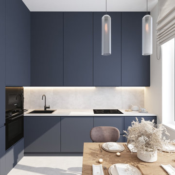
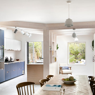
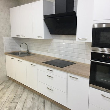
モスクワにあるお手頃価格の小さなコンテンポラリースタイルのおしゃれなキッチン (ドロップインシンク、青いキャビネット、人工大理石カウンター、白いキッチンパネル、セラミックタイルのキッチンパネル、黒い調理設備、磁器タイルの床、アイランドなし、白い床、白いキッチンカウンター) の写真
モスクワにあるお手頃価格の小さなコンテンポラリースタイルのおしゃれなキッチン (ドロップインシンク、青いキャビネット、人工大理石カウンター、白いキッチンパネル、セラミックタイルのキッチンパネル、黒い調理設備、磁器タイルの床、アイランドなし、白い床、白いキッチンカウンター) の写真
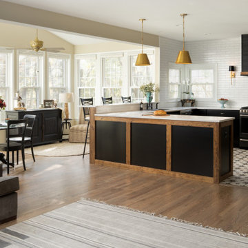
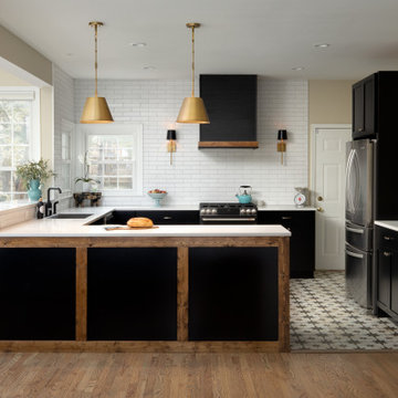
This client came to us with a very clear vision of what she wanted, but she needed help to refine and execute the design. At our first meeting she described her style as somewhere between modern rustic and ‘granny chic’ – she likes cozy spaces with nods to the past, but also wanted to blend that with the more contemporary tastes of her husband and children. Functionally, the old layout was less than ideal with an oddly placed 3-sided fireplace and angled island creating traffic jams in and around the kitchen. By creating a U-shaped layout, we clearly defined the chef’s domain and created a circulation path that limits disruptions in the heart of the kitchen. While still an open concept, the black cabinets, bar height counter and change in flooring all add definition to the space. The vintage inspired black and white tile is a nod to the past while the black stainless range and matte black faucet are unmistakably modern.
High on our client’s wish list was eliminating upper cabinets and keeping the countertops clear. In order to achieve this, we needed to ensure there was ample room in the base cabinets and reconfigured pantry for items typically stored above. The full height tile backsplash evokes exposed brick and serves as the backdrop for the custom wood-clad hood and decorative brass sconces – a perfect blend of rustic, modern and chic. Black and brass elements are repeated throughout the main floor in new hardware, lighting, and open shelves as well as the owners’ curated collection of family heirlooms and furnishings. In addition to renovating the kitchen, we updated the entire first floor with refinished hardwoods, new paint, wainscoting, wallcovering and beautiful new stained wood doors. Our client had been dreaming and planning this kitchen for 17 years and we’re thrilled we were able to bring it to life.
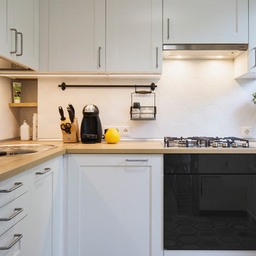
Фото реализации кухни | Дизайнер: Наталья Шевнина | Архитектор: Максим Мущеров | Фотограф: Вячеслав Вазюля
モスクワにある低価格の小さなおしゃれなキッチン (白いキャビネット、木材カウンター、白いキッチンパネル、セラミックタイルのキッチンパネル、黒い調理設備、磁器タイルの床、アイランドなし、ドロップインシンク) の写真
モスクワにある低価格の小さなおしゃれなキッチン (白いキャビネット、木材カウンター、白いキッチンパネル、セラミックタイルのキッチンパネル、黒い調理設備、磁器タイルの床、アイランドなし、ドロップインシンク) の写真
il Soggiorno si trova in una villa moderna costruita nel 2019. Gli ampi spaziosi aperti sembrano quasi sempre costosi. Ma è molto sbagliato seguire lo stile senza tener conto dei suoi dettagli importanti. Ci sono alcune preoccupazioni nel rendere gli spazi minimalisti ostentatamente vuoti, come i magazzini di costosi mobili minimalisti, o costringere il cliente a camminare per chilometri preparando la colazione o rinunciando a comodi gadget quotidiani. Un grande spazio con un minimo di mobili non significa automaticamente uno stile minimalista. Qual è lo stile del minimalismo?
1. La composizione e la forma diventano le principali.
2. Il numero di sfumature di colori sta diminuendo. Questi colori non sono necessariamente freddi.
3. I componenti principali dell'interno o dell'edificio (finestre, porte, scale) sono privi di dettagli e hanno contorni uniformi e chiari. Sono nascosti o loro meccanismi non sono visibili.
4. Gli articoli per la casa possono essere numerosi, ma trovano il loro posto in armadi nascosti e sistemi di di stoccaggio.
5. Le attrezzature e i sistemi di supporto vitale della casa sono integrati nella composizione degli interni.
6. L'ergonomia è calcolata al millimetro, l'attrezzatura è moderna e non richiede il più possibile frequenti interventi per la sua manutenzione.
7. Il minimalismo moderno tende ai materiali naturali e alla compatibilità ambientale, combinati con le alte tecnologie che proteggono la natura.
8. Gli oggetti e alcuni dettagli interni come una sedia o un tavolo sembrano molto semplici, sono incorporati o fanno parte della composizione e non sono considerati elementi separati.
9. Una parte molto importante dello stile minimalismo è molto spesso l'ambiente e la natura. La vista dalla finestra "entra" nell'interno, costituendo spesso la parte più importante della composizione.
10. Per enfatizzare lo stile vengono utilizzati grandi dettagli che contrastano con l'interno generale, ma si adattano perfettamente alla composizione.
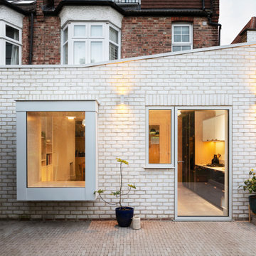
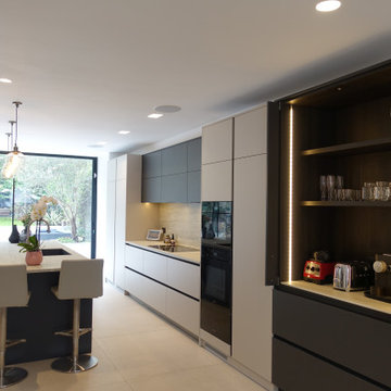
Amos Goldreich Architecture has completed an asymmetric brick extension that celebrates light and modern life for a young family in North London. The new layout gives the family distinct kitchen, dining and relaxation zones, and views to the large rear garden from numerous angles within the home.
The owners wanted to update the property in a way that would maximise the available space and reconnect different areas while leaving them clearly defined. Rather than building the common, open box extension, Amos Goldreich Architecture created distinctly separate yet connected spaces both externally and internally using an asymmetric form united by pale white bricks.
Previously the rear plan of the house was divided into a kitchen, dining room and conservatory. The kitchen and dining room were very dark; the kitchen was incredibly narrow and the late 90’s UPVC conservatory was thermally inefficient. Bringing in natural light and creating views into the garden where the clients’ children often spend time playing were both important elements of the brief. Amos Goldreich Architecture designed a large X by X metre box window in the centre of the sitting room that offers views from both the sitting area and dining table, meaning the clients can keep an eye on the children while working or relaxing.
Amos Goldreich Architecture enlivened and lightened the home by working with materials that encourage the diffusion of light throughout the spaces. Exposed timber rafters create a clever shelving screen, functioning both as open storage and a permeable room divider to maintain the connection between the sitting area and kitchen. A deep blue kitchen with plywood handle detailing creates balance and contrast against the light tones of the pale timber and white walls.
The new extension is clad in white bricks which help to bounce light around the new interiors, emphasise the freshness and newness, and create a clear, distinct separation from the existing part of the late Victorian semi-detached London home. Brick continues to make an impact in the patio area where Amos Goldreich Architecture chose to use Stone Grey brick pavers for their muted tones and durability. A sedum roof spans the entire extension giving a beautiful view from the first floor bedrooms. The sedum roof also acts to encourage biodiversity and collect rainwater.
Continues
Amos Goldreich, Director of Amos Goldreich Architecture says:
“The Framework House was a fantastic project to work on with our clients. We thought carefully about the space planning to ensure we met the brief for distinct zones, while also keeping a connection to the outdoors and others in the space.
“The materials of the project also had to marry with the new plan. We chose to keep the interiors fresh, calm, and clean so our clients could adapt their future interior design choices easily without the need to renovate the space again.”
Clients, Tom and Jennifer Allen say:
“I couldn’t have envisioned having a space like this. It has completely changed the way we live as a family for the better. We are more connected, yet also have our own spaces to work, eat, play, learn and relax.”
“The extension has had an impact on the entire house. When our son looks out of his window on the first floor, he sees a beautiful planted roof that merges with the garden.”
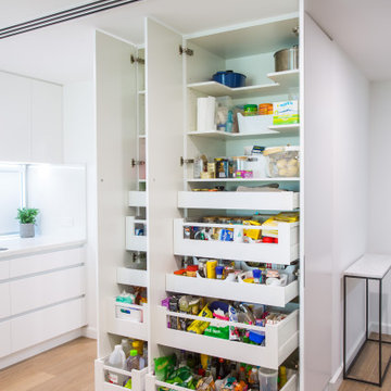
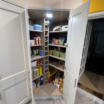
Two pantries, side by side for easy access. One pantry with single door, shelving and pull out drawers Second pantry has two doors with adjustable shelving and pull out drawers for easy access to items.
This kitchen was updated simply by changing the cabinet doors, back panel, concealing the exhaust and a new sink and tap.
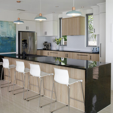
ブリスベンにあるお手頃価格の中くらいなコンテンポラリースタイルのおしゃれなキッチン (ドロップインシンク、フラットパネル扉のキャビネット、中間色木目調キャビネット、御影石カウンター、白いキッチンパネル、セラミックタイルのキッチンパネル、黒い調理設備、磁器タイルの床、ベージュの床、黒いキッチンカウンター) の写真
ブリスベンにあるお手頃価格の中くらいなコンテンポラリースタイルのおしゃれなキッチン (ドロップインシンク、フラットパネル扉のキャビネット、中間色木目調キャビネット、御影石カウンター、白いキッチンパネル、セラミックタイルのキッチンパネル、黒い調理設備、磁器タイルの床、ベージュの床、黒いキッチンカウンター) の写真
Niché dans le 15e, ce joli 63 m² a été acheté par un couple de trentenaires. L’idée globale était de réaménager certaines pièces et travailler sur la luminosité de l’appartement.
1ère étape : repeindre tout l’appartement et vitrifier le parquet existant. Puis dans la cuisine : réaménagement total ! Nous avons personnalisé une cuisine Ikea avec des façades Bodarp gris vert. Le plan de travail en noyer donne une touche de chaleur et la crédence type zellige en blanc cassé (@parquet_carrelage) vient accentuer la singularité de la pièce.
Nos équipes ont également entièrement refait la SDB : pose du terrazzo au sol, de la baignoire et sa petite verrière, des faïences, des meubles et de la vasque. Et vous voyez le petit meuble « buanderie » qui abrite la machine à laver ? Il s’agit d’une création maison !
Nous avons également créé d’autres rangement sur-mesure pour ce projet : les niches colorées de la cuisine, le meuble bas du séjour, la penderie et le meuble à chaussures du couloir.
Ce dernier a une toute autre allure paré du papier peint Jungle Cole & Son ! Grâce à la verrière que nous avons posée, il devient visible depuis le salon. La verrière permet également de laisser passer la lumière du salon vers le couloir.
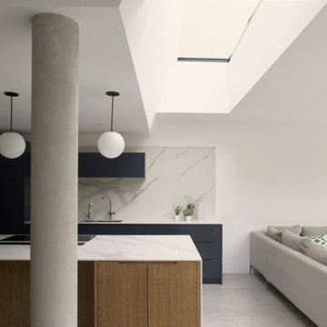
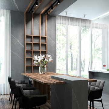
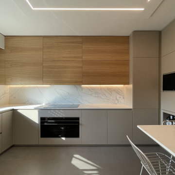
Contemporary open plan family kitchen, bespoke cabinetry in smoked oak and Farrow and Ball Railings, marble surfaces, concrete details and seated sofa area overlooking the garden.
Amos Goldreich Architecture has completed an asymmetric brick extension that celebrates light and modern life for a young family in North London. The new layout gives the family distinct kitchen, dining and relaxation zones, and views to the large rear garden from numerous angles within the home.
The owners wanted to update the property in a way that would maximise the available space and reconnect different areas while leaving them clearly defined. Rather than building the common, open box extension, Amos Goldreich Architecture created distinctly separate yet connected spaces both externally and internally using an asymmetric form united by pale white bricks.
Previously the rear plan of the house was divided into a kitchen, dining room and conservatory. The kitchen and dining room were very dark; the kitchen was incredibly narrow and the late 90’s UPVC conservatory was thermally inefficient. Bringing in natural light and creating views into the garden where the clients’ children often spend time playing were both important elements of the brief. Amos Goldreich Architecture designed a large X by X metre box window in the centre of the sitting room that offers views from both the sitting area and dining table, meaning the clients can keep an eye on the children while working or relaxing.
Amos Goldreich Architecture enlivened and lightened the home by working with materials that encourage the diffusion of light throughout the spaces. Exposed timber rafters create a clever shelving screen, functioning both as open storage and a permeable room divider to maintain the connection between the sitting area and kitchen. A deep blue kitchen with plywood handle detailing creates balance and contrast against the light tones of the pale timber and white walls.
The new extension is clad in white bricks which help to bounce light around the new interiors, emphasise the freshness and newness, and create a clear, distinct separation from the existing part of the late Victorian semi-detached London home. Brick continues to make an impact in the patio area where Amos Goldreich Architecture chose to use Stone Grey brick pavers for their muted tones and durability. A sedum roof spans the entire extension giving a beautiful view from the first floor bedrooms. The sedum roof also acts to encourage biodiversity and collect rainwater.
Continues
Amos Goldreich, Director of Amos Goldreich Architecture says:
“The Framework House was a fantastic project to work on with our clients. We thought carefully about the space planning to ensure we met the brief for distinct zones, while also keeping a connection to the outdoors and others in the space.
“The materials of the project also had to marry with the new plan. We chose to keep the interiors fresh, calm, and clean so our clients could adapt their future interior design choices easily without the need to renovate the space again.”
Clients, Tom and Jennifer Allen say:
“I couldn’t have envisioned having a space like this. It has completely changed the way we live as a family for the better. We are more connected, yet also have our own spaces to work, eat, play, learn and relax.”
“The extension has had an impact on the entire house. When our son looks out of his window on the first floor, he sees a beautiful planted roof that merges with the garden.”
サンクトペテルブルクにある低価格の小さなミッドセンチュリースタイルのおしゃれなキッチン (ドロップインシンク、フラットパネル扉のキャビネット、白いキャビネット、木材カウンター、白いキッチンパネル、セラミックタイルのキッチンパネル、黒い調理設備、磁器タイルの床、アイランドなし、グレーの床、白いキッチンカウンター) の写真
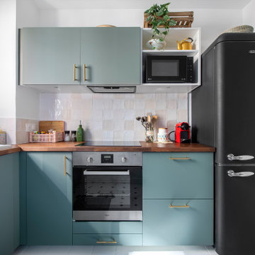
他の地域にあるお手頃価格の中くらいなモダンスタイルのおしゃれなキッチン (ドロップインシンク、フラットパネル扉のキャビネット、青いキャビネット、白いキッチンパネル、黒い調理設備、磁器タイルの床、アイランドなし、グレーの床、白いキッチンカウンター) の写真
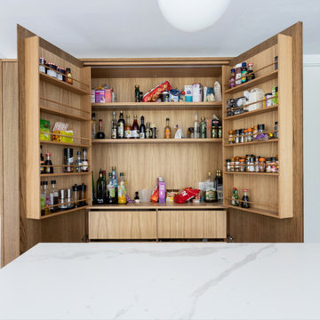
Bespoke kitchen larder within open plan kitchen design. Oak veneer interiors, drawers at lower level and spice racks in the doors.
ロンドンにある高級な巨大なモダンスタイルのおしゃれなキッチン (ドロップインシンク、フラットパネル扉のキャビネット、淡色木目調キャビネット、大理石カウンター、白いキッチンパネル、ライムストーンのキッチンパネル、黒い調理設備、磁器タイルの床、グレーの床、白いキッチンカウンター) の写真
ロンドンにある高級な巨大なモダンスタイルのおしゃれなキッチン (ドロップインシンク、フラットパネル扉のキャビネット、淡色木目調キャビネット、大理石カウンター、白いキッチンパネル、ライムストーンのキッチンパネル、黒い調理設備、磁器タイルの床、グレーの床、白いキッチンカウンター) の写真
ミラノにある高級な中くらいなモダンスタイルのおしゃれなキッチン (ドロップインシンク、フラットパネル扉のキャビネット、グレーのキャビネット、大理石カウンター、白いキッチンパネル、大理石のキッチンパネル、黒い調理設備、磁器タイルの床、グレーの床、白いキッチンカウンター) の写真
Niché dans le 15e, ce joli 63 m² a été acheté par un couple de trentenaires. L’idée globale était de réaménager certaines pièces et travailler sur la luminosité de l’appartement.
1ère étape : repeindre tout l’appartement et vitrifier le parquet existant. Puis dans la cuisine : réaménagement total ! Nous avons personnalisé une cuisine Ikea avec des façades Bodarp gris vert. Le plan de travail en noyer donne une touche de chaleur et la crédence type zellige en blanc cassé (@parquet_carrelage) vient accentuer la singularité de la pièce.
Nos équipes ont également entièrement refait la SDB : pose du terrazzo au sol, de la baignoire et sa petite verrière, des faïences, des meubles et de la vasque. Et vous voyez le petit meuble « buanderie » qui abrite la machine à laver ? Il s’agit d’une création maison !
Nous avons également créé d’autres rangement sur-mesure pour ce projet : les niches colorées de la cuisine, le meuble bas du séjour, la penderie et le meuble à chaussures du couloir.
Ce dernier a une toute autre allure paré du papier peint Jungle Cole & Son ! Grâce à la verrière que nous avons posée, il devient visible depuis le salon. La verrière permet également de laisser passer la lumière du salon vers le couloir.
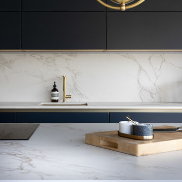
Clean and sleek-looking Kitchen in Taupe and Graphite finish with Dark brown rails and Neolith worktop, Coffee station here is a storage feature It houses the coffee machine behind closed doors, providing a discrete, practical coffee station that doesn’t distract from the beauty of the classic kitchen.
The added worksurface above the drawers provides space for the coffee machine, shelving above provides easy access to mugs and glassware, and the drawers beneath provide the perfect spot for espresso pods.
Линейная кухня выполнена из фасадов 3-ей категории. В основе МДФ, покрытие пленка, сверху матовый лак.
Кухня дополнена барной столешницей в цвет тосновной столешницы.
The tall end larder unit is sat on an angle which allows plenty of storage space as it goes back further than a standard cupboard. As this picture shows, there is ample storage with shelves and a tall bottle rack! The internal light is a great idea, no more rummaging around in a dark corner.
.
This client came to us with a very clear vision of what she wanted, but she needed help to refine and execute the design. At our first meeting she described her style as somewhere between modern rustic and ‘granny chic’ – she likes cozy spaces with nods to the past, but also wanted to blend that with the more contemporary tastes of her husband and children. Functionally, the old layout was less than ideal with an oddly placed 3-sided fireplace and angled island creating traffic jams in and around the kitchen. By creating a U-shaped layout, we clearly defined the chef’s domain and created a circulation path that limits disruptions in the heart of the kitchen. While still an open concept, the black cabinets, bar height counter and change in flooring all add definition to the space. The vintage inspired black and white tile is a nod to the past while the black stainless range and matte black faucet are unmistakably modern.
High on our client’s wish list was eliminating upper cabinets and keeping the countertops clear. In order to achieve this, we needed to ensure there was ample room in the base cabinets and reconfigured pantry for items typically stored above. The full height tile backsplash evokes exposed brick and serves as the backdrop for the custom wood-clad hood and decorative brass sconces – a perfect blend of rustic, modern and chic. Black and brass elements are repeated throughout the main floor in new hardware, lighting, and open shelves as well as the owners’ curated collection of family heirlooms and furnishings. In addition to renovating the kitchen, we updated the entire first floor with refinished hardwoods, new paint, wainscoting, wallcovering and beautiful new stained wood doors. Our client had been dreaming and planning this kitchen for 17 years and we’re thrilled we were able to bring it to life.
他の地域にあるラグジュアリーな広いコンテンポラリースタイルのおしゃれなキッチン (ドロップインシンク、フラットパネル扉のキャビネット、青いキャビネット、人工大理石カウンター、白いキッチンパネル、黒い調理設備、磁器タイルの床、茶色い床、白いキッチンカウンター) の写真
キッチン (黒い調理設備、白いキッチンパネル、磁器タイルの床、ドロップインシンク、トリプルシンク) の写真
1