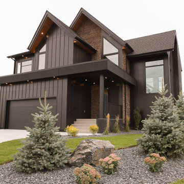
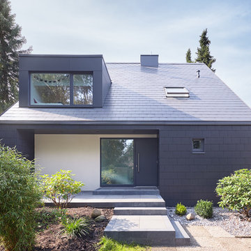
黒い外観の家 (オレンジの外壁、黄色い外壁、コンクリート繊維板サイディング) の写真
絞り込み:
資材コスト
並び替え:今日の人気順
写真 1〜20 枚目(全 1,405 枚)
1/5
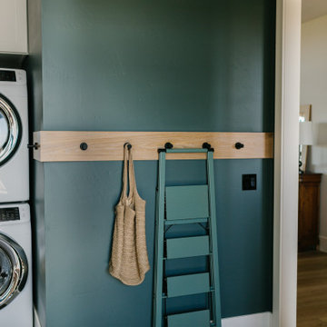
Moody colors contrast with white painted trim and a custom white oak coat hook wall in a combination laundry/mudroom that leads to the home from the garage entrance.
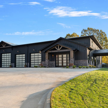
Exterior is done in a board and batten with stone accents. The color is Sherwin Williams Tricorn Black. The exterior lighting is black with copper accents. Some lights are bronze. Roofing is asphalt shingles.
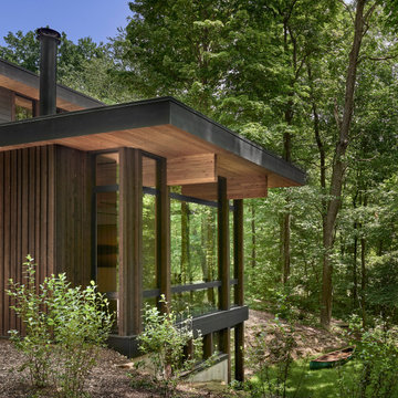
The cedar ceiling of the living rom extends outside, blurring the division of interior and exterior. The large glass panes reflect the forest beyond,
シカゴにある高級な中くらいなラスティックスタイルのおしゃれな家の外観 (コンクリート繊維板サイディング、緑化屋根) の写真
シカゴにある高級な中くらいなラスティックスタイルのおしゃれな家の外観 (コンクリート繊維板サイディング、緑化屋根) の写真
Stacy Zarin-Goldberg
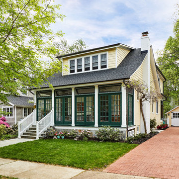
ワシントンD.C.にある高級な中くらいなトラディショナルスタイルのおしゃれな家の外観 (コンクリート繊維板サイディング、黄色い外壁) の写真
ワシントンD.C.にある高級な中くらいなトラディショナルスタイルのおしゃれな家の外観 (コンクリート繊維板サイディング、黄色い外壁) の写真
Modern Tudor/Storybook home in Portland, OR.
ポートランドにある中くらいなトランジショナルスタイルのおしゃれな家の外観 (コンクリート繊維板サイディング) の写真
ポートランドにある中くらいなトランジショナルスタイルのおしゃれな家の外観 (コンクリート繊維板サイディング) の写真
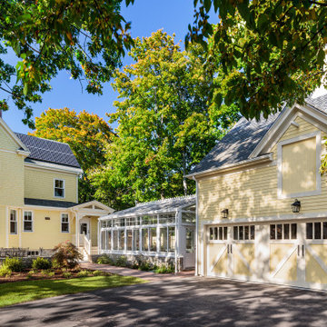
Side view of a restored Queen Anne Victorian focuses on attached carriage house containing workshop space and 4-car garage, as well as a solarium that encloses an indoor pool. Shows new side entrance and u-shaped addition at the rear of the main house that contains mudroom, bath, laundry, and extended kitchen.
This gem of a house was built in the 1950s, when its neighborhood undoubtedly felt remote. The university footprint has expanded in the 70 years since, however, and today this home sits on prime real estate—easy biking and reasonable walking distance to campus.
When it went up for sale in 2017, it was largely unaltered. Our clients purchased it to renovate and resell, and while we all knew we'd need to add square footage to make it profitable, we also wanted to respect the neighborhood and the house’s own history. Swedes have a word that means “just the right amount”: lagom. It is a guiding philosophy for us at SYH, and especially applied in this renovation. Part of the soul of this house was about living in just the right amount of space. Super sizing wasn’t a thing in 1950s America. So, the solution emerged: keep the original rectangle, but add an L off the back.
With no owner to design with and for, SYH created a layout to appeal to the masses. All public spaces are the back of the home--the new addition that extends into the property’s expansive backyard. A den and four smallish bedrooms are atypically located in the front of the house, in the original 1500 square feet. Lagom is behind that choice: conserve space in the rooms where you spend most of your time with your eyes shut. Put money and square footage toward the spaces in which you mostly have your eyes open.
In the studio, we started calling this project the Mullet Ranch—business up front, party in the back. The front has a sleek but quiet effect, mimicking its original low-profile architecture street-side. It’s very Hoosier of us to keep appearances modest, we think. But get around to the back, and surprise! lofted ceilings and walls of windows. Gorgeous.
Rear Additions
The rear of the house was extended roughly 16 feet toward the back property line at the kitchen and even more at the master suite--and thus greatly enlarged the home's square footage. All of this was done, however, with attention to maintaining the scale of the house relative to its original design, to the site and to its neighborhood context.
The porches, deck, stair access points and openings at the rear of the house tie the house and back yard together in a strong way, as was hoped for by the homeowners.
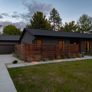
Lawn is artificial turf.
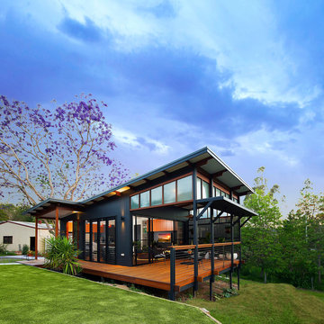
fiber cement siding painted Cleveland Green (7" siding), Sweet Vibrations (4" siding), and Texas Leather (11" siding)—all by Benjamin Moore • window trim and clerestory band painted Night Horizon by Benjamin Moore • soffit & fascia painted Camouflage by Benjamin Moore.
Construction by CG&S Design-Build.
Photography by Tre Dunham, Fine focus Photography
The Funky Fish House is two stories high in the front and three high in the rear.
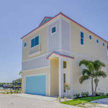
マイアミにあるビーチスタイルのおしゃれな家の外観 (コンクリート繊維板サイディング、黄色い外壁) の写真
マイアミにあるビーチスタイルのおしゃれな家の外観 (コンクリート繊維板サイディング、黄色い外壁) の写真
This home in Lafayette that was hit with hail, has a new CertainTeed Northgate Class IV Impact Resistant roof in the color Heather Blend.
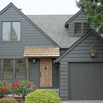
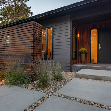
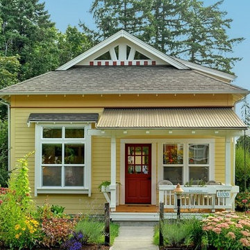
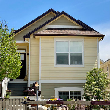
デンバーにあるお手頃価格の小さなトラディショナルスタイルのおしゃれな家の外観 (コンクリート繊維板サイディング、黄色い外壁) の写真
デンバーにあるお手頃価格の小さなトラディショナルスタイルのおしゃれな家の外観 (コンクリート繊維板サイディング、黄色い外壁) の写真
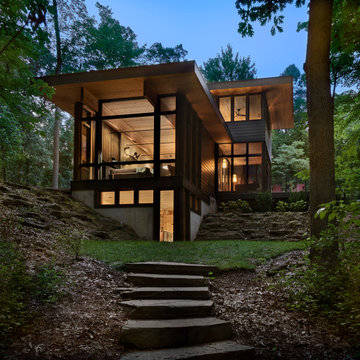
The site's privacy permitted the use of extensive glass. Overhangs were calibrated to minimize summer heat gain.
シカゴにある高級な中くらいなラスティックスタイルのおしゃれな家の外観 (コンクリート繊維板サイディング、緑化屋根) の写真
シカゴにある高級な中くらいなラスティックスタイルのおしゃれな家の外観 (コンクリート繊維板サイディング、緑化屋根) の写真
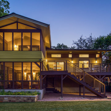
This gem of a house was built in the 1950s, when its neighborhood undoubtedly felt remote. The university footprint has expanded in the 70 years since, however, and today this home sits on prime real estate—easy biking and reasonable walking distance to campus.
When it went up for sale in 2017, it was largely unaltered. Our clients purchased it to renovate and resell, and while we all knew we'd need to add square footage to make it profitable, we also wanted to respect the neighborhood and the house’s own history. Swedes have a word that means “just the right amount”: lagom. It is a guiding philosophy for us at SYH, and especially applied in this renovation. Part of the soul of this house was about living in just the right amount of space. Super sizing wasn’t a thing in 1950s America. So, the solution emerged: keep the original rectangle, but add an L off the back.
With no owner to design with and for, SYH created a layout to appeal to the masses. All public spaces are the back of the home--the new addition that extends into the property’s expansive backyard. A den and four smallish bedrooms are atypically located in the front of the house, in the original 1500 square feet. Lagom is behind that choice: conserve space in the rooms where you spend most of your time with your eyes shut. Put money and square footage toward the spaces in which you mostly have your eyes open.
In the studio, we started calling this project the Mullet Ranch—business up front, party in the back. The front has a sleek but quiet effect, mimicking its original low-profile architecture street-side. It’s very Hoosier of us to keep appearances modest, we think. But get around to the back, and surprise! lofted ceilings and walls of windows. Gorgeous.
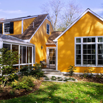
Rear of Cape Cod house showing new master suite and greenhouse.
Weigley Photography
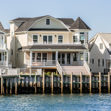
ニューヨークにあるトラディショナルスタイルのおしゃれな家の外観 (コンクリート繊維板サイディング、黄色い外壁) の写真
ニューヨークにあるトラディショナルスタイルのおしゃれな家の外観 (コンクリート繊維板サイディング、黄色い外壁) の写真
黒い外観の家 (オレンジの外壁、黄色い外壁、コンクリート繊維板サイディング) の写真
1