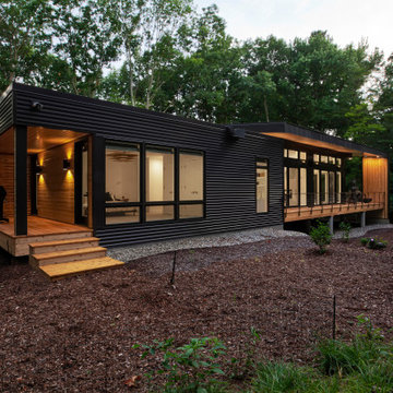
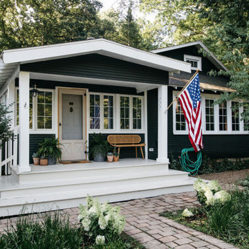
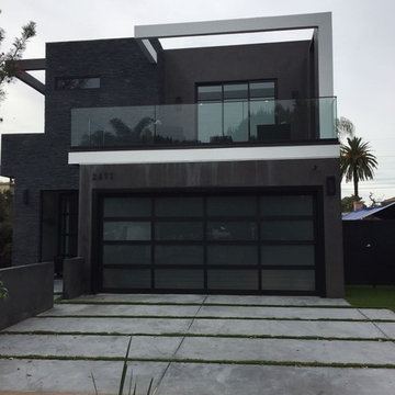
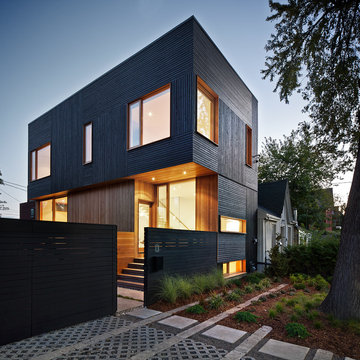
黒い、ブラウンの家の外観の写真
絞り込み:
資材コスト
並び替え:今日の人気順
写真 1〜20 枚目(全 5,239 枚)
1/5
Northeast Elevation reveals private deck, dog run, and entry porch overlooking Pier Cove Valley to the north - Bridge House - Fenneville, Michigan - Lake Michigan, Saugutuck, Michigan, Douglas Michigan - HAUS | Architecture For Modern Lifestyles
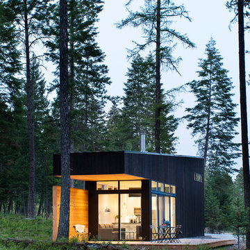
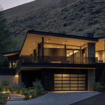
This Ketchum cabin retreat is a modern take of the conventional cabin with clean roof lines, large expanses of glass, and tiered living spaces. The board-form concrete exterior, charred cypress wood siding, and steel panels work harmoniously together. The natural elements of the home soften the hard lines, allowing it to submerge into its surroundings.
The Glo A5 triple-pane windows and doors were utilized for their advanced performance capabilities. Year-round comfort is achieved by the thermally-broken aluminum frame, low iron glass, multiple air seals, and argon-filled glazing. Advanced thermal technology was pivotal for the home’s design considering the amount of glazing that is used throughout the home. The windows and multiple 16’ sliding doors are one of the main features of the home’s design, focusing heavily on the beauty of Idaho. The doors also allow easy access to the deck, creating an eagle-eye view of the Valley.
NT Traditions in Plano, TX.
NT Window is a regional leader in the production of premium replacement windows. The company started as a screen manufacturer over 30 years ago and today boasts hundreds of dealers across the Midwest and the Southeastern United States. NT Window prides itself on crafting innovative products that fill specific needs among replacement window clientele.
Design Credit: @katemarkerinteriors @leocottage
Photographer: @margaretrajic
グランドラピッズにあるビーチスタイルのおしゃれな家の外観の写真
グランドラピッズにあるビーチスタイルのおしゃれな家の外観の写真
This gem of a house was built in the 1950s, when its neighborhood undoubtedly felt remote. The university footprint has expanded in the 70 years since, however, and today this home sits on prime real estate—easy biking and reasonable walking distance to campus.
When it went up for sale in 2017, it was largely unaltered. Our clients purchased it to renovate and resell, and while we all knew we'd need to add square footage to make it profitable, we also wanted to respect the neighborhood and the house’s own history. Swedes have a word that means “just the right amount”: lagom. It is a guiding philosophy for us at SYH, and especially applied in this renovation. Part of the soul of this house was about living in just the right amount of space. Super sizing wasn’t a thing in 1950s America. So, the solution emerged: keep the original rectangle, but add an L off the back.
With no owner to design with and for, SYH created a layout to appeal to the masses. All public spaces are the back of the home--the new addition that extends into the property’s expansive backyard. A den and four smallish bedrooms are atypically located in the front of the house, in the original 1500 square feet. Lagom is behind that choice: conserve space in the rooms where you spend most of your time with your eyes shut. Put money and square footage toward the spaces in which you mostly have your eyes open.
In the studio, we started calling this project the Mullet Ranch—business up front, party in the back. The front has a sleek but quiet effect, mimicking its original low-profile architecture street-side. It’s very Hoosier of us to keep appearances modest, we think. But get around to the back, and surprise! lofted ceilings and walls of windows. Gorgeous.
Photography by Richard Chivers https://www.rchivers.co.uk/
Marshall House is an extension to a Grade II listed dwelling in the village of Twyford, near Winchester, Hampshire. The original house dates from the 17th Century, although it had been remodelled and extended during the late 18th Century.
The clients contacted us to explore the potential to extend their home in order to suit their growing family and active lifestyle. Due to the constraints of living in a listed building, they were unsure as to what development possibilities were available. The brief was to replace an existing lean-to and 20th century conservatory with a new extension in a modern, contemporary approach. The design was developed in close consultation with the local authority as well as their historic environment department, in order to respect the existing property and work to achieve a positive planning outcome.
Like many older buildings, the dwelling had been adjusted here and there, and updated at numerous points over time. The interior of the existing property has a charm and a character - in part down to the age of the property, various bits of work over time and the wear and tear of the collective history of its past occupants. These spaces are dark, dimly lit and cosy. They have low ceilings, small windows, little cubby holes and odd corners. Walls are not parallel or perpendicular, there are steps up and down and places where you must watch not to bang your head.
The extension is accessed via a small link portion that provides a clear distinction between the old and new structures. The initial concept is centred on the idea of contrasts. The link aims to have the effect of walking through a portal into a seemingly different dwelling, that is modern, bright, light and airy with clean lines and white walls. However, complementary aspects are also incorporated, such as the strategic placement of windows and roof lights in order to cast light over walls and corners to create little nooks and private views. The overall form of the extension is informed by the awkward shape and uses of the site, resulting in the walls not being parallel in plan and splaying out at different irregular angles.
Externally, timber larch cladding is used as the primary material. This is painted black with a heavy duty barn paint, that is both long lasting and cost effective. The black finish of the extension contrasts with the white painted brickwork at the rear and side of the original house. The external colour palette of both structures is in opposition to the reality of the interior spaces. Although timber cladding is a fairly standard, commonplace material, visual depth and distinction has been created through the articulation of the boards. The inclusion of timber fins changes the way shadows are cast across the external surface during the day. Whilst at night, these are illuminated by external lighting.
A secondary entrance to the house is provided through a concealed door that is finished to match the profile of the cladding. This opens to a boot/utility room, from which a new shower room can be accessed, before proceeding to the new open plan living space and dining area.
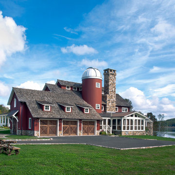
View of carriage house garage doors, observatory silo, and screened in porch overlooking the lake.
ニューヨークにあるラグジュアリーな巨大なカントリー風のおしゃれな家の外観の写真
ニューヨークにあるラグジュアリーな巨大なカントリー風のおしゃれな家の外観の写真
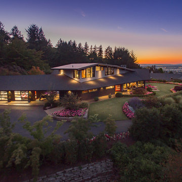
Aerial view of the house and property.
Chad Beecroft
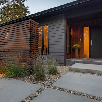
ポートランドにあるラグジュアリーなミッドセンチュリースタイルのおしゃれな家の外観の写真
ポートランドにあるラグジュアリーなミッドセンチュリースタイルのおしゃれな家の外観の写真
Paolasquare International and Chris Spielmann
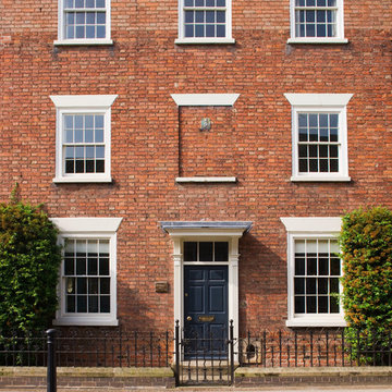
ワシントンD.C.にあるラグジュアリーな巨大なコンテンポラリースタイルのおしゃれな家の外観 (レンガサイディング) の写真
ワシントンD.C.にあるラグジュアリーな巨大なコンテンポラリースタイルのおしゃれな家の外観 (レンガサイディング) の写真
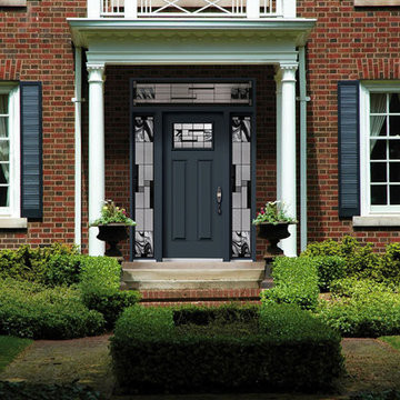
Traditional home featuring "Old Georgian Tudor" red brick exterior with solider course brick arches using ivory mortar.
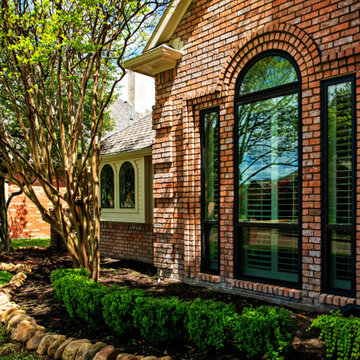
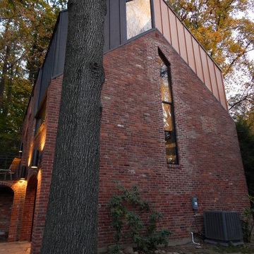
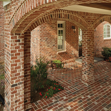
他の地域にあるトラディショナルスタイルのおしゃれな赤い外壁の家 (レンガサイディング) の写真
他の地域にあるトラディショナルスタイルのおしゃれな赤い外壁の家 (レンガサイディング) の写真
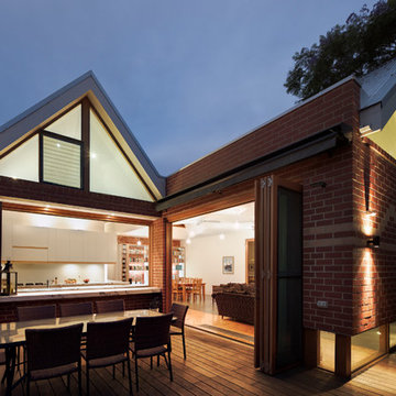
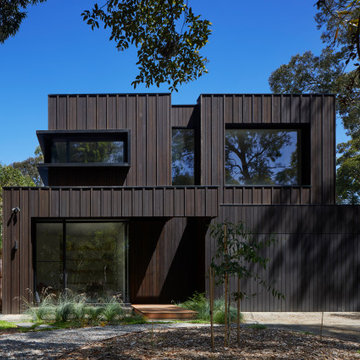
The internal living spaces expand into the courtyard for seamless indoor / outdoor living. Photo by Peter Bennetts
メルボルンにある高級な中くらいなコンテンポラリースタイルのおしゃれな家の外観 (レンガサイディング) の写真
メルボルンにある高級な中くらいなコンテンポラリースタイルのおしゃれな家の外観 (レンガサイディング) の写真
黒い、ブラウンの家の外観の写真
1