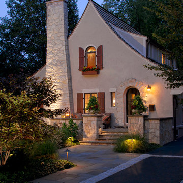
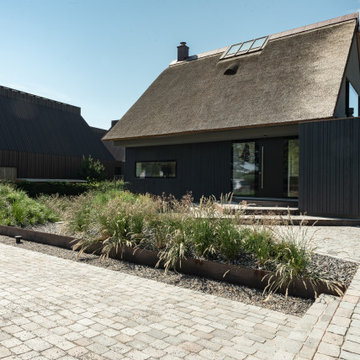
高級な小さな茶色い屋根の家の写真
絞り込み:
資材コスト
並び替え:今日の人気順
写真 1〜20 枚目(全 62 枚)
1/4
This home is a small cottage that used to be a ranch. We remodeled the entire first floor and added a second floor above.
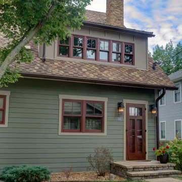
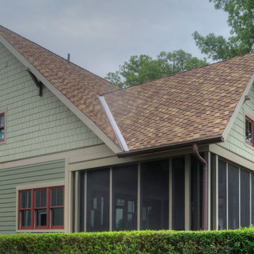
コロンバスにある高級な小さなトラディショナルスタイルのおしゃれな家の外観 (コンクリート繊維板サイディング、緑の外壁、下見板張り) の写真
コロンバスにある高級な小さなトラディショナルスタイルのおしゃれな家の外観 (コンクリート繊維板サイディング、緑の外壁、下見板張り) の写真
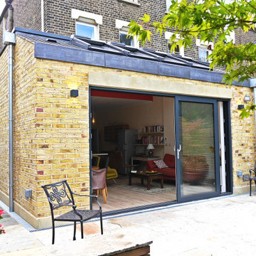
Side and rear extension for the client's five bedroom Victorian villa on Telegraph Hill.
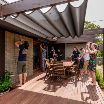
Wellstudio designed an extension to transform the ground floor living space for the growing family, giving them a new light filled volume at the rear of their house which would enhance their wellbeing: space where they could relax, chat, cook, and eat.
The new extension increased the length of the space by approximately 3 metres and allowed the floor to ceiling height to be increased from 2.85metres to 3.4 metres, bringing in extra light and a feeling of elevation.
The new volume also extended approximately 1 metre to the side to further increase the space available. The project enhanced the family's connection with nature by providing much increased levels of natural light and rear glass doors overlooking the garden.
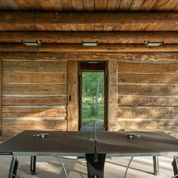
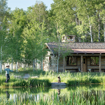
View towards Base Camp 49 Cabins.
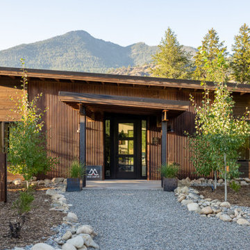
シアトルにある高級な小さなインダストリアルスタイルのおしゃれな家の外観 (メタルサイディング) の写真
シアトルにある高級な小さなインダストリアルスタイルのおしゃれな家の外観 (メタルサイディング) の写真
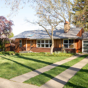
photo by Jeffery Edward Tryon
フィラデルフィアにある高級な小さなミッドセンチュリースタイルのおしゃれな家の外観 (縦張り) の写真
フィラデルフィアにある高級な小さなミッドセンチュリースタイルのおしゃれな家の外観 (縦張り) の写真
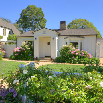
This home is the fifth residence completed by Arnold Brothers. Set on an approximately 8,417 square foot site in historic San Roque, this home has been extensively expanded, updated and remodeled. The inspiration for the newly designed home was the cottages at the San Ysidro Ranch. Combining the romance of a bygone era with the quality and attention to detail of a five-star resort, this “casita” is a blend of rustic charm with casual elegance.
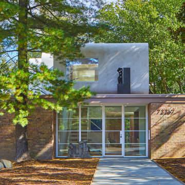
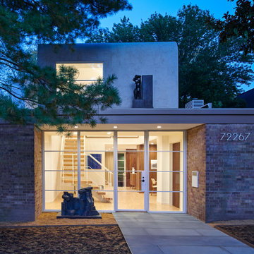
Designed in 1970 for an art collector, the existing referenced 70’s architectural principles. With its cadence of ‘70’s brick masses punctuated by a garage and a 4-foot-deep entrance recess. This recess, however, didn’t convey to the interior, which was occupied by disjointed service spaces. To solve, service spaces are moved and reorganized in open void in the garage. (See plan) This also organized the home: Service & utility on the left, reception central, and communal living spaces on the right.
To maintain clarity of the simple one-story 70’s composition, the second story add is recessive. A flex-studio/extra bedroom and office are designed ensuite creating a slender form and orienting them front to back and setting it back allows the add recede. Curves create a definite departure from the 70s home and by detailing it to "hover like a thought" above the first-floor roof and mentally removable sympathetic add.Existing unrelenting interior walls and a windowless entry, although ideal for fine art was unconducive for the young family of three. Added glass at the front recess welcomes light view and the removal of interior walls not only liberate rooms to communicate with each other but also reinform the cleared central entry space as a hub.
Even though the renovation reinforms its relationship with art, the joy and appreciation of art was not dismissed. A metal sculpture lost in the corner of the south side yard bumps the sculpture at the front entrance to the kitchen terrace over an added pedestal. (See plans) Since the roof couldn’t be railed without compromising the one-story '70s composition, the sculpture garden remains physically inaccessible however mirrors flanking the chimney allow the sculptures to be appreciated in three dimensions. The mirrors also afford privacy from the adjacent Tudor's large master bedroom addition 16-feet away.
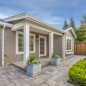
Intentional placement of trees and perimeter plantings frames views of the home and offers light relief from late afternoon sun angles. Paving edges are softened by casual planting textures, reinforcing a cottage aesthetic.
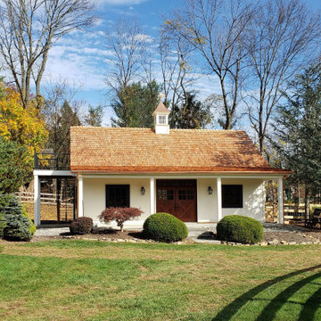
Small horse barn with 3 King Euro Stalls, a wash stall, tack room and loft. Cedar shake room, exterior entrance and deck to the second-floor loft, and a custom cupola.
This home is a small cottage that used to be a ranch. We remodeled the entire first floor and added a second floor above.
コロンバスにある高級な小さなトラディショナルスタイルのおしゃれな家の外観 (コンクリート繊維板サイディング、緑の外壁、ウッドシングル張り) の写真
コロンバスにある高級な小さなトラディショナルスタイルのおしゃれな家の外観 (コンクリート繊維板サイディング、緑の外壁、ウッドシングル張り) の写真
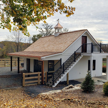
Small horse barn with 3 King Euro Stalls, a wash stall, tack room and loft. Cedar shake room, exterior entrance and deck to the second-floor loft, and a custom cupola.
First floor extension and covered porch
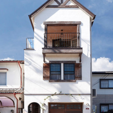
他の地域にある高級な小さなトラディショナルスタイルのおしゃれな家の外観 (漆喰サイディング) の写真
他の地域にある高級な小さなトラディショナルスタイルのおしゃれな家の外観 (漆喰サイディング) の写真
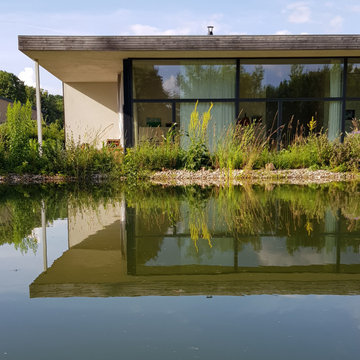
Dem Verlauf der Sonne folgend ist das Haus in drei Himmelsrichtungen verglast, vollkommen offen und doch schützend durch die hohe Rückwand und das weit auskragende Dach. Innen- und Außenraum gehen ineinander über. Die knappen Raumabmessungen fühlen sich in der Nutzung großzügig an durch die geschickte funktionale Gliederung.
Die geringe Nutzfläche von 60 Quadratmetern relativiert sich durch großflächige Verglasungen zur umlaufenden Terrasse, kleine, leichte Möbel und die Wandelbarkeit der Einbauten, die sich wie das Haus vergrößern und verkleinern lassen.
Breite Schiebetüren weiten im Sommer den Raum bis in die Natur – Freiheit und Leichtigkeit prägen das Lebensgefühl.
Minimalistische, bis ins kleinste Detail durchdachte Architektur umgeben von einem wilden Garten.
Foto: Reuter Schoger
Designed in 1970 for an art collector, the existing referenced 70’s architectural principles. With its cadence of ‘70’s brick masses punctuated by a garage and a 4-foot-deep entrance recess. This recess, however, didn’t convey to the interior, which was occupied by disjointed service spaces. To solve, service spaces are moved and reorganized in open void in the garage. (See plan) This also organized the home: Service & utility on the left, reception central, and communal living spaces on the right.
To maintain clarity of the simple one-story 70’s composition, the second story add is recessive. A flex-studio/extra bedroom and office are designed ensuite creating a slender form and orienting them front to back and setting it back allows the add recede. Curves create a definite departure from the 70s home and by detailing it to "hover like a thought" above the first-floor roof and mentally removable sympathetic add.Existing unrelenting interior walls and a windowless entry, although ideal for fine art was unconducive for the young family of three. Added glass at the front recess welcomes light view and the removal of interior walls not only liberate rooms to communicate with each other but also reinform the cleared central entry space as a hub.
Even though the renovation reinforms its relationship with art, the joy and appreciation of art was not dismissed. A metal sculpture lost in the corner of the south side yard bumps the sculpture at the front entrance to the kitchen terrace over an added pedestal. (See plans) Since the roof couldn’t be railed without compromising the one-story '70s composition, the sculpture garden remains physically inaccessible however mirrors flanking the chimney allow the sculptures to be appreciated in three dimensions. The mirrors also afford privacy from the adjacent Tudor's large master bedroom addition 16-feet away.
高級な小さな茶色い屋根の家の写真
1