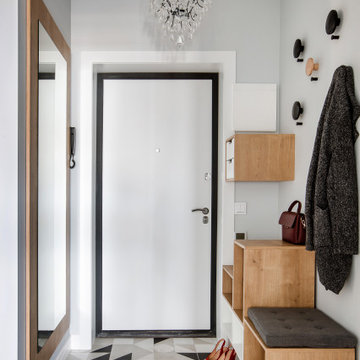
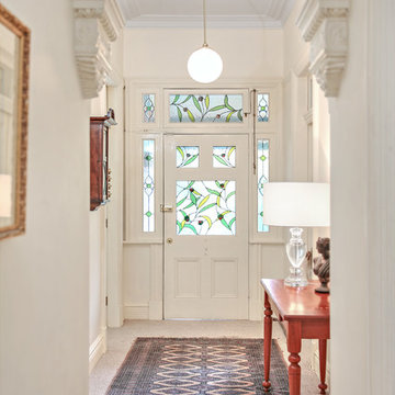
玄関 (グレーのドア、金属製ドア、白いドア) の写真
並び替え:今日の人気順
写真 1〜20 枚目(全 6,650 枚)
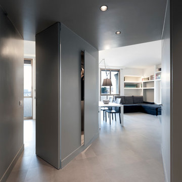
vista dall'ingresso, la porta del guardaroba leggermente aperta, e la porta pivottante dello studio semichiusa. Pareti e controsoffitto tutto smalto grigio
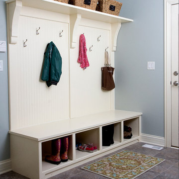
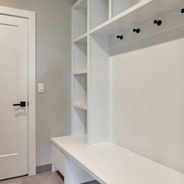
This cottage style mudroom in all white gives ample storage just as you walk in the door. It includes a counter to drop off groceries, a bench with shoe storage below, and multiple large coat hooks for hats, jackets, and handbags. The design also includes deep cabinets to store those unsightly bulk items.
他の地域にあるお手頃価格の広いコンテンポラリースタイルのおしゃれな玄関ホール (ベージュの壁、磁器タイルの床、グレーのドア、グレーの床、クロスの天井、パネル壁) の写真
Download our free ebook, Creating the Ideal Kitchen. DOWNLOAD NOW
For many, extra time at home during COVID left them wanting more from their homes. Whether you realized the shortcomings of your space or simply wanted to combat boredom, a well-designed and functional home was no longer a want, it became a need. Tina found herself wanting more from her Old Irving Park home and reached out to The Kitchen Studio about adding function to her kitchen to make the most of the available real estate.
At the end of the day, there is nothing better than returning home to a bright and happy space you love. And this kitchen wasn’t that for Tina. Dark and dated, with a palette from the past and features that didn’t make the most of the available square footage, this remodel required vision and a fresh approach to the space. Lead designer, Stephanie Cole’s main design goal was better flow, while adding greater functionality with organized storage, accessible open shelving, and an overall sense of cohesion with the adjoining family room.
The original kitchen featured a large pizza oven, which was rarely used, yet its footprint limited storage space. The nearby pantry had become a catch-all, lacking the organization needed in the home. The initial plan was to keep the pizza oven, but eventually Tina realized she preferred the design possibilities that came from removing this cumbersome feature, with the goal of adding function throughout the upgraded and elevated space. Eliminating the pantry added square footage and length to the kitchen for greater function and more storage. This redesigned space reflects how she lives and uses her home, as well as her love for entertaining.
The kitchen features a classic, clean, and timeless palette. White cabinetry, with brass and bronze finishes, contrasts with rich wood flooring, and lets the large, deep blue island in Woodland’s custom color Harbor – a neutral, yet statement color – draw your eye.
The kitchen was the main priority. In addition to updating and elevating this space, Tina wanted to maximize what her home had to offer. From moving the location of the patio door and eliminating a window to removing an existing closet in the mudroom and the cluttered pantry, the kitchen footprint grew. Once the floorplan was set, it was time to bring cohesion to her home, creating connection between the kitchen and surrounding spaces.
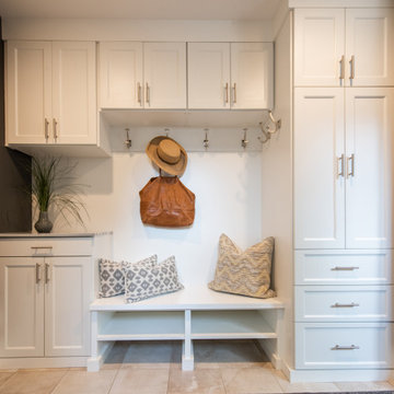
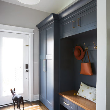
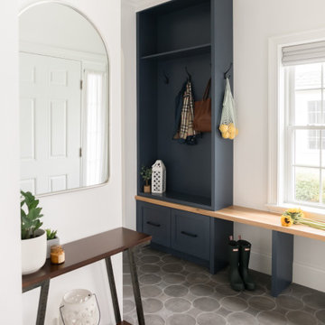
The color palette carries into the mudroom, where we added beautiful new cabinetry, practical bench seating, and accessible hooks, perfect for guests and everyday living. The nearby bar continues the aesthetic, with stunning Carrara marble subway tile, hints of brass and bronze, and a design that further captures the vibe of the kitchen.
Every home has its unique design challenges. But with a fresh perspective and a bit of creativity, there is always a way to give the client exactly what they want [and need]. In this particular kitchen, the existing soffits and high slanted ceilings added a layer of complexity to the lighting layout and upper perimeter cabinets.
While a space needs to look good, it also needs to function well. This meant making the most of the height of the room and accounting for the varied ceiling features, while also giving Tina everything she wanted and more. Pendants and task lighting paired with an abundance of natural light amplify the bright aesthetic. The cabinetry layout and design compliments the soffits with subtle profile details that bring everything together. The tile selections add visual interest, drawing the eye to the focal area above the range. Glass-doored cabinets further customize the space and give the illusion of even more height within the room.
While her family may be grown and out of the house, Tina was focused on adding function without sacrificing a stunning aesthetic and dreamy finishes that make the kitchen the gathering place of any home. It was time to love her kitchen again, and if you’re wondering what she loves most, it’s the niche with glass door cabinetry and open shelving for display paired with the marble mosaic backsplash over the range and complimenting hood. Each of these features is a stunning point of interest within the kitchen – both brag-worthy additions to a perimeter layout that previously felt limited and lacking.
Whether your remodel is the result of special needs in your home or simply the excitement of focusing your energy on creating a fun new aesthetic, we are here for it. We love a good challenge because there is always a way to make a space better – adding function and beauty simultaneously.
After receiving a referral by a family friend, these clients knew that Rebel Builders was the Design + Build company that could transform their space for a new lifestyle: as grandparents!
As young grandparents, our clients wanted a better flow to their first floor so that they could spend more quality time with their growing family.
The challenge, of creating a fun-filled space that the grandkids could enjoy while being a relaxing oasis when the clients are alone, was one that the designers accepted eagerly. Additionally, designers also wanted to give the clients a more cohesive flow between the kitchen and dining area.
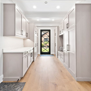
To do this, the team moved the existing fireplace to a central location to open up an area for a larger dining table and create a designated living room space. On the opposite end, we placed the "kids area" with a large window seat and custom storage. The built-ins and archway leading to the mudroom brought an elegant, inviting and utilitarian atmosphere to the house.
The careful selection of the color palette connected all of the spaces and infused the client's personal touch into their home.

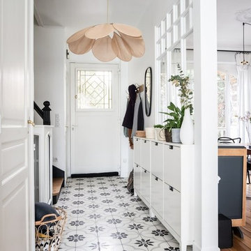
階段を上がり白いガラス框の親子ドアを開ける。
アカンサスの葉と咲き誇る花々、ビーズで表現されたモチーフがキラキラと光を
反射し、光沢の美しい壁紙が出迎えます。
天井照明は、レクリントの緻密なプリーツからの光が優しく包みます。
床は、大理石の美しいモザイクタイルを貼ることで、ゲストの迎えるに
ふさわしい空間になりました。
左手のカットミラーから映り込む絵画が空間に広がりを感じさせます。
あえてエントランスをつくることで、
来客されるゲストへのおもてなしと、目線の誘導や空間の区切りを実現しました。
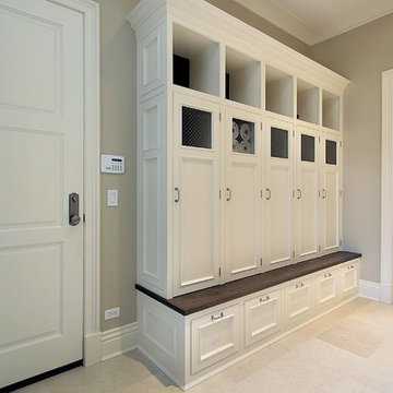
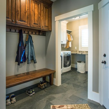
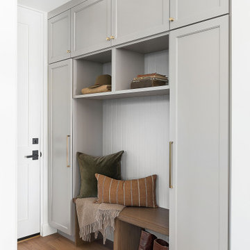
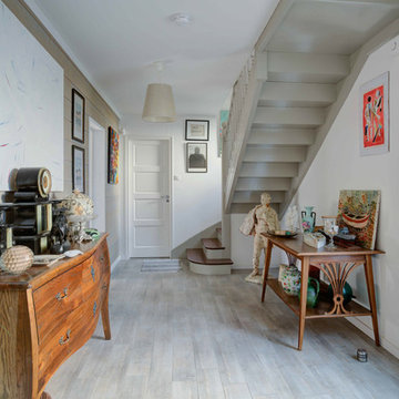
Mud Room
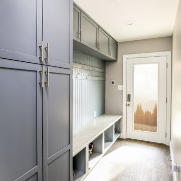
シカゴにあるラグジュアリーな広いトランジショナルスタイルのおしゃれなマッドルーム (グレーの壁、淡色無垢フローリング、白いドア、茶色い床、格子天井) の写真
シカゴにあるラグジュアリーな広いトランジショナルスタイルのおしゃれなマッドルーム (グレーの壁、淡色無垢フローリング、白いドア、茶色い床、格子天井) の写真
ワシントンD.C.にある中くらいなトランジショナルスタイルのおしゃれなマッドルーム (グレーの壁、淡色無垢フローリング、白いドア、ベージュの床) の写真
Entrée optimisée avec rangements chaussures sur-mesure
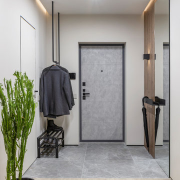
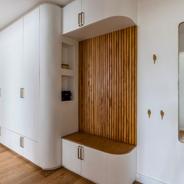
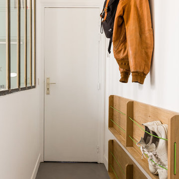
パリにある低価格の小さなコンテンポラリースタイルのおしゃれな玄関ホール (白い壁、コンクリートの床、白いドア、グレーの床) の写真
パリにある低価格の小さなコンテンポラリースタイルのおしゃれな玄関ホール (白い壁、コンクリートの床、白いドア、グレーの床) の写真
This side entry is most-used in this busy family home with 4 kids, lots of visitors and a big dog . Re-arranging the space to include an open center Mudroom area, with elbow room for all, was the key. Kids' PR on the left, walk-in pantry next to the Kitchen, and a double door coat closet add to the functional storage.
Space planning and cabinetry: Jennifer Howard, JWH
Cabinet Installation: JWH Construction Management
Photography: Tim Lenz.
Rénovation complète d'une entrée avec pose de carreaux de ciment, peintre de l'escalier d'origine en noir avec marches en bois, pose d'un décor mural en papier peint et création d'une verrière permettant d'ouvrir l'espace et d'apporter de la luminosité tout en laissant une cloison.
Réalisation Atelier Devergne
Photo Maryline Krynicki
玄関 (グレーのドア、金属製ドア、白いドア) の写真
1