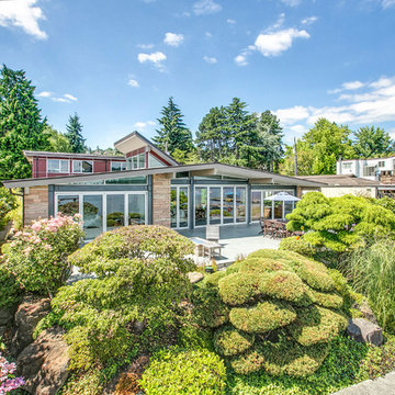
高級な緑色のミッドセンチュリースタイルの家の外観の写真
絞り込み:
資材コスト
並び替え:今日の人気順
写真 1〜20 枚目(全 87 枚)
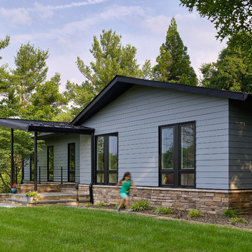
The shape of the angled porch-roof, sets the tone for a truly modern entryway. This protective covering makes a dramatic statement, as it hovers over the front door. The blue-stone terrace conveys even more interest, as it gradually moves upward, morphing into steps, until it reaches the porch.
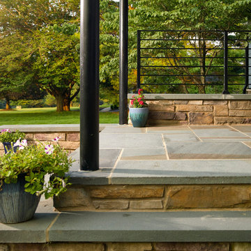
Porch Detail
The multicolored tan stone, used for the risers and retaining walls, is proportionally carried around the base of the house. Horizontal sustainable-fiber cement board replaces the original vertical wood siding, and widens the appearance of the facade. The color scheme — blue-grey siding, cherry-wood door and roof underside, and varied shades of tan and blue stone — is complimented by the crisp-contrasting black accents of the thin-round metal columns, railing, window sashes, and the roof fascia board and gutters.
This project is a stunning example of an exterior, that is both asymmetrical and symmetrical. Prior to the renovation, the house had a bland 1970s exterior. Now, it is interesting, unique, and inviting.
Photography Credit: Tom Holdsworth Photography
Contractor: Owings Brothers Contracting
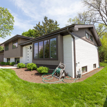
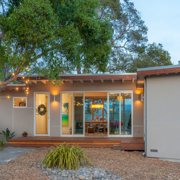
Midcentury home with new Pella Contemporary windows and hardiplank siding
他の地域にある高級な中くらいなミッドセンチュリースタイルのおしゃれな家の外観 (混合材サイディング) の写真
他の地域にある高級な中くらいなミッドセンチュリースタイルのおしゃれな家の外観 (混合材サイディング) の写真
This is a home that was designed around the property. With views in every direction from the master suite and almost everywhere else in the home. The home was designed by local architect Randy Sample and the interior architecture was designed by Maurice Jennings Architecture, a disciple of E. Fay Jones. New Construction of a 4,400 sf custom home in the Southbay Neighborhood of Osprey, FL, just south of Sarasota.
Photo - Ricky Perrone
Photography: Anice Hoachlander, Hoachlander Davis Photography.
ワシントンD.C.にある高級なミッドセンチュリースタイルのおしゃれな家の外観 (レンガサイディング) の写真
ワシントンD.C.にある高級なミッドセンチュリースタイルのおしゃれな家の外観 (レンガサイディング) の写真
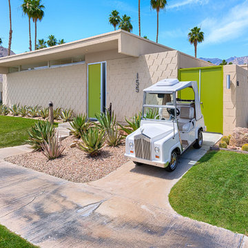
Mid-Century Palm Springs Condominium in Seven Lakes Country Club.
Custom designed Rolls Royce Golf Cart
他の地域にある高級な中くらいなミッドセンチュリースタイルのおしゃれな家の外観 (レンガサイディング) の写真
他の地域にある高級な中くらいなミッドセンチュリースタイルのおしゃれな家の外観 (レンガサイディング) の写真
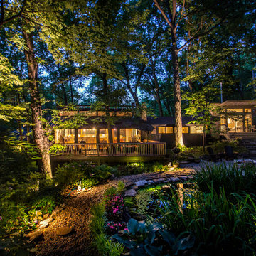
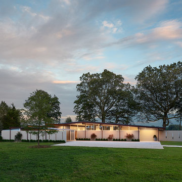
View of the house at dusk from the Woodland Garden on the uphill side of the house. New addition and bridge connection are too the right. Roof of original house was reframed to create a line of clerestory windows.
Photographer:Paul Bussman
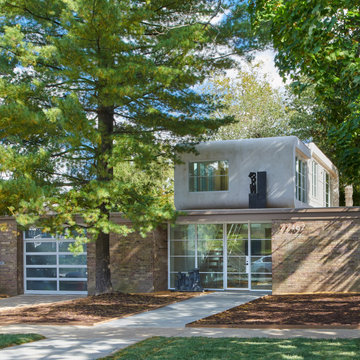
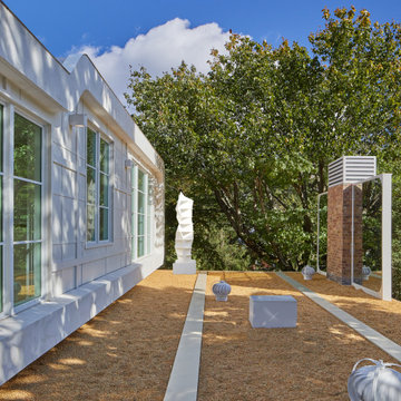
Designed in 1970 for an art collector, the existing referenced 70’s architectural principles. With its cadence of ‘70’s brick masses punctuated by a garage and a 4-foot-deep entrance recess. This recess, however, didn’t convey to the interior, which was occupied by disjointed service spaces. To solve, service spaces are moved and reorganized in open void in the garage. (See plan) This also organized the home: Service & utility on the left, reception central, and communal living spaces on the right.
To maintain clarity of the simple one-story 70’s composition, the second story add is recessive. A flex-studio/extra bedroom and office are designed ensuite creating a slender form and orienting them front to back and setting it back allows the add recede. Curves create a definite departure from the 70s home and by detailing it to "hover like a thought" above the first-floor roof and mentally removable sympathetic add.Existing unrelenting interior walls and a windowless entry, although ideal for fine art was unconducive for the young family of three. Added glass at the front recess welcomes light view and the removal of interior walls not only liberate rooms to communicate with each other but also reinform the cleared central entry space as a hub.
Even though the renovation reinforms its relationship with art, the joy and appreciation of art was not dismissed. A metal sculpture lost in the corner of the south side yard bumps the sculpture at the front entrance to the kitchen terrace over an added pedestal. (See plans) Since the roof couldn’t be railed without compromising the one-story '70s composition, the sculpture garden remains physically inaccessible however mirrors flanking the chimney allow the sculptures to be appreciated in three dimensions. The mirrors also afford privacy from the adjacent Tudor's large master bedroom addition 16-feet away.
Complete Renovation
Build: EBCON Corporation
Design: EBCON Corporation + Magdalena Bogart Interiors
Photography: Agnieszka Jakubowicz
サンフランシスコにある高級な中くらいなミッドセンチュリースタイルのおしゃれな家の外観 (漆喰サイディング) の写真
サンフランシスコにある高級な中くらいなミッドセンチュリースタイルのおしゃれな家の外観 (漆喰サイディング) の写真
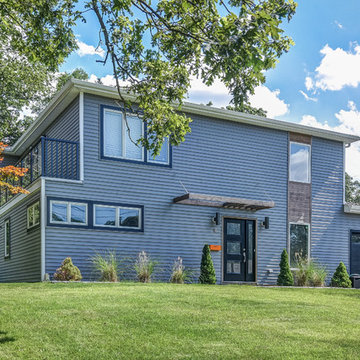
This bold Livingston project by started with a modest 1.5 story, 3 bedroom home. The home was gut remodeled with a 2nd floor addition and 2-story addition in back. The balcony off the 2nd-floor master suite removed the need for a side-yard set-back variance. Nu Interiors and Ale Wood and Design Construction. Photo by Greg Martz.
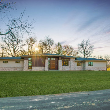
Outside this elegantly designed modern prairie-style home built by Hibbs Homes, the mixed-use of wood, stone, and James Hardie Lap Siding brings dimension and texture to a modern, clean-lined front elevation. The hipped rooflines, angled columns, and use of windows complete the look.
This glass front is made of six panels aligned with picture windows on the back of the house. The continuous sight-line allows generous views of the surrounding landscape.
Golden Visions Design
Santa Cruz, CA 95062
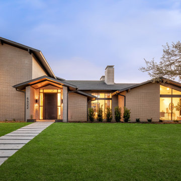
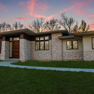
Stunning midcentury-inspired custom home in Dallas.
ダラスにある高級なミッドセンチュリースタイルのおしゃれな家の外観 (レンガサイディング) の写真
ダラスにある高級なミッドセンチュリースタイルのおしゃれな家の外観 (レンガサイディング) の写真
Addition project which included complete interior and exterior renovation. Kitchen, bathrooms, flooring throughout, front entry, windows, railing and much more
The shape of the angled porch-roof, sets the tone for a truly modern entryway. This protective covering makes a dramatic statement, as it hovers over the front door. The blue-stone terrace conveys even more interest, as it gradually moves upward, morphing into steps, until it reaches the porch.
Porch Detail
The multicolored tan stone, used for the risers and retaining walls, is proportionally carried around the base of the house. Horizontal sustainable-fiber cement board replaces the original vertical wood siding, and widens the appearance of the facade. The color scheme — blue-grey siding, cherry-wood door and roof underside, and varied shades of tan and blue stone — is complimented by the crisp-contrasting black accents of the thin-round metal columns, railing, window sashes, and the roof fascia board and gutters.
This project is a stunning example of an exterior, that is both asymmetrical and symmetrical. Prior to the renovation, the house had a bland 1970s exterior. Now, it is interesting, unique, and inviting.
Photography Credit: Tom Holdsworth Photography
Contractor: Owings Brothers Contracting
Designed in 1970 for an art collector, the existing referenced 70’s architectural principles. With its cadence of ‘70’s brick masses punctuated by a garage and a 4-foot-deep entrance recess. This recess, however, didn’t convey to the interior, which was occupied by disjointed service spaces. To solve, service spaces are moved and reorganized in open void in the garage. (See plan) This also organized the home: Service & utility on the left, reception central, and communal living spaces on the right.
To maintain clarity of the simple one-story 70’s composition, the second story add is recessive. A flex-studio/extra bedroom and office are designed ensuite creating a slender form and orienting them front to back and setting it back allows the add recede. Curves create a definite departure from the 70s home and by detailing it to "hover like a thought" above the first-floor roof and mentally removable sympathetic add.Existing unrelenting interior walls and a windowless entry, although ideal for fine art was unconducive for the young family of three. Added glass at the front recess welcomes light view and the removal of interior walls not only liberate rooms to communicate with each other but also reinform the cleared central entry space as a hub.
Even though the renovation reinforms its relationship with art, the joy and appreciation of art was not dismissed. A metal sculpture lost in the corner of the south side yard bumps the sculpture at the front entrance to the kitchen terrace over an added pedestal. (See plans) Since the roof couldn’t be railed without compromising the one-story '70s composition, the sculpture garden remains physically inaccessible however mirrors flanking the chimney allow the sculptures to be appreciated in three dimensions. The mirrors also afford privacy from the adjacent Tudor's large master bedroom addition 16-feet away.

The modern prairie design of this custom home features hipped roofs, mixed materials, large statement windows, and lots of visual interest.
セントルイスにある高級なミッドセンチュリースタイルのおしゃれな家の外観 (石材サイディング、下見板張り) の写真
セントルイスにある高級なミッドセンチュリースタイルのおしゃれな家の外観 (石材サイディング、下見板張り) の写真
Outside this elegantly designed modern prairie-style home built by Hibbs Homes, the mixed-use of wood, stone, and James Hardie Lap Siding brings dimension and texture to a modern, clean-lined front elevation. The hipped rooflines, angled columns, and use of windows complete the look.
高級な緑色のミッドセンチュリースタイルの家の外観の写真
1