高級なブラウンのペニンシュラキッチン (白いキッチンカウンター、黒い床) の写真
絞り込み:
資材コスト
並び替え:今日の人気順
写真 1〜11 枚目(全 11 枚)
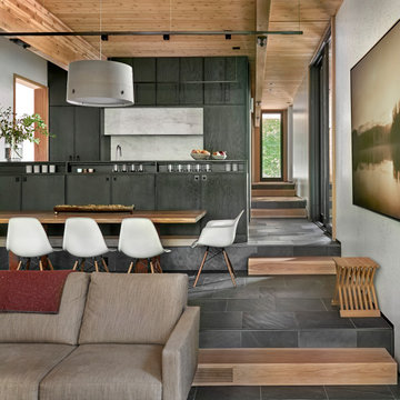
The kitchen, dining, and living areas share a common space but are separated by steps which mirror the outside terrain. The levels help to define each zone and function. Deep green stain on wire brushed oak adds a richness and texture to the clean lined cabinets.
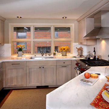
デンバーにある高級な中くらいなトランジショナルスタイルのおしゃれなキッチン (アンダーカウンターシンク、落し込みパネル扉のキャビネット、淡色木目調キャビネット、大理石カウンター、白いキッチンパネル、石スラブのキッチンパネル、シルバーの調理設備、白いキッチンカウンター、濃色無垢フローリング、黒い床) の写真
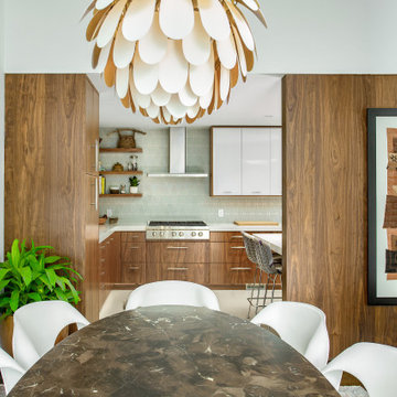
This sleek & roomy cooking space with chimney hood fills the space where the refrigerator once stood. It now serves as a beautiful focal point for the kitchen visible all the way from the living room. Photo - P.Dilworth
U-Shaped Kitchen that took over space for old kitchen and 1st floor bathroom. Opened up 1890's addition to host kitchen and dining room.
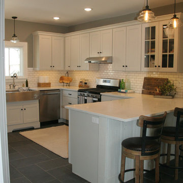
カンザスシティにある高級な中くらいなカントリー風のおしゃれなキッチン (エプロンフロントシンク、落し込みパネル扉のキャビネット、ベージュのキャビネット、珪岩カウンター、白いキッチンパネル、セラミックタイルのキッチンパネル、シルバーの調理設備、スレートの床、黒い床、白いキッチンカウンター) の写真
カンザスシティにある高級な中くらいなカントリー風のおしゃれなキッチン (エプロンフロントシンク、落し込みパネル扉のキャビネット、ベージュのキャビネット、珪岩カウンター、白いキッチンパネル、セラミックタイルのキッチンパネル、シルバーの調理設備、スレートの床、黒い床、白いキッチンカウンター) の写真
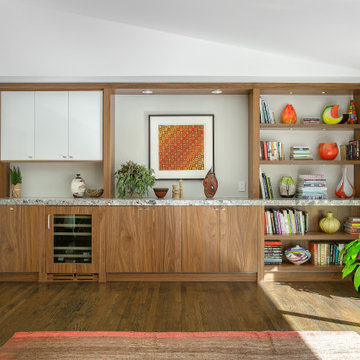
This 1950's kitchen hindered our client's cooking and bi-weekly entertaining and was inconsistent with the home's mid-century architecture. Additional key goals were to improve function for cooking and entertaining 6 to 12 people on a regular basis. Originally with only two entry points to the kitchen (from the entry/foyer and from the dining room) the kitchen wasn’t very open to the remainder of the home, or the living room at all. The door to the carport was never used and created a conflict with seating in the breakfast area. The new plans created larger openings to both rooms, and a third entry point directly into the living room. The “peninsula” manages the sight line between the kitchen and a large, brick fireplace while still creating an “island” effect in the kitchen and allowing seating on both sides. The television was also a “must have” utilizing it to watch cooking shows while prepping food, for news while getting ready for the day, and for background when entertaining.
Meticulously designed cabinets provide ample storage and ergonomically friendly appliance placement. Cabinets were previously laid out into two L-shaped spaces. On the “top” was the cooking area with a narrow pantry (read: scarce storage) and a water heater in the corner. On the “bottom” was a single 36” refrigerator/freezer, and sink. A peninsula separated the kitchen and breakfast room, truncating the entire space. We have now a clearly defined cool storage space spanning 60” width (over 150% more storage) and have separated the ovens and cooking surface to spread out prep/clean zones. True pantry storage was added, and a massive “peninsula” keeps seating for up to 6 comfortably, while still expanding the kitchen and gaining storage. The newly designed, oversized peninsula provides plentiful space for prepping and entertaining. Walnut paneling wraps the room making the kitchen a stunning showpiece.
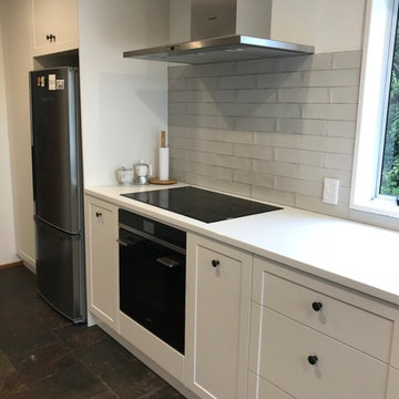
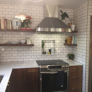
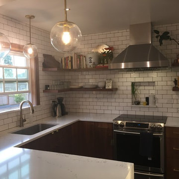
We love the subway tiles that our customers chose for their splashback.
クライストチャーチにある高級な広いコンテンポラリースタイルのおしゃれなキッチン (シングルシンク、落し込みパネル扉のキャビネット、白いキャビネット、クオーツストーンカウンター、グレーのキッチンパネル、サブウェイタイルのキッチンパネル、シルバーの調理設備、スレートの床、黒い床、白いキッチンカウンター) の写真
クライストチャーチにある高級な広いコンテンポラリースタイルのおしゃれなキッチン (シングルシンク、落し込みパネル扉のキャビネット、白いキャビネット、クオーツストーンカウンター、グレーのキッチンパネル、サブウェイタイルのキッチンパネル、シルバーの調理設備、スレートの床、黒い床、白いキッチンカウンター) の写真
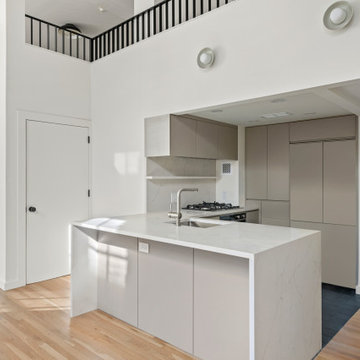
These SoHo homeowners on King Street sought to update the upper level of their apartment by opening it up to create a loft-style space with 2 flexible rooms and a powder room. They also relocated the staircase and completely transformed the kitchen and first-floor bathroom. The design is on-trend for 2023, which is black-and-white forward.
This 1950's kitchen hindered our client's cooking and bi-weekly entertaining and was inconsistent with the home's mid-century architecture. Additional key goals were to improve function for cooking and entertaining 6 to 12 people on a regular basis. Originally with only two entry points to the kitchen (from the entry/foyer and from the dining room) the kitchen wasn’t very open to the remainder of the home, or the living room at all. The door to the carport was never used and created a conflict with seating in the breakfast area. The new plans created larger openings to both rooms, and a third entry point directly into the living room. The “peninsula” manages the sight line between the kitchen and a large, brick fireplace while still creating an “island” effect in the kitchen and allowing seating on both sides. The television was also a “must have” utilizing it to watch cooking shows while prepping food, for news while getting ready for the day, and for background when entertaining.
Meticulously designed cabinets provide ample storage and ergonomically friendly appliance placement. Cabinets were previously laid out into two L-shaped spaces. On the “top” was the cooking area with a narrow pantry (read: scarce storage) and a water heater in the corner. On the “bottom” was a single 36” refrigerator/freezer, and sink. A peninsula separated the kitchen and breakfast room, truncating the entire space. We have now a clearly defined cool storage space spanning 60” width (over 150% more storage) and have separated the ovens and cooking surface to spread out prep/clean zones. True pantry storage was added, and a massive “peninsula” keeps seating for up to 6 comfortably, while still expanding the kitchen and gaining storage. The newly designed, oversized peninsula provides plentiful space for prepping and entertaining. Walnut paneling wraps the room making the kitchen a stunning showpiece.
Shifting the range to the adjacent wall allowed for efficient work top area on either side, room for a dishwasher in the peninsula and lots of counter space above. Photo - P.Dilworth
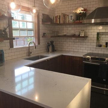
By opening up the kitchen to the dining room, removing the dark upper wall cabinets & black soffit and adding lots of white in the wall tiles and counters, the space was expanded without adding to the footprint. The new U-shaped space added tons of new counter space compared to what they had. Photo - P.Dilworth
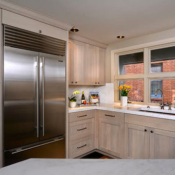
デンバーにある高級な中くらいなトランジショナルスタイルのおしゃれなキッチン (アンダーカウンターシンク、落し込みパネル扉のキャビネット、淡色木目調キャビネット、大理石カウンター、白いキッチンパネル、石スラブのキッチンパネル、シルバーの調理設備、濃色無垢フローリング、黒い床、白いキッチンカウンター) の写真
高級なブラウンのペニンシュラキッチン (白いキッチンカウンター、黒い床) の写真
1