キッチン (ボーダータイルのキッチンパネル、石タイルのキッチンパネル、黒いキッチンカウンター、緑のキッチンカウンター、黒い床) の写真
並び替え:今日の人気順
写真 1〜20 枚目(全 20 枚)
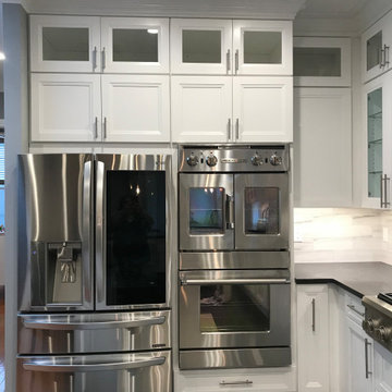
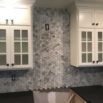
シンシナティにある中くらいなトラディショナルスタイルのおしゃれなキッチン (アンダーカウンターシンク、落し込みパネル扉のキャビネット、白いキャビネット、御影石カウンター、マルチカラーのキッチンパネル、ボーダータイルのキッチンパネル、黒い調理設備、濃色無垢フローリング、黒い床、黒いキッチンカウンター) の写真
This is a 1920's house that has limited space. We removed the drop ceiling and brought the cabinets all of the way up to allow for optimal usage of space. We also added a pot filler over the stove and re-designed the corner cabinet for better usage of space.
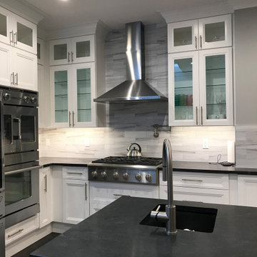
ニューヨークにある広いモダンスタイルのおしゃれなキッチン (一体型シンク、シェーカースタイル扉のキャビネット、白いキャビネット、人工大理石カウンター、グレーのキッチンパネル、石タイルのキッチンパネル、シルバーの調理設備、セラミックタイルの床、黒い床、黒いキッチンカウンター、三角天井) の写真
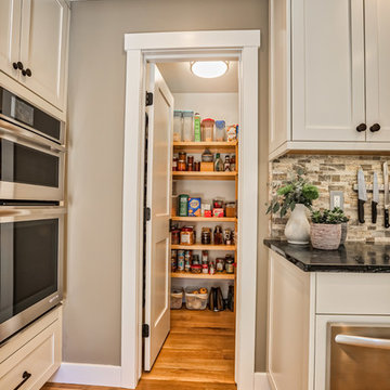
To create this much-needed walk in pantry space, a small square footage was taken from the adjoining living room space. The living room was oversized and underused so the space was not missed. This is part of a first floor renovation completed by Meadowlark Design + Build in Ann Arbor, Michigan.
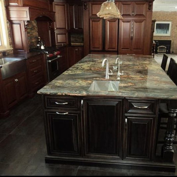
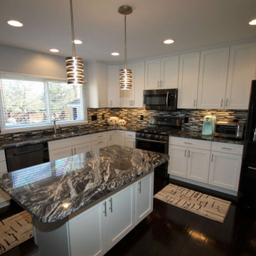
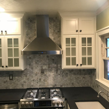
トロントにある広いトラディショナルスタイルのおしゃれなキッチン (エプロンフロントシンク、レイズドパネル扉のキャビネット、濃色木目調キャビネット、御影石カウンター、マルチカラーのキッチンパネル、ボーダータイルのキッチンパネル、パネルと同色の調理設備、スレートの床、黒い床、緑のキッチンカウンター) の写真
Con un techo en cemento era imposible incrustar los perfiles por lo que se usaron perfiles de DeltaLight con led lines y spots y se apoyo la iluminacion con lucrs sobre y bajo los muebles
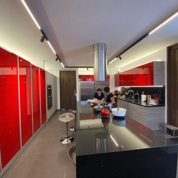
ロサンゼルスにある高級な中くらいなモダンスタイルのおしゃれなキッチン (アンダーカウンターシンク、フラットパネル扉のキャビネット、黒いキャビネット、人工大理石カウンター、黒いキッチンパネル、石タイルのキッチンパネル、黒い調理設備、磁器タイルの床、黒い床、黒いキッチンカウンター) の写真
Words by Wilson Hack
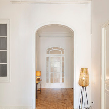
The best architecture allows what has come before it to be seen and cared for while at the same time injecting something new, if not idealistic. Spartan at first glance, the interior of this stately apartment building, located on the iconic Passeig de Gràcia in Barcelona, quickly begins to unfold as a calculated series of textures, visual artifacts and perfected aesthetic continuities.
The client, a globe-trotting entrepreneur, selected Jeanne Schultz Design Studio for the remodel and requested that the space be reconditioned into a purposeful and peaceful landing pad. It was to be furnished simply using natural and sustainable materials. Schultz began by gently peeling back before adding only the essentials, resulting in a harmoniously restorative living space where darkness and light coexist and comfort reigns.
The design was initially guided by the fireplace—from there a subtle injection of matching color extends up into the thick tiered molding and ceiling trim. “The most reckless patterns live here,” remarks Schultz, referring to the checkered green and white tiles, pink-Pollack-y stone and cast iron detailing. The millwork and warm wood wall panels devour the remainder of the living room, eliminating the need for unnecessary artwork.
A curved living room chair by Kave Home punctuates playfully; its shape reveals its pleasant conformity to the human body and sits back, inviting rest and respite. “It’s good for all body types and sizes,” explains Schultz. The single sofa by Dareels is purposefully oversized, casual and inviting. A beige cover was added to soften the otherwise rectilinear edges. Additionally sourced from Dareels, a small yet centrally located side table anchors the space with its dark black wood texture, its visual weight on par with the larger pieces. The black bulbous free standing lamp converses directly with the antique chandelier above. Composed of individual black leather strips, it is seemingly harsh—yet its soft form is reminiscent of a spring tulip.
The continuation of the color palette slips softly into the dining room where velvety green chairs sit delicately on a cascade array of pointed legs. The doors that lead out to the patio were sanded down and treated so that the original shape and form could be retained. Although the same green paint was used throughout, this set of doors speaks in darker tones alongside the acute and penetrating daylight. A few different shades of white paint were used throughout the space to add additional depth and embellish this shadowy texture.
Specialty lights were added into the space to complement the existing overhead lighting. A wall sconce was added in the living room and extra lighting was placed in the kitchen. However, because of the existing barrel vaulted tile ceiling, sconces were placed on the walls rather than above to avoid penetrating the existing architecture.
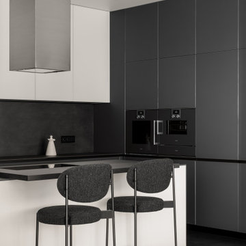
ロサンゼルスにある高級な中くらいなモダンスタイルのおしゃれなキッチン (アンダーカウンターシンク、フラットパネル扉のキャビネット、黒いキャビネット、人工大理石カウンター、黒いキッチンパネル、石タイルのキッチンパネル、黒い調理設備、磁器タイルの床、黒い床、黒いキッチンカウンター) の写真
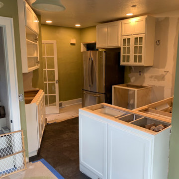
This is a 1920's house that has limited space. We removed the drop ceiling and brought the cabinets all of the way up to allow for optimal usage of space. We also added a pot filler over the stove and re-designed the corner cabinet for better usage of space.
ニューヨークにある広いコンテンポラリースタイルのおしゃれなキッチン (アンダーカウンターシンク、落し込みパネル扉のキャビネット、白いキャビネット、人工大理石カウンター、グレーのキッチンパネル、石タイルのキッチンパネル、シルバーの調理設備、セラミックタイルの床、黒い床、黒いキッチンカウンター、三角天井) の写真
This is a 1920's house that has limited space. We removed the drop ceiling and brought the cabinets all of the way up to allow for optimal usage of space. We also added a pot filler over the stove and re-designed the corner cabinet for better usage of space.
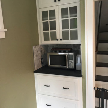
This is a 1920's house that has limited space. We removed the drop ceiling and brought the cabinets all of the way up to allow for optimal usage of space. We also added a pot filler over the stove and re-designed the corner cabinet for better usage of space.
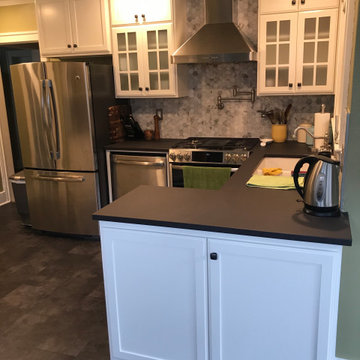
This is a 1920's house that has limited space. We removed the drop ceiling and brought the cabinets all of the way up to allow for optimal usage of space. We also added a pot filler over the stove and re-designed the corner cabinet for better usage of space.
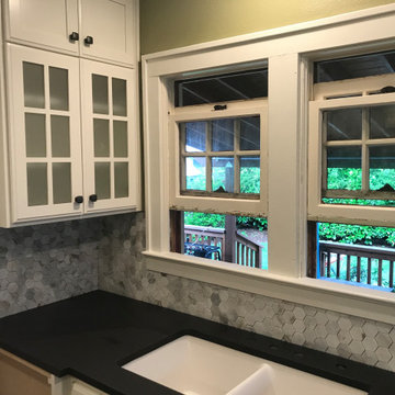
This is a 1920's house that has limited space. We removed the drop ceiling and brought the cabinets all of the way up to allow for optimal usage of space. We also added a pot filler over the stove and re-designed the corner cabinet for better usage of space.
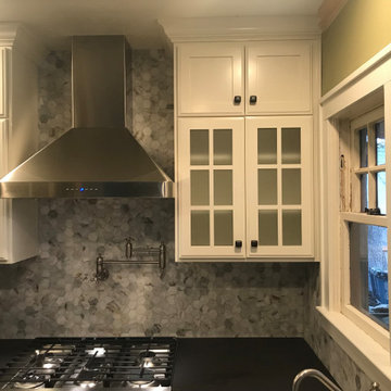
This is a 1920's house that has limited space. We removed the drop ceiling and brought the cabinets all of the way up to allow for optimal usage of space. We also added a pot filler over the stove and re-designed the corner cabinet for better usage of space.
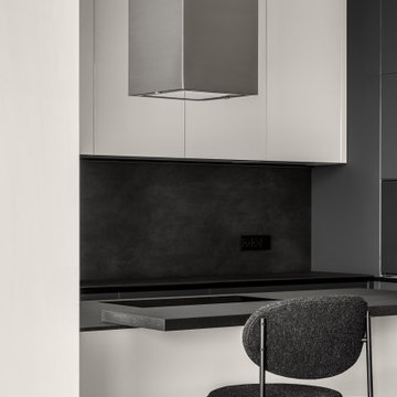
ロサンゼルスにある高級な中くらいなモダンスタイルのおしゃれなキッチン (アンダーカウンターシンク、フラットパネル扉のキャビネット、黒いキャビネット、人工大理石カウンター、黒いキッチンパネル、石タイルのキッチンパネル、黒い調理設備、磁器タイルの床、黒い床、黒いキッチンカウンター) の写真
Words by Wilson Hack
The best architecture allows what has come before it to be seen and cared for while at the same time injecting something new, if not idealistic. Spartan at first glance, the interior of this stately apartment building, located on the iconic Passeig de Gràcia in Barcelona, quickly begins to unfold as a calculated series of textures, visual artifacts and perfected aesthetic continuities.
The client, a globe-trotting entrepreneur, selected Jeanne Schultz Design Studio for the remodel and requested that the space be reconditioned into a purposeful and peaceful landing pad. It was to be furnished simply using natural and sustainable materials. Schultz began by gently peeling back before adding only the essentials, resulting in a harmoniously restorative living space where darkness and light coexist and comfort reigns.
The design was initially guided by the fireplace—from there a subtle injection of matching color extends up into the thick tiered molding and ceiling trim. “The most reckless patterns live here,” remarks Schultz, referring to the checkered green and white tiles, pink-Pollack-y stone and cast iron detailing. The millwork and warm wood wall panels devour the remainder of the living room, eliminating the need for unnecessary artwork.
A curved living room chair by Kave Home punctuates playfully; its shape reveals its pleasant conformity to the human body and sits back, inviting rest and respite. “It’s good for all body types and sizes,” explains Schultz. The single sofa by Dareels is purposefully oversized, casual and inviting. A beige cover was added to soften the otherwise rectilinear edges. Additionally sourced from Dareels, a small yet centrally located side table anchors the space with its dark black wood texture, its visual weight on par with the larger pieces. The black bulbous free standing lamp converses directly with the antique chandelier above. Composed of individual black leather strips, it is seemingly harsh—yet its soft form is reminiscent of a spring tulip.
The continuation of the color palette slips softly into the dining room where velvety green chairs sit delicately on a cascade array of pointed legs. The doors that lead out to the patio were sanded down and treated so that the original shape and form could be retained. Although the same green paint was used throughout, this set of doors speaks in darker tones alongside the acute and penetrating daylight. A few different shades of white paint were used throughout the space to add additional depth and embellish this shadowy texture.
Specialty lights were added into the space to complement the existing overhead lighting. A wall sconce was added in the living room and extra lighting was placed in the kitchen. However, because of the existing barrel vaulted tile ceiling, sconces were placed on the walls rather than above to avoid penetrating the existing architecture.
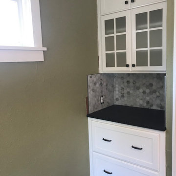
This is a 1920's house that has limited space. We removed the drop ceiling and brought the cabinets all of the way up to allow for optimal usage of space. We also added a pot filler over the stove and re-designed the corner cabinet for better usage of space.
This is a 1920's house that has limited space. We removed the drop ceiling and brought the cabinets all of the way up to allow for optimal usage of space. We also added a pot filler over the stove and re-designed the corner cabinet for better usage of space.
キッチン (ボーダータイルのキッチンパネル、石タイルのキッチンパネル、黒いキッチンカウンター、緑のキッチンカウンター、黒い床) の写真
1