青いキッチン (パネルと同色の調理設備、グレーと黒) の写真
並び替え:今日の人気順
写真 1〜2 枚目(全 2 枚)
We have completed a breathtaking project for some previous clients in their new-build home. This stunning kitchen and utility uses Mereway’s Q-Line range in ‘Pietra Ceramica’ and ‘Grafite Ceramica’. We matched the worktops using Laminam’s ‘Pietra di Savoia Antracite Bocciardata’ and ‘Pietra di Savoia Grigia Bocciardata’ to create a stunning, industrial finish. The ceramic itself has the most beautiful, dramatic and interesting finish due to its unique texture and colour. A key design feature was having the tall bank of units in the darker tone, and island in the lighter tone in order to create more contrast and highlight the beauty of the materials. Sleek, black plinths create a ‘floating’ illusion, adding interest to the overall space.
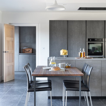
Our design brief for this project was to create a contemporary, hybrid space that harmoniously balanced their day to day life with their social life. Plenty of storage space, a large island, drinks area and a matching utility were core factors of the brief with a primary focus on accessibility as one of our clients is a wheelchair user. Being able to have a kitchen to prepare meals in as a couple was an important factor in the overall design of the kitchen, which is why the recess in the kitchen island is a core feature.
The kitchen table is a thing of beauty in itself, thoughtful design resulted in the table being adjoined to the island. The wood used by Spekva is a stunning feature that stands out so well on its own, and creates a natural warmth, so a simple design for the legs was paramount. Our focus here was on the attention to detail of the legs, which we had specially crafted in order to match the grip ledges of the tall bank of units. This element of the design was crucial to ensuring continuity between the island and table, yet give the design another dimension and another beautiful feature.
Creating a drinks area adds to the social element of the brief. Therefore, on the opposite side of the island, we installed a bar area which includes a wine cooler and built-under fridge for soft drinks and beer.
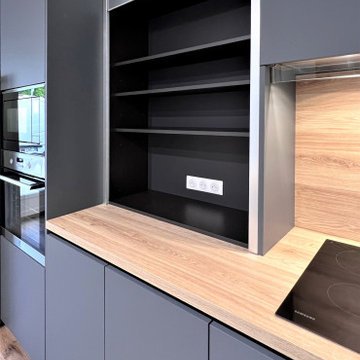
The utility room stays very much in the same direction, which is something we felt important as the utility room can be seen from the kitchen/dining area. Instead of fitting units in the luxurious ceramic, we opted to have units in a competitively priced concrete-effect laminate. This finish fits perfectly into the overall design and is extremely practical for a utility room. The space is kitted out with integrated laundry equipment, a sink and tap and additional storage.
Incroyable métamorphose à Lèves.
Une cuisine refaite à neuf du sol au plafond dans les tons gris et bois.
Une très belle luminosité apportée par des spots disposés dans le coffrage au plafond et sous les meubles hauts.
L’ensemble des appareils type cafetière, grille pain, etc. sont dissimulés dans un meuble rideau, comme le souhaitait ma cliente. Le reste de l’électroménager s’accorde parfaitement à la cuisine.
Cette fois encore, nous avons accentué la profondeur de la pièce grâce à un îlot central qui sert à la fois de plan de travail et de coin repas.
D’ailleurs, saviez-vous que sa surface n’était pas en bois massif tout comme celle du plan de travail ?
Nous avons utilisé du stratifié bois à pores synchronisés. Même texture au toucher, même aspect visuel, il est résistant à l’abrasion et extrêmement facile à entretenir.
Inutile de vous dire que ma cliente est très satisfaite du résultat final et mon équipe aussi.
Si vous rêvez de transformer votre cuisine en cuisine de rêve, contactez-moi dès maintenant.
青いキッチン (パネルと同色の調理設備、グレーと黒) の写真
1