四角い家 (円形の家、緑化屋根) の写真
絞り込み:
資材コスト
並び替え:今日の人気順
写真 1〜6 枚目(全 6 枚)
1/4
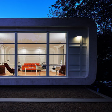
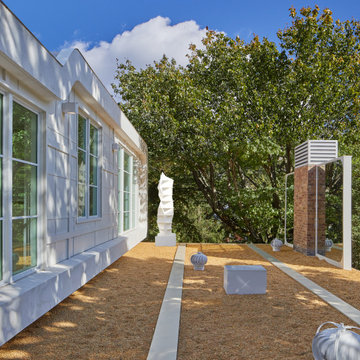
Designed in 1970 for an art collector, the existing referenced 70’s architectural principles. With its cadence of ‘70’s brick masses punctuated by a garage and a 4-foot-deep entrance recess. This recess, however, didn’t convey to the interior, which was occupied by disjointed service spaces. To solve, service spaces are moved and reorganized in open void in the garage. (See plan) This also organized the home: Service & utility on the left, reception central, and communal living spaces on the right.
To maintain clarity of the simple one-story 70’s composition, the second story add is recessive. A flex-studio/extra bedroom and office are designed ensuite creating a slender form and orienting them front to back and setting it back allows the add recede. Curves create a definite departure from the 70s home and by detailing it to "hover like a thought" above the first-floor roof and mentally removable sympathetic add.Existing unrelenting interior walls and a windowless entry, although ideal for fine art was unconducive for the young family of three. Added glass at the front recess welcomes light view and the removal of interior walls not only liberate rooms to communicate with each other but also reinform the cleared central entry space as a hub.
Even though the renovation reinforms its relationship with art, the joy and appreciation of art was not dismissed. A metal sculpture lost in the corner of the south side yard bumps the sculpture at the front entrance to the kitchen terrace over an added pedestal. (See plans) Since the roof couldn’t be railed without compromising the one-story '70s composition, the sculpture garden remains physically inaccessible however mirrors flanking the chimney allow the sculptures to be appreciated in three dimensions. The mirrors also afford privacy from the adjacent Tudor's large master bedroom addition 16-feet away.
ハノーファーにある高級なコンテンポラリースタイルのおしゃれな家の外観 (塗装レンガ、緑化屋根、下見板張り、アパート・マンション) の写真
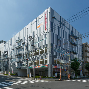
墨田区にある複合施設です。1階にセブンイレブン、演劇練習スタジオ 2階は貸室、3階は保育園、4階は貸倉庫、5階にフットサルコートがあります。
屋上はフットサルコート遮熱のため、屋上緑化にしています。夏涼しく、エアコンなしでもプレーできます。
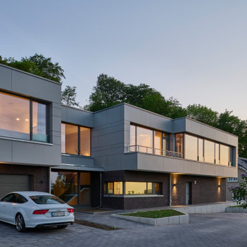
東京23区にあるお手頃価格の巨大な北欧スタイルのおしゃれな家の外観 (コンクリートサイディング、緑化屋根) の写真
東京23区にあるお手頃価格の巨大な北欧スタイルのおしゃれな家の外観 (コンクリートサイディング、緑化屋根) の写真
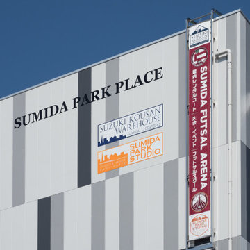
SUMIDA PARK PLACEのサイン計画です。
フットサルチーム広告を掲示しました。
東京23区にあるお手頃価格の巨大な北欧スタイルのおしゃれな家の外観 (緑化屋根) の写真
東京23区にあるお手頃価格の巨大な北欧スタイルのおしゃれな家の外観 (緑化屋根) の写真
Designed in 1970 for an art collector, the existing referenced 70’s architectural principles. With its cadence of ‘70’s brick masses punctuated by a garage and a 4-foot-deep entrance recess. This recess, however, didn’t convey to the interior, which was occupied by disjointed service spaces. To solve, service spaces are moved and reorganized in open void in the garage. (See plan) This also organized the home: Service & utility on the left, reception central, and communal living spaces on the right.
To maintain clarity of the simple one-story 70’s composition, the second story add is recessive. A flex-studio/extra bedroom and office are designed ensuite creating a slender form and orienting them front to back and setting it back allows the add recede. Curves create a definite departure from the 70s home and by detailing it to "hover like a thought" above the first-floor roof and mentally removable sympathetic add.Existing unrelenting interior walls and a windowless entry, although ideal for fine art was unconducive for the young family of three. Added glass at the front recess welcomes light view and the removal of interior walls not only liberate rooms to communicate with each other but also reinform the cleared central entry space as a hub.
Even though the renovation reinforms its relationship with art, the joy and appreciation of art was not dismissed. A metal sculpture lost in the corner of the south side yard bumps the sculpture at the front entrance to the kitchen terrace over an added pedestal. (See plans) Since the roof couldn’t be railed without compromising the one-story '70s composition, the sculpture garden remains physically inaccessible however mirrors flanking the chimney allow the sculptures to be appreciated in three dimensions. The mirrors also afford privacy from the adjacent Tudor's large master bedroom addition 16-feet away.
外壁をALCコンクリート板張りにしたため、ただ1色で塗るのはつまらないと考えました。1枚1枚を薄いグレーから濃いグレーの3パターンで塗り分けしました。
上の方は白っぽく、だんだん下にいくにつれて濃くなっていくのはどうかなと思ってやってみました。なかなかいい感じになったと思っています。
コストパフォーマンスを上げるデザインです。
四角い家 (円形の家、緑化屋根) の写真
1