浴室・バスルーム (珪岩の洗面台、黒い洗面カウンター、マルチカラーの床、引戸のシャワー) の写真
絞り込み:
資材コスト
並び替え:今日の人気順
写真 1〜9 枚目(全 9 枚)
1/5
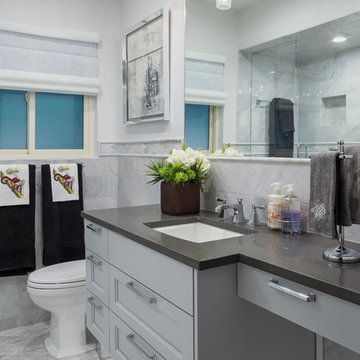
Jeff Morris
Polshed White Carrara tile
Kohler faucet
Connely two piece toilet
Kichler Sconce
Cabinetry by Irie Cabinets - Denver
Linens from the Brass Bed in Cherry Creek
Flowers by Becks Silk Plants
Atlas Sutton Pulls
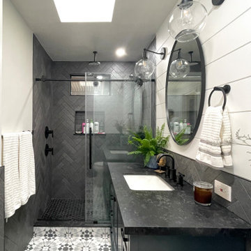
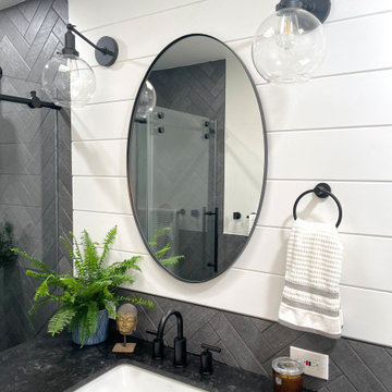
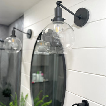
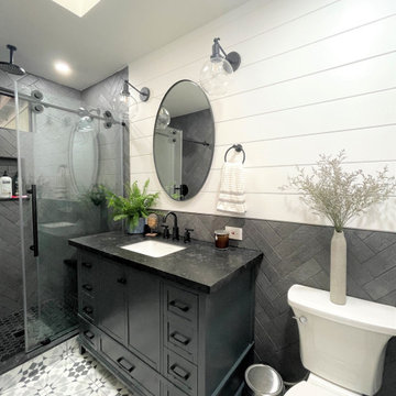
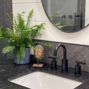
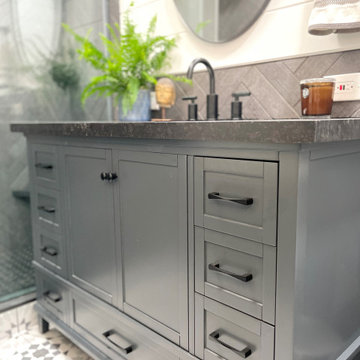
Great design makes all the difference - bold material choices were just what was needed to give this little bathroom some BIG personality! Our clients wanted a dark, moody vibe, but had always heard that using dark colors in a small space would only make it feel smaller. Not true!
Introducing a larger vanity cabinet with more storage and replacing the tub with an expansive walk-in shower immediately made the space feel larger, without any structural alterations. We went with a dark graphite tile that had a mix of texture on the walls and in the shower, but then anchored the space with white shiplap on the upper portion of the walls and a graphic floor tile (with mostly white and light gray tones). This technique of balancing dark tones with lighter tones is key to achieving those moody vibes, without creeping into cavernous territory. Subtle gray/blue/green tones on the vanity blend in well, but still pop in the space, and matte black fixtures add fantastic contrast to really finish off the whole look!
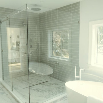
ニューヨークにあるお手頃価格の中くらいなコンテンポラリースタイルのおしゃれなマスターバスルーム (シェーカースタイル扉のキャビネット、ベージュのキャビネット、置き型浴槽、コーナー設置型シャワー、一体型トイレ 、グレーのタイル、セラミックタイル、グレーの壁、磁器タイルの床、オーバーカウンターシンク、珪岩の洗面台、マルチカラーの床、引戸のシャワー、黒い洗面カウンター) の写真
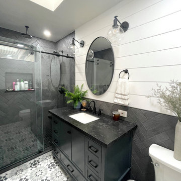
Great design makes all the difference - bold material choices were just what was needed to give this little bathroom some BIG personality! Our clients wanted a dark, moody vibe, but had always heard that using dark colors in a small space would only make it feel smaller. Not true!
Introducing a larger vanity cabinet with more storage and replacing the tub with an expansive walk-in shower immediately made the space feel larger, without any structural alterations. We went with a dark graphite tile that had a mix of texture on the walls and in the shower, but then anchored the space with white shiplap on the upper portion of the walls and a graphic floor tile (with mostly white and light gray tones). This technique of balancing dark tones with lighter tones is key to achieving those moody vibes, without creeping into cavernous territory. Subtle gray/blue/green tones on the vanity blend in well, but still pop in the space, and matte black fixtures add fantastic contrast to really finish off the whole look!
浴室・バスルーム (珪岩の洗面台、黒い洗面カウンター、マルチカラーの床、引戸のシャワー) の写真
1