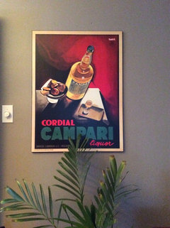
Why are these 3 posters bugging me?
sondramartina
10年前
最終更新:10年前
I have them for almost a week but something is not right.
Do I just need to add accents,pillows & red blanket or should I move posters above credenza in DR?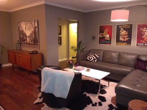
Do I just need to add accents,pillows & red blanket or should I move posters above credenza in DR?
注目アンサー
並び替え:古い順
コメント (84)

cricket1021
10年前I think the problem is the framing. they look like they are poster stuck to the wall.
abbyjean
10年前最終更新:10年前I cannot believe how you scored with that big picture as it truly looks nice in either room. Do all three fit in the dining room or would you only be able to use 2 together and then find another close place for the third one? I like red accents since both rooms are open to each other......not a lot, but enough to be planned and thought out.User
10年前I like how you have them over the sofa. The buffet has warm colour, and the posters have warm colour distributed elsewhere, which balances the space. Just need Marks brick pillow, plus look at the prev. post you did which has colour recommendations for pillows too. Great posters, and in MMM days they had pre and post dinner drinks in the Living room,so is quite fine there. PRO
PROMichael Gainey Signature Designs
10年前I agree.....the posters need more weight,which the black frames would accomplish .Since the posters are so dynamic they need to be the focus....so I would relocate the larger piece of art above the buffet.....to perhaps a metal sculpture.I think touches of black in the room would punctuate your theme.Keep up the good work......it's all about juxtaposition!User
10年前Don't think they go with other furnishings, do look better over buffet than sofa. When I look at LR, I see too many pieces that don't relate. PRO
PROMussman Design Associates
10年前We suggest that you use only one in this space, and that you lower the one you keep. 3x same/similar with art can be a challenge. Another suggestion: you could use two one atop the other on the side wall. Over the buffet place a much larger singular framed piece of art in another subject-still life, floral, landscape, etc. PRO
PROpatricia sarnataro
10年前I think some frames may make you feel better about them , another suggestion is see how it looks to put the big piece over the couch and the posters over the credenza, than add some of the colors from the posters in accent pillows on the couch....I think the graphic bl and wh pillow may be fighting the art a bit, but I do love the rug!
bumblebee728
10年前Maybe what was troubling you was the 3 rectangular posters over the 4 rectangular/square sofa back cushions. I like the one painting over the sofa and the posters in the DR, especially with the 2 on one wall and one on the other. And like others said, now you might want to bring a little color back in to the LR, in a throw or other accessories. PRO
PRODC Interiors & Renovations
10年前I think that the pictures should all be framed in black with a gray mat. The posters can all be in one frame with the mat separating them. That way there is some consistency even with different types of art. PRO
PROKelli Richards Interiors
10年前I like the black & white photo in the living room, to me it makes more sense. I feel that a living room should be calming and those posters are more playful and energetic. They work nicely in the DR. The only thing I would do is frame them with black frames. It will also make them larger and have move of a presence. Then just add a couple accessories on the buffet and a couple of throw pillows on the sofa. I wouldn't use any bright red pillows, maybe more subdued with a little red like the ones Mark posted. It will make the rooms relate to each other. If you are going to paint the blk & wht picture frame, I would do black. Don't stress about it though, you have done a great job decorating this space! I love your mid century modern pieces!
sondramartina
質問の投稿者10年前最終更新:10年前Kelli thank you for your kind words. I have to attach one more photo ,this TV credenza is my favorite piece of furniture in this room.
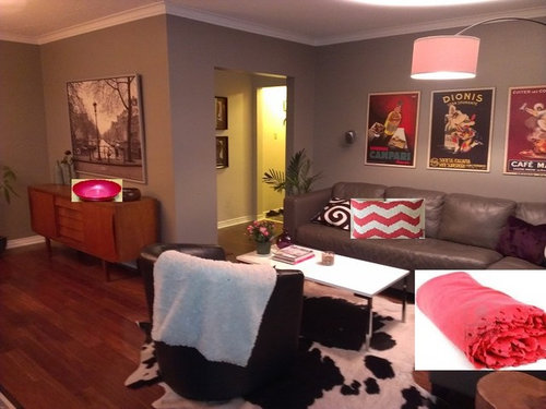
I think I am ok now when I swapped posters & b& w pic . Just few more accessories.

Ann
10年前I think they're nice over the credenza but definitely hung too high. I don't think it's just a deceiving picture angle.sondramartina
質問の投稿者10年前最終更新:10年前Posters height, I just checked this morning again ,if they were hung any lower I would have wall in front of my eyes :)
ps. We are all tall .Ann
10年前Sounds like you've made your mind up but it's fine to have art below eye level when it needs to relate to the furniture below it. It can be hung to be enjoyed while seated rather than standing. In your case, I think your art needs to be no more than 10" (at the very most) above the credenza.sondramartina
質問の投稿者10年前Thanks Ann. It is not final , it could be changed and I will definitely try to use that 10'' advice and re consider the height.Sarah W
10年前I think what was bugging you about the posters over the sofa, was all the segments of three's. Three posters over three cushions is too busy. The large picture framed in black looks real nice over the couch. Get a throw pillow that will draw out some color or tint from the picture. The posters look good in the dining room. That's my two cents. Nice credenza.Ann
10年前10" is a little more than is typical, but in a similar case where I've placed art above furniture (where maybe the art is a bit smaller than ideal), I've stretched the 7" or so standard to 10" so the art wasn't ridiculously low:)- PRO
Kelli Richards Interiors
10年前I am sorry but I do agree with Ann about placing the art lower...unfortunately this will mean filling the holes and touching up the paint :( If you do decide to do this however, it might also look a bit nicer to separate them more by an inch or so. You will also need to lower the art on the other wall and then I would move the plant to the corner. ;)sondramartinaさんはKelli Richards Interiorsさんにお礼を言いました sondramartina
質問の投稿者10年前Ann you were right, They are hung a bit high #$#%^@&%^#&^## which will leave me with visible holes in the wall . :(
So many inventions these days but plugging holes in the walls are still done by old fashioned plastering and painting ?!!!Ann
10年前Sorry about the visible holes. I almost never get art height right the first time, even when I tape paper to the wall first to test. After a few weeks it begins to bug me and I change it (often more than once). My husband would kill me if he knew just how many holes are behind each piece of art.
groveraxle
10年前OK, you people with drywall holes need to stop complaining. You ain't seen nuthin' till you've had holes in 100-year-old plaster and lath.
Impossible Bebong
10年前i think it's the colour of your wall (which on my screen looks like only a shade lighter than the sofa and the two almost blend together) same when you have switched the big frame (it almost disappear and doesn't provide any contrast) painting (or papering) the wall in darker colour (like the accent club chair) will provide the necessary contrast and drama. but it's just my two personal cents.craljh
10年前Me too with the holes. I will be very busy if I ever sell !!! Can you put holes in 100 year old plaster ? It sounds like it may be like concrete. The best surface I ever had was grass cloth wallpaper. I would pick the spot between the strips !!
Momof5x
10年前Visually the eyes tell you they should be swapped as the one over sideboard dining cupboard matches the sofa set and vice versa. PRO
PROCraig Kamman, Edina Realty
10年前I think it might be scale. Perhaps a larger horizontal piece over the sofa. (the posters themselves are cool). PRO
PROSara Palacios Designs and Custom Furniture
10年前The posters need to be re-frame, a good wide mat, I would say white mat. The room is very nice.sondramartina
質問の投稿者10年前Posters are wood mounted(laminated) so I don't know how that works with framing and what would be the cost. At the moment it is not in my budget.
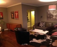
I lowered the posters.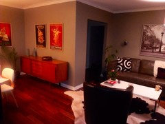
- sondramartinaさんはbumblebee728さんにお礼を言いました
egee
10年前I would put them a little closer together and lower them. They're too high up. Your sofa is a lower profile, so put the artwork that way too. Beautiful room. PRO
PRODNA renovations
10年前I would move 3 posters over cabinet and bring that poster in place maybe just me but lose the dead cow on the floorsondramartina
質問の投稿者10年前最終更新:10年前Dale Gallacher I am not interested in opinions about anything else in this room except posters and other art position.So thanks for the suggestion about that. And I am pretty much done with that as well. :-Dsondramartina
質問の投稿者10年前最終更新:10年前I decided not to frame them so I can now enjoy my house and be at peace with it.
Ann I saw last pic of your DR with new art and it looks great. I would just get nice pot for that plant in the corner.Ann
10年前Thanks Sondra - I do need to get nice pots. I have 4 large healthy plants/trees in the house and they all need a very large replacement pot:)- PRO
Kelli Richards Interiors
10年前sondramartina, Enjoy your home and be at peace with it, I love your attitude! I also think it looks great now that you lowered them a bit. Enjoy :)sondramartinaさんはKelli Richards Interiorsさんにお礼を言いました


Kelli Richards Interiors