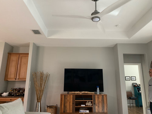
Lots of unnecessary "architectural" elements in this space. I'm bothered more by the two "doorways" they created on either side of the TV niche. I would be doing some research to see if I could remove some of those partial walls.
Is this a condo or apartment? Looks like they had to use soffits to run hvac?
Hi. Can the tray be drywalled to be level with the rest of the ceiling? Serious question, I don't know if this is a practical solution or would create more problems than it solves.
At least center the tv in the space, and remove the other objects near it. Can you get a new console for underneath? One that is at least 1/3 longer than the one you have?
It’s true that it would help to see the entire space (and even to have a floor plan of the room), but I can immediately see what is unsettling to you. I can also see why they did the recessed ceiling the way they did; the ducting is on the left and they simply framed it to accommodate the ceiling fan. As a designer, I would have a few questions for you about how you use this room. Do you use the ceiling fan? What’s the height of the ceiling from the floor to the ceiling with the ducting? The door to the right has an entry vestibule that I would remove. That would be a simple fix to immediately help balance the space better. But you still have a few elements that I would change. The cabinet on the left with the wall with the switch on it is something I would remove as well. I would build out that entire wall with cabinetry and make the space feel more open and more cohesive.
As mentioned by chispa, If possible I would remove the walls creating a hallway to the room on the right and run the back wall behind the TV straight across. I don't know if anything can be done on the left side with what looks like a kitchen cabinet stuck in a niche but at least with what's illustrated below the tray ceiling looks somewhat more centered.
All white ceiling fan fixture. Remove what appears to be a kitchen desk type cabinetry to the left and create a focal point with shelves and complete cabinetry more in style with a living area as opposed to a kitchen. Beverly FLA has a great rendition of wall color and media changes. Removing the wall to the right is most likely not going to work due to flooring issue, you would need to correct flooring where the wall is removed.
Consider merging the two sections visually by filling in the left indent so it‘s flush and complementary to the middle (won’t have to deal with repairing flooring). As well, the ceiling now won’t feel as off and in general, the entire space will feel less choppy.
Another poster suggested removing the bumpout that leads into the hallway. If it doesn't present a structural issue I would suggest that also. Might also suggest removing the single thickness wall on the opposite side of the tv. That should make the room less choppy.
I just put them into a quick layout so you can see examples. I would alter the walls, it’s easier to work around them & use your money on the items that will go inside those spaces & can also be taken with you if you ever left. If you’re handy, this would be an easy cabinet/bookcase build. Obviously I made up random dimensions but you’ll get the idea. Hope it helps.
We will replace flooring so that isn’t an issue. Te the cabinet space so that can go too. The pantry doors are an eyesore as well (also unbalanced). I’m concerned that if we take out the sidewalls, there will be a level issue. Can you tell when the floor and current back walls meet?
Oh & also, I wouldn’t worry about the ceiling too much until you determine how you want to create intent in the space. It’s wonky but you can drop the recess fairly easy to remove conflict. I think it’s noticeable because your furniture isn’t to scale with the space. You need to fill the recess & mount your tv. That’s the easiest way to draw your eyes forward & not up. Right now, it’s the only thing that creates focus. I also would not alter the hallway entry, not only does it give you a very intentional space, it creates balance on the wall. The reason it seems heavy on one side is because the upper cabinet & empty middle. Unless you’re looking to make structural changes, have at it, but if the purpose is to work around what’s there….that would be my opinion. Also, forgot this example.
I agree with the comment to remove the additional wall around the doorway on the right side. I am almost 100% sure that is not structural. You will need to patch the tile in that area, so i am assuming you have extra pieces of tile in storage for that. Filling in the tray ceiling would be quite a bit of work with framing and drywall finish overhead.
Great to see the Houzz community stepping in with suggestions and even some rendering/ image options. Very cool!


AnnKH
Joanne Carter質問の投稿者
chispa
Lyn Nielson
Sue Pedersen
jck910
Sammie J
DeSantis & Domb Interior Designs
BeverlyFLADeziner
lisedv
Valinta
Maureen
Norwood Architects
Amber Winebarger
Joanne Carter質問の投稿者
Joanne Carter質問の投稿者
Joanne Carter質問の投稿者
Amber Winebarger
lisedv
Highland Builders LLC