1990s to now townhouse transformation
This project was a little unique, in that it was the first that was done completely remotely from initial client briefing through to contract documentation. Located on the other side of the country, in the leafy suburb of South Perth, Western Australia, this two-level red brick townhouse with a beige interior was built in the early 1990s and is long overdue for a makeover.
Key points of the initial brief from the client:
- It had to be a design that would last in her forever home. The client didn’t want to have to refurbish or upgrade anything ever again!
- It needed to incorporate clever storage ideas.
- The design needed to be classic and relatively neutral in terms of colours and fixtures so as not to date quickly, as well as a cool colour palette.
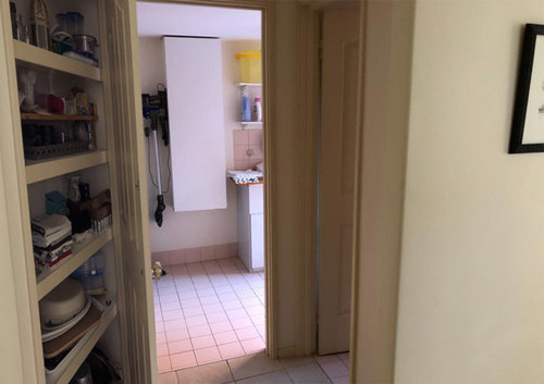
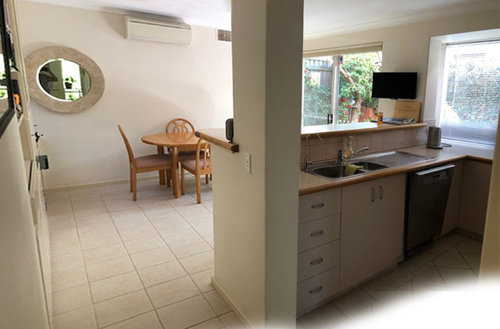
- The budget could only accommodate minor structural changes. These were mainly incorporated into the center of the ground floor where a ‘bottleneck’ exists between the entrances leading into the laundry, powder room, and storage cupboard which are very close and adjacent to the kitchen.
- A better flow and connection between the kitchen, dining area, and courtyard
- Seating in the small dining area to accommodate up to 15 guests and the overall kitchen/ dining area to be more user-friendly for entertaining
When initially discussing ideas with the client, I noticed that she liked elements from various interior design styles and eras that wouldn’t necessarily work together homogeneously or suit the 90’s built structure that is also part of a body corporate.
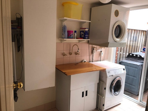
Before:
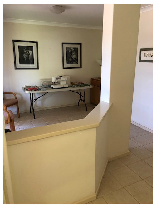
After:

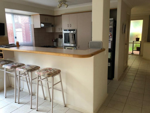
Before:
After:

The first step was to go through a discovery phase and define what her style was and how I was going to incorporate her own personality into the spaces to create a meaningful and lasting design.
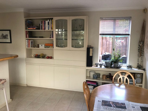
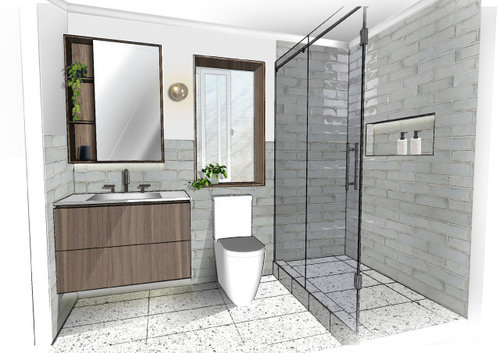
A Mid-century interior was the preference, although discussed that replicating a mid-century design would look out of place in a ’90s built structure. I presented a concept that subtly incorporates some mid-century details into the design but they are used in a modern way. Finishes such as walnut veneer, reeded glass, grey smoked mirror, timber-framed elements, smoked glass wall lights, and Serge Mouille feature lighting have been incorporated.
Finishes:

Before:
After
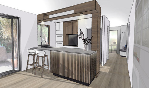
The kitchen layout has to be one of our favourite new spaces as it's now more user-friendly with all of the awkward corner cabinets removed. The layout is also better for entertaining with the original high section of the island bench removed, previously creating a visual barrier between the dining area and kitchen. The sink is closer to the window and frees up the space on the island bench where Helen can be preparing in the kitchen while chatting to guests as they mingle in the dining area. A breakfast bar has also been added to the courtyard window with direct access to the kitchen.
Bench seating and an extendable dining table allows for flexible seating arrangements along with additional storage.
Before:
After:

Before:
After:
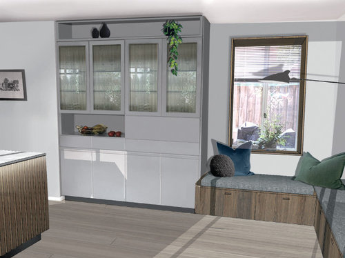


Cool grey tones in the tiles, stone, and tinted mirror compliment the walnut veneer used throughout, along with the gunmetal fixtures with knurled texture, which again adds contrast and sophistication to the overall palette.
Before:
After:
Before:
After:

Check out what our lovely client had to say here!
コメント (8)
 PRO
PROCentric Spaces
質問の投稿者昨年Hi Dreamer
This project is currently at building construction tender stage. Hoping to lock in a builder soon. We will send you some project update pics so you can see it as it gets built.
Cheers
Chris
Donna Derham
昨年Get rid of the shower door and go for a walk in, much less to clean. put towel rail at end near walk in. Bar stools in front of sink is wrong. Use downlights as the others get dirty quickly in the kitchen. Love the rest.
 PRO
PROAus Joinery Kitchens Pty Ltd
昨年In the dining area where the cabinet and dining are, couldnt the doors of the cabinet go right up to the ceiling? the shelf between the top of the door and ceiling look like a dust collector or is this part of the mid century styling?
- PRO
Centric Spaces
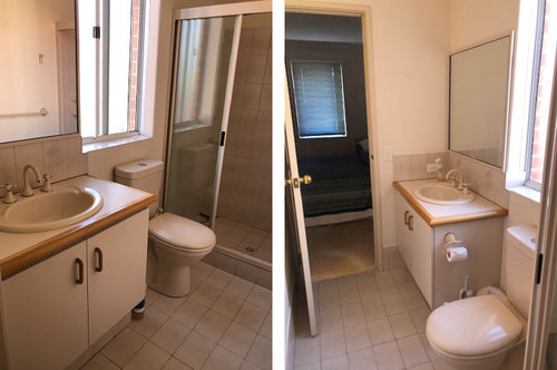
質問の投稿者昨年Hi @Donna Derham & @Aus Joinery Kitchens Pty Ltd great comments and ideas. However, answering the clients brief, working within their budget and navigating existing conditions formulates the design outcome. Whilst interpreting all of these requirements within a specific design style. For example, the clients budget did not allow for changes to the existing upper level concrete floor slab in the bathroom which meant we needed to retain the existing hob to satisfy building constraints.
This demonstrates how important and crucial the discovery phase is with a client at the beginning of a project, to work through and solve problems before construction phase has started, avoiding costly changes and satisfying the project brief, budget and time frame.  PRO
PROFontaine Industries
昨年Great design! Love your sketchup work, the choice of colour palette and the details such as the timber window trims. Maybe get rid of the shower door as mentioned by Donna Derham, perhaps can go with a large glass shower panel to achieve a more seamless look. Looking forward to see the photos once this project is done.


dreamer