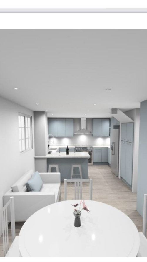
Colours for east-facing kitchen/dining room
We are planning to start a kitchen renovation project in September, a year later then planned.
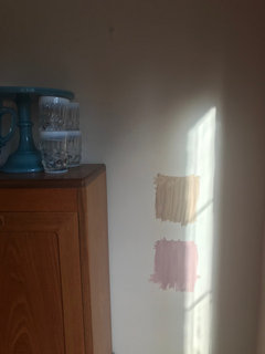
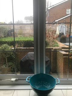
A year ago I chose colours for our east-facing kitchen. Now I started having doubts about my chosen blue scheme. I am afraid it would become outdated too soon, as well as the colours could feel cold in our light-starved ground floor. It lacks light during colder months because our back garden is on a steep slope, which effectively cuts the level of natural light by half (see a pic of my garden view below).
I would really appreciate recommendations and opinions on:
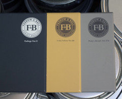
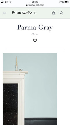
- a suitability of the chosen colour scheme (say, oval room blue + shaded white by F&B)
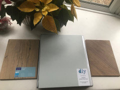
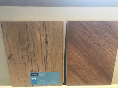
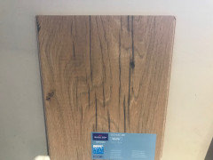
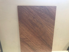
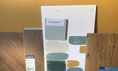
- would one of two laminated floors samples below would work with blue and shaded white?
- any relevant tips and suggestions.
コメント (43)

Jonathan
3年前I’m not a fan of pale blue but if it’s your taste then I think you have put together a cohesive look that is pale enough to be fine in a room with little light.
Given a lot of the time electric light may be necessary make sure you give this consideration- I would be thinking of LEDs above and below the wall cabinets, standard lamps and table lights in the living room. And make sure you choose warm white lighting.
Separately if you moved the Barbecue and painted the brick wall opposite the kitchen window this would bounce some light in too

Juliet Docherty
3年前Shaded White is a lovely colour, but I would personally not put it with pale blue. Shaded White contains a lot of yellow (this doesn't mean it looks yellow but it does contain it) and this could clash a bit with very pale blue. If you look up Rebecca Wakefield on Instagram she uses Shaded White a lot and has teamed it with Treron, walnut coloured wood, oak and black elements.
My large lounge is East facing and gets little light in the afternoons. I found that everything looked too yellow/green and that the Skimming Stone/Elephants Breath colours which contain a bit of red were better.
This is Rebecca Wakefield below.

Lena
質問の投稿者3年前Thank you, Jonathan and Colourhappy! Those are very relevant considerations.
Oval room blue&shaded white combination was suggested on F&B website, or in one of Joa’s books. I always thought it great to have a second opinion!Juliet Docherty
3年前Shaded White works better with a deeper blue, rather than a pale blue in my opinion.
Lena
質問の投稿者3年前Thank you so much, Colourhappy. It turned out I already followed Rebecca Wakefield, most likely on your previous suggestion.
Her kitchen looks lovely and cohesive. The light olive colour might work with India Yellow I already have in the hall...
Just out of curiosity, what shade of blue would work with shaded white, please?
Lena
質問の投稿者3年前Yes, Sonia, I started having second thoughts about a cool blue after re-visiting my kitchen plans. I love navy blue and really like blues generally, so tried to envisage it in my kitchen.
I almost had a panic attack a few days ago when someone were asking about their hall, receiving comments that it was too cold.
I recall you having Inchyra blue in the sitting room. It might look lovely with Oval room blue...

Sonia
3年前Lena my living room is Cromarty, not Inchyra, but I did do a post on here asking if Inchyra would go as a feature wall. Everyone said NO, and to leave it Cromarty......so that’s what I did. Even my cleaning lady said I mustn’t paint the kitchen Oval Room Blue.......blimey 😂
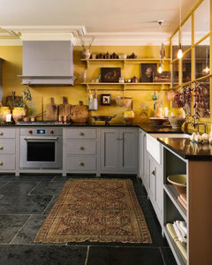
Sonia
3年前Saw this devol kitchen in a soft grey with bright yellow walls. It’s a bit cluttered but thought I would share it.
Juliet Docherty
3年前I've got Inchyra and it appears neither warm nor cool because it's deep and quite saturated. Any colour, even orange will cool with lots of white added so I think that as blue reads as coolish to start with then it's the pale blues that can feel a bit chilly. We can't measure colour temperature, it's purely a 'feel' thing.
Lena
質問の投稿者3年前Sonia, I saw a bright yellow kitchen in my wildest dreams. But I am not so brave. :)))
Also we possibly will move house in 5-10 years, so I have to be able to sell it.
I have a sunny yellow bread bin though. PRO
PROOnePlan
3年前Hi Lena ! Your kitchen is still on our system- so if you come up with a hand full of favourite colours we can try them on your drawing if you like ?! Just email over the ones you’d like to try ! :-)
Lena
質問の投稿者3年前Thank you, Colourhappy and all, for colour suggestions.
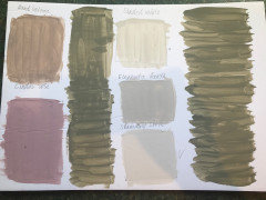
I received F&B samples of:- Treron
- Elephant’s breath, Skimming stone, Shaded white
- Cinder rose, dead salmon.
Lena
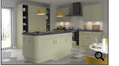
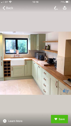
質問の投稿者3年前Both my husband and I liked the idea of an olive coloured kitchen units, but found Treron too dark. Also we didn’t figure out yet how to order a kitchen painted in a specific paint on DIY-kitchens website.
However, with our chosen Carrera kitchen comes a standard light olive colour, so we ordered a sample door yesterday.
Lena
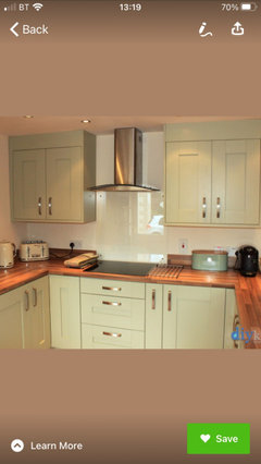
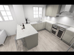
質問の投稿者3年前I’d really welcome opinions on the kitchen colour above. Also would a combination of light olive green above work with Skimming stone walls and Cinder rose on the opposite wall to the kitchen (it makes it a wall in the dining room).
Sonia
3年前Hi Lena, that picture of the kitchen is a little odd. Is it computer generated rather than a real one? It looks lemon yellow on my screen but that may be my iPad which is rather rubbish with colour. Will be interesting to see what the sample is like.
Lena
質問の投稿者3年前Sonia, the sample will arrive within a week. I’ll post a picture as soon as I get it.
Also we arranged a meeting with OnePlan on Tuesday. I’ll post a drawing of our kitchen in that colour when Karen would’ve done it.Juliet Docherty
3年前I have deep olive green with Skimming Stone and I love it, but, I wouldn't put light green with it because in my opinion it would clash. This is because value difference (how light or dark something is) works really well with 'opposite' colours, think of dark brown with pale blue grey. When you put two opposite or complementary colours together with the same very pale value it can create a discordant effect. It depends on how saturated and how dark the olive green is. Can you post a photo when you get it?
Lena
質問の投稿者3年前It started to feel that changing the colour of kitchen units (from light blue I still like) to a different one would be too complicated.
Lena
質問の投稿者3年前Colourhappy, which white paint would work with the original light blue units, please, if not Shaded white?
Lena
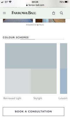
質問の投稿者3年前Diy-kitchen’s Cornflower blue looks like F&B Parma gray to me. So a suitable white would be Borrowed light, wouldn’t it?
Juliet Docherty
3年前Have you considered taupe coloured units, something like cashmere? Sorry, I just thought I'd ask. My sister recently did her kitchen with this colour way and it worked really well. @hovehomemakeover on instagram.
Lena
質問の投稿者3年前Thank you Colourhappy!
I didn’t consider taupe. I loved your sister’s kitchen on Instagram, but thought it would not be suitable for my quirky (it’s a nice word for awkward, isn’t it? 😂) kitchen.
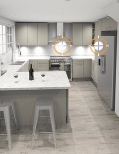
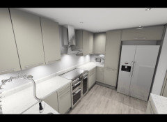
However, OnePlan suggested to try it on our plan, and both my husband and I love it after all.- PRO
OnePlan
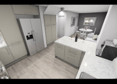
3年前https://panorama.2020.net/view/3igkrjex3ukfkx65vxotgg/
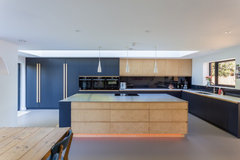
The panoramic... purbeck stone ( cashmere ) cabinets - Eternal Calcutta gold worktops - moles breath feature wall.
Lena
質問の投稿者3年前I will be looking into flooring later on. However, I already ordered paint samples of colours complementing to Purback stone. 👏👏👏
Lena
質問の投稿者3年前Karen, thank you. I liked Mole’s breath and will put it on a samples board. But I think I might also try and squeeze in my blue wall, or at least see how Oval room blue (suggested on F&B website) work on the opposite wall. I already have a sample.
Sonia might be pleased that at least someone might be using Oval room blue after all. 😁pmasmith3
3年前My new kitchen units are Dove Grey with oak worktops and flood. Purbeck Stone was recommended by F&B shop for the walls and it works really well.
Juliet Docherty
3年前最終更新:3年前My sisters kitchen is Cashmere units, and the wall colour that works with it is Skimming Stone. The tiles are large format that also similar in hue. I would say it looks neither warm nor cool, a really good pleasing neutral that can be accessorised with bronzes, cognac colours etc. I helped her choose the scheme.
Lena
質問の投稿者3年前Colourhappy, your sister’s colour scheme is very sophisticated and calm. Her whole house looked an absolute beauty 😍
I really appreciated your suggestions. 🙏🤗💐 PRO
PRODREAMROOM DOORS
3年前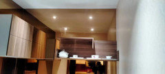
hello we are kitchen decoration located in china we have a new catalogue fro 2021 we have modern and classic design be free to contact us 008613282012713 its our whatapp account and phone number be free to contact us hndoumoulayzein@yahoo.com its our email address
- PRO
DREAMROOM DOORS
3年前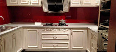
we have all kind of design modern and classic be free to contact us 008613282012713


Sonia