Color scheme for living/dining room w/ limited natural light
rubes1
10年前
最終更新:10年前
We're moving into a small apartment w/ an open dining/living room & a window only on the east. The window is very big, but the building next door obstructs the light, so not much natural light gets in.
The space is basically rectangular with shiny white tile floors.
Initially I wanted to paint the walls gray & cream w/ magenta accents, kind of like the attached image, before I thought about the lighting problem.
We want to keep our Ikea Karlstad Sivik corner sofa (similar to the one pictured below, though more gray-tone) & just change the throw pillows, but can't decide what color to paint our living/dining room. I like vintage style art work, like 1950s fashion magazine covers. I also really like Razzia's "Pret A Porter" poster.
Would love to hear contemporary color ideas for paint & throw pillows. Thanks!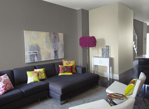
注目アンサー
並び替え:古い順
コメント (25)
 PRO
PROStudio M Interior Design
10年前I'm loving that sofa. Check this out, it's from a photo of a finished basement but I'm loving the color scheme and color choices. Loving the gray grasscloth and neutral wall colors with pops of color in the geometric rug and throw pillows. Good luck with your remodel :) rubes1さんはStudio M Interior Designさんにお礼を言いました
Carolina
10年前Light in east facing rooms can seem a bit blueish, so you could go for a blueish or greenish colour on your walls. Something like this for example (you probably know this, but do test colours out in the room first and look at it in different lights and on all the walls that you want to paint.) Slow Green SW6456 Paint · 詳細
I have a dark east facing room in my home and painted one wall a colour very similar to this: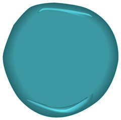 In the Tropics Paint · 詳細
Works beautifully.rubes1さんはCarolinaさんにお礼を言いました
rubes1
質問の投稿者10年前最終更新:10年前Thank you Studio M, that is a great space! I love the bright colors with the black & white accents. The rug is great too! The space seems to have a lot more light than ours. Do you think gray would be a wise choice for the wall color?rubes1
質問の投稿者10年前That's a nice color I wouldn't have thought of Carolins! I never knew east light looked bluish. Would love to see pictures of that room if possible! What accent color would you do for throw pillows, accessories in that room with that wall color? I was afraid of blues with my sofa, 'cause I thought it would look too nautical. I also have a light oak coffee table I love & want to keep.
Karin Madgwick
10年前It is an exciting time when you have a new project starting. When you have little natural light you can make your own by using mirrors and lighting. The lighting can be introduced under counters, under cabinets, soft lamps back light splash back in your kitchen. Keep your walls very light and your hi light colours should be bright, for example lime green ,bright magenta, bright aqua etc. Metals should be polished chrome. Hope that this helps.rubes1さんはKarin Madgwickさんにお礼を言いました
deidrer
10年前We painted Benjamin Moore Revere Pewter. It's light & versatile & looks beautiful no matter what color you pair it with! It has a grey tint but with browns it takes on a taupe color. The blues make it look grey.rubes1さんはdeidrerさんにお礼を言いました PRO
PROAnish Motwani Associates
10年前go for complete WHITE
Regards
Anish Motwani Associates
www.anishkmotwani.inrubes1さんはAnish Motwani Associatesさんにお礼を言いましたrubes1
質問の投稿者10年前Thank you, Karin. Very helpful! I actually love that color palette. Still stumped on the main wall color though. What light colors would go those accent colors (lime, magenta, aqua) as the main wall color besides white & gray? I'm just afraid of those looking too dull with the poor lighting.rubes1
質問の投稿者10年前Thank you, Anish. I understood white can end up looking dull & gray though in a room with poor lighting & that it's better to stick to more saturated color. What do you think?rubes1
質問の投稿者10年前Deidrer, thank you. I love that color. If the room had more light, I would definitely be painting my walls that color, but I'm debating. Is gray really a no-no for poorly lit rooms?Carolina
10年前Hi rubes1,
if you have a photo of your room, you can upload it to the Sherwin-Williams website. Look for their color visualizer tool. And then you can virtually try out colours in your room. Gives you a bit of an idea how it would look in real life.
I'll see if I can take a decent photo of my east-facing room tomorrow. No promises, but I'll do my best. It's sort of our study/snug.rubes1さんはCarolinaさんにお礼を言いましたrubes1
質問の投稿者10年前Thank you, Carolins! I will definitely check out the website once we have access to the new place (we haven't moved in yet).Karin Madgwick
10年前Rubes 1, I am in Australia so our paint colours are different. I would go to a local paint specialist and get some suggestions on the light colours that they have that stay bright in low light rooms. Then get sample pots of the ones that you choose. Paint 2 coats onto an A4 side cardboard, let it dry between coats and study the result in day and night light. Also try it in different rooms.rubes1さんはKarin Madgwickさんにお礼を言いましたrubes1
質問の投稿者10年前Thanks S&K. That's a lovely space. The previous owners actually painted the room yellow & we didn't like it at all, so I'm wary about yellow, though it was a paler yellow than that. PRO
PROS&K Interiors LLC
10年前Pastel yellows can look look rather juvenile. This is a very elegant color but if you don't like yellows at all then it will not work for you.rubes1さんはS&K Interiors LLCさんにお礼を言いました- PRO
Studio M Interior Design
10年前@Rubes1, To answer your question about the light gray wall, I think it would be fine. Let your bold pops of color stand out, and keep the color scheme from being too overwhelming by incorporating a subtle wall color. Have you considered maybe for that wall doing a gray texture like a grasscloth? It's still subtle but brings warmth and continue your designer look in the room.rubes1さんはStudio M Interior Designさんにお礼を言いました deidrer
10年前I agree with Studio M. My kids hallway is incredibly long & has no natural light but that Revere Pewter is so light that it actually helps "light" the hallway when the ceiling recessed lights are on.Carolina
10年前So... bear in mind that this is a snug/office/central hall and we have three labradors who love to sleep in that chair or on that sofa... hence the state of them. The chair is 20 years old, it needs reupholstering but I still love that Jean-Charles de Castelbajac fabric, so can't say goodbye to it yet... The photos seem to hang very high, but they are at eye level, I promise. Ceiling is just very low.
This our very dark, east-facing snug. And since it is a dark space anyway, and the rooms leading off of this space are very light, high ceilings and lots of windows, I chose dark colours for two of the walls here. Behind me is a large window, but we have large trees blocking the light, and to the left is a wall with doors all painted white. he other walls are a very dark brown and this sort of tropical blue with a green tint to it. That colour works really well in the changing light and I love it. It looks greener in the yellow light of the morning and more blue later in the day.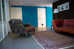 carolins' favorites · 詳細rubes1さんはCarolinaさんにお礼を言いました
rubes1
質問の投稿者10年前Very cool color combo, Carolins! Thanks for sharing. LOVE the armchair & the sofa too!
R Robulock
10年前I love the color carolins posted! It is bright and it is a cheerful color.
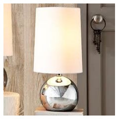
Karin M has great ideas too. You can use mirrors, lamps, and stick to a "cool" color scheme to brighten the room instead of warm colors that tend to warm it up. The gray and the tropics aqua color are both cool colors that will go with magenta and definitely chrome. A chrome lamp or a glass table with chrome legs.
I love the geometric black and white rug as well that Studio M posted.
If you like 1950s fashion magazine covers so much, you can frame 3 of your favorites 1950s fashion magazine covers, very careful with the colors as they may look too vintage. Also, make sure that the magazine covers can be enlarged if possible with a white border and black or chrome finished frame. All 3 frames should be the same size and mounted next to each other.R Robulock
10年前Here is an idea to add more lighting, shelves with recessed lighting, you don't have to have so many, 2 on each side of the TV should be enough.
Contemporary Family Room by Birmingham Interior Designers & Decorators Jeffrey King Interiors


S&K Interiors LLC