clashing kitchen quartz countertop and large marble tile backsplash
If you could choose to replace just one - counter or backsplash - which would you choose, and with what. Keep in mind that it’s an open kitchen and rest of the house is Mid-Century modern with transitional elements. (Working with a designer now since the kitchen debacle.). I’m also being color and warmth into the kitchen with Mid-Century fabric window treatments, possibly champagne bronze or brass knobs and pulls and possibly even painting the pendants’ silver trim to match the new knobs and pulls.
But I’m still stuck on the countertop and backsplash. Thoughts?


コメント (81)
 PRO
PROHome Art Tile Kitchen & Bath
4年前I love the countertop while for backsplash I think it's too gray. You mentioned including champagne bronze or brass knobs and pulls. Having that in mind, I think polished Calacatta Gold marble tile (a beautiful combination of whites and grays with gold tones) would fit the decor perfectly.

ulisdone
4年前From what we can see, all your cabinets, trim, and doors are traditional, along with the bead board hallway unit. Are you sure you want to be forcing a MCM look?
sofikbr
4年前I think you have beautiful kitchen. Backsplash is not really working as both your cabinets and countertops has warm undertone. When you would be able to add more pictures from kitchen overall we can see what tipe of tile will pull it all together. My initial thought would be to add wood elements, like wood seats counter chairs, shelves and keep backsplash one color long nerow tiles.

RedRyder
4年前The backsplash is what I would remove. Adding wood elements, as suggested above (and obvious in Beth’s photos) will help move it towards the look you want. The b/s isn’t great with the countertop. If you remove it and prepare the wall, it will be easier to envision something. You can always just paint it and wait till the right tile (and finds) become available. Taking it down will help “see” new ideas.

cpartist
4年前Regarding your thoughts DB, that's why I suggested just changing the backsplash to a 4" square tile in a color you love. And I do mean color. What colors do you have in the rest of the house?
I wouldn't do a fancy MCM tile because it wouldn't really work with the rest of the kitchen vibe but bringing in a color from the rest of the house will work.

thinkdesignlive
4年前I agree more photos please - I really like your dark wall/mud room! https://www.houzz.com/discussions/3941860/have-you-ever-painted-over-a-tiled-kitchen-backsplash#n=13
D. B.
質問の投稿者4年前I really appreciate all the help you guys are offering. Very constructive ideas. I’ll try with the photIs. Don’t know why I’m having difficulty. I haven’t posted photos outside the kitchen because its not ready for an unveiling. A new MCM coffee table needs to come out of its box, a cabinet that isn’t quite right needs to be picked up by West Elm. And we’re still under construction In part....Re the kitchen cabinets, I’m now thinking of changing the facing - making them flat. They don’t bother me, despite their being more traditional, the way the other stuff does, but I do like a simpler look. It may not bw that an expensive a project provides Luxor makes a door that is compatible with my current cabinets. (I don’t choose the cabinets. These were there when we moved in a year ago.) I will have to leave the traditional facing on the island but if the cabinets are flat, that should help. I’ll also look at changing the crown molding; perhaps the crsftsman who made our lovely built in can also change the crown molding that he installed to be consistent with the kitchen.. At the same time, I’m obviously no exoert, but I think MCM is compatible with traditional elements. I dont think one has to be all in on one period or another. My house was built in the 1950s and I think I can credibly integrate MCM. This will just have to be a marathon, not a sprint. I moved too quickly when I first got in here because so much needed to be done - just basic stuff like smoothing out crumbly walls in the powder room (the flipper had no pride of workmanship), and so I made aesthetic decisions in a harried way. Trying to be more thoughtful now....Btw, the cabinet color is not warm at all - very, very cool - def need better photos. This is why we chose BM chantilly lace paint, which is the brightest of BM whites.....Ulrimately, I think I’m leaning toward some sort of thin profile squared off corian with a subway-type tile, or perhaps a tile that adds some color.
lepstein
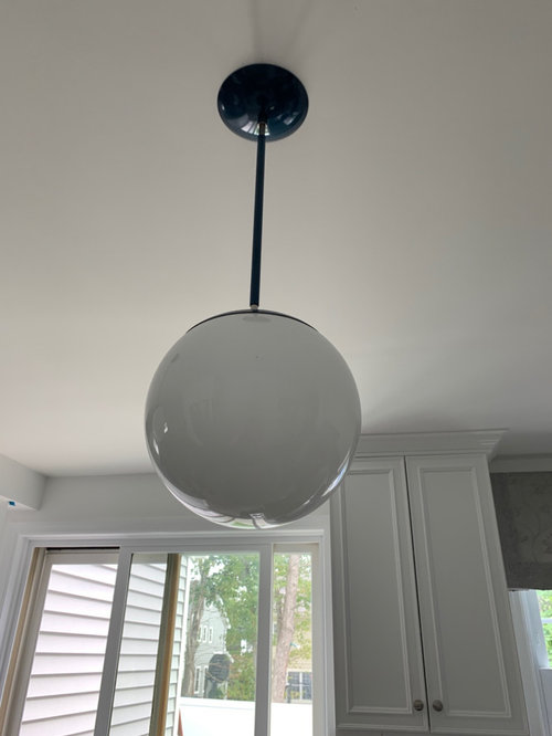
4年前Picking up the blue in your hall fixture seems the obvious colour choice to me. We are seeing warm, but you say it is cool, so match the level of warmth. You might want to do just the grout in blue if blue tile seems too overbearing.
I agree that adding teak wood might help. I also agree that traditional cupboards are ok. Flat is more to the era but not necessary.
Weird thought: painting just raised level of cabs in a colour (try it using painter's tape to be sure it isn't too busy) might bring an mcm element.lepstein
4年前Looked at pic again. Cabs don't have raised portion so I am referring to decorative portion or entire edge.
D. B.
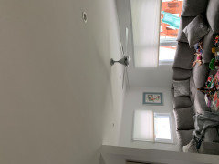
質問の投稿者4年前Those are two photos taken from opposite angles - from back living area toward kitchen and sliding glass doors and the other looking toward living area.
D. B.
質問の投稿者4年前I’ve ordeeed some deep blue velvet throw pillows and a MCM inspired lumbar for color and depth.
D. B.
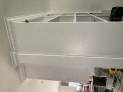
質問の投稿者4年前Above photos are on other side of kitchen “entryway.” You can see the crown molding for kitchen on left and where craftsman matched it at top of built-in on right.
D. B.
質問の投稿者4年前Above is the view down the kitchen toward the powder room and the powder room. I think we’re going to change all bathroom hardware to brass (maybe west elm) or champagne bronze (including faucet). Add a MCM sconce above mirror.
D. B.
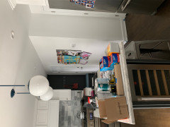
質問の投稿者4年前Excuse the mess - the house has been a work done for a long time. Above is view from kitchen to teak dining table.
D. B.
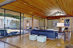
質問の投稿者4年前Above is view from dining area toward fireplace and front of house (there is a low-slung picture window to left).
tedbixby
4年前Seeing photos of your home, I wouldn't think of the interior as the typical "mid-century" that comes to mind when people talk of mid-century homes. Based on your photos I think your kitchen cabinets and crown molding are fine with the style of the rest of the house and circling back I would just replace the backsplash as that is not working with your countertop.
D. B.
質問の投稿者4年前I think Ive decided the countertop has to go, too. Id say its MCM in the way West Elm is MCM. It’s a mixture with elements. I’d like to keep pushing toward MCM, though, rather than away. And it doesn’t all have to be done overnight.
D. B.
質問の投稿者4年前Right, thats certainly MCM. This house probably never had the interaction with nature that those sorts of protyoical MCM houses have. Bur my house was built in the mid-50s, has a definite MCM profile from outside, and I’m trying to move my furnishings in an MCM direction.
thinkdesignlive
4年前DB you need to start ideabooks. Save images of spaces you like. It will help your relationship with the designer and will also help people here chime in a more appropriate way. Good luck!
D. B.
質問の投稿者4年前Ill look into ideabooks. Thanks....As I look st the photos above, I will say that imo, what’s separates my house from them is the wood-paneled architecture (-!; of course larger spaces). The furniture has an MCM vibe but is also elclectic. That seems about he direction Im trying to move my house in. Bring together my Nelson pendant in rhe stairwell, and MCM credenza In living room. and bubble sconces and pendants, Dr Seuss prints, into a more cohesive mix.
D. B.
質問の投稿者4年前Designer and I went to to tile store yesterday. A definite contender for the bascksplash - this cool porcelain tile (of course with new counter....and we’re going to change cabinets and hardware, too). It’s 3-D:

felizlady
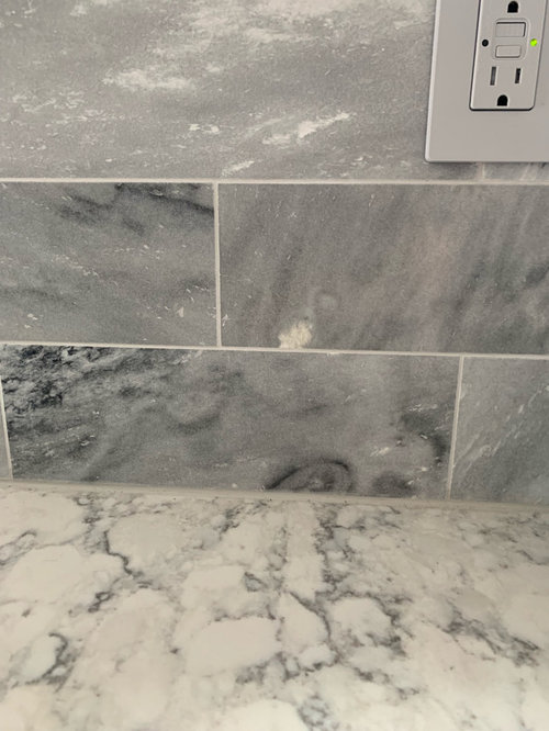
4年前The backsplash went in after the counter, so it’s easier to remove and replace the backsplash. Have a professional do the removal. The new backsplash should be a simple solid-color tile which matches a color in the counter material. The reason you don’t like what you have is that there are clashing colors and clashing vein patterns.
D. B.
質問の投稿者4年前Were going to change the entire kitchen. The counter will be white,, maybe with a bit of sparkle. Tile in above photo is contender for backsplash.
thinkdesignlive
4年前It’s your kitchen and if that backsplash makes you swoon then go for it. Definitely with a solid counter. I fee like it’s a bit ‘playful’ but if that is a look you like and your overall home supports then that’s all great. Also, I think outlets and switches just kill that dimensional look so consider under cabinet plug strips if you can.
Anna (6B/7A in MD)
4年前I hope you can save some of that material or donate it, landfills don’t need more.
tedbixby
4年前DB what is that tile? There is another OP looking for a tile and I think this may be something for her to consider.
D. B.
質問の投稿者4年前I bring stuff to habitat for humanity that I can’t use, but I don’t know if the counter and tiles will survive removal in a useable state. Any recycling/disposal suggestions welcome.
I’ll find out what the tile is and get back to you.
D. B.
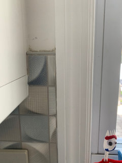
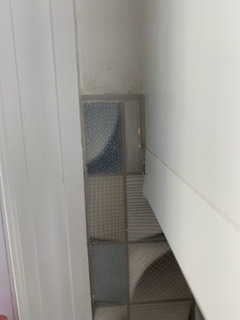
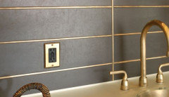
質問の投稿者4年前So we changed our counter and backsplash just before the pandemic. The tiler will return to fix things when it’s safe to do so (and the painter will fix walls). Want your thoughts on how he spaced the tiles around the window. Obviously some chipped tile that needs to be addressed - I would just appreciate your thoughts on spacing.
You can see that he didn’t mirror the tile on each side of the window - or at least not in the way I would have preferred. On the left, the tile pattern is “wide tile, narrow tile.” On the right, it is also “wide tile, narrow tile.” However, appropriately mirrored, the tile on the left would be “narrow, wide” (ie, a reflection of what’s now on the right) l, OR the tile on the right would go “narrow, wide” (ie, a reflection of what’s now on the left.
thinkdesignlive
4年前Honestly it’s hard to comment without seeing the whole tiled areas. So if the tiler had centered it on the window what would that have done at the corners? I see my comment in 2019 didn’t dissuade you from going with this tile :) Are you happy with it? Glad to see you paired it with a solid counter.
D. B.
質問の投稿者4年前We love it! So much warmer. And the counter, while not totally solid (it has blue and sparkly flecks) is so much brighter. The electrician didn’t feel he could do under cabinet outlets. He wa already extending the under cabinet lighting. But I think the new Lutron outlets and wall plates in stone blend nicely. And we have a Bose speaker on the counter that is always plugged in, and I don’t think I’d love the look of a wife dangling from the cabinetry.
I guess I thought this particular problem is more a function of where he cut the tiles around the cabinet - that he could have chosen to cut them in a different spot - but perhaps that wasn’t the case. I’ll have to ask when he returns. I guess a question is how big a deal is it visually?tedbixby
4年前I like the idea of the wife dangling from the cabinetry-lol... Looking forward to seeing your whole reveal.
 PRO
PROEmma DeRoche Interior Design
4年前D.B. These are the best design challenges when caught at the right moment or planned beforehand. :) I am personally BIG on symmetry. So I would have probably placed a piece of trim (tile or nice metal Schluter) somewhere as a design element to help balance the cuts. Design + function purpose! ;)
Now that it is already laid out and grouted, Ultimately it depends how strongly you feel about this assymetry. This is YOUR house, your perfection or imperfection to live with.And yes, you pin pointed the issue correctly. Indeed this happens when the installer decided a specific spot to start the pattern. If he hasn’t laid out for you or your designer to approve then he will choose what makes sense for HIM. But also some tiles are more challenging than others.
D. B.
質問の投稿者4年前Yes, I think this might be a challenging tile. He did metal shluter along the outer edges. Where would you do it internally?
- PRO
Emma DeRoche Interior Design
4年前Without having your kitchen laid out in my software with the tile specs or being in your kitchen myself It’s hard to say, but the key phrase is that “I would have put it in a way that a full tile column frames your window.”. It seems like like a full tile would fit. And probably put the schluter at the base of the cupboard and/or other places. I’m thinking of a “fatter” schluter than the one your installer used at the edge though.
D. B.
質問の投稿者4年前I was looking more closely, and I’ve gotten a better sense of the problem - though not how to fix it....He really did a beautiful job in the effort to ensure that no tiles were cut abruptly at either end of the two implicated walls. He also did a lovely job underneath cabinets. I believe part of the purpose in using less obtrusive shluter was to make the overall effect a more charming one, less severe....I think what happened, though, was that he started on either end of the windowed wall and then ran into the window, which he had to accommodate somehow. As much as I would prefer perfect symmetry on either side of the window, I think it may be an impossible ask. I’ll discuss with the tilers post-pandemic - hopefully, everyone stays healthy (knock on wood).


Skippack Tile & Stone