Ideas to Update the Exterior
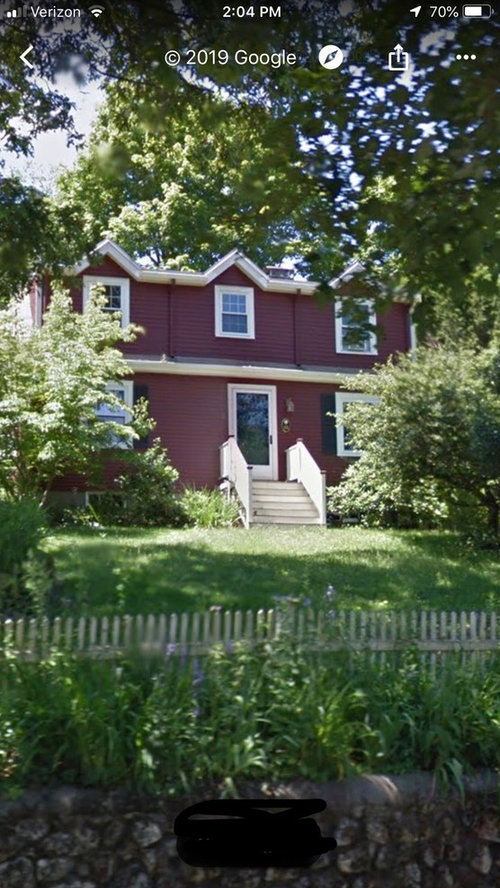
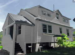
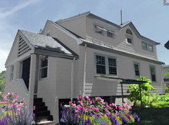
Hi! We bought this rather quirky-looking house a few years ago. I’m wondering if folks have ideas on how to update the exterior and create a slightly less odd looking front?
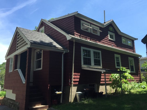
We’re currently doing a kitchen renovation, so some exterior things are changing on the back of the house (windows, exterior door), but when it’s done we’re going to re-paint, and I’m a little stumped about what (if anything) can help the appearance, especially the odd peaky windows on the front. I’ve been thinking of maybe a color change to a light or darker blue. Would love ideas!
We are not currently able to do anything structural to the front, because there were other things we needed to prioritize with the renovation so looking mostly for painting, landscaping, or other similar ideas. Also the picture of the front is dated from before we purchased and we’ve gotten a new white picket fence since then.
Much appreciated!
コメント (27)
 PRO
PROJudyG Designs
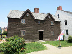
4年前最終更新:4年前Hey, you have a house of seven gables! Cute
Once suggestion (and you can stick with the red if you like it), paint all the trim and the siding the same color. I don’t like the overhang, but it looks as if it is part of the structure. If that trim were the same as the siding, you would not notice it as much.Shutters: they do not fit and are spoiling the look of the windows. Take them off.
Windows: are the mullions pop-outs? I would paint them red (or whatever), as well.
Front door, storm door and its trim, a different color than the house.
 Barn-Inspired Renovation - Waccabuc, NY · 詳細
groveraxle
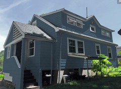
4年前Like JudyG, I would paint the it all the same color, except I think I would paint the whole thing white.

jjacee
質問の投稿者4年前Yes, we often lovingly refer to it as the house of too-many gables! And I like both ideas. The window mullions (has to look up what that was!) are inside the window so I don’t think I can paint those.
@JudyG Designs and @groveraxel the overhang is part of the structure, do you think it makes it feel too blocky to paint everything the same color? Or will that help minimize some of the bulk? (We are on top of a very large hill in our neighborhood, and that is a 5-ft. Retaining wall below the fence, so I worry about the house standing out in a negative way.)
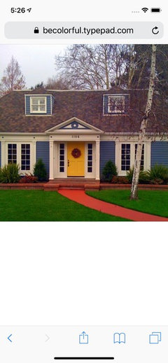
@suzyq53 And if we went two-tone would you do the darker color on top like the example photo or on the bottom?
Really appreciate the ideas so far!
jjacee
質問の投稿者4年前Wow. That visual in white really helps! Would that be a light gray trim on the windows?
Anna (6B/7A in MD)
4年前最終更新:4年前Do you like the red? I kind of do. Maybe a cream trim if keeping the red. I do feel like it’s a lot of red though. Agree about the shutters, lose them.
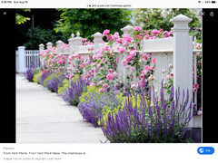
If you did go with all white ( not a bad idea), I would use something along these lines for the color scheme of your garden:
groveraxle
4年前Jjacee, I didn't touch your trim, just painted the siding a bit brighter white than your trim. Here I adjusted the lighting. This is probably a more accurate look if you paint the same or less bright than the trim.
jjacee
質問の投稿者4年前Thanks groveraxel that helps a lot!
And yes, Anna, I agree. I don’t mind the red. I tend to like color in general, but I think it is a bit much on our place right now, and I worry about repainting red because I feel like it’s so easy to get a shade that’s not quite right. That’s why I’d been thinking a blue might be a bit safer- still some color but easier to find a nice shade.
jjacee
質問の投稿者4年前Anna, I love those garden colors and actually have quite a few of them in the yard currently! (Can’t really see in the pics) we’ve got purple irises, lilac, a couple things that I still haven’t figured out! And pink peonies, roses, and tulips throughout the spring and summer. That’s mixed in with a bunch of other stuff too, but I could work to cultivate it, although I like it a little wild!

Olychick
4年前Oh, your red house is SO charming! And has so much personality. I'd never paint that house white; it loses all of its quirkiness and what makes it different and loveable to my eyes and just becomes another boring white house! Love the red JudyG shows.
jjacee
質問の投稿者4年前Thanks Olychick! We love it too, quirks and all.
It’s just in desperate need of some exterior updating (worn paint, lots of old patching, some rotting trim) so I’d love to work on curb appeal a bit, and I’m definitely open to color suggestions as well!
One thing I’m noticing from folks is that it sounds like either no or low-contrast trim is the way to go, and that is helpful because originally I’d been thinking of starker contrast. So I am definitely picking up some great ideas.
Really appreciate all the input!
jjacee
質問の投稿者4年前Groveraxel- you are a master of photoshop (or whatever tool you use). I’m so impressed!
Anna (6B/7A in MD)
4年前I wish I could tell you, but I searched "blue house with yellow front door." You can use the photo above in the SW ColorSnap Visualizer (I think that's the tool?) and it will give you suggestions for a color match--click on several places in the photo and it'll give you an idea of where to look in their paint chips. If you do go with a yellow door, note that it's a deeper yellow color--not a super bright one.
groveraxle
4年前Any high contrast between siding and trim will call attention to the odd angles and tiny gables.
 PRO
PROVicki Simon Interior Design
4年前最終更新:4年前I love the classic red/black/white color scheme. I would make the following changes to correct the balance of the entryway and front facade: 1. Paint the white trim on the upper windows the same red as the house, in gloss of course. The scale of the trim is way too close to the roofline. Just the window trim. Since you got a white picket fence, and you have the existing sandwiched new mullions, that amount of white should be the full extent of it. 2. I would swap the existing black shutters for wider ones that more minimize the imbalance of the placement compared with the entryway. They should be the same height as the window trim. Decorative shutters are a way to represent what used to be functional shutters that cover a window. So, scale-wise they look best when they are scaled to do just that, though you can get away with a "cheat". These that you have look way too narrow, and not the right height. Then, 3. I would call attention to the entryway more so. A quick fix could be a black and white striped awning worked sensitively into the overhang eaves there--with period appropriate black metal rods holding it up. Voila!
jjacee
質問の投稿者4年前Thanks so much, Vicki!
Very practical and logical. Clarifying question: when you say just paint the upper window trim do you mean that we should leave the roofline trim the contrasting color, or should the roofline trim also be the same red?
Thanks all for the suggestions on the shutters!
Everyone has been so kind and helpful. Its been giving me a lot to think about has really helped me visualize some of the options.
And thanks again to groveraxel for the amazing photoshop to illustrate!
 PRO
PROInner City Skyline
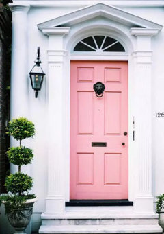
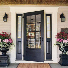
4年前Just saw these exciting doors you can consider for the exterior. Images found on Google.
- PRO
Vicki Simon Interior Design
4年前jjacee, I meant just the second floor window trim, leaving the roof eaves white.
Debbie Downer
4年前最終更新:4年前Love the roofline! I would guess there was a porch in the center 1/3 of your house - I would start researching/budgeting for replacing that. The second view hsows your house to be craftsman-esque - or of that era & influences anyway. That being the case a portico on the front would be exactly the wrong thing to do. White would be the wrong thing to do.
Look into colors of the era . Not that you have to make it into a museum piece or it cant look fresh and current in its own way - nooo! Just that a house always looks better/more cohesive if the original design intentions are figured into the design - its the difference between "not bad" and showstopper.
All white is not going to do much for deemphasizing the gables. There still is a stark contrasty line between roof/sky and the white. Better would be a midtone that blends/harmonizes with roof. You could have a slightly different tone for the trim/eaves - say a dark pinky brown-beige with a red for the body of the house. Reds btw come in at least as many shades and hues as blues.
Is your roof staying though? That looks like blues/grays/greens so you might want to go that direction and ditch the red as you are already thinking. Idea is to have all the components just be less contrasty. Some of these show how the darker eaves colors blend in witht he roof and deemphasize the roofline - such as 1905 craftsman https://www.oldhouseguy.com/projects/exterior-paint-color-portfolio/ .
jjacee
質問の投稿者4年前Thanks Current Resident!
So much good advice in here. The roof is staying, and I like how it looks from the back but in the front it’s completely flat between the peaks, so it’s a little hard to find comparable houses and color schemes!
I agree about the porch, and it’s definitely on my list of future projects! Thanks for the website- great resource.
One question for you: if we went with a less contrasty but still different trim, would you see that on the window trim as well? Or just the eaves?
Again you all have been hugely helpful in this process!


groveraxle