Help with paint color
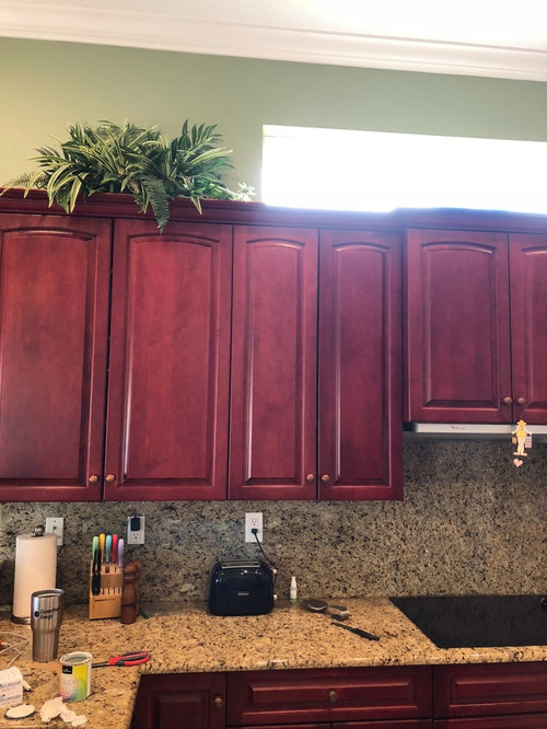
I need to paint the breakfast area/ kitchen. I have cherry cabinets and have redone cornice boards in a light beachy fabric. I hope this wasn’t a mistake. Only small wall area above cabinets, the rest is in breakfast area. I have tried Benjamin Moore quiet moments, beach glass and Woodlawn blue, also Sherwin Williams Rainwashed. Sea salt totally washed out in morning light.
Am conflicted with the cherry but can’t change right now.
any advice welcome.
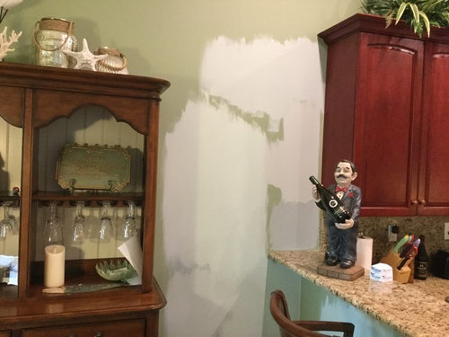
in second photo, beach glass is top left, quiet moments underneath. On right top is quiet moments with Woodlawn blue below, then Rainwashe.d.
third photo, Woodlawn blue on top, Rainwashed on left, quiet moments, middle right and beach glass bottom right.
if it looks like I’m going crazy, I feel like it!
many thanks


コメント (12)

sloyder
5年前hard to tell from the photo. I would paint the colors on paint board, so you have a clean base. If paint color is washed out then you need a darker color.
cat_ky
5年前Sea Salt often looks washed out in high light. All the paints you are picking have green undertones, is that what you are looking for, or are you looking for something a bit bluer, since you seem to be looking for beachy colors? If you are looking for something bluer, try some of the lighter aqua colors. Make sure you look for colors that do not look muddy.

Patti Miller
質問の投稿者5年前I painted them on poster board first and they look totally different than they do on the wall. Couldn’t tell on board, so painted on the walls.
Patti Miller
質問の投稿者5年前cat-ky... I thought the gray blue green might go better with cherry cabinets. Also thought Woodlawn blue was a truer blue? What do you mean by muddy? I read online that you should go with cooler colors to contrast with the cherry, like gray, blue. all these look cool to me except Woodlawn blue.
cat_ky
5年前Patti, a muddy look is a color that just doesnt have a lot of clear brightness to it. It is more muted. I think your room calls for a color that is just a bit brighter. You might take a look at this Benjamin Moore color https://www.benjaminmoore.com/en-us/color-overview/find-your-color/color/2048-60/jamaican-aqua?color=2048-60 Here is a link that explains clear and muddy colors better than I can. http://www.housepaintingtutorials.com/wall-colors.html
Patti Miller
質問の投稿者5年前Prika design... the painter just said that he would put two coats over the green. So if I put two coats of my sample color, won'’ that give the true color?
 PRO
PROPrika Design
5年前Yes that would work Patti. Please do remember that surrounding wall color and all the other surfaces in the room is still going to reflect on your ‘sample paint color’ since light bounces off from all the surfaces near by. Natural light in a room plays an important role too. That’s why if one color looks nice in someone’s else’s home it may not look the same in your home. You may find a big difference in how your sample looks now and how the entire room looks, once painted. It sometimes gets overwhelming when it comes to choosing the right color. I would have suggested you with some suggestions but colors look very different on screen as compared to physically seeing them. What you are doing is right, you have done your research, you have shortlisted few samples, and painted them in different areas/walls of the room. Now, I would suggest to watch the samples in different times of the day over a few days and start eliminating different samples one by one. You may also call your friends home and get their opinion. Once the entire room is painted, give yourself some time for your eyes to adjust to a new color. The chances are that you may like your choice unless the color is awful or totally off. Good luck!Patti Miller
質問の投稿者5年前Thank you Prika design!! Any thoughts on whether Sea Salt or Quiet Moments would be ok with dark cherry cabinet? I’m worried about making a mistake and having to redo. My first thought was that Sea Salt is too light but I’m trying it again! It’s a crazy process!
- PRO
Prika Design
5年前Patti, as I mentioned earlier it’s difficult to give you the right color choice by only looking at the pictures. Both colors you have chosen have green undertone and are nice. I don’t think you’ll go wrong with either of these choices. Sea Salt is definitely the lightest color on the strip. If you prefer just a hint of color then you can go with this. During the day it will probably not show any color but it will make the room light and bright. If you want to try another shade of SW then Oyster Bay is on the same strip, it’s two shades darker and Comfort Gray is one shade darker than Sea Salt. There’s another color, Jogging Path. It’s a different shade with both green and grey undertones. I had that color in my previous home and loved it. You may look up all these colors online before buying samples.
Coming back to the pictures you provided. As I see on my screen, Quite Moments seems like a nice color as compared to other paint samples in the picture. I don’t want to confuse you but I am unable to see true colors on screen.
You may try color snap tool on both SW and BM websites. Take a picture of the room and fill the color of your choice. Hopefully you’ll be able to better visualize. Do post your final decision and picture of your kitchen with new paint color. I am curious to see the end result. All the best! lindsey_9002
5年前I have a similar problem, only with white wall paint and cherry cabinets! Your cabinets appear to be more reddish than mine, though. I can't help too much but I would steer clear of Rainwashed. We just painted our basement in SW Rainwashed and it's lovely and calming but it can read turquoise on some walls.
 PRO
PROAlison Powers Color Consultant
5年前Instead of a color, I would look for a neutral found in your countertops to tie everything together. Manchester Tan is a good place to start.

Prika Design