Updated Living Room. I need honest opinions.

コメント (391)

lwfromny
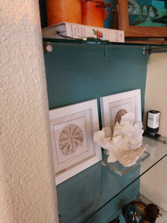
5年前Whew - just found this thread and read the whole thing. What a wonderful journey you have been on! I just wanted to comment that I have seen Comfort Gray in many different rooms and lighting situations and it’s one of those colors that’s always gorgeous. I chose it for my master bedroom and love it. I think it would be great in your room, and you could use the darker teal behind your shelves and in some accessories.
As a new person to this thread, reading your thoughts and ideas as they have moved over the span of time, my impression is that you have a love for many things - color, neutrals, a variety of art, etc. I am the same, and it’s a blessing and a curse :). It can take me forever to decide on things, and the outcome can be either an amazing, or in some cases I’ve ended up with a mish mash hahaha. So in the past few years I’ve discovered a technique that really focuses me. I choose three words that describe how I want the room to feel (not look) when I’m done. Calming? Invigorating? Elegant? Beachy? Traditional? Simple? Then when I’m pulled in a lot of directions and struggle to choose something when I love so many things, those words settle and focus me, and are a tremendous help in decision making.
If you try this, don’t rush the process of choosing your words. One good way to come up with them is to look at pictures of rooms you love and want to look at over and over. Also look at the rooms in your house that you feel the best in. You will probably that there are some common words that describe all these rooms - those are probably your words. Then use them - what paint and art and accessories will create a room that feels like your words? This really works - I even had my daughter do this when we shopped for a wedding dress, and it really worked!
I’ll be watching your progress - I can’t wait
to see how it all comes together! And oh by the way - LOVE those shades!!
J J
質問の投稿者5年前lwfromny, how thoughtful of you to share your advice. It has been a process for sure, which has been mostly joyful. I am priming the shelves this weekend . I'll share photos soon.
wmsimons85
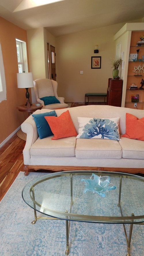
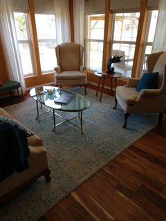
5年前So pretty. I agree with Toats, haven’t seen a long shot of the rug but looks beautiful.

jpp221
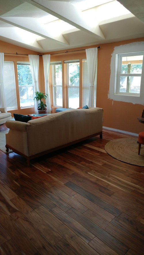
5年前I find the orange off-putting. Particularly with those drapes, it somehow looks like an ikea kids’ room. The room needs some pattern, something less colour-blocked primary/pastel toned.J J
質問の投稿者5年前jpp221. thanks for joining. The orange color is going away. Take a look at my recent posts.

wmsimons85
5年前I agree looks great with the shade and also the teal in the bookcases. Will hopefully look great with your sofa

kjoy1
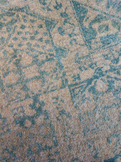
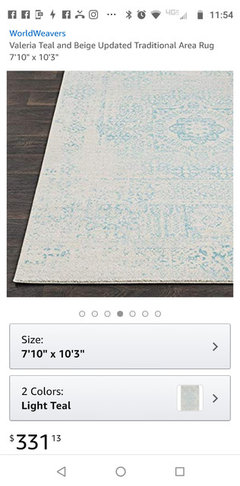
5年前Joy...loving the new paint colors:) Can you tell me more about your new rug...is it the Bosphorus Medieval Tracery from rugsusa? Is the background gray or ivory?
jpp221
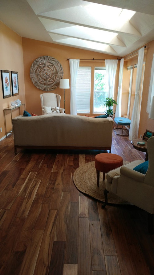
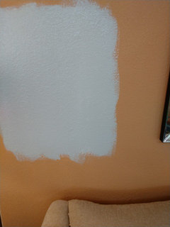
5年前Sorry for chiming in without having read all the posts (but I dare say, I think one can be forgiven—there’s a whole lotta posts there!). The new grey colour is a great choice. If you can (and if it’s not too late), I’d try to matte down the finish as much as possible. With those textured walls, any sheen can be a challenge (and look not terribly authentic, as the texture is meant to look very stucco-ish, which is a flat finish). With that said, any glare in the photos you did post may only be because the paint was fresh.
Again, I’ve not read all the posts, so forgive me, but if the white drapes are staying, I’d consider trimming them in something, to give them a band of colour and pattern. It will luxe them up immediately.
Did the sofa get turned 90 degrees, against the wall, as others suggested? I’d be curious to see how that would work, as I’d imagine it would open the room up beautifully and orient the seating toward a nice view out a bigger window.jpp221
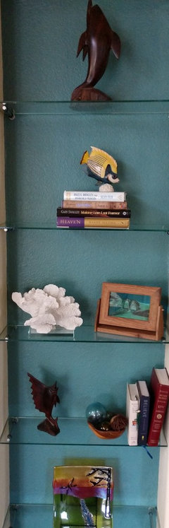
5年前By the way, that radio (I think that’s what it is) by the entry is exquisite (and I don’t particularly like antiques, so that’s saying a lot).J J
質問の投稿者5年前Regarding the paint. I will get the highest quality base with matte finish. The samples only come in cheap satin. Good call! PRO
PROWindow Accents by Vanessa Downs
5年前I too am interested in where you bought the rug. I scrolled and read up further but didn’t see info. It’s beautiful and it might work in my study, if it comes in an 8 ft round.J J
質問の投稿者5年前jpp221, thank you for your advice. No apology necessary, just happy you have joined in. The curtains are custom made. The material is quite nice with a subtle texture. I may consider adding a bit of color or pattern as you suggested. Suggestions welcome. We like our older radios! Most are heirlooms we've restored.novice0
5年前Joy Peace, I love you room! Interested in the same color scheme as well! Could you tell me where you found the coral and teal photos?
felizlady
5年前I prefer the sofa against the wall: then we can see your pretty colors working together. I do think the rug is a bit small in either arrangement. The big round piece on the wall is too large.J J
質問の投稿者5年前Felizlady,. I replaced the rug for larger one. The round wall art is no longer on the small wall.

wmsimons85
5年前最終更新:5年前I think the rug is a good size. Looking at the below, could you turn it horizontally? Maybe with just the front feet of the furniture on it. It does look like it may fit better that way. Seems everyone loves your room. Me included! :)

jbtanyderi
5年前The hall art is much too small. How does that isolated chair fit into the scheme of things? Wider, fuller drapes would better balance the seating pieces.J J
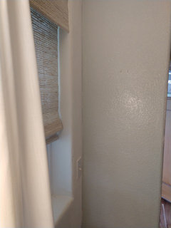
質問の投稿者5年前Challenge with drapes....the angles of the corner and ceiling are not symmetrical. Not certain getting wider/ fuller curtains is an option? The shades are new and at one time I considered no curtains.


J J
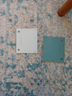
質問の投稿者5年前Grover, as always, you are spot on! Left is your rendering from long ago. Right is the color today.

- PRO
Window Accents by Vanessa Downs
5年前I don’t think you need to go fuller on your draperies. They are framing the window well enough and any fuller, they’d be covering too much. Your shades serve the purpose for privacy and light control and the panels serve the purpose of framing the windows. 
nicole___
5年前It's a VERY nice room! Love those sky lights and wood flooring. Wow!
Is the whole room blue now?


J J質問の投稿者