opinion on red kitchen colour scheme
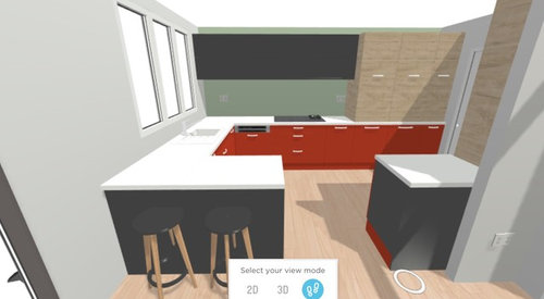
Looking for opinions on my kitchen colour scheme. 1st photo showing layout and colours of cabinetry - ignore fine details like handles and size units as this is a very amateur sketch, it’s just to get a feel for the design colour scheme.
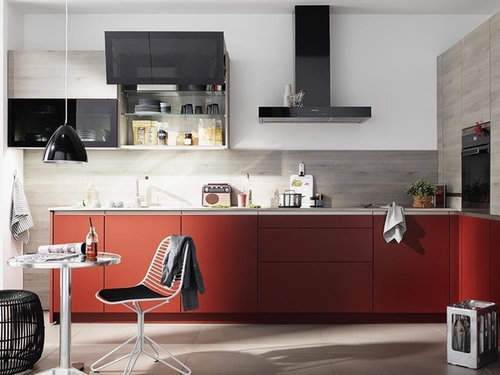
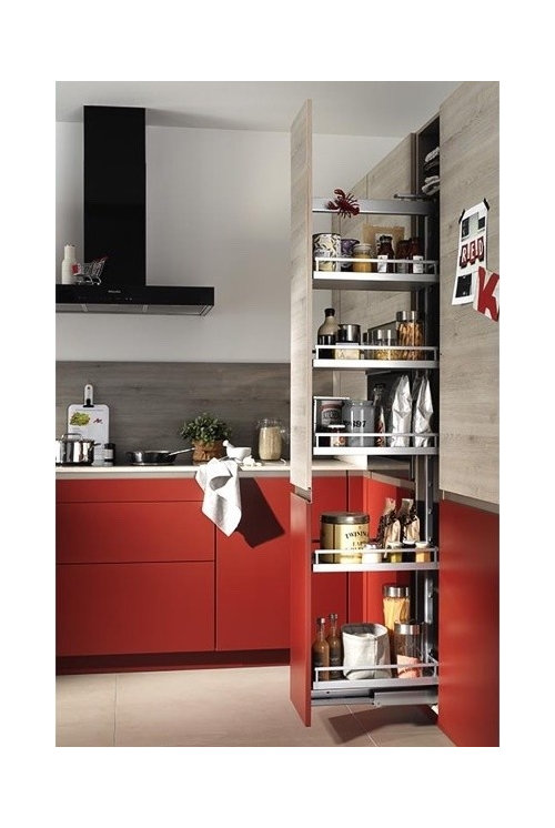
Other pictures are the cabinet we like from the kitchen manufacturer.
My husband and I like it though I know some would be weary of red. We love it and are going for a modern oriental colour scheme but would like to know if you think this would work. The kitchen has limited natural light facing northeast!
Thanks in advance

コメント (17)

Kat
質問の投稿者6年前Thank you @colourhappy
The floor will be tile - off white, easy to clean with dog and 3 year old and electric UFH
Would black gloss units work? Or too dark
Otherwise see attached pic of truffle grey/white - would the truffle grey work instead?
Emily
6年前Really liked colourhappy suggestions and saw that particular article and remember living it. Personally would steer clear of gloss black as it might be a bit 80s with red.
Juliet Docherty
6年前Personally I would avoid pure black also as it's a bit stark. Truffle grey sounds good. Reds tend to look darker and cooler against white and they glow paler and warmer against darker sombre colours. Photographing actual samples together in the room will really help. Also, start collecting paint samples, paint them onto pieces of A4 card so you can move them around. Maybe start a red ideas book?
Juliet Docherty
6年前Is it that you love red and want some red in the kitchen, or that you want red units? You could incorporate red into the scheme but not necessarily on the units. My kitchen is quite dark and I used deep olive bronze walls/tiles but with pale wood units.
Kat
質問の投稿者6年前We love both red and the red units. Just trying to work out the balance of colours and consider the lighting in the room.
The worktop can be a similar shade to the pale pine cabinets.
Do you have a pic of your kitchen? Sounds lovely!Juliet Docherty
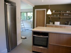
6年前Hi Kat. I don't have any really good pics, just mobile phone ones. Your kitchen is similar layout to mine. The most useful things we did were to set back the cooker wall units a little to create a shelf that runs all the way across the wall. This is good as it removes clutter from worktop and cooking stuff is away from tiles. Also we knocked a hole in a supporting wall to house fridge (the boxing in on other side in hall was made into a useful coat store).
Kat
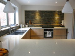
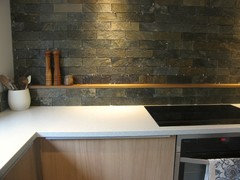
質問の投稿者6年前I absolutely love the olive green tiles and the wall colour - do mind if I ask where you got these and what the colour of the wall is? Knocking back behind cooker is also a great idea!Juliet Docherty
6年前Hi Kat, the tiles were riven quartzite tiles (see link) and they weren't too pricey but I would go for honed as the riven were very riven. We ordered far too many and selected the ones we wanted. Make sure they are sealed before grouting. The paint is Light Bronze Green and I chose it to bring out the violet tones in the pale oak. Got the shelf idea from an old Conran book and it is so useful. Also, interestingly enough, there are no splashes on the tiles and it all looks as new (I have sealed them and grout though) so they are very forgiving.
https://www.stonetilecompany.co.uk/natural-deoli-green-quartzite-brick-tiles
minnie101
6年前I don't know how practical/costly it would be to have done but charred wood (can't remember what the Japanese call it!) might work with the whole aesthetic for the darker elements? It's not easy to find charred wood kitchen pictures (!) but obviously you can control how dark it is. If not the truffle sounds good. I think I'd go handleless for the units
 PRO
PROPeriod Property Store
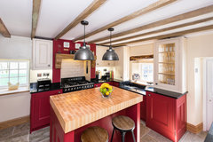
6年前最終更新:6年前I quite like a red kitchen. Although this style is less modern than yours, I think it shows that red can really work in this environment even though it is a strong colour.
 PRO
PROSteven Andrews Bespoke - Design Better
6年前Hi Kat,
Looks like you’ve got plenty of good advice here and I like your original inspiration you attached. My advice would be to not have too many differing colours and materials as it can start to look too busy, especially when you’ve got deep and/or vibrant colours.
Also where you have grey, black or red cabinets keep the plinth and end panels the same. Your sketch shows a red plinth below the grey units which I don’t think works as well as your original inspiration.
All the best.
SteveKat
質問の投稿者6年前Maybe this design scheme is better? Red Splashbacks instead of red units using the wood laminate and truffle grey units in the picture. What do you think?
- PRO
Steven Andrews Bespoke - Design Better
6年前Hi Kat, yes this could be very nice. Are you suggesting glass splashback? If so I'd be tempted to only go up the wall about 400/500mm and then paint the rest of the wall so it's got a nice crisp clean look. I notice that you've changed the cabinets to drawer-line. I find that these can be a bit harder to use than having a combination of drawer cabinets and door cabinets, as you had in your previous design. Food for thought maybe.
Kind regardsSteve

Carolina
6年前最終更新:6年前I prefer your first pic, with the red cabinets. I think I would personally have the cabinet doors at the bottom of the light wooden ones in the same light wood. So it is a tall bank of units in light wood.
And I love colourhappy's tiles and shelf idea. Would look gorgeous. The Japanese charred wood that Minnie is referring to is Shou Sugi Ban.
 PRO
PROSUN STUDIO.London - Glassworks and Prints
6年前Dzień dobry Kat,
Have you finished your renovation? Red colour always been my favourite in the kitchen, but I see something missing on the visualization.I am talking about kitchen splashback, this month we have done a really nice splashback that would fit red colour range (Here is a review of this splashback).
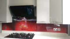
In case you did not like the design, let us know, we can put any image on it. Our free design offer applies to kitchen splashbacks as well.
Would you like me to schedule an introductory call with our advisor?
Thank you,
Erwin


Juliet Docherty